No one else seems to have picked up on this in the Google Earth community so:
Holographic Google Earth from Nicolas Loeillot on Vimeo.
More details its by lm3labs.com (which deserves to be sent to websitesthatsuck.com for bad web page design IMHO).
Unfortunately the holograms don't seem to be in 3D, I'd love to know if they're working on a 3D version.
Monday, June 30, 2008
10 Questions to ask about your Google Earth Project
Lets look back to my first post, if any of you remember it was a list of my 10 pet hates in Google Earth. Over the year, I've looked at a lot more Google Earth projects and I'm afraid most of my comments are still valid, we're in the lost decade of geo-web usability. So here's a statement of redirection: over the last year I have concentrated on 'Design Principles'. I'm finding more and more that my posts are simply refinements of the basic ideas I've explored here already, from now on I'm going to switch the focus of this blog onto 'Project Reviews' but, in a change to how I've done reviews so far I will be asking 10 key questions of each project:
1. What do the users get out of looking at the project?
It should 'meet their needs'. You should think hard about who is going to access your site and why they are going to explore it. Some example needs: they want to find some specific inforamation, they want to donate, they want to be entertained or they want to feel part of a community.
2. Is there a good introduction?
Do users get the general idea of what will be in my project before they enter it? Do I flag up possible issues with the project that they might not understand?
3. Is the text written concisely?
Web writing should be short, snappy and to the point. Important stuff should be out in front, more minor details should be in there but linked to and in the background. This relates to (1), if you aren't quick to get to the point your users will drift off somewhere else on the web/geo-web.
4. Have icons, lines and areas been used well?
Beyond the need to avoid bad combinations of colors for those with color blindness, the best project combines as much data as possible on screen at any one time while still being clear. The general rule of thumb (which I got from Edward Tufte) is that lines should have their visual impact reduced as much as possible by making them thin, more gray or reducing opacity. Much the same rule applies to areas, often the best design is to use a solid black or white boarder to an area with an infil of reduced opacity.
5. Have acronyms been avoided?
6. Is the Places column structured well?
Overly busy structures in the Places column leave users confused. Keep it as simple as possible to do the job, if necessary, split into 2 or more KMZ files to do the job.
7. Is there an appropriate amount of data in the project?
Strongly related to (1) but still worth thinking of separately. It is common to overwhelm users with too much information when it would have been more sensible to split the material into 'introductory' and 'advanced' sub projects.
8. Have advanced elements been used that could be avoided?
Clever design features are often used when they often hinder, not help the purpose of the site. My particular dislike is for the use of Regions to prevent overload. If you are 'flying' at a particular height features are hidden, clever enough but not if you don't know there are elements hidden from view. If there's a simple way of doing something, choose it.
9. Is there Map Junk?
Features that do not add anything to the story and may even get in the way. They differ from features that fall into the (8) category in usually being present to add to the look rather than being a 'cool' feature.
10. On entry is the level of visible features appropriate?
Usually its sensible to ensure all the layers except those directly involved in your introduction are turned off when the user opens your project. Very simple, often not done.
Mostly they're the same as my original list of hates and I've covered all these topics in the posts here over the last year.
So who is first in line for a scathing design orientated review? erm, me. :) I thought it only fair that I ask the 10 questions of something I've published before criticizing the work of others and that is part of what will be happening here tomorrow.
Happy Birthday Blog!
 This week GoogleEarthDesign is one year old. Hurrah! To celebrate reaching this milestone (75 posts and counting) for one week only I will be upping my normal 1-a-week rate to a post every working day...
...but wait, there's more!...
...each of the four remaining posts will also involve a 'release'. I shall say no more, you'll just have to show up to find out what they are.
Another post follows today where I announce a new direction for this blog.
(it isn't me in the picture BTW, courtesy Cayusa of Flickr)
Thursday, June 26, 2008
Is Google Maps GIS?
Blink Geo asked the question after a post by High Earth Orbit (via Digital Urban who adds his own 2p worth).
IMHO it's necessarily a fuzzy line but overall, no.
Although you can turn layers on and off, pan and use a variety of tools, GMaps and GEarth are not really GIS in the old sense of the phrase as they are not fundamentally about data processing. A better way to think about it is by involving the idea of paper, in old pre-web days a GIS expert would analyse a problem, produce a set of map outputs and print them to paper. Now it may be better to 'print' the output to KML so it can be loaded to GMaps and GEarth*. The users are just looking at it, drawing conclusions maybe, but they aren't processing the data.
Fuzziness in the idea: Tools such as my thematic mapper and Map Tube are arguably allowing data processing within GMaps/Earth but certainly for the moment, you can't really call a collection of add on tools a GIS.
*This is not an original thought but I can't find the blog post where it was suggested.
Tuesday, June 24, 2008
Regions: Excellent Feature if used Wisely
In an earlier post I described my problems with how people are using the regions function.
Reiteration: The Hidden Treasure Problem - if you have hundreds of placemarks (or other features) making up a large data set in a Google Earth project its a problem to render (get your PC to draw) them on screen without overloading the graphics card. The regions feature allows you to set a box in space - if the user's viewpoint is within this box the placemarks plot, if they aren't, the placemarks are hidden. If you split your placemarks into lots of these boxes, then you only see placemarks in your area and you get around the large data set problem. All very good. Problem is people are using the regions function without giving users a signal that there is hidden data within the boxes, so you could fly too high to see placemarks and not realize anything was there at all. I suggested an overlay of a magnifying glass icon was a solution.
In a video from the Google I/O conference, Bent Hagemark refers to regions (14 minutes in)
you might like to watch it with the slides in better resolution here
He notes the hidden treasure problem and suggests marking the position of hidden data with a placemark. I suspect my overlay idea is better but lets not quibble. He also describes how to arrange a series of ground overlays so that when you fly in Google Earth increases the resolution. This is done using regions, low res large area images render at altitude and Google Earth shows high res small area images only when you fly low. This is a great idea which doesn't suffer from the hidden treasure problem. There are three applications of this idea which spring to mind:
*Interestingly, this is actually how the base data in Google Earth itself is organized.
Reiteration: The Hidden Treasure Problem - if you have hundreds of placemarks (or other features) making up a large data set in a Google Earth project its a problem to render (get your PC to draw) them on screen without overloading the graphics card. The regions feature allows you to set a box in space - if the user's viewpoint is within this box the placemarks plot, if they aren't, the placemarks are hidden. If you split your placemarks into lots of these boxes, then you only see placemarks in your area and you get around the large data set problem. All very good. Problem is people are using the regions function without giving users a signal that there is hidden data within the boxes, so you could fly too high to see placemarks and not realize anything was there at all. I suggested an overlay of a magnifying glass icon was a solution.
In a video from the Google I/O conference, Bent Hagemark refers to regions (14 minutes in)
you might like to watch it with the slides in better resolution here
He notes the hidden treasure problem and suggests marking the position of hidden data with a placemark. I suspect my overlay idea is better but lets not quibble. He also describes how to arrange a series of ground overlays so that when you fly in Google Earth increases the resolution. This is done using regions, low res large area images render at altitude and Google Earth shows high res small area images only when you fly low. This is a great idea which doesn't suffer from the hidden treasure problem. There are three applications of this idea which spring to mind:
- In an emergency situation (say for the Chinese earthquake) NGOs want to view satellite data of the area they are working in but often have only intermittent connection to the web. You could send them a USB key with a KMZ file containing satellite imagery organized by regions*. There is no need for GE to be online and you could also provide updates not available in Google Earth itself - e.g. up to date imagery after a Tsunami strike showing which roads and bridges have been destroyed.
- If you have a wide coverage of thematic maps you could arrange the maps in regions so that the user sees higher resolution thematic maps as they fly in. To illustrate the image below is from an earlier post, it shows two thematic maps: one large low res and one small high res image. By using regions you could get the large map to render whilst the view is at altitude but as they fly in a series of the smaller maps appear.

- Picture Frames that only appear depending on your altitude. E.g. details of how to negotiate road blockages after a Tsunami in placemarks ('The bridge here is down but the river can be forded up river 2km, I've drawn a path to show you the route', ). You wouldn't want to see all the details in a high altitude view but by 'flying' your planned route at low level you could plan how you were going to do it.
*Interestingly, this is actually how the base data in Google Earth itself is organized.
Wednesday, June 18, 2008
3D Discussion - Simple is Good
This blog is coming up to its first Birthday, it has made me sit back and reflect on a number of issues of which more on the big day itself. One of the things is that despite writing this blog for a year I feel isolated, I see little evidence that the Google Earth community is beginning to concentrate on good design rather than flashy delivery. So its been a real pleasure to see Bjorn over at thematicmapping blog (1, 2, 3, 4) really mull over his own innovation in producing 3D thematic maps quoting critics (like yours truly here and in comments here), cartographers and book chapters. Good for you Bjorn, lets have more discussion like this.
That being said, I still disagree with him :) . Here's why:
Simple is good: When comparing countries on a thematic map using color on a 2D map just works, 3D prism maps in google earth create problems that require users:
Which neatly makes a more general point; if you can present data in a way that is both simple and effective then you have to have very good reasons to switch to a more complex presentation technique.
But back to the main point: I'm really pleased to have someone else discuss design of content in Google Earth especially someone quoting design texts.
*to psychologists its known rather grandly as 'extrinsic cognitive load'
That being said, I still disagree with him :) . Here's why:
Simple is good: When comparing countries on a thematic map using color on a 2D map just works, 3D prism maps in google earth create problems that require users:
- to click something (e.g. to find out the true value)
- to navigate to a new view (usually involving 1)
- work out what they are looking at (most users are used to 2D color thematic maps, they don't know what a prism map is about at first glance)
Which neatly makes a more general point; if you can present data in a way that is both simple and effective then you have to have very good reasons to switch to a more complex presentation technique.
But back to the main point: I'm really pleased to have someone else discuss design of content in Google Earth especially someone quoting design texts.
*to psychologists its known rather grandly as 'extrinsic cognitive load'
Wednesday, June 11, 2008
Tags and 20 Design Principles
I have added tags (or labels as blogger.com likes to call them) to my posts today grouping my posts here into:
Since Design Principles are the most numerous and important posts on this blog here's a complete list as of today:
3D Rears its Ugly Head Again
2005 - 2015: the Lost Decade of Neo-Geography?
Google Earth: Poster or Database?
Illustrating Scale
Map Design Improvements
Hallway Testing
Talk: Design in Google Earth
Think Old Newspapers
Tufte ideas on Google Earth Projects II
Tufte ideas on Google Earth Projects
Folders: The 3 x 4 x 5 rule
Folders as Picture Frames
Can't See the Wood for the Gerrymandering
Introductions II - By Video
What You're Gonna Tell 'Em - Introductions
3D Maps
Death to Acronyms
Introductions Help Your Users
Good Icon Design
- Design Principles: Advice on how to construct maps in any virtual globe so not software specific.
- HowTo: Specific advice how to do things in Google Earth
- Experiments: Projects I've done worth discussing
- GE Wish List: Things I would like to see in Google Earth
- Project Review: Reviews of the work of others
Since Design Principles are the most numerous and important posts on this blog here's a complete list as of today:
3D Rears its Ugly Head Again
2005 - 2015: the Lost Decade of Neo-Geography?
Google Earth: Poster or Database?
Illustrating Scale
Map Design Improvements
Hallway Testing
Talk: Design in Google Earth
Think Old Newspapers
Tufte ideas on Google Earth Projects II
Tufte ideas on Google Earth Projects
Folders: The 3 x 4 x 5 rule
Folders as Picture Frames
Can't See the Wood for the Gerrymandering
Introductions II - By Video
What You're Gonna Tell 'Em - Introductions
3D Maps
Death to Acronyms
Introductions Help Your Users
Good Icon Design
Tuesday, June 3, 2008
Users Do Not Care
This is from the wonderfully named webpagesthatsuck.com talking about the principles of good web page design:
A good illustration is my recent video tutorial, in it I used a series of videos embeded in Google Earth, users were not restricted to an A to Z navigation system through the videos but it was designed with this in mind. Lovely Youtube hosted them for me and kept track of the hits. This graph shows the length in seconds of each video by title
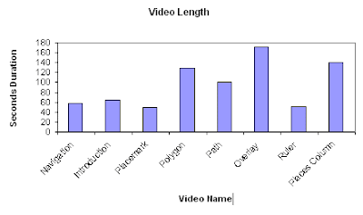 As you can see the total length of the set is less that 13 minutes long and I would expect you could complete the whole tutorial in 1/2 to 3/4 of an hour. So, having gone to the bother of downloading the file and booting up Google Earth, how did people fare going through the material?
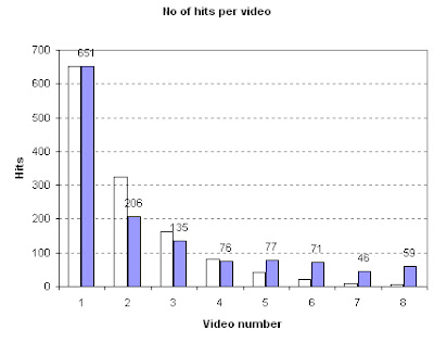
Graph of Video Hits vs Position in Tutorial.
Purple bars are data (black numbers show data values), transparent bars show a 'half life' curve where the number of users progressing to the next video is halved each time. Numbers here relate to the order of videos and refer to the same videos as in the first graph.
"Nobody cares about you or your site.In this case what goes for the web, goes for the geo-web except that 'purchases' are rare and problem [4] isn't well developed in the geo-web yet (although Healthy Planet seems to be a good start).Really. What visitors care about is solving their problems. Now. Most people visit a web site to solve one or more of these four problems:
- They want/need information
- They want/need to make a purchase / donation.
- They want/need to be entertained.
- They want/need to be part of a community.
Too many organizations believe that a web site is about opening a new marketing channel or getting donations or to promote a brand or to increase company sales by 15%. No. It’s about solving your customers’ problems. Have I said that phrase enough?"
A good illustration is my recent video tutorial, in it I used a series of videos embeded in Google Earth, users were not restricted to an A to Z navigation system through the videos but it was designed with this in mind. Lovely Youtube hosted them for me and kept track of the hits. This graph shows the length in seconds of each video by title
 As you can see the total length of the set is less that 13 minutes long and I would expect you could complete the whole tutorial in 1/2 to 3/4 of an hour. So, having gone to the bother of downloading the file and booting up Google Earth, how did people fare going through the material?
Graph of Video Hits vs Position in Tutorial.
Purple bars are data (black numbers show data values), transparent bars show a 'half life' curve where the number of users progressing to the next video is halved each time. Numbers here relate to the order of videos and refer to the same videos as in the first graph.
The graph shows pretty well that users have almost no attention span on the geo-web, fully 7/8 of them had given up without watching more than 3 minutes video (only 76 of the 651 got to video 4) which translates to total time spent on the tutorial of probably less that 10 minutes . I don't think all these users are the kind of person who cannot avoid changing TV channel every 30 seconds, no, I think they found that my tutorial did not 'solve their problems' so they clicked onto something new without completing the tutorial.
This is why design issues matter; even a small glitch can dramatically reduce the total user time spent on your Google Earth Project.
Further Analysis of the Results: The graph varies quite widely from a half life curve in the lower reaches of the tutorial. I put this down to a number of factors:
This is why design issues matter; even a small glitch can dramatically reduce the total user time spent on your Google Earth Project.
Further Analysis of the Results: The graph varies quite widely from a half life curve in the lower reaches of the tutorial. I put this down to a number of factors:
- Users coming across my tutorial not via Google Earth but via Youtube in which case I presume they dived into the topic area they were most interested in, wondered what the damn thing was about (the clips don't make sense on their own) and navigated away. They wouldn't be affected by the order of videos in GE so would contribute hits randomly across the set.
- Navigating to what interests them instead of what is next. An example is video 6 which is about overlays, from my first batch of videos I know this is a popular topic for users to access.
- I ran a tutorial with 40 undergraduate students using the videos, I imagine the possibility of the material being on the exam drove my students through more of the tutorial than the average member of the public would have done which would have skewed the results.
Subscribe to:
Posts (Atom)