If you're wondering where the posts are this week, I've been busy at the AGU conference in San Francisco. Some brief notes on things I saw there:
Volcano Lesson Plan: Declan De Paor showed me a neat trick for use in a lesson plan teaching volcano hazards. Similar to my own lesson plan on volcanoes he uses Google Earth to explain volcano hazards in the vicinity of Mt Rainer. However, he gets students to work out a plan for evacuating the area and then challenges them with an eruption and gives them a limited time to work out what to do. To simulate the real situation he has students open a KML file which has a network link. At a given moment he changes a single file on a server (very simple text change), which triggers a 3D model of an ash plume to appear on Mt Rainer on each of the students' screens. A lovely way to make a simulation more effective.
User Testing: I'm planning some work to look at how effective Google Earth visualizations actually are in helping students with spatial learning. I was pleased to hear that I'm not the only one interested in this, Declan is using a program know as Sliverlight on the Mac to record how students use his materials in an effort to assess the effectiveness of Google Earth based educational materials. As I've been telling anyone who will listen here this week, user testing is the acid test of whether materials based in Google Earth work so great to hear Declan and his team are doing this too.
Sunday, December 21, 2008
Tuesday, December 9, 2008
Review: Google's Geothermal Resource Project

As you would expect from Google this project is very well designed overall. As a result I've abandoned my usual template for reviewing projects and concentrated on noting good design points and things I think a] should be improved and b] could be improved. The [a] and [b] distinction is important, there are always things that could be improved with a project.
Good design points:
- Good topic: The choice of topic here is good, energy resources over the States suits itself to a map, a list of links for each state would be much less useful.
- Supporting Website: The supporting website is well designed, the use of a video to introduce the topic as a whole is a good idea.
- Clean, Uncluttered Look: The Temperature Key, pop ups and elements in the main screen all have a clear and clean look. Sometimes people get a bit too excited about customizing the look of a project, particularly pop up screens which are often littered with logos and links cluttering the view. This project has links and logos in pop up boxes but uses them in a subtle and unobtrusive way.
- Visuals and Introduction: Use of pie charts instantly communicates the total geothermal resource within each state in a visual way, they were produced using Google Chart API. The overview folder has a nice introduction, use of images is good and text is kept to a reasonable amount.
- Pie Chart Emphasis: Roll over a pie chart in the Flat folder and it will emphasize the outline of the State it refers too. A nice touch especially given the translucent nature of the boundary, it doesn't add that much to screen clutter.
- Overview Folder: This uses a structure where you click links in the top of the introduction to access other parts of the introduction (including the introductory video). I would cut down on the length of the overview overall and present as just one block of text in one placemark. The video could be presented in a separate placemark. Using links like this works in a web page but I bet that a lot of users will not recognize the structure presented like this in a pop up balloon.
- Lack of Key: The Flat folder contains Pie charts but no key in the main screen to explain what the pie chart means (although the colors refer to the same values). You have to click a pie chart to decipher it, which is an unnecessary complication. In discussion with the author about this he said that they tend to avoid using screen overlay keys
as they have evidence that users simply don't look at them. (Correction: actually the author specified that users don't turn layers on or off so end up with overlapping layers). He also reported that they have heard of users calling tech support to get rid of a key, theythink it is a virus in Google Earth that has appeared on screen!(Correction: I was over egging the pudding here, they just heard of users getting frustrated with something on screen they couldn't get rid of) (it can be unclicked in the places column). To me, if a user cannot be relied upon to read a (well designed) key I can't build them a useful map anyway. - 3-D: All my usual complaints about 3D not working as well as a simple color thematic map apply here. However, I have to admit that the translucent white color scheme is easy on the eye. The author makes a nice point that he thinks users will interpret height as a measure of potential energy more readily than color. That may well be true.
Points that Could be Improved:
- State Boundaries: As a Brit who isn't familiar with State boundaries and keeps his main screen clear from clutter by turning off the boundary layer I would have appreciated translucent boundaries to the States with the Flat folder. The author makes the point that the state boundaries are visible when you roll over them. That is true, but its another bit of work to move my mouse over a state to see what shape it is.
- Flat Folder: The title could be more meaningful, 'Only Pie Charts' is what I came up with as an alternative with but it is a little clumsy. I think most users won't understand the concept of a flattened layer which is what I suspect this refers to.
- Depth Animation: There will be some users who will be confused by what this is showing since the fact that the timeline is used to differentiate depth is not made clear. Of course, explanation then adds to screen clutter...
- Interpretation: The project contains data but no interpretation, for example, a label and brief explanation of what the shallow hotspot in NW Wyoming is would be interesting (I think its Yellowstone?).
- Rising Block: There's a lot for users to get their heads around in this project, they have to understand that there is different energy potential with depth, with location (i.e. by State), how much energy is used already by each state and what the 2% and 20% recovery rates refer to. To help with the explanation an introduction using a rising block may help.
Wednesday, December 3, 2008
Produce a Photo 'Placard' in Google Earth
The idea is to produce a Placemark that has a small photo as an icon. When clicked it opens a full sized version of the image. The photo appears above the ground tethered to it by a line making it look like a placard.
 Screen Shot from Stefan's original Kom Firin Post, the first example I saw of placards.
I think the weird green color is shading added by Google to make this part of the Nile delta look green at altitude. It works a mile up but from down on the ground it looks very odd.
 Screen Shot from Stefan's original Kom Firin Post, the first example I saw of placards.
 I think the weird green color is shading added by Google to make this part of the Nile delta look green at altitude. It works a mile up but from down on the ground it looks very odd.
Before we start you should find an image to use and produce a smaller version of it. This can either be a cropped image, a reduction in pixel size or a completely new small image like a company icon.
Lets dive in:
- Click the Yellow pin icon on the top of the 3D screen to produce a placemark.
- A yellow box appears in the main screen, drag it to where you want the placemark to sit.
- In the new placemark dialog box select the 'Altitude' tab and give the placemark an appropriate altitude above the ground and tick the 'Extend to ground' box. The extend functionality adds the handle to the placard.
- Click the yellow pin icon top right of the dialogue box, the 'Icon' dialogue will open. Click 'Add Custom Icon' button bottom left and locate your small image. Click OK
- Back in the main dialogue, click the description tab and add the text:
- Add your large image name and path inbetween the inverted commas. This is actually html code, if you're not used to it or get stuck this is a useful guide (scroll down in the link to find the section on adding images).
- Click the OK button and you're done!
Wednesday, November 26, 2008
Audio Narration vs Text
Over at Digital Geography Noel has been experimenting with flash based audio with the help of Vocaroo.com, it works well. I discussed audio in Google Earth a year ago but using evoca which was free then but now only has a free 30 day trial, so my audio links in the Nile tour are now broken.

A partly redone example using Vocaroo:
A couple of thoughts occurred to me:
Audio in Teaching Animations: Mayer and Moreno experimented using animations for teaching. They found that students performed better on tests when they had used animations (such as how a piston works in a car engine) with audio narration rather than with text narration. I strongly suspect that in a Google Earth tour an audio narration will similarly perform better than a text narration for users so this is something we should be doing more of.
Web Services may Change: My experiments with Evoca were free, it would be fine for a student project but if you want something that will last into the future you can't rely on a web service, they may start charging as with evoca. I've experimented this morning with trying to add narration to the web without a web service and the results aren't good. At the moment its still fiddly and requiring techie skill: I used the free and open source Audacity for recording and this tutorial for adding a flash player with sound files. If someone knows an easier way to get audio on the web in little flash applets without using a web service I'm all ears.
Screenshot of original audio tour experiment.
A partly redone example using Vocaroo:
A couple of thoughts occurred to me:
Audio in Teaching Animations: Mayer and Moreno experimented using animations for teaching. They found that students performed better on tests when they had used animations (such as how a piston works in a car engine) with audio narration rather than with text narration. I strongly suspect that in a Google Earth tour an audio narration will similarly perform better than a text narration for users so this is something we should be doing more of.
Web Services may Change: My experiments with Evoca were free, it would be fine for a student project but if you want something that will last into the future you can't rely on a web service, they may start charging as with evoca. I've experimented this morning with trying to add narration to the web without a web service and the results aren't good. At the moment its still fiddly and requiring techie skill: I used the free and open source Audacity for recording and this tutorial for adding a flash player with sound files. If someone knows an easier way to get audio on the web in little flash applets without using a web service I'm all ears.
Friday, November 21, 2008
BookWeb vs GeoWeb
The web as we know it is based on a book analogy. It started out as little more than text with hyper links. Growing more sophisticated, the addition of multimedia and databases still hasn't altered the central book analogy: a web site is still made up of web pages whatever its content.
IMHO the GeoWeb represents the first radical divergence from this form. In the early days of the web maps were static, but now they're dynamic and involve 3D models, videos and time animations. Such a media is now way beyond what can be called a 'map', but it is map based because the navigation is not structured like a book, its primarily a spatial arrangement. Which goes someway to explain why I talk about Google Earth projects on this blog and don't refer to this or that .kmz file. To me its the difference between between a website and a .html file.
A lot of the terms we use on the web are spatial or have spatial roots e.g.: website, navigation, site map and cyberspace. In fact spatial thinking and location are such a central human approachs to thinking that I wonder if the GeoWeb has the power to overtake the BookWeb. It may happen, it may not but if it does I don't think any of us has the faintest idea what it will actually be like.
Everyone have a good weekend.
Wednesday, November 19, 2008
Case Study: Time Based Data Practical in Google Earth
I thought today I'd describe my efforts with a recent piece of work I've been working on: Enhancing some excellent data from the NASA visualization lab to be put in a practical for students on an introductory course in Oceanography at Southampton University.

Plankton Bloom around Galapagos Islands from practical. Red indicates high density.
Data Set and Central Challenge: The data I was enhancing was changes in sea surface temperature and also plankton density with time (the two have an important relationship that I won't go into here) during an El Nino event. The central problem of the practical was that dealing with multiple sets of time data is tricky and I planned to have the (400!) students attempt the practical unsupervised so there was no one on hand to help them out if they got stuck.
Approach 1 Issues: My initial approach was to produce a video tutorial to cover the aspects of timeline control they would need and then direct them to manipulate a single Google Earth file. The tutorial here is a low bandwidth version of that video tutorial. However, whilst testing the practical before release on two likely users I discovered they were still struggling with 2 main problems:
Approach 2: Instead of 1 google earth file I gave the students 3 separate ones to open at different points in the practical with the layers arranged correctly within each file. This meant they didn't have to work out how to manipulate the data as I had set the folder structure up in advance (as discussed last week). I still had to teach them about some aspects of the timeline but I managed to do this using static diagrams within a set of written instructions. These two approaches allowed me to ditch the video tutorial completely, I failed to teach them many skills about layer control but IMHO this was worth the sacrifice.
Lessons I draw:

Plankton Bloom around Galapagos Islands from practical. Red indicates high density.
Data Set and Central Challenge: The data I was enhancing was changes in sea surface temperature and also plankton density with time (the two have an important relationship that I won't go into here) during an El Nino event. The central problem of the practical was that dealing with multiple sets of time data is tricky and I planned to have the (400!) students attempt the practical unsupervised so there was no one on hand to help them out if they got stuck.
Approach 1 Issues: My initial approach was to produce a video tutorial to cover the aspects of timeline control they would need and then direct them to manipulate a single Google Earth file. The tutorial here is a low bandwidth version of that video tutorial. However, whilst testing the practical before release on two likely users I discovered they were still struggling with 2 main problems:
- Dry Content: The tutorial explained a number of pretty dry concepts (e.g. dragging timeline handles to download images) without getting the students to immediately apply the concepts, as a result they didn't really concentrate on it.
- Tricky Controls: Manipulating the layers was still tricky even after watching the video tutorial, it requires you to tick the right boxes, make sure the right layers are selected and also understand how to manipulate the timeline.
Approach 2: Instead of 1 google earth file I gave the students 3 separate ones to open at different points in the practical with the layers arranged correctly within each file. This meant they didn't have to work out how to manipulate the data as I had set the folder structure up in advance (as discussed last week). I still had to teach them about some aspects of the timeline but I managed to do this using static diagrams within a set of written instructions. These two approaches allowed me to ditch the video tutorial completely, I failed to teach them many skills about layer control but IMHO this was worth the sacrifice.
Lessons I draw:
- MOST IMPORTANT - Testing: This sort of thing only appears when you do some kind of testing of your content before release. You don't have to kill yourself with this, hallway testing is sufficient.
- Splitting Content: Splitting the content up into different Google Earth files was a useful strategy in this case. Its a useful strategy elsewhere (#7 of my review points).
- Keep it Simple Stupid: In the end, the simpler solution is often the best, I'm often pleased with the clever things I've done but in this case when it proved ineffective, I was prepared to ditch it.
Wednesday, November 12, 2008
Controlling First View of your project
Good Practice Point: When producing a Google Earth project for the public it is important to decide what data is showing when the user first opens the file. For example, you can prepare a view of the places column where some sort of 'read me' placemark introduces your work with an overview map visible. All other data is hidden which this helps to avoid overwhelming the user with too much information when they open your project.
HowTo: To do this select which files you want visible by ticking/unticking them and choose whether to open or close folders by expanding them (the '+' or '-' icon to the left of the tick box). If you arrange the elements in one parent folder you can right click > 'save as' the current file structure is recorded so it reopens in exactly the same way on a user's machine.
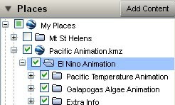
Possible Bug?: There seems to be a bug in GE 4.3.7284 which means that you must remember not to save the parent folder ('El Nino Animation' in the image) but save the actual .kmz file ('Pacific Animation.kmz' in the image) entry in the Places column. If you save the former it defaults all folders to be closed.
I talk more about introductions here
Thursday, November 6, 2008
GIS in UK teaching
Teachers in the UK are suddenly being faced with curriculums(ae?) that suggest use of GIS in teaching. Here is the copy of a post (on a ning site) I've just written discussing the subject:
I've read this thread with interest. I'm the outreach officer for the School of Geography, University of Southampton and my research area is IT in geography education. Part of my research role is to watch how technology and use of it is developing, my opinion is that you don't need GIS, you only need Google Maps/Earth.
As outreach officer I've been producing school lesson plans based on Google Earth, so far one on flooding in the Brahmaputra, one on volcanic hazards on Hawaii:
http://bit.ly/1mdcFS
I've also put together a web based manual on using Google Earth:
http://www2.geog.soton.ac.uk/users/TrevesR/ge_tut/
Back to the discussion. You may ask: Isn't Google Earth/Maps GIS? Strictly, yes, but its probably better described as part of the geo-web (along with packages like ESRI explorer, MaqQuest and users of the new Google Earth API such as earthswoop.com). A simple description that mostly works is that the geo-web is heavily based on connection to the web (surprise, surprise) and is about geo-visualisation rather than about analysis of spatial data which is what GIS is about. Fly your students from space down to view Sellafield in Google Earth and that's visualisation, calculate what houses are within 50 miles of the plant using buffer zones and housing data, that's analysis.
I have read a couple of UK school curriculums(ae?) and when they suggest GIS they are talking about geo-visualisation not analysis. I've also checked that out with the education department at RGS who know far more about schools than I do and they agree with me. Not needing 'GIS proper' is good because it means you can use Google Earth/Maps which is free, comes with free data worldwide and is much simpler than any GIS to operate.
Points made in your messages:
software going obselete: One of the advantages of Google Earth and Maps is that the file types they use (.kml and .kmz) are becoming the standard way to package up geographical data. This means that if you create a lesson plan using kml files and (not that I think it will) Google Earth dissappears, you will be able to read them into a similar program. That protects you from this problem. I could expand this point if anyone's interested but I'm guessing most of you aren't.
lack of PC access: Not a lot can be done about this, student access to computers is obviously the best option in a teaching situation. However, a lesson with a single teacher controlled PC can be a good second best and my Brahmaputra lesson plan discusses this.
Size of software being too big for your system: I would guess that Google Earth would be less demanding to operate than many GIS systems, however, it does require a good internet connection and graphic card capabilities to work well may be a problem with some set ups. However, a lot of good work can still be done using My Maps in Google Maps and that will run on much less powerful machines with less good internet connections.
The example of Earthquake maps linked to spreadsheet data: Plotting point data can be achieved using Google spreadsheets and Google Earth, see:
http://earth.google.com/outreach/tutorial_mapper.html
I would hesitate to recommend you use an online spreadsheet in a lesson as it can operate very slowly. However, you could get students to put data into an offline (eg. XL) spreadsheet, email the data to you and you could collate the data and operate the online spreadsheet. I've also produced my own purely XL based spreadsheet for producing point data, its not any use in this instance but proves the more general point: Most things you would want to do in your lessons that involve computer mapping you can do with Google Earth/Maps for free.
Wednesday, November 5, 2008
Lesson Plan: Hawaii Volcano Hazard
Back in June I published a detailed lesson plan on flooding in the Brahmaputra.

Today I have published a second plan on the volcanic hazards on Hawaii. Not only does it teach geographic principles about lava hazards and topography it also explains and uses the 'runaround' technique I've developed which I mentioned here with respect to second life.
Runaround Idea: The basic idea is to put a grid on the floor, then project a map on a screen. Students are asked geographical questions and move to a position to answer the question. Its a development of a warm up game used by Geese Theatre Company.
Advantages:
- Multiple students can respond to a question (c.w. a traditional lesson situation where only one student can respond to a teacher question at a time)
- Response is a position rather than an area: For example, if I asked students to locate London on a world map using runaround they could answer quickly with a point. If I asked them without it they would have to answer 'In England' or the clumsy 'far southeast corner of England close to the east coast but a fair way in from the south coast'.
- Students seem more engaged and interested than in a traditional lesson which I put down to them having to stand up and move around constantly. This is in line with the (unproven) theory of Kinesthetic Learning.
- They find it fun!
And for any Brit who's suddenly nostalgic for 70s TV here's a runaround clip:
Tuesday, October 28, 2008
Mapping Opportunity: Stephen Fry's trip
A lot of the time I look at content on the web, TV and radio and think 'I could enhance that SO much by using Google Earth'. With Google Earth being free and creating maps so easy there is a real opportunity for improving public outreach with Google Earth - hence the first part of the title of this post 'Mapping Opportunity' which I'll start using as a tag. In this example we discuss using a Google Earth map to structure video and text content in a multi country trip.
 Stephen Fry packs his bags at home.
I've had to guess where he lives, some of you may recognise my choice of location.
The Content: Stephen Fry is on his travels again:
 Another screenshot with Mt Kenya in the Background
My Map: Amongst other things I have
Offer: I have the greatest respect for Stephen and the memory of Douglas Adams so if Stephen's team want, I'd be happy to give advise on how to best use maps in their outreach for free. It may be too late for this trip but I'm sure there will be others...
 Stephen Fry packs his bags at home.
 I've had to guess where he lives, some of you may recognise my choice of location.
The Content: Stephen Fry is on his travels again:
"It's farewell for quite a few months, I fear, as I head off to Africa, Mauritius, Indonesia, New Zealand and the Sea of Cortez to make a documentary about disappearing species."This is a follow up to a book by the late and greatly missed Douglas Adams: Last Chance to See. Stephen is posting tweets (as they are known) on twitter and the occasional video so people can follow his travels. This makes for a perfect map based project and Stephen has actually published a map showing his location on twitter a couple of time - but its just a location placemark in a Google Map, a very limited use of web maps.
 Another screenshot with Mt Kenya in the Background
My Map: Amongst other things I have
- Embedded the videos in placemarks at likely locations
- Added one of his Tweets as a placemark
- Added content from the Arkive project which shows the sort of related placemark people could find when browsing around the project area in Google Earth
- Added formatting (icon, text etc) as in the Arkive placemarks
- Time stamped the elements so that you could animate them with the timeline to show Stephen's progress. This would work particularly well because Stephen has produced lots of Tweets
Offer: I have the greatest respect for Stephen and the memory of Douglas Adams so if Stephen's team want, I'd be happy to give advise on how to best use maps in their outreach for free. It may be too late for this trip but I'm sure there will be others...
Tuesday, October 21, 2008
Timeline Tutorial Video
Previously I posted a howto on some aspects of the timeline. I've had to do a proper tutorial for a course I'm working on at the moment so here is a cut down version for you all. It explains how to get the timeline to work properly:
I had various technical problems with uploading it to youtube which is why its still in flash format.
Wish List: Investigating this has led me to believe the timeline controls are too simple given the complexity of what it does. It harks back to my earlier post comparing ESRI's timeline with Google's, the chief suggestion I'd like to carry forward is that there needs to be a power/newbie toggle switch that keeps the timeline as at present for the power users but when clicked reveals an alternative expanded view for the newbies. Here is a summary of the problems and my suggested solutions using the 'newbie view':
- Multiple sets of time data: Animating different data sets with time is very powerful but even I get confused about child folders and what should be showing. There should be a number of timelines showing along the top of the screen with a playhead and a line showing when the data starts and stops for each data set. When you select a different parent folder the timelines will change accordingly along the top of the screen.
- Downloading Data: Much time data is in the forms of images which have to download via a network link. Users press play on the timeline and nothing happens because the images haven't downloaded and so can't be rendered. There should be a special shading on each timeline showing which bits are still downloading and when you get to an image that is still downloading it shouldn't just be a red cross in the main screen, it should say 'Downloading...' so users know what is happening.
- Range of Time: There should be an illustration of what time range the playhead is activating as it moves. At the moment you just drag the handles around and guess a range, a simple 10y, 25w, 9h readout would help (if the timerange is much smaller you could just shift the units of time to something like 9h, 50m, 6s).
Thursday, October 16, 2008
GeoCommons: Map Creation Pleasure
The Evil of PowerPoint: There has been a ground swell of opinion in educational circles that PowerPoint gets in the way of effective presentation giving. If you're interested, John Naughton is a brilliant speaker and has written on the subject here (including linking to a lovely parody which tries to use PowerPoint to deliver the Gettysburg Address). The thrust of his argument is not that PowerPoint isn't useful, its that its wizards and templates tend to push people into giving a bullet ridden sales pitch. Often, they could do better using other types of presentation, e.g. simple multimedia graphics via PowerPoint, a topic which I explore in a paper here.
So I was delighted to find GeoCommons, a service to help people build maps. Unlike PowerPoint it guides people to produce good design with its wizards and templates, see the screenshot of its icon panel:
 Screenshot of GeoCommons Icon Chooser Panel
KML Polygons?: Unfortunately it seems not to be able to cope with uploading KML Polygons which is a shame, I've emailed them to ask if I'm right about this or if I've just come across a bug but no reply of yet.
In other areas it also scores highly but this has been well documented by Stefan so I'm just keeping to design aspects in this post.
*In fact the same people that brought you ColorBrewer were also involved in designing GeoCommons.
So I was delighted to find GeoCommons, a service to help people build maps. Unlike PowerPoint it guides people to produce good design with its wizards and templates, see the screenshot of its icon panel:
Good for colors, icons and backgrounds: As you can see, you have to have a halo with your icon, a feature which I thoroughly approve of and about which I've blogged previously. And it's not just icons, when choosing fills for thematic maps you are presented with sensible color scales like the ones from ColorBrewer*. I also like the fact you can choose a blank background for your map, helpful if it is very full of symbols that are making the view cluttered.
KML Polygons?: Unfortunately it seems not to be able to cope with uploading KML Polygons which is a shame, I've emailed them to ask if I'm right about this or if I've just come across a bug but no reply of yet.
In other areas it also scores highly but this has been well documented by Stefan so I'm just keeping to design aspects in this post.
*In fact the same people that brought you ColorBrewer were also involved in designing GeoCommons.
Friday, October 10, 2008
Indian Floods
A while back I published a lesson plan showing the causes and effects of global warming on flooding in the Brahmaputra. Unfortunately the discussion was all to accurate and floods have been occurring in the region I discussed in the last month or so. Google have published their own Google Earth project showing imagery from August 3oth and 1st of September.
Here is a screenshot from my lesson plan:
 this image shows settlements in the area, the color of the circle shows how 'sensitive' they are to flooding and the size the population.
 this image shows the same area with a red overlay of what has been flooded from the google project. The two translucent areas show regions I identified in the lesson plan as;
- North area: poor people living close to the river
- South area: richer people living further from the river.
Thursday, October 9, 2008
Misleading Graph: BBC on house prices
Map design is a subset of informational design and so techniques on how to mislead with statistics in graphs should interest those of us involved in maps.
Today I was surfing the BBC site and came across this:
 It comes from an article discussing house prices and shows the percentage change of house prices with time according to Halifax and Nationwide. I added an inset (see arrow) which cuts a section of the y axis at the bottom of the graph and aligns it with the graph further up. As you can see, -10 lines up with 0 but the spacing of the intervals at the bottom of the graph is less that in the middle of the graph so -11, -12 and -13 don't line up with -1, -2 or -3. This has the effect of making the graph look less steep than it actually should be over the last 3 months.
So was this just some BBC junior being told to fit the graph into a smaller space and making a genuine mistake or is there a reason for this error?
Recently I've noticed the BBC trying to put a positive spin on the financial crisis gripping the world economy. I broadly welcome this, since part of the problem is people's trust, the media talking negatively certainly don't help the situation. In the text that goes alongside the graph at one point it says:
"It joined the Nationwide in claiming that the rate of decline [of house prices] was starting to stabilize when looking at three-month comparison figures."
So it could be someone trying to back up that statement by making the graph look like it agrees. However, the title of the article "Further decline in house prices" is pretty negative so I'm inclined not to believe its a mistake rather than an underhand attempt to mislead.
Whichever it is, this is not what I expect from the usually excellent news coverage from the BBC.
Later (20:40 9th Oct): With impressive speed its been corrected.
Tuesday, September 30, 2008
Hurricane Gustav Project Review
The US Naval Research Laboratory has released a Google Earth project showing information about the progress of Hurricane Gustav. It pulls in data from satellites and shows all sorts of data. It is impressive in its scope but the design could be improved.
I'm too busy to give this a full review but here's some points you can see from the screen shot.
LATER: In archiving the project for my records I found bits and pieces I hadn't seen earlier (as I said, I did this at speed because of time pressures). That made some of the points I'd made unfair so I rewrote the post correcting these points and also making the language more neutral than it was in the original. If anyone saw the original, I withdraw my comments.

Screen shot of the Google Earth project showing satellite data for hurricane Gustav
I'm too busy to give this a full review but here's some points you can see from the screen shot.
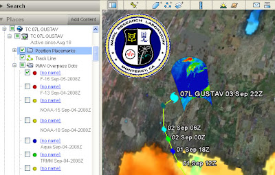
- Introduction: Its there, but its overlong. Text is black on a dark gray background which is difficult to read. There is a link to a 28 page instruction manual, I'm afraid its difficult to get the public to read 28 sentences about how to use your project let alone 28 pages.
- Acronyms: TC 07L, PMW, F-16 and TRMM acronyms are all visible on screen, the public won't know what they mean.
- Shield: The Naval Research Laboratory shield screen overlay is too big and busy. You can turn it off and the design may be out of control of the people putting the file together but they could have reduced it in size or made it semi transparent.
- Rollover behavior: The blue inset screen you can see right and below the shield appears when you roll your mouse over a red dot ('no name' title in the places column). Its remotely sensed data but the key to the data is held elsewhere. It would be better to put it in a pop up window that works with a toggle click for on/off. Keys should automatically appear with the data that they apply to.
- No name: What are the red, yellow, green and blue circles in the places column? They are in the PMW Overpass Dots folder but have no names. There is no information in the icons themselves (i.e. they aren't shaped like a satellite to give us a visual clue). There is gray text information about what they are but mostly it's in acronyms and gray text gives the visual message 'extra non crucial information', it would be better to rename the titles.
- Orange Gulf of Mexico? (bottom of image). It's that color because its showing sea surface temperature. You click a link from within a pop up box and, without warning you, a new KMZ file opens, named (in this case) "20080902.0000.ghrsst.sst.global (1440)". Now, if you're smart you can interpret this as a global image taken on 2nd Sep 2008. But you probably won't know SST is sea surface temperature. The file also appears without an associated key so you can't work out what the colors mean. If data pops up in a separate kmz file like this the user should be warned so they can find it if they want to turn it off.
LATER: In archiving the project for my records I found bits and pieces I hadn't seen earlier (as I said, I did this at speed because of time pressures). That made some of the points I'd made unfair so I rewrote the post correcting these points and also making the language more neutral than it was in the original. If anyone saw the original, I withdraw my comments.
Thursday, September 25, 2008
This blog in a Picture

Wednesday, September 24, 2008
Timeline HowTo
The timeline is the feature of Google Earth that allows time animation. The screen shot below shows some time tagged placemarks of a group of our geography students going up the Arrolla glacier earlier this month*
Animation of a student field work hike up a glacier near Arrolla
 Arrolla Glacier Walk GEarth File
The Google timeline documentation is fairly useful for the basics but leaves users a bit confused over some issues so here are some timeline tips:
Can't get the timeline to show? To get the timeline to show you need to have time stamped data somewhere in your places column. The relevant data must also be visible (i.e. radio button ticked in the places column).
Timeline is visible but not showing what you expected? Once the timeline is visible:
1. Click the clock icon on its far left and select 'restrict time to currently selected folder'.
2. Click the folder (or sub folder) in the places column holding the data you want to view
3. The folder should get a blue background. Make sure its radio button is clicked too.
4. Check if the timeline is now working as expected, if not go onto time range tip.
Time range tip: The timeline shows the complete range of data from the oldest to the youngest time stamped data in your selected folder (if you have selected 'restrict time to current folder' option as listed above).
Imagine you have selected and ticked a parent folder (selected folders have a blue background) that holds 3 sub folders. The 3 sub folders contain GPS data from 1st of May 1975, 2 July 2008 and 1 Sep 2008 respectively. In this situation the timeline will animate from 1 May 1975 to 1 Sep 2008; if you click the 'play' button on the timeline the data from 1 May 75 will briefly show on screen, then nothing will show at all as the timeline animates through all the days from 2 May 75 to 1 Jul 08. Finally there will be a brief flash of data as the timeline passes 2 Jul and 1 Sep.
The solution is to untick certain folders within a parent folder so that a smaller time range is shown. Alternatively, select and tick a subfolder instead of the parent folder.
Shadow Shading: Just to show what it could do, I turned on the 'sunlight' button on in Google Earth and captured the effect in the film clip. It shades the backs of the mountains quite nicely but looks odd because it fails to animate the shadow that the peak (center right of screen) cast over the valley at the time the imagery was acquired.
*The GPS automatically recorded their position every 2 seconds, each of these data points plots as a placemark. The timeline shows a 'spread of time' so at any point in the animation you will see a number of placemarks showing. If they're bunched together, the group was slow moving or stationary. If they are spread apart it shows the group was moving at speed. Where the placemarks dissapear altogether its because the GPS lost signal because of the mountains.
Animation of a student field work hike up a glacier near Arrolla
Can't get the timeline to show? To get the timeline to show you need to have time stamped data somewhere in your places column. The relevant data must also be visible (i.e. radio button ticked in the places column).
Timeline is visible but not showing what you expected? Once the timeline is visible:
1. Click the clock icon on its far left and select 'restrict time to currently selected folder'.
2. Click the folder (or sub folder) in the places column holding the data you want to view
3. The folder should get a blue background. Make sure its radio button is clicked too.
4. Check if the timeline is now working as expected, if not go onto time range tip.
Time range tip: The timeline shows the complete range of data from the oldest to the youngest time stamped data in your selected folder (if you have selected 'restrict time to current folder' option as listed above).
Imagine you have selected and ticked a parent folder (selected folders have a blue background) that holds 3 sub folders. The 3 sub folders contain GPS data from 1st of May 1975, 2 July 2008 and 1 Sep 2008 respectively. In this situation the timeline will animate from 1 May 1975 to 1 Sep 2008; if you click the 'play' button on the timeline the data from 1 May 75 will briefly show on screen, then nothing will show at all as the timeline animates through all the days from 2 May 75 to 1 Jul 08. Finally there will be a brief flash of data as the timeline passes 2 Jul and 1 Sep.
The solution is to untick certain folders within a parent folder so that a smaller time range is shown. Alternatively, select and tick a subfolder instead of the parent folder.
Shadow Shading: Just to show what it could do, I turned on the 'sunlight' button on in Google Earth and captured the effect in the film clip. It shades the backs of the mountains quite nicely but looks odd because it fails to animate the shadow that the peak (center right of screen) cast over the valley at the time the imagery was acquired.
*The GPS automatically recorded their position every 2 seconds, each of these data points plots as a placemark. The timeline shows a 'spread of time' so at any point in the animation you will see a number of placemarks showing. If they're bunched together, the group was slow moving or stationary. If they are spread apart it shows the group was moving at speed. Where the placemarks dissapear altogether its because the GPS lost signal because of the mountains.
Thursday, September 18, 2008
Google Geo Education Summit
On Friday I was invited to this event at the Google offices in London. Ollie has blogged the event in detail amongst others.
It was a very useful event, it was great to finally meet Tina Ordruff of Google and Noel Jenkins of Juicy Geography fame both of whom I've had phone conversations with before about Education matters. Jamie Buchanan-Dunlop of digital explorer presented along with Tina, Noel and myself, pleased to hear he's finally got enough project work in Google related education to drop teaching and concentrate on it full time. Ollie was there amongst others who it was good to meet.
I won't blog things in detail as time is tight for me at the moment however some notes that struck home for me:
Students better than Teachers: I think Ollie suggested this one, we should be encouraging school students to use Google Earth in their work even if it the teacher isn't using Google Earth much themselves.
Google Earth as gaming environment: Jamie outlined this in his presentation. The new Google Earth plugin allows web programmers to build tools involving the 3D engine of Google Earth easily and things involving games are attractive to students. This idea has pros and cons: concepts such as scoring, lives, competition, ramping up difficulty so that no instructions need to be read can be great motivators for students. The plugin allows techies to build these edu-games with little development time. However, I've read a paper where use was made of edu-games and testing showed that although the students enjoyed playing the games and thought they'd learnt things in fact they only developed superficial knowledge. As with many things in elearning, there are lots of ways edu-games could fail but tremendous potential in the concept.
Local vs Global: In my lesson plan I thought the fact that the content was about India would be exotic and interesting to teachers and students. In contrast consensus amongst the teachers at the meeting was that local mapping was a powerful teaching aid as students got to grasp the relationship between map and reality. Jamie has developed a fascinating school grounds project along these lines that I might adapt for University use.
Virtual Scout: Noel talked about how he gets students to scout around Svalbard via Google Earth in one of his lesson plans, this is a concept I've come across myself in developing materials - there is evidence of giant lakes (much bigger than the great lakes) in the USA in glacial times that can be found by using the terrain and imagery data within Google Earth. Students can be taught how to identify something and then virtually 'sent' to find other examples in a given area. Really good teaching practice.
GIS in Schools: Although there are a number of free GIS products around for schools none of them really hit the mark according to the teachers present. I also learnt that A and GCSE curricula both have GIS explicitly mentioned. Google Earth could be easily adapted for this use.
Tina came to visit us in Southampton on Tuesday and we discussed even more educational topics. Hopefully more of that later.
Wednesday, September 17, 2008
Web 2.0, Google Map design and Map of News Stories
Three Talks: I have a list of things I'd like to blog about, just recently its been growing ever longer as I find more interesting stuff on the web but have less time to write. This post is an attempt to shorten the list down by writing in brief about 3 talks I've come across that are related to, but not directly about, design in Google Earth.
Relationship to Web 2.0: Google Earth is an example of a Web 2.0 technology, Clay Shirky gives an entertaining talk about how web 2.0 is working including discussion of crime mapping in Brazil. Well worth watching in full.
Google Map Design: Googler Pam Fox gives details of a talk she gave about design in Google Maps. Producing content in Google maps is similar to Google Earth, its a lot more technical for the producer but it can be embedded in a web page which is a considerable advantage. She starts by saying:
I also liked the 'Markers as Links', idea that she discusses but I didn't like the design on slide 9. Yes, its different from the default Google Maps design but it uses too much intense red, a better design would have used a more subtle color.
Map of USA News: Alisa Miller describes what is, at the current time, my favourite static map: The amount of US news about the world shown as a distortion of land mass.
 Click to expand
If I could find a high definition version out there I'd stick it on my wall.
Relationship to Web 2.0: Google Earth is an example of a Web 2.0 technology, Clay Shirky gives an entertaining talk about how web 2.0 is working including discussion of crime mapping in Brazil. Well worth watching in full.
Google Map Design: Googler Pam Fox gives details of a talk she gave about design in Google Maps. Producing content in Google maps is similar to Google Earth, its a lot more technical for the producer but it can be embedded in a web page which is a considerable advantage. She starts by saying:
"You can't just throw your data on a map and call it a day. Your users deserve more than that."Amen to that.
I also liked the 'Markers as Links', idea that she discusses but I didn't like the design on slide 9. Yes, its different from the default Google Maps design but it uses too much intense red, a better design would have used a more subtle color.
Map of USA News: Alisa Miller describes what is, at the current time, my favourite static map: The amount of US news about the world shown as a distortion of land mass.
 Click to expand
If I could find a high definition version out there I'd stick it on my wall.
Tuesday, September 9, 2008
Tutorials update including 'Writing Introductions'
I've previously posted about introductions to Google Earth projects by text1 , by text2 and by video .
 today I've combined and updated the web tutorials with a new section on Introductions.
I've also updated some of the navigation on the tutorials, included a revamped section of video clip examples and provided a new section: 'further study' links. This is a selection of key posts from this blog on advanced map making with Google Earth.
today I've combined and updated the web tutorials with a new section on Introductions.I've also updated some of the navigation on the tutorials, included a revamped section of video clip examples and provided a new section: 'further study' links. This is a selection of key posts from this blog on advanced map making with Google Earth.
Monday, September 8, 2008
Wallis Award: Southampton University Campus Map
Often on this blog I criticize the use of 3D in thematic maps. Today I'm pleased to promote a map that is 3D to show buildings which has been awarded the Society of Cartographers Wallis award for excellence in cartography:
It's been produced by my colleagues in the Cartographic Unit here at Southampton. Its a lovely example of how the type of 3D view Google Earth produces can be improved upon. The cartographers took a block view of the buildings (not from Google Earth) and then interpreted it to improve clarity. Using 3D and choosing the particular view was an excellent choice, the section of the campus I've reproduced above shows a particularly tricky part of the campus to navigate as there are multiple tall buildings around with a maze of entries. By showing the buildings in 3D it is easy to separate which building is which to navigate your way around.
Well done Carto! (as we call them in the school)
Saturday, September 6, 2008
Democratic Website Sucks
This post is about web design rather than Google Earth design.
How to lose viewers: So I wanted to watch Al Gore's speech to the democratic convention, here's the official link. If you go there with Firefox 2 without the right plugin it asks you to download one. Doh! democrats, if you want to get people to watch your speeches then don't make them download a special plugin, hoards of them will not bother. Look on Youtube and of course, the speech is there for all to see using flash, which pretty much everyone has.
How to lose viewers: So I wanted to watch Al Gore's speech to the democratic convention, here's the official link. If you go there with Firefox 2 without the right plugin it asks you to download one. Doh! democrats, if you want to get people to watch your speeches then don't make them download a special plugin, hoards of them will not bother. Look on Youtube and of course, the speech is there for all to see using flash, which pretty much everyone has.
Monday, September 1, 2008
Ed Parsons calls for a 'New Cartography'
SatNavs Lack Detail?: Its still the silly season for news in the UK and people from the British Cartographic Society (BCS) have had their 15 minutes of fame on the BBC by criticizing the lack of good old British landmarks on SatNavs. Ed Parson's rightly defends the neo-geographer's point of view by outlining the silliness of this comment and I agree with him, of course you shouldn't have churches and museums on a SatNav, it cramps up the view and you want it to be relatively sparse of detail so you can turn on layers like churches and museums at will.
New Cartography:
Ed goes on to say:
Analogy with Animated Film: Ed goes onto to discuss an analogy between the geo-web and the development of computer generated animation:
Tron became a cult film because of its innovative use of computer animation and video game look. However, it actually doesn't use that much computer animation, traditional techniques were widely used and matching the new and old technologies together in one film meant it was actually more time consuming to produce than a traditional hand drawn animation.
Bad Use of Technology: My point is that the development of a new technology isn't a simple switch from old to new, as Tron shows there is often an intermediate phase where the new technology actually makes things worse before we learn how to really use the tools properly and reap the benefits. I'd characterize these periods as 'old', 'wrong' and 'right' and at the current time I think the geo-web is firmly in the 'wrong' part of the cycle because of a lack of understanding about design. Exactly the same situation occurred in the development of the web.
Wake up Cartographers: IMHO the BCS needs to think clearly about what it is saying, comments about the loss of churches on SatNavs is as silly as bemoaning the disappearance of chimney sweeps in an age of central heating. As Steve Chilton admitted in his interview with me about cartography and GIS:
3rd Sep: since I wrote this post I've been in email contact with Mary Spence about the article. I'll add her email as comments so interested parties can see the exchange. She feels that her views were not well represented by the BBC. Rereading the 'wake up cartographers' section of this post I think I put my point too strongly, I didn't mean to insinuate that cartographers aren't up on the latest technologies, I should have limited myself to criticizing the message that appeared on the BBC.
New Cartography:
Ed goes on to say:
"That’s not to say the principals of design are not important in the creation of “maps” for screen display, indeed one could argue for the need of a "new" cartography which adopts rather than ignores the capabilities of screen based maps to portray information dynamically."If you're new to this blog: Over the last year I have been arguing on this blog for such a "New Cartography". I have discussed the principles of geo-web design (27 posts) by examining best practicises from cartography, GIS and web usability design. With Steve Chilton, Chair of the Society of Cartographers I've mulled over the relationship between cartographers, neo-geographers and the GIS community. And more.
Analogy with Animated Film: Ed goes onto to discuss an analogy between the geo-web and the development of computer generated animation:
"In the early 1990’s Disney Animation Studios was having great success with movies such as the Lion King, Aladdin and Beauty and the Beast. Indeed they opened up an animation studio ... ... so that visitors could see animators working ... ...it was shut down in 2004, when Disney stopped it’s traditional animation efforts, as it began concentrating on its own computer generated efforts..."Its a good analogy to the development of the geo-web but a particular Disney film deserves further consideration:
Tron became a cult film because of its innovative use of computer animation and video game look. However, it actually doesn't use that much computer animation, traditional techniques were widely used and matching the new and old technologies together in one film meant it was actually more time consuming to produce than a traditional hand drawn animation.
Bad Use of Technology: My point is that the development of a new technology isn't a simple switch from old to new, as Tron shows there is often an intermediate phase where the new technology actually makes things worse before we learn how to really use the tools properly and reap the benefits. I'd characterize these periods as 'old', 'wrong' and 'right' and at the current time I think the geo-web is firmly in the 'wrong' part of the cycle because of a lack of understanding about design. Exactly the same situation occurred in the development of the web.
Wake up Cartographers: IMHO the BCS needs to think clearly about what it is saying, comments about the loss of churches on SatNavs is as silly as bemoaning the disappearance of chimney sweeps in an age of central heating. As Steve Chilton admitted in his interview with me about cartography and GIS:
"Cartographers in general did not interact with the GIS producers to influence these matters as software and techniques were developed, a certain conservatism and resistance to change was evident."if cartographers behave the same way about the geo-web and fail to shows understanding of its latest developments neo-geographers won't bother to listen to what they have to say about it and boy, do neo-geographers have an awful lot to learn about map design.
3rd Sep: since I wrote this post I've been in email contact with Mary Spence about the article. I'll add her email as comments so interested parties can see the exchange. She feels that her views were not well represented by the BBC. Rereading the 'wake up cartographers' section of this post I think I put my point too strongly, I didn't mean to insinuate that cartographers aren't up on the latest technologies, I should have limited myself to criticizing the message that appeared on the BBC.
Thursday, August 28, 2008
GPS to Google Earth.
Quick post today, I'm about to take some leave but will be back next week.

I have to admit that I was never really keen on all the fuss about converting GPS trails to Google Earth files, it just seemed a bit of a fuss. However, on Monday I gave a talk at the Royal Geographical Society London on just this subject so I spent a while last week mucking around working out how to do it. I was impressed with how easy it is to process the data plug in your GPS, turn on GPS Utility , do a bit of setting up, press download and the data is on your PC. Save as KML and you have your data in Google Earth. What really impressed me and the participants of my session was that you can see the trail you walked and using the time control animate your progress. See the file:
 GPS track of me getting some sandwiches at work

I have to admit that I was never really keen on all the fuss about converting GPS trails to Google Earth files, it just seemed a bit of a fuss. However, on Monday I gave a talk at the Royal Geographical Society London on just this subject so I spent a while last week mucking around working out how to do it. I was impressed with how easy it is to process the data plug in your GPS, turn on GPS Utility , do a bit of setting up, press download and the data is on your PC. Save as KML and you have your data in Google Earth. What really impressed me and the participants of my session was that you can see the trail you walked and using the time control animate your progress. See the file:
The GPS automatically records my position every 2 seconds which is the data making up the time tagged part of the data.
Playing around with this made me realise that Google's documentation on the time controller isn't up to the job, and since Googling 'timeline tutorial google earth' lists this website as the top link I think I'd better put something down in writing soon.
Playing around with this made me realise that Google's documentation on the time controller isn't up to the job, and since Googling 'timeline tutorial google earth' lists this website as the top link I think I'd better put something down in writing soon.
Friday, August 22, 2008
Graph Design: Lessig's Video Chart Fails to Deliver
Strongly linked with Google Earth web design is design of graphics such as charts, tables and graphs.
Lawrence Lessig is a well known commentator on copyright and the internet. He's also a master of presentational skills. Usually. This graph is the most important graphic in his most recent presentation and I don't think it works:
 US broadband penetration slipping Its shows a wonderful snippet of information: in terms of broadband penetration the US started at 5th in 2000 and in 2007 had slipped to 22nd place. The graph could be improved in a number of ways:
- 5 and 22 are unit-less numbers: As Lessig himself comments this is a problem. They could refer to gigabits per year, positions in an online poll or Osborne luggagable computers for all we know.
- Missing Axis: Related to the unit-less numbers, why is the y axis missing? If I cared to read off the value in the year 2003 I would find it difficult. Whilst this would seem to be a petty request, showing data in a way that users can query in different ways is good design.
- Unnecessary 3D: The shadow, 3D shape and perspective view don't add anything. A 2D graph would be better as it would be easier to process mentally.
- Data Thin: Why only show the decline of the US? Why not show other countries for comparison and emphasize the US plot? France especially deserves to be plotted since it is mentioned as doing better than the US later in the presentation.
- Title: I'm also a little suspicious of the title border. Is it adding anything? The 'ripped paper' design doesn't appear anywhere else in the presentation so its not part of a consistent design.
Tuesday, August 19, 2008
Hurricane Flight Graphic: Full Review.
In this post I complete a review of a Google Earth project by Tropical Atlantic highlighting the work of the Hurricane hunters collecting real time weather data of tropical cyclones. The author and I have been swapping comments so the back story is covered too.
 Screen shot of the project.
Back Story: I promised this review of this project a while back after posting some immediate thoughts. Since that time the author Christopher Hollishas added comments about my post. I really appreciate this happening, the best way to learn for all of us is to discuss. Christopher says that he never meant the project to be for the public, he meant it for skilled hobbyists. That being the case a lot of my discussion is invalid as I'm assuming that the project is aimed at the unskilled public. However, you can't properly assume skills unless you've sat down and done some hallway testing, I wonder if this has this been done with some hobbyists and what was learnt about the project? If it hasn't been done I bet that the skilled hobbyists are a lot more like the unskilled public than Christopher thinks.
The Review:
1. What do the users get out of looking at the project?
They get to see real time (if a mission is being run) where the latest mission into a hurricane is and what its measurements have been as it has flown. There is a lot of public interest in this story because hurricanes are interesting and the people flying such missions are (in the public perception) putting themselves at considerable risk. Hobbyists able to interpret the data may be getting the latest data on the hurricane.
2. Is there a good introduction?
No, there isn't an introduction at all, a serious problem.
3. Is the text written concisely?
Yes it is but it is written as brief notes which cannot be understood by public.
4. Have icons, lines and areas been used well?
No, and my detailed comments on this are here.
I usually admit in a review that my suggestions are only informed opinion, however, the key here has two ranges of wind speed marked as the same color; that's just plain wrong. In addition, I think there are too many icons shown to illustrate the wind strength and direction data. Color may not be the standard meteorological way to illustrate wind strength but the standard approach here doesn't work as the wind icons are too closely packed.
In addition I have no idea what the binoculars and cylinder icons actually mean without clicking them open.
5. Have acronyms been avoided?
No, in one of the arhieved files I found HDOB, OB 04, AF304 and RECCO used. All are incomprehensible to me.
6. Is the Places column structured well?
Yes, this is pretty simple and straightforward
7. Is there an appropriate amount of data in the project?
Yes, the amount of data in the project is OK to tell the story.
8. Have advanced elements been used that could be avoided?
There isn't anything in the project which is overly clever, in fact for once I would suggest that the use of the regions feature could reduce the problem of screen clutter - if only every 10th wind icon was shown this would reduce screen clutter when the viewer is at high altitude and all the icons could come into view as the viewer zoomed in on the flight path.
9. Is there Map Junk?
No, the project is clean and clear of none essential items.
10. On entry is the level of visible features appropriate?
Yes apart from my thoughts on the icons looking cluttered.
This is a great story of high interest to the public and being able to track the plane in real time is a master stroke. I think the project should be relaunched for the public as well as for hobbyists. As it stands it's a lost opportunity to get some fantastic public attention for Tropical Atlantic.
Monday, August 18, 2008
Flooding in London
Andy Smith and team at CASA UCL created the above movie clip. Thought it deserved to get put in GE.
Flooding Movie Clip Located in Google Earth.
Friday, August 15, 2008
Future of Geography Teaching
Students can now share a virtual teaching space with a map on the floor, when posed a questions such as 'where would you put your house' they vote by moving their avatar to their chosen place on the map.
Predicting the future is a notoriously dumb thing to do but here goes: Stefan of Ogle Earth points out a development importing Google Maps into Second life (the second half of the post) talking about some of Eric Hackathorn's work. I predict its a development that is surely something we are going to see much more of in education:

Screen shot of Big Island Hawaii imported into Second Life with my KMZ layers imported in on top. You can see my avatar standing mid island.
Real Life Teaching: I already use Google Earth in a lesson where I teach students about the volcanoes of Hawaii and then get them to decide where they would put a house on big island Hawaii to avoid being burnt down by lava. I project Google Earth onto the wall and use a grid marked on the floor so that students can stand on the ground in relation to where they would put their house on the map.
Second Life Teaching: Of course in Second Life its possible to project the map onto the floor much easier than in real life and this is what the screen shot above shows. You can see my avatar standing in the middle of the Google Maps generated map over which I've loaded a kmz file showing, amongst other things, 3 active volcanoes*. It would be possible to run a teaching session in Second Life mimicing my real life teaching but with the advantage of a map on the floor.
Not there yet: In real life this technique has proved popular with teachers and students. Unfortunately, in second life Eric's development is still too clunky to be used for real but I agree with Stefan, you are going to see a lot more things like this in the future when the technology gets quicker, slicker and easier to use. At the moment the social space is provided by Second Life and the maps by KMZ file and Google Maps but the idea - mashing up maps and a virtual avatar space - could be delivered by other applications just as well.
*strictly Pu`u`O`o isn't a separate volcano from Kilauea which are both marked on the map.
Wednesday, August 13, 2008
Default Layer Icons
I'm back after a great break in Spain, I haven't touched a computer in 10 days which has been refreshing.
Frank's Opinion: Over at Google Earth Blog Frank comments on the new layer icons in Google Earth, his criticisms are:
- They're too small
- They're often redundant (Places and Wikipedia discuss the same location)
- They're all the same color
Here's a screen shot:

Its deliberately small so that you can get a sense of how the icons mix together. As you can see, on a gray background (this is the Thames in London) the icons fail to 'pop out' at you.
My Opinion: I agree with Frank except for the size. I think if they had different colors then the size would work. However, I have some additional views:

To be fair, I've bumped up the size slightly but if you look carefully I've made the icons translucent which reduces screen clutter back down. I think they stand out from the background (pop out) and stand out from each other much better than Google's icons.
Discovery Icon: I also don't like the discovery Icon middle left. To be fair to Google, they probably have a deal with the Discovery channel to use their trademark 'as is' but as a map icon its way too busy is too large and, again, has no double halo.
Frank's Opinion: Over at Google Earth Blog Frank comments on the new layer icons in Google Earth, his criticisms are:
- They're too small
- They're often redundant (Places and Wikipedia discuss the same location)
- They're all the same color
Here's a screen shot:

Its deliberately small so that you can get a sense of how the icons mix together. As you can see, on a gray background (this is the Thames in London) the icons fail to 'pop out' at you.
My Opinion: I agree with Frank except for the size. I think if they had different colors then the size would work. However, I have some additional views:
- Double Halo: The icons just have a white halo around them, to make sure they stand out against all backgrounds they need a white and a black halo around them.
- Hidden Content: Google use region control to keep the view uncluttered; as you zoom in more icons appear but not so many to block the view. This does work but in the process causes the 'hidden content' problem.
- Icon consistency: Google keep on changing the icons they use for this content. This is a problem as people come to associate an icon with certain content so consistency is important. You can change an icon so as to improve it but leave it recognisably the same icon (like this) but Google have binned their whole design and started from scratch.

To be fair, I've bumped up the size slightly but if you look carefully I've made the icons translucent which reduces screen clutter back down. I think they stand out from the background (pop out) and stand out from each other much better than Google's icons.
Discovery Icon: I also don't like the discovery Icon middle left. To be fair to Google, they probably have a deal with the Discovery channel to use their trademark 'as is' but as a map icon its way too busy is too large and, again, has no double halo.
Wednesday, July 30, 2008
Randy Pausch RIP
Via John Naughton I came across the 'last lecture' of Randy Pausch. As John says:
He died last Saturday.
Some thoughts relevant to this blog:
Fundamentals are Fundamental: He describes (9.00 minutes) an early training session with a Football coach who turned up to their first practice without any footballs. When asked why the coach answered with a question of his own:
"How many players are then on the football field?"
"22" answered one of Randy's fellow students.
"How many of them are touching the ball at any time?"
"1"
"Right, today we are going to practice what the other 21 players should be doing".
Randy points out that this is a good point for life in general: fundamentals have to be right. That's what I'm trying to do here with what people are producing in Google Earth, encourage people to get the fundamentals right.
The Importance of Low Cost: At 18.40 minutes he describes one of his earliest successes, building a cheap Virtual Reality system. At the time most people's systems cost half a million dollars, he ran a project where they built something for five thousand dollars in parts. Apparently the conference where he first presented it went wild, people were relating his work and that moment to the Hewlett Packard garage. Building stuff out of free easy to use materials is also what I'm centrally about only the materials aren't objects, they're data and software. This is why I'm so interested in Google Earth and it also is the major reason I'm interested in my other stuff. IMHO lots of people in elearning are still thinking in the million dollar bracket and unlike the VR people, don't seem to see the use of what can be done for free or cheap.
Astonishing Creativity: At 37.30 minutes he plays a video of a Virtual Reality project some of his undergraduate students built. Virtual Reality of course is strongly linked to Virtual Globes such as Google Earth. I was astonished by the creativity and skills that his students showed, he'd managed to create an environment where students felt challenged, supported and as a result produced brilliant materials. My reflection on this is that sometimes I feel bad criticizing people's efforts here, being an educator I want to lift people up towards excellence and create an environment where we can see this sort of creativity in Google Earth. How is knocking people's icon design doing that? Well, I think it comes back to the 'fundamentals are fundamental' point, when people have got that sorted then we can expect the kind of excellence shown here.
"Randy Pausch, the popular computer science professor at Carnegie Mellon whose appetite for life was only sharpened by a diagnosis of terminal pancreatic cancer in September 2006, has died.[quoting Good morning Silicon Valley]:
Pausch’s inspirational last lecture a year later, titled “Achieving Your Childhood Dreams,” was posted to YouTube and became an unexpected sensation, viewed millions of times."
He died last Saturday.
Some thoughts relevant to this blog:
Fundamentals are Fundamental: He describes (9.00 minutes) an early training session with a Football coach who turned up to their first practice without any footballs. When asked why the coach answered with a question of his own:
"How many players are then on the football field?"
"22" answered one of Randy's fellow students.
"How many of them are touching the ball at any time?"
"1"
"Right, today we are going to practice what the other 21 players should be doing".
Randy points out that this is a good point for life in general: fundamentals have to be right. That's what I'm trying to do here with what people are producing in Google Earth, encourage people to get the fundamentals right.
The Importance of Low Cost: At 18.40 minutes he describes one of his earliest successes, building a cheap Virtual Reality system. At the time most people's systems cost half a million dollars, he ran a project where they built something for five thousand dollars in parts. Apparently the conference where he first presented it went wild, people were relating his work and that moment to the Hewlett Packard garage. Building stuff out of free easy to use materials is also what I'm centrally about only the materials aren't objects, they're data and software. This is why I'm so interested in Google Earth and it also is the major reason I'm interested in my other stuff. IMHO lots of people in elearning are still thinking in the million dollar bracket and unlike the VR people, don't seem to see the use of what can be done for free or cheap.
Astonishing Creativity: At 37.30 minutes he plays a video of a Virtual Reality project some of his undergraduate students built. Virtual Reality of course is strongly linked to Virtual Globes such as Google Earth. I was astonished by the creativity and skills that his students showed, he'd managed to create an environment where students felt challenged, supported and as a result produced brilliant materials. My reflection on this is that sometimes I feel bad criticizing people's efforts here, being an educator I want to lift people up towards excellence and create an environment where we can see this sort of creativity in Google Earth. How is knocking people's icon design doing that? Well, I think it comes back to the 'fundamentals are fundamental' point, when people have got that sorted then we can expect the kind of excellence shown here.
Checking out: Which is a good philosophical point to leave you with for a while. I'll be on leave next week so expect the next post here in for a fortnight or so.
Subscribe to:
Posts (Atom)