Friday, December 23, 2011
Map Tales vs Google Earth Tours
Over at my other blog there's a post comparing Google Earth Tours with a web service offering similar functionality.
Thursday, November 17, 2011
Misleading BBC Landscape Animation
This is a lovely science story: A massive range of mountains completely covered by the Antarctic ice sheet has been mapped in 3D detail. The story is nicely explained in an animation similar to a Google Earth Tour.

Unfortunately it contains a visualization howler: The vertical exaggeration is about x200 and although this is marked on the above diagram, it isn't emphasized (the 4000m scale bar is off in a corner). When you play the animation, it gets worse, you aren't told about the exaggeration at all. The outcome is that untrained viewers of this visualisation will think that under the ice the topography is much steeper than the Himalayas whereas I estimate the steepest slope they have visualized is no more than 1:500.
Unfortunately it contains a visualization howler: The vertical exaggeration is about x200 and although this is marked on the above diagram, it isn't emphasized (the 4000m scale bar is off in a corner). When you play the animation, it gets worse, you aren't told about the exaggeration at all. The outcome is that untrained viewers of this visualisation will think that under the ice the topography is much steeper than the Himalayas whereas I estimate the steepest slope they have visualized is no more than 1:500.
Friday, October 7, 2011
Flood London's Bankers!
I was recently asked to produce something to showcase new big screened computers in a new media room at Southampton University. VIPs watching including our Vice-Chancellor. I revisited an earlier idea where I flooded London, I rewrote the code using an animated update to produce a tour which will raise the water from 20 to 200m in 3 seconds.

Open this
Flood London.kmz
and turn off all layers in the layers panel except 3D buildings which should be on.
1] Double click 'Space to High' and you will be flown from space to a high view over london.
2] Double click 'Flood London' and sea level rises from 20m above current to 200m
3] Double click 'High to City' to be flown to the city of London. You should see the skyscrapers of London's banking center already partly flooded. Turn off the tour (black cross in tour control, bottom left of main screen) then
4] Double click 'Flood London' and the sea rises again. Experiment with controlling the tour controller bottom right to see you can become a virtual Canute.
It shows two nice teaching facilities:
- Animated update which will require you to get into KML if you want to do it for yourself in another location.
- A set of tours: By combining tours which fly the user around with one which controls the flood level we can build some interesting visualisations.
Friday, September 9, 2011
Google Earth vs Web Maps for Education
As I said over at my new blog, I still think GEarth more useful for education than other web maps systems. Frank Taylor commented that I should note that here, I think he makes a good point and that it deserves a post.
Creating maps via the web is now wonderfully simple either by web maps or virtual globes (Google Earth, OSM, Google Maps, GeoCommons) when compared with traditional GIS. This opens all sorts of opportunities for educational development that haven't previously existed. However, I think GEarth is still the best tool for education because it has features that web maps lack:
- Tours: Google Earth Tours allow educators to pre record flights around the globe either to be used as a replacement for powerpoint or for use in a class activity where students see a tour then practise a skill. Tours functionality is only available in ESRI's virtual globe apart from Google Earth.
- Offline: You can cache imagery, load maps and create maps all offline with Google Earth. That has considerable advantages for many uses in education.
- 3D: When looking at cities (3D buildings) and landscapes where terrain is important the 3D aspect of Google Earth becomes important.
- Others: Other advantages include the transect tool, great usability, a wealth of KML files on the web that can be customized for educational use and the fact that many students are used to the basic GEarth controls.
GIS for Schools: I've always said that in schools visualization is the important feature of a computer mapping system, the analysis that comes with GIS is just too complex to teach at school level, its more than enough to get students used to concepts such as symbolisation, choropleths, layers, rasters, vectors, zooming and panning. So the fact that GEarth can be used to teach all these concepts is more than enough, spending money buying anything extra is not worth it IMHO.
I'll be continuing to discuss GEarth in education here.
Tuesday, September 6, 2011
New Blog!
Welcome back, before I left I promised an announcement. As of today I'm switching the majority of my blog writing to a new blog: Web Map Design. Check out the welcome message to see what this means for this blog and my reasons for the switch. I've also already written posts over there on Google's London Transport Map, and Goldilocks Maps.
Thursday, August 11, 2011
Blog Holiday
Today's was the last post until September - I'm taking some holiday and I also need to focus on some other projects. Do check back after August is over as I have something exciting in development to announce.
Navigation - Too much freedom?
I'm currently writing a paper about the use of GEarth Tours in education. I thought I'd discuss one aspect that's come up: the problems of navigation in 3D software (thats Maps as well as GEarth as you effectively move through 3D space using pan and zoom).
The Problem: In GEarth you have 5 degrees of freedom:
Altitude, Latitude, Longitude, Camera Pitch, Camera direction
The Problem: In GEarth you have 5 degrees of freedom:
Altitude, Latitude, Longitude, Camera Pitch, Camera direction
Controlling these is complex and so causes problems - users can:
- become lost in virtual space
- get disorientated
- become confused as they fly through model walls (ie inside a building only designed to be seen from outside)
- navigate around missing the views that the designer of a GEarth project wanted them to see.
Similar Problems in other Software: It isn't just GEarth - map systems, information spaces with pan and zoom functionality and Virtual Worlds all suffer from similar problems. In some software its possible to fly straight into the ground with nothing visible at all which is when you get 'desert fog', users don't know where they are with no visual clues on screen to help them.
Solutions: There are multiple solutions I've found in the literature, one is illustrated by Google Body: Constraining freedoms of movement from 5 to 2. When viewing the body your camera angle is fixed and you can only fly around a cylinder of fixed distance from the body (in fact it feels more like you are moving the body rather than your camear position but actually they add up to the same thing).
GEarth Tours: The solution readily available in GEarth is the GEarth tour, effectively you are constraining the user to 1 degree of freedom as within a tour they only have the ability to play or rewind - nothing else. This means that providing the tour is designed well we mitigate or solve all the problems I listed above.
In education removing those issues comes at a cost: users watching a tour are far more passive than if they are navigating around so we have to be careful to insert active tasks into tour. For example, turning the tour off for a while and having students go and search for a landscape linked to the GEarth tour they've just viewed. How to do this is the theory that we are investigating with our Google Research Award.
Thursday, August 4, 2011
Usability testing and Problems with Questionnaires
I came across this interesting presentation from Patrick Weber and Catherine Jones (amended to name both authors 11 August) at SOTM eu. He discusses usability issues with Open Street Maps editor using eye tracking and usability techniques. I only got the video to work by downloading it, the player didn't work.
Map Usability: What's great about this is that its a discussion about the usability of maps in the public sphere not a secret report for some company. IMHO there is a great need for much more of this work, we're woefully unaware of how to make interactive maps usable. It has lots in common with a current MSc project I'm supervising that I discussed last week looking at placemark clustering.
Simple Testing: Patrick discusses results from videoing users and eye tracking. These tools definitely help analyse and communicate the issues that arise from testing but you can still find out a lot without these tools via a technique is called Hallway testing (talk aloud procedure). It takes about half a day and needs no eye tracking or video recording.
Testing 'Doing' not Gathering Opinions: Hallway testing is pretty quick given the amount of information you get from them but its quicker still to gather feedback by questionnaires. Questionnaire feedback gives you some useful insights into your map system but it is by no way a complete picture. This was bought home to me this week in a reference I found about users searching for targets in overview* maps. The experiment tested search tasks with and without an overview map. Users were very positive about the value of overview maps but when the speed and accuracy of the searching were analysed using the overview it turned out that their performance didn't improve. Questionnaire data can be misleading, to really find out the truth you have to observe (and measure if you can) users trying to complete tasks with you map based tool.
*An overview is a small map in the corner of a web page showing the view from a higher altitude and usually marking the current view.
Monday, August 1, 2011
Where's Latitude 41 gone?
I notice that a great source of neo-cartographic discussion, www.41latitude.com, is now blank with no goodbye message. Anyone know what's happened? I have an idea but if anyone's got any firm news I'd be interested to hear.
Wednesday, July 27, 2011
3 Crime Maps: Point collation
Quick update of the Placemark Clustering project: we'll be doing user tests using the uk police crime map later this summer (discussed below) comparing it to a chloropleth grid (translation = head map based on grid, I explain further here)
In thinking about this I've hunted down some examples and I thought it would be interesting to name check 3.
No Collation: The first map is Oakland Crime Spotting (bottom inset in figure) that is very similar to San Francisco Crime mapping, reviewed here. Unlike the other two maps it attempts no point collation at all, I image the authors would argue that they deal with the problem by providing sophisticated filtering tools to reduce the point density. However, it doesn't help if the user wants to get an overview picture of crime across the area the map covers.
Traditional Choropleth: Switching to the the UK, the Metropolitan Police (=London for non UK readers) offer a choropleth map based on wards and subwards (top left insert). I regard this as the traditional approach. Notably it doesn't show actual figures for postcodes, only sub wards - a sub ward is a collection of postcodes. My problem with this is that almost no one knows the boundaries of wards and sub wards so its a strange way to split the city up. (Aside: in my experience, Londoners tend to split London up based on tube stations)
Point Collation: The UK police offer a national map which uses point collation (top right insert). This is the main one we're planning to test as IMHO it isn't an effective way to visualise the data (related post). It offers a finer grain of data - you don't actually see the true location of the crime but it is collated down to the postcode level. In London, a postcode is roughly equal to a single street.
Also worthy of a mention although not a crime map is the Google Haiti Resource finder which uses a very similar point collation method of collating data points.
Friday, July 22, 2011
How is the GeoWeb affecting the Climate Change Debate?
I was recently asked by a student from Southampton's Web Science doctoral training centre to comment on how the GeoWeb is affecting global warming. It's part of a larger study he is doing on how the web affects global warming and discussion about it. Here's my response as a blog post.
Data Visualisation: The GeoWeb has lowered the bar to visualizing data on the topic of Global warming and explaining the background concepts. Examples include Simon Rogers of the Guardian who is using fusion tables to visualise data on a map. See 34mins 33 seconds into this:
He explains how he can now produce useful map visualizations without needing input from specialist software engineers.
Unfortunately Simon hasn't used fusion tables to visualize global warming data (that I can find), however, fusion tables could easily be used to produce maps such as this other Guardian map: Carbon emissions by local authority in the UK. This kind of visualization has great potential as citizens can use them to make voting decisions by comparing their local authority to the others. Maps are very powerful in this regard.
Concept Visualisation: I've also used Google Earth to help visualise climate change concepts, the below clip is explaining Gaia ideas and I use Google Earth at 1min 13secs into this clip:
Mixed Concept and Data Visualisation: Google promotes the use of Google Earth in good causes via Google Earth Outreach, they have a showcase of climate related outreach projects based in Google Earth (click 'climate' link on the right when you reach the page). The showcase is made up of concept and data visualisations. Some of these are excellent such as the National Snow and ice Data Centre (NSIDC) but others could be designed a lot better e.g. 4 degree warming (my review).
Conclusion:
I think the GeoWeb has great potential to inform the climate change debate but at present, it hasn't been nearly as well used and discussed as use of the GeoWeb in emergency aid situations and helping the democratic process (e.g. Ushahidi). Despite having a personal interest in using Google Earth to explain climate change concepts, I think the best potential of the GeoWeb in discussing climate change is not in education but in lobbying politicians to live up to their rhetoric on delivering reductions in carbon emissions. A simple 2D map showing how much carbon dioxide is emitted by region is a fantastic tool to bring politicians and policy makers to account, I wish there were more examples out there of this use.
Wednesday, July 13, 2011
Cutting Edge 3D - no User Tests
Today I want to highlight the work of the Senseable Lab at MIT, from a brief review of their work I'd say they seem to specialise in the area of real time 3D visualization and sensor input.
Beautiful Design Ideas: From an artistic 'this is a work of art' point of view their ideas are novel, fun and highly engaging, see this TED talk for examples
I really relate to the water building, I hang out on the South Bank in London and there's a similar water sculpture there that is hugely popular (clip). Also, I'd LOVE to have some of those helicopter pixels in my lectures to illustrate geography concepts like earthquake waves to students.
Artistic 3D Visualizations of Singapore: This year the Sensable team have produced a project collecting real time data from Singapore and visualizing it. Here are some examples as a clip:
Looking from the angle of information communication there's lots to like:
- Engaging animations. The graphics draw the viewer in to find out more, they're certainly engaging and artistically beautiful. I'm sure their exhibition at Singapore Art Museum was a sucess.
- Elegant Time lines: They show time as a playhead moving against a timeline or against a bar chart illustrating relevant data. These elegant graphics are minimalist and communicate effectively without making the animation too busy visually. In a lot of ways they remind me of Tufte's sparklines.
- 3D Data Visualized Well? I've previously praised their technique in the of visualising 3D data using altitude, color and opacity at the same time as a way of getting over the problems of 3D thematic maps.
Beautiful but Ineffective? However, I worry that beyond looking attractive, these visualisations fail to communicate the data effectively. Two example issues that occurred to me:
- Double 3D = Busy: In the heat vs energy consumption visualisation I think trying to show 2 sets of 3D data at once with the top layer of data partly obscuring the bottom layer doesn't work well.
- Where's the Rain?: In the rainfall taxi visualisation by having the rain plot in 3D above the ground its difficult to relate where its actually falling on the ground.
Friday, July 8, 2011
Teaching Contact doesn't = Quality
This post is of interest to those in education but hasn't anything to do with maps beyond discussing a GIS course.
Best Buy Facts of Uni Courses: Recently its been announced that English universities will have to collate and publish a set of 'key facts' about each course they offer to the public, kind of the equivalent of the Annual Percentage Rate (APR) that credit cards must publish enabling customers to easily compare card with card to see how much interest they'll be paying. In theory I like the idea but the devil is in the detail of what measures you use and what they communicate to students. Amongst a series of possible problems that were suggested at the GEES conference I was at last week one is particularly close to my heart: the measure of teaching contact time with staff. I unpack this issue in the rest of this post.
Value of Blended Learning: The main project I'm working on this summer is developing a blended learning course: We have over 300 students due to take a second level GIS course this autumn and who need to complete practicals on computers. Running standard face to face computer room practicals has obvious problems so this year I am rewriting the practicals so they can be completed without face to face support. In effect we are making a big investment (my time) to produce highly polished written materials. These will offer students a better learning experience whilst avoiding the cost of face to face support. Students can still get staff support but it will be via forums and drop in sessions. If I can pull it off, blended learning offers the best solution for the staff and students in this situation.
Contact Time = Good? The problem is that this blended learning solution reduces staff contact time. Every student will think that high contact time with tutors is a good thing when looking at the key facts sheet. However, that measure has not included the value of my highly polished practicals that (I hope) more than make up for the lack of direct support.
My expertise in converting courses to blended learning comes from my time at the Open University who offer distance learning courses with even less contact time, I wonder what they think?
Friday, June 17, 2011
Do Flashy Google Earth Tours have a Place?
Looking at the examples of GE tours out on the web I'm struck that they often use flashy attention grabbing effects but fail to communicate their content well, (an example discussed). However, watching this video made me pause and rethink
Chart Junk: I've always advocated the Edward Tufte approach to graphic communication, he regards anything that is not directly contributing to communication as 'Chart Junk' - anything that is there to make the tour look flash or just as decoration is getting in the way of the message and should be removed. Richard Mayer has empirical evidence showing that chart junk in educational animations (which are very similar to GE tours) has a negative effect on teaching efficiency which he calls the coherence principle.
Context is All: So is chart junk fluff that should be removed or does it add a professional feel and grab attention in a useful way? My view is that in formal education (taught classes in schools or Unis) producing intangible value should be low priority, any clever effects in GE tours fail to grab attention by the 2nd or 3rd lecture of a course. However, in an outreach context, particularly in a setting like a kiosk in a museum, a GE tour would be vying for attention against other exhibits so special effects represent intangible value that is worth having. These two contexts are extreme points on the end of a scale and there are all sorts of other contexts inbetween them for which decisions need to be made. The key question in making such design decisions is 'do I need to grab users attention?'.
Content First, Flash Presentation Second: Despite the context discussion above I would add that even in a context where flash presentation is important authors need to be careful that the message still gets through. Its no use grabbing someones attention if you fail to then do anything with the time they then give you. Juggling this need to both attract attention and also tell a good story is not easy but Hallway Testing is the solution.
My answer to the original question is 'Yes, but it depends on the context and where the answer is 'yes', be careful'.
Monday, June 6, 2011
Google Research Award – Identifying Learning Benefits of Google Earth Tours in Education
It is always nice to announce good news. Back in February, together with [Muki Haklay at UCL], I submitted an application to the Google’s Faculty Research Award program for a grant to investigate Google Earth Tours in education. We were successful in getting a grant worth $86,883 USD. The project builds on Muki's expertise in usability studies of geospatial technologies, including the use of eye tracking and other usability engineering techniques for GIS and my expertise in Google Earth tours and education, and longstanding interest in usability issues.
Job Offer: In this joint UCL/Southampton project, UCL will be lead partner and we will appoint a junior researcher for a year to develop run experiments that will help us in understanding of the effectiveness of Google Earth Tours in geographical learning, and we aim to come up with guidelines to their use. If you are interested, get in contact with Muki.
Our main contact at Google for the project is Ed Parsons. We were also helped by Tina Ornduff and Sean Askay who acted as referees for the proposal.
The core question that we want to address is “How can Google Earth Tours be used create an effective learning experience?”
So what do we plan to do? Previous research on Google Earth Tours (GETs) has shown them to be an effective visualization technique for teaching geographical concepts, yet their use in this way is essentially passive. Active learning is a successful educational approach where student activity is combined with instruction to enhance learning. In the proposal we suggest that there is great education value in combining the advantages of the rich visualization of GETs with student activities. Evaluating the effectiveness of this combination is the purpose of the project, and we plan to do this by creating educational materials that consist of GETs and activities and testing them against other versions of the materials using student tests, eye tracking and questionnaires as data gathering techniques.
We believe that by improving the techniques by which spatial data is visualized we are improving spatial information access overall.
Related Project: A nice aspect of the getting the project funded is that it works well with a project that is led by Claire Ellul and Kate Jones and funded by JISC. The G3 project, or “Bridging the Gaps between the GeoWeb and GIS” is touching on similar aspects and we surely going to share knowledge with them.
For more background on Muki Haklay, see his blog. This is a joint post on both our blogs.
Friday, June 3, 2011
Grids and Scale Bars
Related to my post last week about landmarks and judging distance I have some suggestions for GEarth itself.
Scale Bar Problem: At the moment if you click
View > Scale legend
you get a scale bar in the bottom left corner of GEarth. It isn't very usable as it works in the same space as the tour controller. Also, as you zoom in or out the bar itself stays static and just the measure of the distance changes. This doesn't work very well as users can't gauge what 3/4 of 772.1m is quickly.
My Solution: It would be a lot better if the bar itself changed size and the numbers stayed round until a new number was needed. So zooming from a scale where the scale bar initially showed 0 to 100m my idea would be to have the bar gradually expanding until it reaches a critical width at which point the bar snaps back to half its width and the scale numbers now read 0 to 200m.
Grid: Selecting
View > Grid
pulls up a grid of thin white lines that dynamically change as you zoom in and out. Ironically, its a lot like the solution I suggested for the scale bar above but in this case, I don't think it works as its all over the screen and is too visually busy. Better to Allow the user to choose to have a grid of a fixed width visible which has smallish crosses at intersections rather than having a complete grid. This would help with orientation and memory. If you're interested in reading further about landmarks in Virtual Worlds and Virtual Reality I can recomend this paper .
If you have your own suggestions as to how to improve GEarth, Google would like to hear from you. I've added my vote on the above topics...
Friday, May 27, 2011
Tours User Testing
Earlier this year I did some user testing on Tours in Google Earth investigating my thoughts on best practices for producing tours in a more detailed fashion. Volunteers watched simple tours which flew them from one placemark to another via a variety of paths. The placemarks were then switched off and, from a high view, users were asked to identify where the markers were.
Preliminary results show some interesting outcomes that should be bourne in mind when producing Google Earth Tours (GETs):
Speed: Double click a placemark in Google Earth and you will be flown into a closer view at the default speed. We flew students around at that speed, twice as fast and half as slow but to little effect, students across the 3 speeds performed similarly whatever speed was used.
I've often worried that I'm flying students too fast for them to follow where they're flying from or to within a GET. It seems for simple paths, students can be flown surprisingly fast and still follow what's happening.
Overview: The paths used flew students from placemark to placemark at a high altitude with both placemarks clearly in view at the same time and also along the same route but at a lower altitude without being able to see both placemarks at the same time. Not having an overview dramatic reduced students abilities to recall placemark locations.
In terms of best practices this leads us to suggest that unless you have good reason not to, virtual flight segments within a GET should always include a mid point overview showing both placemarks in view if this does not naturally occur.
Distance vs Direction: Students proved good at tracking the direction they were following but were less good at guessing the overall distance between placemarks. Evidence for this is less clear but it may be worthwhile reminding students of scale when they are at overview points so they can get a sense of overall distances between map elements.
I'm writing the results up more formally for those interested.
Thursday, May 19, 2011
Google IO talk on Maps Usability
Stuff I liked:
- Mobile vs Desktop: I don't do much with mobile maps so it was interesting to have the differences between mobile and desktop discussed, I liked the idea that users on the desktop are 'planning'
- Rendering Speed: Fast response is an integral part of the UX (user experience), I haven't really thought about this before except for very slow rendering maps so the discussion at 21 mins in was useful.
- Emphasising: Justin's points about how to use the GMaps API to demphasise uneeded map elements (30mins onwards) were smart and well made. I liked his examples of both good and bad maps.
- White roads for routes I especially liked Justin's point about making roads white for route focussed maps (36 mins), he's right that it emphasises the route well.
- Placemark Clustering: At 14.29 Jez and Luke promote the idea that a placemark clustering visualisation is better than not clustering points. Strictly they're correct as it is a way of tackling the 'too many points' problem but I think placemark clustering is flawed and not as good as other techniques. It should be said that this is my opinion - it may be that the clustering they show is actually a very effective technique, the proof would be a user test (which I will have a student looking at later this summer). My point is you shouldn't promote an unproven technique.
- Walk the Walk: It would have been good if the heat map Jez and Luke presented at at 14.58 had heeded Justin's smart advice and faded the background so the mix of colors stood out. To be fair, I guess it wouldn't have been straight forward to do this as it was a fusion tables map visualisation rather than a straight instance of the maps API but it can't be that difficult.
- Missing Topics: So they covered a lot of topics but there's a of UX things that IMHO are relevant to developers that I discussed but which failed to get a mention: Layer control, Icon design (although they did point out that you should choose useful icons rather than just use the default markers), use of color, balloon design, map copy/micro-copy and introductions.
Monday, May 16, 2011
Google IO 2011
I've never been to Google IO, I'm told the tickets are v difficult to get but looking at the recordings of the sessions, it could be one to think about for the future.
Mano Marks and Sean Askay on High Perfomance KML is excellent so far, I've only got part way through but Sean has already shown some combinations of Tours and the timeslider, update to change the elevation of polygons and a GPS track and heart rate visualisation that I want to play with. Sean's also launched a new site unchartable.com with similar content that I'm going to be watching.
I'm also watching a video on fusion tables which has some good new features about the fusion table/google maps tie up.
Credit to Google for getting this all recorded and released so quickly.
Monday, May 9, 2011
Does 3D suck?
I was on a road trip holiday the week before last and before I left I read this James Fee blog post he has an image of Godzilla walking into electricity pylons with the tag line 'Google Earth keeps bumping into things trying to work out why it is here'. This led me to ruminate and I quickly wandered from James' post about GEarth enterprise to the more general 'what is Google Earth good for?'. I considered features such as
- layer control
- zooming
- time animation
Current Uses of 3D. I don't have much time for fancy graphics, so beyond cool looking 3D flights, what does 3D in Google Earth actually add to understanding at the moment? There are several examples:
- 3D buildings: Populating a city with 3D models adds a lot of value to urban geography, you can see what a skyline looks like or enhance what you've seen on a walk through a foreign city by revisiting your walk in GEarth later. 3D trees are available in GEarth too but I don't think they're nearly as useful as the buildings.
- Mountains and Valleys: When considering topics where topography is important a 3D view can add understanding. The Appalachian Mountain removal project is a perfect example as the location of the mines on the tops of the mountains is key to understanding the problem.
- Earth Science Models: 3D models of large scale processes on our planet such as subducting plate margins and hurricanes can add understanding, see the project I'm working on with Old Dominion University and others.
- Streetview and Panoramas: Streetview and gigapan panoramas come close to giving a realistic 3D view of a scene. Streetview enables you to move from location to location whilst a gigapan allows you to zoom in on interesting features of the panorama.
IMHO the Streetview/Panorama example is the most important of these. However, the 3D visualisations discussed above are far less common on the web than the uses of 2D like data mashups, real time maps and map related infographics.
Future Uses of 3D: But what is available now may not be the whole story. Can we imagine a use for 3D in the future that is the 'killer app?'. Here's some possible future uses:
- Real 3D Earth Science Models: Currently the way to present a 3D geology model is to slide it out of the ground to give the viewer the idea that its come from underground. It works pretty well but it would be good to be able to fly beneath the earth's surface and show models in their real situation.
- Thematic 3D data: I've frequently discussed 3D thematic maps on this blog, mostly unfavourably. However, the 'Obama: One People' visualisation I discuss here looks to me like it really adds something, I think 3D thematic maps could be useful visualisations but they remain unproven - no one has done user tests on them.
I can foresee that Streetview and similar panoramas will improve in time with real time 360 views and developments like Microsoft's streetslide helping make them more usable. Beyond that, neither of the topic areas listed above is convincing as a killer app.
2D Dominance: So I don't think 3D is ever going to topple 2D as the best way to visualise spatial data. This may seem a little surprising, we live, work and move about in 3D all the time, why won't 3D will become more common? What this point misses is that we also symbolise all the time too, a road map is far more useful than satellite imagery for navigating with because it strips out everything unnecessary (trees, people, greenhouses) and leaves exactly the information we need: roads and junctions as symbols. Usually the best visualisation is the simplest one possible so if a spatial problem can be visualised in 2D its best to do it that way. Especially if you are rendering the map on a small screen smart phone. We live on a planet that were it reduced to the size of a billiard ball would be smoother than any in the world so it really isn't surprising that most of our spatial data can be effectively reduced to 2D.
*of course you can now pull 3D GEarth into a Google Maps but I'm not really focussing on the technology here.
Thursday, April 21, 2011
Gapminder and GA Conference 2011
So at the GA Conference last weekend the most interesting thing for me was Hans Rosling and Gapminder. Hans's talk was excellent, as he was addressing a set of Geography teachers he went into more depth about some map design characteristics of the Gapminder World. If you haven't come across it I recommend you give it 4.5 minutes of your time by watching this video
Thematic Maps: Gapminder started out visualising the data with a standard thematic map of the world which they colored to show changing variables like rise in GDP. Hans said they soon rejected that as countries with big areas such as Australia dominate the view visually. That's a clever insight IMHO.
Map with Symbols: So they tried circle symbols and varied their sizes. This was better but a change in size isn't as visually arresting as movement. Hans's smart phrase was : 'movement has a direct highway to the brain'. So they ended up with their famous graph visualisation and a map tab you can click to see a map presentation. I think the key point about the data presentation is that country location isn't that important, all you really need to know is which continent a country is in. This means the map can be ditched in favour of a graph plot which brings with it the advantages of movement and the ability to draw tracks.
I couldn't help thinking that Hans the statistician seems to know more about good graphical and map design than a lot of GeoWeb developers and GIS specialists I know.
Happy Easter Break!
Tuesday, April 19, 2011
GA Conference 2011 - Links and Slides
I had a great time at the GA conference last week, I gave two workshops on using Google Earth in education. Lots of people thought the sessions should be longer and asked for links to the materials. These are the slides from the Introductory session (you'll need a Google account if you haven't already got one). They include:
- Links to the first 3 lessons as presented in the session
- A Link to video versions of the other 5 lessons
- Links to the files I used to illustrate the Case Studies
These are the Advanced Session Slides. They include:
- More Case Studies of use
I'll write up some thoughts on the conference later.
Thursday, April 14, 2011
7 Foot White Elephant: When Globes Fail
Negative Reviews: Observant readers of this blog may have noticed I've stopped doing reviews of Google Earth projects recently. They took a lot of time and I'd always get a defensive response from the authors which isn't any use in starting dialogue and discussion about map/Virtual Globe design. However, someone actively promoting bad techniques of geo-visualization in a keynote presentation deserves a rebuttle so here's some thoughts on Julia Grace's keynote from Web 2.0 Expo NY 2010:
At 2.29 she shows a graphic with static, old style pie, line and bar charts:
"whenever I see these sorts of charts, something inside of me dies. The bottom line is that we can do better than this"
Simple is Best: Well yes, sometimes a highly interactive graphic is a great answer to a communication problem but a lot of the time simple non-interactive graphics are better. Perfect example, David MaCandlass's graphic of scare stories with time. Its well produced but at its heart it's a simple line graph:
At 5.34 into her keynote I end up agreeing with Julia for a while. She name checks the interactive NYT Oil spill map as being an excellent visualisation. I agree with her on that, its a great use of an interactive map tools to help the user understand the spill.
Map on a Globe: At 6.06 she then discusses a 2D map of IBM offices she had to use, she thought it sucked because of map distortion, her solution? Go out and buy a 7 foot globe and project the map onto that (an image comes up at 6.39). Apparently the globe was so large it wouldn't go through the door of their offices.
The Problem with the Globe: The problem she thinks she's solved is an ancient one: you can't represent the earth's surface on a flat surface without distorting the map in some way. However, although the globe solution she's promoting does solve the distortion it has an even more important flaw: now you can't see all the offices at the same time because they're on different sides of the globe. Even if the globe was the best solution, what's so wrong with a virtual globe on an iPad? A whole lot cheaper and much, much easier to get through doors.
When High Tech is not Cool: But what I really object to in this talk is the tone. Simple visualisations are likened to 'Tron', old, flat and outmoded whereas 'Minority Report' visualisations are cool, 3D and the shape of things to come. Of course this isn't true, the best data visualisation solution is defined primarily by the audience you're addressing and sometimes simple is best. You'll notice she never mentions users and usability.
Friday, April 8, 2011
Investigation into Placemark Clustering
First of all I'll start by making a point by considering a couple of examples of the development of everyday technologies:
Spam Email didn't have to exist: Email was invented early in the history of the internet but because everyone then knew each other by name, no one bothered to produce code in email programs that checked the ID of senders. We all suffer because this didn't happen, the internet is swamped by spam email traffic that could have been avoided. Google Wave was an attempt to get us all off email to avoid this sort of problem, it didn't take off despite having the promotional weight of Google behind it.
Get Technology right early on: My point is that its incredibly important to try and get early technology right otherwise you may never be able to correct it. One of the issues I see like this in web mapping is the clustering of points, if we get it wrong now we may never be able to undo it and we will end up using sub optimal visualisation techniques just because we've always done it.

Clustering Placemarks: Previously I've written about the problem, placemarks need clustering because at a certain density of points it is becomes impossible to pick individual points out. IMHO some of the ways of visualising these are poorly designed e.g. clustering placemarks into 'blobs' with numbers.
It may be that numbered blobs work as a way of clustering placemarks - maybe users immediatly get the concept of a large blob being a cluster and that outweighs other problems I've identified. But what worries me is that this technique is all over the place in web maps and no one has actually done any user testing to show that its effective.
Enter my new MSc student Craig who's doing his project on this map visualisation. By doing a series of user tests we hope to answer the questions:
* Does blob clustering work compared with other techniques?
* If not, can we adapt it so it does?
Wider Point: This isn't the only example of a technique that is being widely used in web maps without being user tested (anyone for 3D thematic maps?) so I think Craig's work will also be important in promoting the more general idea that we need usability testing in web maps. At the moment I think web programmers are applying these untested techniques because they think the look flash and/or they are easy to apply because the software needed is readily available.
Thursday, March 31, 2011
Street View in Tours: Ancient Rome
AFAIK I was the first blogger to spot that the new GEarth tours in GE6 supported streetview. I still think this a great bit of functionality and I'm surprised I haven't seen it popping up more. Today I came across yesterday's blog post by Google about how their streetview trike has been capturing imagery of historic European sites (what a cool job that trike operator must have), really clever use of the technology but I was interested in the way they presented the streeview examples: They linked out to GMaps instances of streetview from within the blog, three examples are shown here:
to play in GEarth itself Rome Street View tour
Colosseum
It works and is impressive but this form of presentation is clunky if you wanted to see the relationship between sites in which case a GEarth tour becomes the media to choose. As an experiment I've produced these three sites in a GEarth tour, it's a bit rough but I think you can see my point about how this is a better way if the geographic relationship of the three sites is important.
to play in GEarth itself Rome Street View tour
Note I used the wrong forum site.
Good Design Points:
- You'll note that by use of annotations for Rome, and a 'reference' square I give a sense of location and scale to the viewer.
- Use of the square allows people to memorise the locations of the three sites as it acts as a strong landmark.
- I return to high views between sites as this allows people to follow where they're being flown to.
- I also customised the Colosseum views and tour path (by choosing a different high view) as in its original format the tour flew through the Colosseum walls - distracting for the viewer.
- I make explicit remarks about how the user can pause the movie to look around and also about how fast the imagery is likely to be downloading. The former is necessary to encourage active use of a tour, most people will hit play and sit back if you don't actively suggest they could do something different. The comment about imagery download will help those on slow connections who may be thinking 'its not working' as all they can see is a pixelated sludge on screen.
Technical Points:
In KML you can control turning on and off streetview, the sunlight slider and historical imagery. It would be useful to be able to do the same for 3D buildings and roads. However, by using the Tour gadget to produce GEarth in a browser (as I did) you can control these layers without needing to code anything.
I also noted that streetview imagery is low resolution until you click pause at which point it sharpens up.
Friday, March 25, 2011
Old Maps of Africa in audio slideshow
Sorry for the lack of posts, work has been unexpectedly busy over the last 2 weeks.
I came across this wonderful BBC audio slideshow of old maps in Africa promoting this Royal Geographical Society exhibition.
Things about Africa you didn't know: The content is excellent, it explains where the name Africa comes from, explains why the Atlantic was originally known as the 'Black Man's Sea' and also makes an excellent point about the political power of maps: early maps showed the locations of tribes inland so the maps seemed full of people, later European maps showed empty spaces with color wash to indicate which European power controlled that area. People still lived there but the map makers wanted to show Africa as a blank land helping to justify their desires to colonise and exploit.
Simple Narrative is Effective: The presentation itself shows the power of simple, audio, slide show narration. There is no flashy 3D fly throughs, talking heads or 'cool' animated effects, just some music, audio description and the occasional annotation to draw the eye to the right location on the map. If you had just been given the maps as a set of layers to look at in GEarth you could have seen how the maps line up with current African geography but you would probably have missed the 'Ifrica' point they make, IMHO the narration adds a lot of value. Of course providing such a GEarth project after the presentation would have been fun as you would have got the best of both worlds: heard expert explanation but also been free to explore your own interests on the maps. This is an idea I've previously talked about in terms of GEarth tours and activities
Wednesday, March 9, 2011
Fusion Tables for Volunteered Geographic Information (VGI)
VGI Background: There is a lot of discussion about Maps Crowdsourcing (or Volunteered Geographic Information - VGI) on the web at the moment. The excellent Geospatial Revolution clips are an example, this one discusses VGI as used by Open Street Map and Ushahidi in Haiti:
Note: Starts playing at relevant point in movie clip
I've just revamped a lecture for next week discussing VGI in depth and I wanted to get students to create and upload some VGI data but also to understand how to create a very simple VGI system. The solution was Google Fusion Tables.
Fusion Tables Background: For a while now I've heard Mano Marks amongst others pushing the geo capabilities of fusion tables (up coming where 2.0 example), this is the first time I've found an application for them. Neo-Geography is a term for all the new uses of interactive maps and map like visualisations appearing on the web, services like Google Maps, Google Earth are examples, they principally allow the public to visualise geographic data. What is so different about fusion tables is that they offer the ability not just to visualise but also to get into simple analysis of geographic data. Thus in Google Earth I can see Haitian refugee camps but with Fusion tables, it becomes easy to color code them by size. Fusion tables are also free and a lot more simple to operate than desktop GIS.
HowTo: Create VGI Thematic map: The following HowTo takes you through the steps of creating a database, uploading VGI data in the forms of polygons, defining a palette and outputting the result.
1] In GEarth digitise a number of polygons and give each of them a variable value (just 2 digits, no text) in the description box. E.g. I get students to digitise clumps of trees around Mt St Helens and give them a percentage tree cover value. Put all the polygons in a folder then save the folder as a KML file.
2] Go to the fusion tables site. If you do not already have a Google account you will need to set one up.
3] Click on File > New table > Import data > From this computer > Choose file, then upload your kml file. Click next then check the import columns include a 'description' column before clicking 'next' again to accept. Write a relevant description in the ‘Description’ box presented, then click Finish.
4] Your data should appear in a table with columns for description, name, and geometry. The Geometry column is the data Google Earth uses to draw each polygon, click on one of the kml labels to see the list of lat longs it uses.
5] Click on Visualize > Map. Your polygons should appear in a mashup using Google Maps, select ‘Satellite’ top right to see the true terrain. You will notice they are a default red at present. To create a simple thematic map we will apply a palette to the polygons colouring them a different colour depending on the percentage cover entered in GEarth.
6] Click on Visualize > Table to switch back to table view. Select Edit (on the menu bar) > Modify Columns > description > Type > Number > Save. This changes the percentages you entered in the GEarth description balloons from text to numeric values and you will see the description column right justify itself as a result.
7] Switch back to map view, now select Configure Styles (on the top of
the map) > Polygons, Fill colour > Buckets
Click the Radio button and on the pull down menu select 5 buckets. Select Column > description.
8] By default you have been given equal sized buckets (20% each), change them if you want. You should change the colours in the pull down menus on the right of the dialogue box to something appropriate. Click Save to apply this palette.
You should now see your palette displayed.
9] Now you have set up your VGI system, add others to the fusion table (share button top right of your fusion table web page > choose collaborators who can edit).
10] Get your volunteers to complete step [1] then access the fusion table and choose File > Import more rows to upload their own polygons.
Viola! A basic VGI system.
Wednesday, March 2, 2011
NeoCartography Commision and New Design Blog
A couple of developments passed through my inbox this week with the encouraging news that there a growing number of us interested in GeoWeb Usability or NeoCartography:
Linking neo-geographers and cartographers: Steve Chilton (who I interviewed on this blog in 2007 ) is the nominated chair of a proposed International Cartographers Association Commission on NeoCartography. The basic idea is to foster links between the communities of cartography and neogeography, I've just emailed Steve to add my own support as its clear to me that both communities have much to learn from one another.
An Italian Map Design Blog: Giacomo Andreucci from Bologna University emailed me to tell me he enjoys this blog (thanks) , has launched a new maps design blog and that he has produced his own variation of my (old!) list of 10 worst design errors . He has also produced a book which I can't comment on as its in Italian but he tells me he starts it with his own 10 design errors.
Wednesday, February 23, 2011
Geography's Importance in Schools: National Curriculum
In the UK the government has called for a consultation about Geography in the national curriculum. Here's part of my response:
Question: Why should Geography be maintained with a national curriculum (i.e. the government defines what schools teach rather than just advising them what to do):
Geography is a vital area for schools to cover in the future both for the safety of the environment we live in and also our economic future for two main reasons:
1] Climate change is the central issue that our country will be facing in the future, whether or not it is front and centre of government policy right now. We need citizens of this country to have as much of an understanding of this as possible to be able to engage in the debate, both the science and the human sides of the discussion. .
2] There is an explosion in the availabilty and visualisation of spatial data, maps and map related graphics occurring on the web at present and the UK is at the forefront of this work with economic benefits for the UK. For evidence of this you only have to view Tim Berners-Lee's recent presentation 6 minute presentation to TED on open data:
In it he uses maps as visualisation tools no less than 8 times for 9 mini case studies of open data.
In 'any other points you wish to make':
I am particularly concerned about a specialist part of the Geography curriculum which forms my research interests. The use of GIS (Geographical Information Systems) at school level has appeared in the school curriculum without a proper understanding of the complexities, uses and value of this topic area. The curriculum mis-informs them how to implement GIS in their teaching. It is my opinion that at school level school students should be using ICT to visualise map data e.g. view a map showing the voting patterns across the UK and to see the general pattern that Conservatives do well in the country, Labour does well in cities. Then zooming closer in, eg. on London, to see that it isn't all labour voters. Teachers are confused thinking that they need to use more than ICT visualisation, e.g. proper GIS analysis of geographical data, e.g. to get the computer to draw zones around motorways and relate that to respiratory problems in the area. Analysis like this is too complex for school students to tackle and, as well as this teaching problem, it encourages schools to waste money on buying GIS packages that are more powerful than necessary whereas free software, such as Google Earth is perfectly satisfactory for visualising geographical data and thus teaching geography in schools.
Tuesday, February 22, 2011
Google Earth Presentation II
Last weeks tutorial on creating presentations was complex so I produced an XL spreadsheet to simplify things. The instructions to use this are:
How To Make Your own Presentation:
- You will need a Google Account so you can create Google docs and to be able to produce a Presentation in docs.
- In Google Docs create your presentation (relevant help).
- Click Share (top right) > Publish/Embed then copy the link that appears under the 'Your document is viewable at'. Paste this text (beginnin "https://..." into cell C2 of this spreadsheet. Select the big cell with lots of text below it and right click > Copy.
- Back in GEarth, select 'temporary places' in the places column and right click > Paste. Click on the cross to the left of 'KmlFile' to expand your list. You've just created a set of 10 placemarks with links to your presentation. If your presentation is less than 10 slides long you can delete the unnecessary placemarks.
- Choose your starting position, generally you want to start with a high view covering all the locations if that's possible. Select the ''Presentation" folder and create a tour flying from here to your first location (tour creation howto). Call it something sensible, e.g. "tour 1"
- Drag your Tour up the list until it is above the "**Click for Slide1**" text
- You can now test your presentation, double click the tour then when its complete, click the line "**Click for Slide1" and you should see your presentation slide in.
- Repeat steps 5 and 6 creating lots of tours that you drag inbetween the slide placemarks.
- Select the KmlFile icon and Right click > save as to save the presentation.
Monday, February 14, 2011
Google Earth Presentation
Edit 16/2/11: Corrected broken link to presentation example
If you're like me you make presentations using PowerPoint and GEarth and spend your time flicking between the two. This isn't very slick and I think a combination of the two would be very powerful. It turns out it isn't difficult to do taking advantage of Google Docs Presentations and the integrated web browser in GEarth. Download this presentation example.
To run the presentation:
- Click the link that starts "https"; the lower of the 2 lines to the right of the slide 1 in the Places Column.*
- The first presentation slide opens in the browser (it may delay on the first slide). Click the right arrow that appears bottom left of the screen repeatedly to make the presentation build up . Continue until the text '<- Back' appears bottom right.
- Now double click the "High to London" tour in the Places column. GEarth flies to London.
- Repeat [1] for slide 2
- Repeat [2] for slide 2
- Repeat [3] but click "London to Shropshire" tour instead
- Repeat [1] for slide 3
It's a little fiddly but better than flicking between PowerPoint and GEarth.
How To Make Your own Presentation:
**NB: For simpler process via a spreadsheet see this later post
- You will need a Google Account so you can create Google docs and to be able to produce a Presentation in docs.
- I used incremental reveal to make the slide develop step by step but you don't have to. You may want to make the last increment of each slide read 'next tour' as I did so that you know when the end of the slide is reached, otherwise you may keep clicking and go onto the next slide at the wrong time.
- In Google Docs Produce your presentation (relevant help).
- In GEarth Produce a project folder (click 'temporary places' in the places column so it gets a blue background then right click > Add > Folder).
- Choose your starting position, generally you want to start with a high view covering all the locations if that's possible. Create a tour flying from here to your first location (tour creation howto). Call it something sensible, e.g. "tour 1"
- Now create a placemark, in the dialogue box that opens, click the icon button in the top right corner. In the new dialogue that opens choose 'no icon' at the bottom. This means no icon appears in the main screen, this placemark will just carry the link to the presentation. Click 'OK' once to get back to the main 'Edit Placemark' dialogue but don't close it yet.
- Open your Google Docs presentation in a browser. Click Share (top right) > Publish/Embed then copy the link that appears under the 'Your document is viewable at'. Paste this text into the big description box of the placemark dialogue in Google Earth.
- At the end of the text add the string "&skipauth=true&start=0". There must be no spaces and it should end up looking like this: "https://docs.google.com/present/view?id=dg7jd85c_27c3mm9bf7&skipauth=true&start=0" (i.e. everything will be the same except the text between 'id=' and '&skipauth=...' and it should all be on one line in GEarth).
- The string of text you added tells the browser to open the presentation at slide zero. Confusingly, to the browser slides are numbered "0,1,2..." rather than "1,2,3..." hence we start at slide 0.
- Name your placemark "Slide 1" Click OK in the dialogue box and you should see a placemark appear in the places column. clicking the link should open the first slide in the browser window.
- Record a tour from the current location to your next location.
- Select Slide 1 placemark in places column, Right Click > Copy then Right Click > Paste. Drag the new placemark down the places column to the correct location. Right click > properties and change the '0' on the end of the string in the description box to a '1'. Click OK. If you now select the link in this new placemark you should see the next slide of your presentation.
- Repeat steps [11] and [12] as many times as necessary. I would advise you to put in an intermediate high point between 2 locations if they are both low as I did between London and Shropshire as this allows users to see where they've been and where they're going.
- Now make sure all placemarks and tours are in the folder you created in step [4], drag them in if necessary. Select that folder and Right click > save as to save the presentation.
Notes:
- No Offline: This technique can't be used offline as the presentation tool only works when you're online. If you won't get wifi where you're going the only slick alternative is to pre-record movie clips of tours in Google Earth and embed those in your PowerPoint. Its trustworthy but takes a lot of time.
- Videos: You can embed youtube clips and similar multimedia in the presentation which would be useful.
- Markers: If you wish to mark locations on the ground you can add a 'markers' sub folder as I have and put in placemarks, polygons as you wish.
I don't know how much development work it would be but this would obviously be much slicker and easier if you could record the opening of the browser and the URL it calls in tours and control it with a universal 'Next/Previous' pair of buttons that worked both GEarth and the presentation.
Friday, February 4, 2011
Dreamweaver for Google Earth
I noticed that Declan wrote up an idea we kicked around in September (see 'September' on the DigitalPlanet pages), so I thought it deserved a post. I referred to it then as 'Dreamweaver for KML.
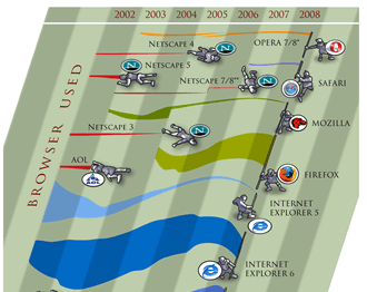
Image courtesy of favbrowser. A bit out of date but still interesting.
Geo-Browser History: My point is that if you regard GEarth as a geo-browser then the history is similar. Today in GEarth you can create simple maps and tours just like in Netscape communicator you could create simple web pages. However, a lot of sophisticated features such as time, region control, pauses in tours need to be hand coded into the KML. There are a few tools out there that allow you to produce KML without hand coding such as the spreadsheet mapper, my spreadsheet for adding loops and a tool for adding screen overlays but these are all limited in scope.
Tool Description: An obvious improvement would be 'Dreamweaver for Google Earth', where all this functionality was combined into one specialist KML producing program just as dreamweaver was a specialist HTML producing program. It would need to be:
- WYSIWYG, ie be able to write code directly or using wizards and then see the result in an instance of the GE API
- Extensible allowing you to write an extension that produced your favourite snippet of KML structure.
- Elegant, highly usable and producing well formed KML code
So what should its wizards allow you to produce? My list would be:
- Time control
- Screen Overlays
- Functionality producing usable maps e.g. color palettes that avoid color blindness issues
- Simple sketchup models such as a photo billboard
- Region controls
as well as enhancements to editing tools that are already available in GEarth such as better polygon digitising controls.
Flash Editor for Google Earth? So why haven't I mentioned tours yet? Well, I think the analogy here is with FutureSplash Animator (later 'Flash') released by Macromedia in 1996 which was a timeline based tool for producing animations on the web. It pre-dated Macromedia Dreamweaver and was kept separate. To me, it makes sense that a Google Earth tour is an animation so it needs a separate animation editing tool that is timeline based, I explain in more detail here (although I discuss it by comparison Captivate, another timeline based tool).
So Why aren't you Building these programs then? because if I did, and it was a sucess, a certain company ending with 'Oogle' and beginning with 'G' would bring out a rival and completely blow me out of the water. Instead this is a lazy web request.
Monday, January 24, 2011
Conrad Wolfram on Teaching Maths with Computers: Dangerously Wrong
Warning: Nothing much about maps or GEarth in this post.
So I just watched this TED talk about teaching kids maths using computers:
He makes some excellent points in it but IMHO his argument is deeply flawed.
So who rattled the bars of your cage?: It's a fair point, I may know about teaching geography with computers but what do I know about teaching math? Well, in my past I spent time teaching maths to geologists undergrads with low academic achievement and I've also been on a team that built an online set of materials teaching maths to geologists (which has now disappeared from the web).
Maths by Hand: I agree with Conrad that hand calculation of maths problems is not good training for our school students, as he points out its a relatively small, uninteresting part of a bigger question. Getting students to define a real world problem in maths terms and then understand how the numerical answer is limited is more difficult and much more important.
So what's wrong?: The techniques that he advocates - e.g. using real world examples or verifying the answers, are aspects of constructivism which is not necessarily about using computers and has been around for years. He goes on to advocate programming as necessarily giving students a good grounding in maths, again, this approach is nothing new, logo programming was put forward as a way to teach students math techniques in the 80s. As this review reveals, the technology has a lot of merit but testing results were far from conclusive. As an example, when discussing the use of logo programming to teach geometry it says:
"In summary, studies show that success [teaching geometry with logo] requires thoughtful sequences of Logo activities and much teacher intervention. That is, Logo's potential to develop geometric ideas will be fulfilled if teachers help shape their students' Logo experiences and help them to think about and make connections between Logo learning and other knowledge the student might have"
(emphasis mine) Doesn't sound a lot like Conrad's silver bullet does it?
History of Technology and Education: The phrase 'computers as a silver bullet' worries me because I researched the history of Technology in Education recently. What I found is that numerous times the technology of the day has been touted as offering a paradigm shift in improving education but every time it has been found to be over hyped. Examples in the 20th century were radio, film, TV and computers (Penrose talk prezi slides 4 to 8) all of which failed to deliver because the students' needs were lost in the misguided application of technology. To be fair, Conrad does mention that computers can deliver poor teaching but he maintains that programming is the silver bullet for math teaching.
Conclusion: Students's educational needs are complex to meet and require experienced teachers using whatever technology is appropriate to the task at hand, be that computers or a big bit of paper with some felt tip pens. Teaching technologies touted as silver bullets have always been, and will always be, a dangerous distraction.
Thursday, January 20, 2011
Flood Simulation HowTo
EDIT 26 Jan 11: changed relative to ground to absolute, thanks to Google Earth Blog
In his novel 'Book of Dave', Will Self imagines a world in the future where sea levels have risen over a 100m.
This destroys civilization as we know it but leaves London skyscrapers still standing half underwater in the sea - the remaining humans who live on 'Ham' (an island created from the rising sea surrounding the high ground of Hampstead Heath, London) climb one of these which they call 'Central Stack' to capture seagulls. As the book has a map of Ham in the front I played around in Google Earth to see how accurate the boundary of the island actually was, as it happens, Will's imaginary island is what would really occur if sea level rose that far.
I realised the technique I used (one a teacher pointed out to me at a training session a while back) could be used in a lesson to visualize rising sea levels or ancient ice sheets. If you draw a polygon and give it an altitude that is about ground level the sheet created will disappear below the ground where the land is higher but be visible where the land is lower. Here's how to create a series of these sheets in a folder so you can show a sequence of increasing sea levels :
- Click the Temporary Places folder in the Places column (it will get a background) then right click > Add > Folder. Add a name in the dialogue box and tick the 'Show contents as options' box. You'll see why in a moment.
- Navigate to a location you want to 'flood' in the main screen. Right click the folder you've just created > Add > Polygon. Move the dialogue screen that opened out of the way (I move it to the bottom of the screen) and click the 4 corners of a square. Make it less than 10 miles across otherwise wierd things happen to the layer because of the curvature of the earth (I think, see note below)
- Drag the dialogue box back into view and under the 'Style, Color' using the controls titled 'Area' select an appropriate color for the square (blue for sea level rise, white for an ice sheet?) also select an opacity of 30% or so.
- Under the Altitude tab choose an altitude of 100m and then select
'Relative to Ground''Absolute' in the pull down menu. This will raise your colored square 100m above the ground. - Name your square something sensible but with a '100' in it (e.g. "London 100m") then click OK.
- Now right click the element you created in the Places column and select copy. Right click the copy >Properties > Altitude and change the altitude to 200m. Change the name to replace 100 with 200 and click OK.
- You should now have 2 sheets, one at 100m altitude and one at 200m. Clicking in the circles turns one on and the other one off automatically.
- Experiment with altitudes that works for your chosen location, copy and paste more sheets if necessary by repeating step [6] - within the folder you created only one sheet will be visible at any one time.
- Right click the folder and select 'Save As' to save and send to someone else.
3D Buildings: It's a lot of fun to turn on the 3D buildings layer whilst you have sheets visible in the layers column, as in the screeen shot the layers will show how deep buildings would be sunk in the sea - not sure if any of those in the screen shot are Central Stack.
Absolute Heights: Experimenting with the levels, the sheet behaves oddly, it doesn't meet the land at the height you would expect. I'm not sure why this is but it may do with the curvature of the earth (in the middle of a big square the earth will protude through a level sheet even though there is no topography). If anyone has a definitive answer I'd like to know.
Surface Flicker: If you zoom into the layers from a distance you may see line of where land meets sheet flicker and change. This is because GEarth creates the view of the earth you see by taking the satellite images and draping them over a set of 'posts' it builds rather like a marquee tent. If you view the ground from a higher altitude GEarth uses fewer posts so the surface changes as you zoom in and out. There is a way around this but its fiddly, I'll post about it if anyone's interested.
Subscribe to:
Posts (Atom)