Showing posts sorted by relevance for query flood. Sort by date Show all posts

Friday, October 7, 2011

Flood London's Bankers!

I was recently asked to produce something to showcase new big screened computers in a new media room at Southampton University.  VIPs watching including our Vice-Chancellor.  I revisited an earlier idea where I flooded London, I rewrote the code using an animated update to produce a tour which will raise the water from 20 to 200m in 3 seconds.


Open this

Flood London.kmz

and turn off all layers in the layers panel except 3D buildings which should be on.

1] Double click 'Space to High' and you will be flown from space to a high view over london.
2] Double click 'Flood London' and sea level rises from 20m above current to 200m
3] Double click 'High to City' to be flown to the city of London.  You should see the skyscrapers of London's banking center already partly flooded.  Turn off the tour (black cross in tour control, bottom left of main screen) then
4] Double click 'Flood London' and the sea rises again.  Experiment with controlling the tour controller bottom right to see you can become a virtual Canute. 

It shows two nice teaching facilities:

  • Animated update which will require you to get into KML if you want to do it for yourself in another location.  
  • A set of tours:  By combining tours which fly the user around with one which controls the flood level we can build some interesting visualisations.

Friday, August 24, 2007

Embedded Videos

I mentioned our grandly titled 'Cognition and Technology in Fieldwork' project yesterday, a more down to earth description would be 'taking Google Earth in the field on PC tablets and seeing if that helps teach students geography'. One of the original drivers for this work was the idea that to teach the relationship of flooding to geography students could find a certain point by a river using Google Earth and access a video clip of a flood at that point and compare it to the river in front of them. We thought this would be a lot better than what we do at present which is get the students to the same point and wave our arms around trying to explain what the flood would be doing.

I still like the idea, hearing that you can get YouTube videos into Google Earth via Ogle Earth I thought I would experiment a little. Here's the result;

YouTube educational experiment

I think it works well. I've included a placemark for Tenbury as its very close to my parents house, the flash floods in the river at the bottom of their garden this summer in the UK have been the worst they've known in 40 years. The problem with this for my fieldwork example is that students will be offline with the tablets so although you could get the placemark in Google Earth, you couldn't get the video. Sad.

From a design point of view, I think this could be very useful but I can also foresee lots of instances where people thoughtlessly create links like this with thinking;
  • Does adding video really add value in terms of understanding?
  • Could I do it better with an image in a pop up? (adding video is a big drain on bandwidth and won't be available offline as an image from a .kmz would be)
  • Does the video really have a strong geographical link to the placemark?
Following the KISS (keep it simple, stupid) principle, if it fails one of the above questions it really shouldn't be used.

Thursday, January 20, 2011

Flood Simulation HowTo

EDIT 26 Jan 11: changed relative to ground to absolute, thanks to Google Earth Blog

In his novel 'Book of Dave', Will Self imagines a world in the future where sea levels have risen over a 100m.


This destroys civilization as we know it but leaves London skyscrapers still standing half underwater in the sea - the remaining humans who live on 'Ham' (an island created from the rising sea surrounding the high ground of Hampstead Heath, London) climb one of these which they call 'Central Stack' to capture seagulls. As the book has a map of Ham in the front I played around in Google Earth to see how accurate the boundary of the island actually was, as it happens, Will's imaginary island is what would really occur if sea level rose that far.

I realised the technique I used (one a teacher pointed out to me at a training session a while back) could be used in a lesson to visualize rising sea levels or ancient ice sheets. If you draw a polygon and give it an altitude that is about ground level the sheet created will disappear below the ground where the land is higher but be visible where the land is lower. Here's how to create a series of these sheets in a folder so you can show a sequence of increasing sea levels :
  1. Click the Temporary Places folder in the Places column (it will get a background) then right click > Add > Folder. Add a name in the dialogue box and tick the 'Show contents as options' box. You'll see why in a moment.
  2. Navigate to a location you want to 'flood' in the main screen. Right click the folder you've just created > Add > Polygon. Move the dialogue screen that opened out of the way (I move it to the bottom of the screen) and click the 4 corners of a square. Make it less than 10 miles across otherwise wierd things happen to the layer because of the curvature of the earth (I think, see note below)
  3. Drag the dialogue box back into view and under the 'Style, Color' using the controls titled 'Area' select an appropriate color for the square (blue for sea level rise, white for an ice sheet?) also select an opacity of 30% or so.
  4. Under the Altitude tab choose an altitude of 100m and then select 'Relative to Ground' 'Absolute' in the pull down menu. This will raise your colored square 100m above the ground.
  5. Name your square something sensible but with a '100' in it (e.g. "London 100m") then click OK.
  6. Now right click the element you created in the Places column and select copy. Right click the copy >Properties > Altitude and change the altitude to 200m. Change the name to replace 100 with 200 and click OK.
  7. You should now have 2 sheets, one at 100m altitude and one at 200m. Clicking in the circles turns one on and the other one off automatically.
  8. Experiment with altitudes that works for your chosen location, copy and paste more sheets if necessary by repeating step [6] - within the folder you created only one sheet will be visible at any one time.
  9. Right click the folder and select 'Save As' to save and send to someone else.
3D Buildings: It's a lot of fun to turn on the 3D buildings layer whilst you have sheets visible in the layers column, as in the screeen shot the layers will show how deep buildings would be sunk in the sea - not sure if any of those in the screen shot are Central Stack.

Absolute Heights: Experimenting with the levels, the sheet behaves oddly, it doesn't meet the land at the height you would expect. I'm not sure why this is but it may do with the curvature of the earth (in the middle of a big square the earth will protude through a level sheet even though there is no topography). If anyone has a definitive answer I'd like to know.

Surface Flicker: If you zoom into the layers from a distance you may see line of where land meets sheet flicker and change. This is because GEarth creates the view of the earth you see by taking the satellite images and draping them over a set of 'posts' it builds rather like a marquee tent. If you view the ground from a higher altitude GEarth uses fewer posts so the surface changes as you zoom in and out. There is a way around this but its fiddly, I'll post about it if anyone's interested.

Monday, April 28, 2008

Google Earth: Poster or Database?

The use of Google Earth for science visualization is growing, I don't think its reached anything like its true potential at the moment but one thing I notice is that my science colleagues are using it as a database rather than a poster.


Posters at the AGU conference I attended before Xmas.

When I say poster, I mean a conference poster. People put their data and , importantly , interpretation of that data on one big sheet and stand around to discuss the issues with others. A Google Earth version of this would include some data and lots of labels and highlighted areas to explain an idea. This is a preview of a project I'm working on at the moment:


Screen Shot from the BrahmaTwin project

Map Explained: What the blobs show are communities, the blob size shows population, the blob colour shows vulnerability to flooding from the Brahmaputra. The blurry map around the purple square is the large view of the whole project: I use it to show people the overall area. The purple square contains a high res sub map (another overlay) which I use to discuss interpretation: the yellow and blue blobs are areas where poor and rich live respectively, you can see that the rich occupy areas away from the river and the poor are left with flat areas close to the river that are liable to flood.

A good example of a database is Mark Mulligan's Terrascope, showing historical satellite data. Its excellent, I have made use of it elsewhere in the BrahmaTwin project.

To me the power of Google Earth is best used when presenting a kind of poster, its excellent at being a canvas on which to present the reults of interpretation as in the BrahmaTwin project. To put it another way, for authors who use GIS already, instead of printing to paper to produce a map, "print" to KML to produce a Google Earth project. I see very few examples where experts interpret data and explain it in Google Earth, most seem satisfied with producing data in a format where it can be explored with Google Earth.


Friday, May 28, 2010

AGI report: State of GI in 5 years time.

This was a report predicting the future of GI in 2015. It's a good summary made up of opinion from a broad spectrum of GI experts. Of particular interest to me was the section on 
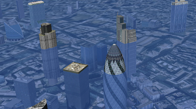
cartography and visualisation (p 18 main report):

"However, it is not clear if cartographers or visual designers will have more influence in these [challenges of 3D visualisation] developments."

is an intelligent point to make, I see far more visual designers playing with maps on the web than I do cartographers embracing the new GeoWeb tools so it will be interesting to see who influences the development of augmented reality applications the most. However the quote,

"The contrary view is that we may see the death of the conventional 2D map by 2015"

is just plain silly. History is littered with examples of new technologies that were predicted to kill older technologies and didn't. Fax machines were killed by email but theatre, radio and ovens were not killed by cinema, TV and microwaves respectively. There is lots to be said for a 2D generalised map, augmented reality on phones may be dominant by 2015 but don't expect the 2D map to become extinct.

Cartography and Visualization by Mackness is a separate report which the main report summarised. He brings up a good point about the importance of zoom:

"improved capacity to model geographic spaces at multiple levels of detail. Data modelling at multiple scales to support ‘intelligent zoom’ – hugely facilitate map based tasks associated with small devices (with small screen real estate) "

zoom is important and I think it even goes beyond his mobile devices - its very useful on PCs too.

But I was disappointed that whilst he thinks "maps as interface", will be more important to the public in the future he doesn't identify usability of maps as a possible impediment to the development of GI. With each new function developers get to wield in map making there is a slew of bad implementations that are a result of ignoring usability issues, IMHO this is definitely an impediment to effective use of GI tools.

GI and Climate Change: Moving onto the section in the main report I was pleased to see some understanding of the importance of usability being talked about:

"Increasing sophistication in the analysis, presentation and understanding of uncertainty issues, for example how to communicate probabilistic [sic] based information sets. This issue is particularly relevant for scenario forecasting such as climate change or flood risk analysis, where there are increasingly sophisticated datasets availability [sic]"

I agree communication of difficult to understand spatial data to the public will grow in importance. Much the same point is made in the section on renewable energy.

The Data Deluge: Finally, in this section the report talks about the cost of data going down which produces the problem of a data deluge for the public:

"This means that rather than being able to let “the figures talk for themselves” it becomes increasingly important how the information is presented and telling the story associated with the information in a compelling way. This does not mean however to filter the information, to protect it, or to otherwise impede its release – that would be counter productive. Rather the increasing availability of GIS tools and “geoweb” enthusiasts mean that there is a wider pool of people who can be partners in understanding and communicating the issues."

Google Earth Tours are already an answer to 'telling the story' for the amateur enthusiast and I look forward to seeing them and other similar technologies become more popular as ways to dissect public data.