Monday, October 29, 2007

Time Line: Google vs ArcGIS Explorer

Added 24 Sep 08: I've now posted a timeline HowTo tutorial

The Time Line was one of the most keenly awaited features to make it into Google Earth over the last couple of years. This allowed users to produce powerful visualizations of animal movement and flooding. I've covered the feature before concluding that it was powerful but fell down on some usability issues. Google Earth isn't the only virtual globe with a time line, I stumbled upon the video below


which shows the ArcGIS Explorer version.

It brought to mind several points (not a true review, I've done this from the video only);

1] The Explorer timeline lives in an opaque window compared to the gray/white screen over used by Google Earth. This uses some screen real estate but will aid users trying to manipulate the controls. I think the Explorer compromise is worth it.

Explorer 1, Google nil

2] With Google Earth the timeline controls every element on screen that holds a time stamp. So if you have multiple kmz files visible on screen which show animal movement, all the animals will animate when you use the slider control. In explorer the video shows the multiple steps needed to make each data set attach itself to the timeline controller. IMHO the number of steps is too many for the average virtual globe user.

This second difference is a throwback to the roots of both companies producing the software. Google made its money by making a fast and uncomplicated search engine, ESRI, producers of Explorer, make Geographic Information System (GIS) software that is powerful but complex for the unskilled user.

Final score:
Explorer 1, Google 1.

An easy way to make the Google timeline better would be to have two options. The first would keep the timeline as it is for expert users. The second would
- enlarge it
- give it an opaque look
- turn off features 1 and 2 in this diagram
and would be for weaker users.
Friday, October 26, 2007

It's Simple to Create a Map

I've just come back from the Moodle conference (known as Moodle Moot) in Milton Keynes. Moodle is an open source virtual learning environment and is my other area of interest away from virtual globes.

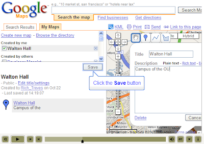
Part of my talk was about how easy it is to use neo-geography for teaching, so simple, I argued, that none geographers should be using it too. To illustrate this I recorded a screen video of me producing a Google map which shows just how few steps are required.


Its similar to the youtube video Google released themselves


but their video doesn't show the final step of publishing to the web. Also, I'm concentrating on showing the simplicity of the process rather than the features of creating a google map.

Friday, October 19, 2007

List of Design Posts

Good Icon Design

Introductions Help Your Users
Introductions II - By Video

Death to Acronyms

What You're Gonna Tell 'Em - Introductions
How To Make A Video Introduction

Discussion of how to deal with placemark cluttering:
Can't See the Wood for the Gerrymandering

Good Design takes Time(lines)

Folders as Picture Frames

How to structure you project:
Folders: The 3 x 4 x 5 rule

Tidiness in the places column:
Snip Wasted Space

Mixing colours:
Colorbrewer

Where the topic isn't self explanatory I've added a comment.

Busy Busy

Term has started here at Southampton University, I'm pretty snowed under which is why the blog has been quiet recently.

What my week has felt like....

The original idea of this blog was to publish thoughts on design principles. In the near future I'm going to re-use most of this in a taught course to our Geography post graduate students so as I've been repackaging it for them I thought it timely to summarise the posts for you too. I've put it in a separate post to keep it clean as a reference.

Monday, October 15, 2007

Colorbrewer

If you produce a thematic map with Google Earth often you will end up covering the whole map with different colours, an example is the second image in this post. In such cases it is important that the colours you use in the scale work well, this is a topic covered by color theory. ColorBrewer is a neat little flash based tool for picking colors and playing with effects of how colors match up on a map.

It has help links peppered around it which is very handy, start with 'how to use' in the top right corner of the home page.

Tuesday, October 9, 2007

Project Review: USHMM, Crisis in Dafur

Since I started this blog back in June you may have noticed a bias to discuss example projects from Google Earth Outreach, its true, and I make no apologies for my focus. My reasoning is that it's good to raise awareness for non-profit and that Google Earth is excellently suited to non-profit outreach as the level of expertise needed to produce a project is low when compared to GIS software. This is especially true if the project is simple and that is a characteristic very apparent in the Dafur layer as I discuss below.

To access the layer, select: Layers > Global Awareness > USHMM: Crisis in Darfur

Initial thoughts: What I like most about this project is its simplicity, there are only 5 layers including a well designed introduction placemark. Lots of projects I have seen break the 3x4x5 rule and by doing so run the risk of confusing users with low IT skills. On the subject of simplicity, the names of the placemarks have been kept to 3 words in the layers column so that each one occupies only one line, I suspect using snippets. This is also good design as it keeps the project compact in the layers column.

Other Pros: Lines are thin and subtle in colour given the colour of the background. The icons are simple with appropriate use of colour (more info: my post on icons).


Screenshot of balloon

The balloons are professional looking, with good use of photos, subtle icons and links to further information on the web. I have noticed a number of projects where people have put information in Google Earth that has no spatial reference point. IMHO it is better design to link to non-geographical information on the web rather than put it into Google Earth itself.

Cons: If you zoom in within the project area you will see icons becoming visible that were hidden. This is a feature trick using regions, and is a way of dealing with screen clutter. The problem with it is that a user with low IT skills may become confused and not realise they have to zoom in. IMHO a better way of dealing with the problem is to chose only the best placemarks in the main file but to link to an additional file with all the placemarks. The user with low IT skills avoids getting confused and the expert user still has access to the greater mass of placemarks.

On a more minor point the flame icons are difficult to distinguish when they clump together. By putting a circle with a halo around them this can be improved.


Original Placemarks on the Left, my Version on Right


In the example I have replaced the original icons with my own, if you try and count the number of icons on the left you will find it difficult, on the right you can just about work out there are 9 icons because of the way the halos overlap each other. A final small point is that the cross in the top right corner of balloons is difficult to see because of the dark blue colour chosen.

Conclusion: Overall its a great project and the best use of design I've seen anywhere. Simple design can be very, very effective.

The layer has been very successful at raising awareness. At a time when coverage of the Darfur situation was waning it brought the issue back into the spotlight as in this article.

Friday, October 5, 2007

Free our Data

This isn't a post about design.

In the UK the Ordnance Survey own mapping data which the can license to users, this contrasts with the US where, as I understand it, mapping data is free. Scott Sinclair defended the OS position in the UK Guardian paper yesterday.

A couple of points are worth making;
- It may cost £110 million a year to keep the OS data up to date but who funded the base map data in the first instance? This makes up most of the data that the OS is licensing. Was it perhaps the UK taxpayers? If so then we are having to buy back from the OS what our grandparents paid for out of their taxes.

- Their are other funding models than licensing, in the US, government data is free, how do they fund the upkeep of their maps?

- Scott complains;
At the same time, any moves we make to widen access, such as launching a new website for people to share walking routes, are simply seen as not good enough. You quote an Ogle Earth blog attacking us for "entering a market niche that is serviced much better and for free by the private sector"
Widening access is good, collect 3 gold stars and go to the top of the class. Now try doing it in a sensible manner. Producing a tool for marking walks that is inferior to those that are widely used now, for free (e.g. Google Earth) is flushing money down the drain.

Back to posts about design next week now I've cleared the holiday backlog of work.

Tuesday, October 2, 2007

Helsinki Bus Map

I've been on holiday and at a conference for the last 10 days but back in the saddle now.

My boss has a road map of Helsinki on one wall of his office which has become familiar after seeing it so often. It was therefore distinctly bizarre to come across a map showing Helsinki bus positions in that city (courtesy of Ed Parsons' blog). Its a great example of real time map use but If you watch it for a while you'll see that the positioning system isn't accurate enough to produce the true, smooth path of the buses, the bus icons jerk in random directions giving the bizarre impression of shoppers thrown wildly against the windows.

I mention it as its a lovely example of design; subtle colours, clear icons and the arrow showing direction of movement are all excellent. It also showcases one of the two features of Google Earth/maps that I consider 'killer apps': Real time plotting of features. With mobile web devices becoming ever cheaper and more common being able to check where your bus/plane/friend has got to via your mobile phone is bound to be hugely popular.

Update: 3/10 The link to Ed Parsons' blog has been corrected, thanks for the heads up Frank.