Monday, September 17, 2007

Design and Steve Jobs

A question that came up at the Cartographer's conference was 'How do we encourage the neo-geographers to adopt good design in web maps?'. I made a point in the discussion based on a story Steve Jobs (Apple CEO) made in his famous Stanford Address about random events that end up changing your life. He explains how he'd dropped out of Reed college in the US but stuck around sleeping on friends floors;


"...The minute I dropped out I could stop taking the required classes that didn't interest me, and begin dropping in on the ones that looked interesting...

...Reed College at that time offered perhaps the best calligraphy instruction in the country. Throughout the campus every poster, every label on every drawer, was beautifully hand calligraphed. Because I had dropped out and didn't have to take the normal classes, I decided to take a calligraphy class to learn how to do this. I learned about serif and san serif typefaces, about varying the amount of space between different letter combinations, about what makes great typography great. It was beautiful, historical, artistically subtle in a way that science can't capture, and I found it fascinating.

None of this had even a hope of any practical application in my life. But ten years later, when we were designing the first Macintosh computer, it all came back to me. And we designed it all into the Mac. It was the first computer with beautiful typography. If I had never dropped in on that single course in college, the Mac would have never had multiple typefaces or proportionally spaced fonts. And since Windows just copied the Mac, its likely that no personal computer would have them."

So the design of the writing you are currently reading on screen is down to a college dropout wandering into a random course on calligraphy in the years when Apple was still a green fruit.

I try and persuade people that design is important in virtual globes, I'm not sure how to best do it but I'm encouraged by Steve's story that its possible to hit a tipping point and the idea will spread itself.

Thursday, September 13, 2007

Snip Wasted Space

Looking for something else in Google Earth Outreach I came across the snippet.

In the placemarks column there is often a problem with the description appearing below the placemarks spreading elements out more than you would wish. Using a blank snippet (you'll need to scroll down to find it) reclaims this space and snippets also allows other kinds of control.

Some of you may not know how to edit KML, if so read on: KML is a text file that Google Earth reads to render your data on screen. To use the snippet trick you will have to access your Google Earth file and edit it using a text editor, the details of how to edit KML are here . the construction is called a tag and the original link tells you exactly what to edit to make it work.

Tuesday, September 11, 2007

Label Control

One of the features of Google Earth that the cartographers last week didn't like were the labels.

Screenshot of some placemarks showing labels scaled to perspective by Google Earth.

A request to Google: Currently you can control the scale of labels and their colour (requires you to know how to edit kml directly too) but not the font and their position. Google Earth does a neat trick of moving a label's position depending on what is around it to make it clear and also applying perspective to scale as in the screenshot above. However, when you are arranging the elements of a Google Earth project it would be very useful to be able to fix the position of a label and control its font. For example, if you have a series of placemarks in a line sometimes one of the labels 'flips' to the other side which looks very shoddy.

Poor old Google, they must get sick of users requesting pet features all the time and here am I, just adding to the pile. However, I think there is a wider point here. Google is busy building high tech functionality like photo viewers whilst much simpler functionality is being ignored, I wonder sometimes if they are overly obsessed with sexy high tech rather than dealing with basics.

Thursday, September 6, 2007

Folders: The 3 x 4 x 5 rule

Further to my discussion of folders last week I thought some rules of thumb would be useful. Google have published their thoughts on this in one of their Google Earth outreach tutorials, however, their tutorial assumes that authors know how to write KML. I don't think everyone has the time to work out KML so I've sifted through their tutorial and added some of my own thoughts.

The basic rules are here to keep a good balance between having a rich resource with enough elements but one that is not overly large or complex in terms of structure.


A structural illustration of the 3 rules for folders.

1. No more than 3 levels of sub folder
2. No more than 4 content folders in the project. However, you can have 1 introduction folder in addition.
3. No more than 5 items (placemarks, overlays, polygons, sub folders) in each folder or sub folder.

This would seem to limit you to 4 folders with 5 subfolders and 5 elements in which is 4 x 5 x 5 = 100 elements in total. In certain cases this won't be enough but what I suggest is that you can break rule (1) if the subfolder is locked so that it cannot be opened, similar to my Picture Frame concept.

Connecting Cartographers and Neo-Geographers.

Yesterday I went to the Society of Cartographers summer school in Portsmouth to talk about this blog. Steve Chilton who I interviewed last month (part I, part II) had nagged me into giving another talk. I went because I realised that the purpose of this blog is partly to try and bridge the gap between the people building maps with the new web tools (often termed neo-geographers) and the cartographic community. Part of the problem is that neo-geographers get a lot of their information via RSS through blogs, forums and social bookmarking services like del.ic.ious. As expected, a show of hands in my session yesterday revealed that most cartographers present didn't use RSS or know what it was. Add to that the lack of blogs about cartography (if you know of any, please email me) and you can see the niche I'm trying to fill with this blog.


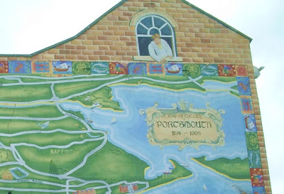
Map of Portsmouth wall mural, courtesy of 'some fool (old school)' on flickr.com

If any of the delegates read this, thanks for your feedback, I'll get onto discussing your thoughts in some further posts, I did wonder if any of you found the above mural and what you think of it? :)

Monday, September 3, 2007

Videos of Google Earth

Over at Digital Earth Andy has posted a detailed tutorial on how to take videos of Google Earth, I tackled the same topic in an earlier post, based on his advice.


Its well worth the read but I have a couple of comments:

Background audio: I'm not entirely convinced by the helicopter sound, I don't really think it adds to the experience. I'm more convinced by the music but what about a commentary? Maybe I'm biased coming from a geography education background but if that video were to be used in a lesson a commentary (with or without music) really adds value.

Space Navigator: I have one, they're good but you can use a normal, cheaper joystick instead

Overall though its a great posting, thanks Andy! Brian Norman adds a useful tip in the comments.