I got students to use Google Earth but I explain how you could use Google My Maps as well. The feedback from the course was excellent so I thought it worth discussing how to set one up yourself.
Tuesday, December 14, 2010
VGI in Education Talk
I've done a talk discussing a project using VGI in teaching a first level Earth Science course:
Wednesday, December 8, 2010
Streetview now Captured by Tours
I was away when GEarth v6 was released but I was excited to see the pegman make it into GEarth bringing the smooth usability of streetview in GMaps into GEarth.
Others have documented the feature well but no one in the blogosphere appears to have noticed (and isn't mentioned in the above clip) that you can now record streetview in tours too: tour of the walk from Waterloo Station to the London Eye. All you do is;
- record a tour in the normal way,
- drag and drop the pegman (orange man icon on the main screen controls) half way through to enter streetview
- navigate around in streetview
- click 'Exit Street View' button top left of your screen to exit street view
- stop the tour.
to quote a famous meerkat: 'simples'
This has a ton of applications:
- What better way to direct your friends to the pub?
- Real estate (relators in US speak) adverts showing the town amenities close to their property
- Teaching human geography
Well done Google, a smart feature all round.
Techy KML Details: GEarth 6 has spawned a new gx KML element: "gx:ViewerOptions", this element inserted into a FlyTo parent with"gx:option name="streetview"" tells GEarth to changes from normal to Streeview in the middle of a tour. ViewerOptions also allows historical imagery and sunlight conditions to be captured as well.
Friday, November 12, 2010
Blog Break and Infographics in the Media
After slogging my way through the summer while all my colleagues took leave I'm about to take 3 weeks off myself to sort some things at home and holiday abroad. I haven't been posting much because of trying to kick a few projects into shape before leaving them for a while. I'll be back 2nd week of December.
I'll leave you with a fascinating set of videos I've found by Geoff McGee for a fellowship he completed at Stanford University. Its about data visualisation as a story telling medium and focusses on graphics in the media. What's interesting about it is the same problems I've noticed in using neo-geo tools in education and outreach come up in their topic area. Points that particularly resonate with me:
- Martini Glass Presentation: The importance of an introduction, context setting and explanation of what you can 'do' with an interactive web graphic or complex print graphic (section III: Telling Data Stories). Without this, your creation is just a set of pretty colours to the user. The Martini glass stem represents the video clip slide presentation introduction and the triangular glass represents the freedom of the user to explore the graphic on their own.
- Attractive Does Not = Effective: A beautiful looking stream graphic showing box office results for movies with time is discussed in part IV, various commentators point out that it grabs attention wonderfully but then is difficult to interpret what it shows.
Monday, November 8, 2010
Timelines and Tours outside Google Earth
I've come across a couple of examples of GEarth features implemented elsewhere which were worth a mention:
The building clip has a poor frame rate and the building isn't manipulated in some way (like showing the inside rooms) but otherwise, the format is exactly the same. I'm in the middle of researching to best design tours at the moment and the Seung clip is a lovely illustration of how the results of my studies will not just apply to GEarth and other Virtual Globes but to any 3D visualisation system where zooming across scales in a film clip is important.
Timeline Example: I thought this timeline from a New York Times graphic is much better than the timeline in Google Earth:
- Easier to grab and move the jaws, in GEarth the jaws are too small
- The play button only allows the jaws to move together, in GEarth you can press play and the far side of the jaws will move which is too complex for users to understand and utilise IMHO
- The time labels are simple and clear whereas in GEarth the labels are more fussy
- The blue shading communicates 'this is the time range' in a clear way and its semi transparent so you can see the graph below it.
The GEarth timeline remains high on my list of things Google should really fix in GEarth.
Tour Example: I think the tour feature of GEarth is one of its strongest features allowing user in presentations or promotional film clips. I came across a film sequence in a TED talk which has a form remarkably like a tour:
(BTW the clip is fascinating and well worth watching in full)
The clip 'zooms' down from large to small scale and at the destination scale the camera moves around a 3D object which is then manipulated in various ways to illustrate the relationships of neurons. Compare it with this GEarth tour:
The building clip has a poor frame rate and the building isn't manipulated in some way (like showing the inside rooms) but otherwise, the format is exactly the same. I'm in the middle of researching to best design tours at the moment and the Seung clip is a lovely illustration of how the results of my studies will not just apply to GEarth and other Virtual Globes but to any 3D visualisation system where zooming across scales in a film clip is important.
With the Seung clip I defined where it should start, see how to get a YouTube video to start where you want it.
Wednesday, October 27, 2010
Visualizing Motion
Static and Dynamic Motion Viz: Timelines offer an excellent way to visualise motion of people or vehicles. I've discussed timelines in GEarth with a video illustration previously. Recently I've been hanging out at the GIS Stack forum which IMHO is an excellent resource. A recent question was on visualizing motion statically: what were the best techniques? What software could you use? I've pitched in with an answer along with some other contributors.
Static vs Dynamic: What doesn't come out in the discussion is would you choose a static option over the dynamic one if you had a choice? I think for the expert map reader (I'm thinking of a biologist tracking animal movement as an example) a static map has a number of advantages, it can be scanned quickly to find the point/time you are interested in and values of velocity are easy to read off. By comparison, an animation must be played to get to the point you want to view. As it can be printed it's also very portable.
For the bloke on the street, I think the dynamic version has most advantages: understanding the static version requires interpretation, the animation is instantly recognisable. Also, animations instantly attract the attention which is important for the public but not necessary for the expert.
Wednesday, October 20, 2010
Recording Tours via Screen Recorder
I've lots of deadlines coming in at the moment so excuse the lack of posts last week.
Here's the video example:
The HowTo write up Mike Griffin does is good but I have some suggestions (numbers in brackets refer to their step numbers):
Dialog box in the way (1): The way to deal with this is to simply drag the dialog box so most of it is off screen. Its not particularly elegant but it solves the issue.
Setting Viewpoints with Placemarks (2): as I suggest in this tutorial, if you choose your viewpoint before you create a viewpoint placemark its better because GEarth automatically sets the current view as the Placemark's view.
Manual Flights Clicking (4): The main problem with the technique Mike suggests to my mind is that you have to sit there manually clicking placemarks and then watching as GEarth flies from placemark to placemark incredibly slowly. This would drive me nuts for anything but the shortest tour.
If you can handle XML an alternative is to dive into the KML you've produced in setting up the placemark viewpoints to grab the Camera or LookAt data (in italics below) for each placemark.
<Placemark id="ElkRidge">
<name>Elk Ridge</name>
<description>shortly after the eruption</description>
<Camera>
<longitude>-122.2989801778228</longitude>
<latitude>46.29626193853221</latitude>
<altitude>13.39603579634948</altitude>
<heading>-31.06642935444568</heading>
<tilt>90.62346382665406</tilt>
<roll>-6.361109362927034e-014</roll>
<altitudeMode>relativeToGround</altitudeMode>
<gx:altitudeMode>relativeToSeaFloor</gx:altitudeMode>
</Camera>
<styleUrl>#msn_grn-blank1</styleUrl>
<Point>
<coordinates>-122.2993707244499,46.2969626924056,0</coordinates>
</Point>
</Placemark>
You can insert this data from each placemark into a FlyTo construction in a tour:
<gx:FlyTo>
<gx:duration>3</gx:duration>
<gx:flyToMode>smooth</gx:flyToMode>
<Camera>
...same data as above in here...
</Camera>
</gx:FlyTo>
<gx:duration>3</gx:duration>
<gx:flyToMode>smooth</gx:flyToMode>
<Camera>
...same data as above in here...
</Camera>
</gx:FlyTo>
using a series of these will give you a tour and you can edit the duration tags to alter the speed of flight from placemark to placemark. When you're happy with how the tour looks you go back through the tour KML resetting each duration to be x10 what it was previously. Now you can set the screen recording going as Mike suggests, run your incredibly slow tour and let the computer do the work recording it while you go and have some lunch.
Other Advantages: Recording tours as videos rather than as tours in GEarth has other advantages: you can access all the features of the movie software you use (such as fade in transitions) which aren't available in Google Earth. As time goes on I expect Google will add more features to tours.
Thursday, October 7, 2010
Maps and Art
There is an intriguing outbreak of using maps in art in the blogosphere;

The above image is of the English channel and is from the intriguing Fata Morgana which, using the latest feature in the Google Maps API has taken away everything but the words (and in the UK, what words! 'Hougham Without' in the middle of the image sounds lovely).
Axis maps release a set of posters working on a similar idea but putting a ton more cartographic love into their work.
Via Ogle Earth I found a wonderful reflective essay on the juxtaposition effects of imagery from different times: HiLoBrow.
And finally, Evert Schut finds inspiration in the many and varied patterns Google Earth produces at Google Earth Art.
Wednesday, September 29, 2010
W3G Conference - like Geography only cooler
(Title of this post ripped and mixed from @DJSoup tweet)
unconference format.
Highlights for me included:
Steve Feldman's fantastic rant (blogged here and here) about data that shouldn't be mapped. His line was that mapping some data doesn't do it any favours because a] it doesn't tell you anything worth knowing b] its misleading. He identified some twitter maps as culprit, like this map of tweets about the Gulf Oil Spill, I agree with him that this one doesn't pass the 'does mapping this add anything to understanding?' test.
Peter Batty's comments in his unconference slot about usability. As I said in my slot, I have been advocating Krug's 'Don't make me think' book and usability testing to all sorts of groups for years so it was excellent to see someone else making much the same points.
I also met Stuart and colleague from Geo.me who have a very impressive engine for fast production of bespoke maps. Well worth a look.
I gave a talk on techniques of clustering points mostly and expansion on this post. I think I misjudged the crowd with my approach but geo.me and Nick Bicanic made some interesting counter points to my argument so it was worth doing.
This was my first unconference and NeoGeo event, its noticeably a lot less stuffy than more mainstream conferences I go to which is great. Thanks to everyone who put it together.
Thursday, September 23, 2010
Cartography of Base Maps
updated 1 Oct to attribute the quote correctly
There's been an interesting cartographic discussion of base maps recently in the geo-blogosphere; Stamen Design blogged some notes about their work on Bing maps, which was picked up by 41Latitude which was in turn highlighted by James Fee. The point that comes out from this, as Justin O'Beirne says, is that
"in trying to make a base map that’s optimized for everything, we’re actually creating one that’s optimized for nothing."
Which I heartily agree with. An example is street names, if you are producing a map for city navigation street names are vital but if your map is a thematic one showing a heat map of crimes per square km, street names aren't important and should be removed. 41Latitude suggests having a range of base maps for different uses, this is sensible but of course you can go one step further: The new Google maps API allows you to customise the base map and of course, if you start with a really basic base map (say land and sea) of any service you can always produce a custom base map by adding specific layers (e.g. roads) as you see fit.
How Many Users: What no one so far has mentioned is that how much you customise a base map is really controlled by how much effort you want to put in. In turn, that is usually a factor of how many users you have and how complex your map is.

sketch map courtesy Rosanne Elkins-Bushnell
At one end of the scale, the proverbial 'back of an envelope' map has as its base map the envelope and works fine for a sketch of how to find a coffee shop for one person on a street. Showing a group of people the location of the hotel you're all meeting at works pretty well as a marker on a street map; my maps by google would be fine for this as the data can be displayed as a simple map. However, once you start having multiple layers with markers or polygons you really want to start thinking about improving your base map as screen clutter and usability becomes a real issue, especially if your map service is going to be used by many users and a client is paying you to put it together. You want to choose from a series of base maps to get the optimal base map or even customise it for your particular use.
Wednesday, September 15, 2010
10 Myth Busting Facts about Google Earth
Back from my trip to America now, whilst out there I met up with colleagues who also train teachers and students in using GEarth. Over beers a topic that often came up was misconceptions about Google Earth from those with no GIS or Google Earth experience, so I've put together my personal list of myth busting facts. They're in rough descending order of importance:
1] You can make your own map in GEarth. You can add points, lines or areas to Google Earth marking anything you want. Tutorial.
2] Google Earth isn't just satellite images and roads. There are lots of sets of data (called 'layers' because they are like a layer of see through plastic that can be turned on or off at will) you can look at draped over the background imagery of Google Earth. Examples include ; weather, Panoramio photos and shipwreck locations (Layers > Ocean > Shipwrecks) . Some of these layers come on automatically when you use Google Earth, you can turn layers on or off in the layers column as you wish. To cut down screen clutter I usually turn everything off apart from terrain.
3] Any map you make in Google Earth is not visible to anyone else unless you publish it. Just because you write a document in Microsoft Word it doesn't mean Microsoft can see it, it's exactly the same with anything you create in Google Earth. Background elements such as satellite images, roads and town names provided by Google are visible to all but add elements to Google Earth yourself and only you can see them.
4] You can publish your own map without going through Google. The layers column (bottom left of the screen in Google Earth) is a selection of materials that Google think lots of people will find useful but if you want to publish your own map by emailing it to people, or putting it on your web page you can just do it without checking with Google first.
5] The satellite data in Google Earth is historic, i.e. its not imagery taken today. Usually its a pretty recent image taken in the last 3 years.
6] Google does not censor satellite imagery. I can't say this for certain but stories appearing about Google censorship in the press are usually a misunderstanding based on age of imagery or the fact that Google buys a lot of its images from other agencies who may be doing the censorship themselves. See this post for details.
7] You can use Google Earth offline. Google Earth stores the satellite images of areas you visit on your hard drive in a special folder called a cache. If you've visited London in Google Earth you can then disconnect from the web and use Google Earth to look at London some more. Google Earth will do this by loading the images back in from the cache. If you then fly to Paris and zoom in Google Earth will just show you a fuzzy mess because it can't download the new imagery to produce Paris on screen until you connect up to the web again. This is very useful for presentations using Google Earth at conferences where you can't rely on wifi.
8] You can tilt the view to see mountains in 3D. A couple of years ago it was a common misconception that Google Earth was just 2D, many users didn't know you couldn't tilt the camera view and see the landscape in 3D. I'm not sure its such a common misunderstanding any more.
How To: tick the terrain layer in the layers column if you can see one, if you can't, don't worry. Hold the shift key down and use the up and down arrows on your keyboard to tilt .
9] Google Earth is not a security threat. Lots of scare stories have gone around about terrorists using Google Earth to plan attacks or thieves using it to set up robberies and that Google Earth should therefore be turned off or censored (see 6 above). It may be true that Google Earth is a tool for enemies of society but there are two main arguments against censoring Google Earth; firstly, satellite imagery has been available for sale to all comers for years before the appearance of Google Earth - if your security system relies on people not being able to see dated satellite imagery of your house, military instillation or city then it's never been very good security. Secondly, cars, mobile phones and pens are all used by terrorists and thieves, are we going to ban them too?
10] You can use Google Earth to explore other Planets, the Sky and History. Google Earth has lots of other features people users are usually unaware of, for example, you can use it to explore the surface of Mars, the Moon and the night sky. It also can be used to show historic imagery.
Thursday, September 9, 2010
3D Geology Models
I'm in Norfolk, Virginia working with Declan de Paor and team at Old Dominion University this week. I've already had a fascinating time looking at their latest work (see an old post for more details of the type of thing Declan does). An example is a model of the earth below Iceland, screen shot below.

The great thing about this project is that unlike most TEL (Technology Enhanced Learning) projects I've been involved in, the team here have a lot of technical examples working already and we're just starting! A lot of TEL projects start with a teaching idea without knowing how to produce it technically which means that little or no time is left to find out if the learning technology works as the team's time is absorbed in solving technical problems. So I think this project is really going to produce some excellent materials and push forward the use of Google Earth in education.
Google Earth API Use: One thing Declan's team are doing that I think is really clever is that they're using the GEarth API to reduce complication. Instead of having lots of controls like the compass control and layers panel in the GEarth client, they use the GEarth API showing only the controls that they need which simplifies the tool for students. Unfortunately they haven't published any examples yet but I'll point them out when they appear.
Wednesday, September 1, 2010
Google Earth for Scale: Colossus of Endlesham Road
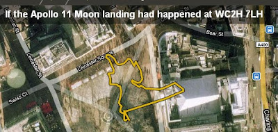
I really like howbigreally.com, a project by the BBC using google maps to illustrate the scale of things e.g. it puts the Apollo 11 moon walk into your local park.
The idea of sticking the statue of liberty or Nelson's column into a figure to show scale is nothing new and is something I do myself in Google Earth, e.g. UK outline vs Gulf oil spill . What's clever about howbigreally is the use of Google maps as a backdrop and some excellent choices of topics to illustrate.
Their examples are all of lengths and areas though, to illustrate the size of the statue of Colossus they show the statue's footprints. It made me think, this would work with 3D topics such as giant statues if it was done in Google Earth with sketchup models. I experimented and the rough and ready result is below:
The (Large 2 Mb) Google Earth file: Colussus
Putting a model in Google Earth to scale wasn't difficult but around where I live, the buildings aren't modelled in 3D so I combined a screenshot of the model in Google Earth with streetview imagery to show the statue in place.

HowTo:
1] Look up Colussus in the sketchup warehouse, (the one I use is courtesy of Goldie). If the model isn't in KMZ format already, load it into sketchup then export to Google Earth (HowTo). Obviously you can put any sketchup model in place, not just Colussus.
2] Once in Google Earth find the size of your model (I looked up Colussus on wikipedia), in this case I knew his height so I produced a placemark and gave it an altitude (in the edit Placemark box > Altitude tab > Relative to Ground (pull down menu), enter height in Altitude box and tick extend to ground box).
3] Right click the model in the places column and click properties. Move the camera until its looking down on the model, you can drag the green box corners, sides and central cross which will alter the size and position of the model. Do so until it matches the height of your placemark and is in the right position.
4] In the properties as above use the green diamond to rotate the model to the correct position.
Automating: Just as howbigreally automates areas and lengths against Google Maps, it would be possible to automate the position of a model like this in Google Earth and produce an automatic tour around it too.
Thursday, August 26, 2010
Personal Website Update
Following yesterday's post, I thought I should get started updating my personal website. It was surprisingly quick and easy, I'm all done!
I've added items to the publication, project, lesson plan and tutorial sections that weren't listed before (if you've followed this blog, I've discussed most of them here). I've also fixed broken links and generally had a good old tidy up. Very satisfying!
Wednesday, August 25, 2010
Current Projects: Haiti, Tours, Education and China
This summer has been very busy so I haven't got around to updating projects on my personal web pages. There are a number of projects that I'm working on at the moment that aren't listed and deserve a mention:
Haiti Maps Usability: I am supervising Luke Caley an MSc project student looking at usability of maps in the Haiti earthquake disaster, Luke is talking to people who where there at the early stages of the disaster investigating how maps and mapping were used in the field. There is a related area about the usability of crowd sourced map systems that is fascinating but unfortunately beyond the scope of this study.
Our theory is that Aid workers are a group for whom map usability is critical: when you publish a map on the web user's are only ever a click away from watching cats falling off sofas on YouTube. In an emergency situation the attention of aid workers is even worse - trying to figure out your map is time they could be using to pull people out from under collapsed buildings. So far the interviews seem to be showing that our theory is basically correct. Lots of organisations are generously giving time to helping us, for example ImageCat and MapAction. Final results are due in this autumn.
Google Earth Tour Research: Research is continuing into defining best practices for using tours in virtual globes (see 58:12 into this video for my talk on earlier work). Our results will apply to any virtual globe but for this study we've chosen to use Google Earth. Our main areas of investigation are into seeing how speed of flight and path geometry in tours affect the user's ability to track where they are within Google Earth. The video clip below illustrates the effect tour path has on user understanding, keeping track of where you are is easier on the outbound flight than on the return inbound leg:
User testing on students is planned for September and the results will be used in teaching materials. These materials will support students who will produce their own tours as part of a Southampton University GIS course. The study is funded by GEES.
Usability of Google Earth Materials in Education: I'm working with Declan De Paor from Old Dominion University and others on an NSF funded educational project where I'm providing input on usability issues. It's very early days on this project but Declan's examples give a good taste of what we're going to get up to.
China: I'm also off to China working with John Dearing and others where I'll be using Google Earth to communicate with Chinese farmers helping to alleviate poverty. Again, the project has yet to really kick off.
Next year is looking busy but exciting!
(update 26 Aug: Corrected Declan's surname spelling mistake)
Wednesday, August 4, 2010
Back Button, Places Column Tip
Back Button: As I move around in GEarth, GMaps and other mapping systems it occurred to me that I'd really like to have a back button to fly me back to the last view or back to the last placemark I looked at similar to the way a browser back button takes you back to the last page. You could have a whole history recorded like a GEarth tour which you could replay until you found the location you wanted.
Places Column Tip: There are 3 parts to the element listing in the GEarth places column which can be clicked with different effects. I use this most times I have GEarth open.

Monday, August 2, 2010
Data.gov GEO Viewer Fail
Via James Fee I picked up on the new Data.gov GEO Viewer. I couldn't get it to work either. Marten Hogweg reviews it and it's worth reading the comments: webotter picks out problems with the UI of the viewer.
Thursday, July 29, 2010
Next Climate Change Talk
Here's the latest release from a series of climate change talks I'm doing, this one discusses the Gulf Oil spill, the Athabasca Oil Sands and climate change:
Unlike the earlier 'Is the Earth a Super Organism' talk I've released so far in this series, this one is completely based in GEarth. It's 10th in the series but I've released it early as:
- The spill is still ongoing
- I wanted to have a go at a talk completely in Google Earth to showcase my ideas of what a well designed tour should be like.
I've made a Prezi to link to other resources beyond the scope of the talk:
Good Design Points: A few reasons I think this is a well designed tour:
- The tour covers views across a range of scales, this is where a tour really beats a traditional PowerPoint presentation
- Simple Flights: The flights between segments are simple and fairly slow to give users chance to process the movement and work out where they are being taken.
- Scale: I included Nelson's column, the outline of Great Britain (twice) and a 5 mile long at various points to fix a sense of scale. GEarth is very good at helping users grasp the scale of things.
- Annotations: I use lots of annotations to draw the user's eye to the correct part of the screen.
- Dateline: Because the inbuilt GEarth dateline is too small I included a custom dateline indicator.
Things I'd like to fix:
- Dateline is too small: I fell into the classic trap of looking at GEarth on a large screen then reducing down to a 640 wide movie clip - you can't read the text easily.
- Audio Hiccups: There are a few audio hiccups that I'd like to fix but these aren't easy in Camtasia without affecting the video. I've got to get a better mic too....
- Better Images: There are a ton of better images I'd have liked to have used but I haven't got the time to ask permission. Every image used is cc marked and that limits choice.
Work Flow: To produce it I imported models, images, overlays etc. into GEarth then I recorded a tour visiting all the locations as I wanted. Using the pro version of GEarth, I then recorded a silent movie of the tour which I imported into Camtasia. Within Camtasia I added the audio section by section, using freeze frames to extend the movie where needed and cutting footage to fit the commentary. I also added 'call outs' the red annotations which work in addition to annotations I've added in Google Earth. Its not an elegant technique but it avoids issues to do with GEarth tours such as not being able to review changes easily and needing to edit kml code rather than use the Camtasia graphic interface.
Friday, July 23, 2010
12 Neo-Cartographic Tips for Developers
After releasing the Google Maps API styling features Googler Mano Marks commented: So here are my 12 best neo-cartographic tips:
"The truth is, we're mostly engineers, not cartographers. I'd love to see some great guides to how to style your map. Anyone want to give it a go?"
Tips 1 to 6 (9.30)
Tips 7 to 12 (6.10)
Links out: There are various links out and other text and relationships shown in the clip, to access them you can navigate in the Prezi pane:
Other Notes:
- Not Just Cartography: Mano's request was asking about the new style features. Actually only 2 of the tips [5 and 6] relate to the new feature because IMHO a holistic approach to map design is necessary so you have to consider usability, graphic design and interactivity as well.
- Not Just for Developers: I aimed the material at developers but its a good introduction to design for anyone thinking of putting an interactive map together because I don't use any jargon.
- Discussion of Styling: My post discussing the lack of cartographic advice that went with the styling feature release. Ed Parson's post is also relevant.
Friday, July 16, 2010
Global Warming Map from Foreign Office
This GEarth layer and GEarth plugin has been released this week by the foriegn office showing the effects of 4 deg C rise in tempearature on the world. Great topic but poor science communication IMHO. For example, in an earlier incarnation it was a map (click the screen shot to be taken to the map):
 In this form you could click layers on and off at the bottom and see all the countries in the world at once. In the GEarth plugin version, countries are obscured by the curvature of the earth and there's no layer control so you're left with a cluttered mess of circles and ovals all on screen at the same time.
I'm going to review it more fully next week when I have more time, there are a number of other interesting design features to the project.
Tuesday, July 13, 2010
Google Earth 5.2 Thoughts
Sorry for lack of posts last week, my family is over from New Zealand so I took some time out.
GE 5.2 has already been reviewed well by Mickey and Stephan, I share their enthusiasm for the tracks, elevantion and slide in browser functionality. I've noticed some other features in the 5.2 Pro version (not sure if they're in the normal version) that IMHO deserve comment:
Table: (Tools > Table) This gives you a table view of the KML that you've selected in the places column so you can see the text in the description boxes of a number of placemarks at once, its similar in functionality to Northgates KML editor. Table isn't documented anywhere I can find and I was disappointed to find its read only, it really would be useful if you could use it to write to KML directly as per GIS tools and the Northgates tool.
GE gives you the ability to produce KML within the editor already but I'd love to see functionality where I could put time tags into KML without having to copy raw KML out to a text file.
Regionate: This is documented to a degree but it didn't tell me exactly what this functionaility does, e.g. it doesn't chop up paths into smaller segments. Maybe it only deals with placemarks?
I was also excited to see a contextual help button in the dialogue box. Contextual help in GE is something I've advocated before so I was disappointed to find its only in the Regionate and flight simulator dialogue box (given a cursory hunt around). Why not link to help files from all dialogue boxes?
Slide in Browser: Stephan makes a nice point about the slide in browser, I agree with him that maintaining the option of the split screen would be good. However, I think that the sliding browser screen would be excellent for using GE in presentations, set up a tour, fly into an area in GE then pan across a presentation slide in a browser from the web, use that to support your talk for a while then return to GE to continue the tour. I think Google should think about linking the Google Docs presentation tool with Google Earth in this way, I played around with the idea but currently:
- It takes 2 clicks to open a presentation (open balloon, select link)
- Opening a GDocs presentation in the GE browser currently crashes GE pro!
Polygons and Ruler: I was pleased to see that the polygon bug has been fixed, that was a real pain. Being able to save paths produced with the ruler tool is also smart.
Friday, July 2, 2010
Climate Change Talks
Previously I've enjoyed releasing something good on GoogleEarthDesign's birthday (It was 3 this week) so here's my latest big idea:
Climate Change Talks: A quick search of the internets revealed no one has done a set of video clips on climate change for education (apart from illegal snippets of 'an inconvenient truth') so I decided to do some. Some of the later ones are matched to the UK A level Edexcel curriculum. Here's the first one on the topic 'Is the Earth a Super Organism'.
It's better viewed in HD
Format: Climate change as a topic requires discussing abstract ideas such as positive and negative feedback as well as map based graphics so I went for Prezi.com as an alternative to PowerPoint and added clips of GEarth tours where useful. When a lot of your presentation isn't actually spatial its better not to base your content totally in a GEarth tour as it presents difficulties. E.g. importing, sizing and adding labels to an image in Prezi is a snap with lots of drag and drop controls whereas its a pain to do as an image overlay in GEarth.
Having said that, some of the other clips I have planned which are completely spatial in nature will be done just as GEarth tours and recorded as YouTube clips.
Here is the original prezi page:
(navigate by using the plus minus buttons that will slide out if you mouse over the right hand side or use mouse wheel and click and drag)
It's rather like viewing a GEarth file after watching a tour of the content. In the bottom left corner of each frame it has links to related topics that don't feature in the talk.
Death to PowerPoint: Lots of people have criticised PowerPoint for its slide analogy format, I think you can still do some useful stuff with it but I see their point. The nice thing about Prezi is that I can produce a mind map like poster and then take you around with added audio by recording it with demo software (I use Camtasia 7).
Pros:
- I like the zoomable interface idea Prezi shares with GEarth tours
- Prezi is very usable and Camtasia is not bad
- Doing it this way I like the way I can be discussing one set of points but adding arrows to link back to earlier slides of content.
Cons:
- Using 3 bits of software is a drag (GEarth, Prezi and Camtasia 7) and is time consuming
- I don't like the way Prezi.com promotes the idea of rotating text all over the place, I've heard reports it makes people feel sick.
Video Clips in Education: I had a long think about how to present this content and I thought it worth listing my inspirations:
- Hans Rosling: Excellent speaker with great use of technology
- Lawrence Lessig: Great speaker, interesting and unique style but I'm not sure I like how linear it is.
- Ken Robinson: Amazing, totally absorbing using just his voice. Good to remember that technology is not what makes a great talk, its the talk itself and the speaker.
Very interested to hear what people think.
Thursday, June 24, 2010
on Blogging and Tweeting
This blog is coming up to 3 years old so I'm trying to make time to do some reflecting on the work to date. Today I thought I'd talk about why I'm still doing this after 3 years:
Lost Decade of GeoWeb Usability: A while back I compared the progress of GeoWeb usability with the history of web usability. Jakob Nielsen described the first ten years of the web as the lost decade where web design was awful and no one seemed to care. Whilst there are encouraging signs of an understanding of what makes great GeoWeb content (Axis Maps, Stamen Design, New York Times: example ) there is much more out there that is badly thought out IMHO. So I'm still here advocating good GeoWeb design.
Blog as Outward Facing Notebook: When I first started this blog I had grand ideas of getting lots of useful feedback based on the long lists of comments I was seeing on some other blogs. I don't get as much feedback as I expected and I now realise that its a power law relationship - a few blogs get the majority of the attention with lots of comments whilst the rump of bloggers get a loyal core following but less feedback.
However, this hasn't put me off the process, I actually blog because its a great way of forcing myself to keep decent notes on all kinds of map related stuff. The fact that I can turn it outwards and share these ideas with a larger community has some benefits but is mostly just a bonus, its use for me is mostly as a personal index which I search for something most days I'm online. I recently found I share this view of blogging with John Naughton, one of my favourite web/internet gurus.
Tweeting: As for tweeting, my motivation is much the same. I treat it as a micro-blog where I post all the links I may find useful in the future but don't have time to write up properly as a blog post.
Hits: The final bonus of blog keeping is seeing the hits, I've found it fascinating what people are interested in on my blog.
Wednesday, June 16, 2010
Forgotten Spaces Google Earth Tour

Forgotten Spaces is an architectural competition that suggests new uses for the forgotten spaces around London. As a Londoner and appreciater of architecture it caught my imagination and I went to see an exhibition about it over the weekend at the National Theatre.
I enjoyed it but was frustrated by the lack of a decent overview map both in the exhibition and on the web: I wanted to see about what the neighbourhoods were like around the locations. It occurred to me that they could have used Google Earth really well in presenting the competition so I created a Google Earth tour of three of the entries to illustrate the idea.
It isn't very slick as I'm short on time but I think its good enough to shows some ideas that I discuss below:
A few points to make about the tour:
- Quick!:Whole thing took me 2 hours, including a fair amount of time spent locating where the spaces were. In a day I could create something slick looking.
- Streetview: You can get streetview in Google earth (they have their own layer), by copying the photo spheres into the tour folder you can incorporate them in the tour as I have. Gives you great local context.
- Viewing Elements: I imported the photos into Google Earth as photo overlays - you just drag and drop them from windows explorer into the main GE window. Its very quick but you cannot enter the viewing mode in the tour which is a pain, same with the streetview photo spheres. On a tour you can pause the tour and double click the elements and you'll be able to enter photo viewing mode, have a go to see what I mean.
- Avoiding Cyber Sickness: If you throw the camera about wildly its possible to induce cyber sickness in viewers and even if you don't do that, wild camera moves confuse users, they don't know where they are. You can see that I tend to zoom and pan in and out whilst keeping the view north-top vertically-down. If I want a tilted view with a non north bearing I do that when zoomed right it, trying to keep the relevant screen elements in view as I do so. Zooming out, I straighten up the view before zooming out.
- Overview Map/relative locations: To help users build up a cognitive map of where all the elements are (so they can effectively explore afterwards) I start and end with an overview of all the locations and between locations fly up to this overview. When panning from place to place I keep elements in view so users can get an idea of their relative locations.
This post is unofficial and not condoned by RIBA, I have used their copyright images for educational purposes and also as a critique of the web presentation of Forgotten Spaces.
Wednesday, June 9, 2010
Cloud GIS: Indiemapper review
Update 12/6: I spelt Indiemapper wrongly as Indemapper which I've now corrected. Thanks for the heads up Maarten.
Introduction: Indiemapper is an online GIS from Axis maps, it compares with services like GeoCommons (my GeoCommons review) and the newly released ArcGIS Explorer online (James Fee's review).
I was really excited to dive in and experiment with it as it promised to enable good map design practices. Sure, you can still make ugly maps with it if you try hard but the defaults will nudge (in the sense of this nudge book) you to make good design decisions and contextual help is there to inform you of good design practice. No one will be surprised to hear I think this idea is a Very. Good. Thing.
I discussed Indemapper with Mark Harrower on a conference call before writing this review.
Pros:
- Good Map Design as Default: By integrating colorbrewer and typebrewer into the package and providing design advice in contextual help they've produced an app that promotes good design. Yay!
- Cloud Based: This is aimed at people who don't need the full power of desktop GIS and its a cloud based service so you can access you work from any computer.
- Group Working: Is also possible and I can see lots of potential for this.
- Contextual help: As well as supporting good design, contextual help is a real usability plus - instead of having to waste time finding the help section that deals with your particular problem, a contextual help button takes you straight to what you need.
- Integration with PhotoShop: Axis maps have made a point of making it easy to export from Indemapper into other software such as photoshop.
Sort of Neutral:
- Projections: Indemapper is promoted as being good at handling projections. I can see where Axis is coming from about this but I don't think projections are as important as they make out.
Cons:
- No User Manual (yet): Mark explained to me that one of the audiences they had in mind for Indiemapper was for people not expert in GIS who don't need full GIS functionality. For those people the GIS like interface is intimidating, they really need a set of step by step tutorials on howto make a map with Indiemapper. Contextual help just doesn't fill the need properly. Mark said they had a series of video tutorials planned covering this.
- Free for Educational Users: All Unis I know will have GIS teaching materials authored for Arc. IMHO to persuade a tutor to switch to Indiemapper for teaching the educational licence cost has to be zero and at the moment, its just a reduction. Both ArcGIS Explorer online and GeoCommons are both free.
- Desert Fog on Startup: When first opened Indiemapper has a blank screen. For users who have been making maps in NeoGeo tools like Google Earth or Google Maps, they will be confused and a little intimidated that there isn't a base layer visible. Better to have a default layer visible that users can change than a blank, desert fog screen.
- Static Maps only: Indiemapper isn't designed to produce interactive maps. Mark said this was something they would consider in the future. I agree with him that there's a ton of applications for static maps but I'd like to see some simple interactions possible - clickable pop up balloons with simple html would do.
- GIS Metaphor: Indiemapper works on a GIS metaphor in that a database is linked to a map. If you open a few layers and click on a point you will pull up the normal GIS attribute table. This is second nature to anyone who's worked GIS but newbie map makers will be confused, attribute tables and how it links to a map are quite a complex concept to understand and manipulate. Mark explained to me that the design team spent time discussing if there was a better way to organise a map than layers. I agree with their decision to use layers as the way to organise the map, I can't see a way around that, but I think they could have adopted an interface where data is still arranged in layers but the underlying data structure (XML as it happens) is hidden from the users view by simple screen interactions. Google Earth operates in this way, you don't get to see the KML with simple main screen operations.
Unlike my other criticisms, altering the GIS metaphor is probably a big structural change, so I doubt its worth implementing. That's OK so long as they make sure the issue is well covered in the video tutorials.
When Indiemapper is supported by video tutorials and able to produce simple interactions it's a tool I'd definitely consider for my teaching and for producing my own maps.
Wednesday, June 2, 2010
Google Earth Tours in Geog. Teaching III
This is a 3rd of a 3 part series. Part 1 was introduction and started the 'rules of flight'. Part 2 finished off the rules of flight. This post covers audio, annotations, testing, use of layers and a literature review that covers all three posts.
3. Audio:
Research shows that an audio commentary is much easier to understand than a narrative delivered via on screen text. Labels identifying major sections of the animation also add value. However, adding background music has been shown to be valueless - it's just a distraction in an educational situation.
Audio and visual elements should match in a GET because you shouldn't make users interpret two different presentations at the same time. A critique of a GET which did not follow this advice can be found in an earlier blog post of mine under the heading; "Talk about what's on Screen"
Audio Practicalities: I describe how to produce an audio GET in this tutorial
4. Annotations:
If the GET audio track has a descriptive line like 'and here you can see the extent of the Scottish Highlands' use an on screen marker such as a polygon to draw the viewers eye to the location concerned. Annotations like this should be used throughout tours, its easy to learn about a study area by doing a tour and forget that your users haven't formed a cognitive map. Annotating what you're discussing is a solution to this.
5. Testing:
Despite the best intentions, and having created a GET that you think looks and sounds excellent, often users miss elements that you thought you had made obvious or they misinterpret the message of the tour in ways that the author had not considered. The only solution is to test 2 or 3 typical users before releasing your GET, fortunately, this is much quicker, simpler and cheaper than you would imagine following Hallway testing guidelines.
6. Use of Layers:
A layer refers to a set of data, examples include: a thematic map showing voting by region in an election or a set of placemarks showing locations of pizza restaurants. If you wish to explain a complex map which is made up of a combination of layers e.g. showing that right wing voter States in the USA have more pizza restaurants in them, you will need to use multiple layers. It helps your users if you turn the layers on one by one in your tour explaining what the screen is showing as you go. Showing them all the layers at once and trying to explain what they are seeing is less clear.
Sometimes layers are complex enough to require annotations themselves (e.g. circling an area of particularly dense concentration of pizza restaurants)
Layers Practicalities: In running through a tour to record an audio it can often help to collect separate layers into a folder. When running through the tour you can then select a camera view for the folder and turn all the elements in it on and off at the same time. For example, you could put the pizza restaurants layer and a polygon annotation mentioned above in one folder.
Literature Review: In writing this series I did a literature review which the academics amongst you may find useful. I've expanded it since writing this.
Friday, May 28, 2010
AGI report: State of GI in 5 years time.
This was a report predicting the future of GI in 2015. It's a good summary made up of opinion from a broad spectrum of GI experts. Of particular interest to me was the section on cartography and visualisation (p 18 main report):
"However, it is not clear if cartographers or visual designers will have more influence in these [challenges of 3D visualisation] developments."
is an intelligent point to make, I see far more visual designers playing with maps on the web than I do cartographers embracing the new GeoWeb tools so it will be interesting to see who influences the development of augmented reality applications the most. However the quote,
"The contrary view is that we may see the death of the conventional 2D map by 2015"
is just plain silly. History is littered with examples of new technologies that were predicted to kill older technologies and didn't. Fax machines were killed by email but theatre, radio and ovens were not killed by cinema, TV and microwaves respectively. There is lots to be said for a 2D generalised map, augmented reality on phones may be dominant by 2015 but don't expect the 2D map to become extinct.
Cartography and Visualization by Mackness is a separate report which the main report summarised. He brings up a good point about the importance of zoom:
"improved capacity to model geographic spaces at multiple levels of detail. Data modelling at multiple scales to support ‘intelligent zoom’ – hugely facilitate map based tasks associated with small devices (with small screen real estate) "
zoom is important and I think it even goes beyond his mobile devices - its very useful on PCs too.
But I was disappointed that whilst he thinks "maps as interface", will be more important to the public in the future he doesn't identify usability of maps as a possible impediment to the development of GI. With each new function developers get to wield in map making there is a slew of bad implementations that are a result of ignoring usability issues, IMHO this is definitely an impediment to effective use of GI tools.
GI and Climate Change: Moving onto the section in the main report I was pleased to see some understanding of the importance of usability being talked about:
"Increasing sophistication in the analysis, presentation and understanding of uncertainty issues, for example how to communicate probabilistic [sic] based information sets. This issue is particularly relevant for scenario forecasting such as climate change or flood risk analysis, where there are increasingly sophisticated datasets availability [sic]"
I agree communication of difficult to understand spatial data to the public will grow in importance. Much the same point is made in the section on renewable energy.
The Data Deluge: Finally, in this section the report talks about the cost of data going down which produces the problem of a data deluge for the public:
"This means that rather than being able to let “the figures talk for themselves” it becomes increasingly important how the information is presented and telling the story associated with the information in a compelling way. This does not mean however to filter the information, to protect it, or to otherwise impede its release – that would be counter productive. Rather the increasing availability of GIS tools and “geoweb” enthusiasts mean that there is a wider pool of people who can be partners in understanding and communicating the issues."
Google Earth Tours are already an answer to 'telling the story' for the amateur enthusiast and I look forward to seeing them and other similar technologies become more popular as ways to dissect public data.
Friday, May 21, 2010
Google Map Styles
I've been keeping tabs on the Google I/O conference via twitter and the blogosphere. I'm very pleased to see that they've announced that in the latest Google Maps API v3 you can apply styles to Google Maps. Here's an example produced by Programmable Web a developer outside of Google:

This is a move I suspect is driven by Cloudmade, a competitor using OSM (Open Street Map) data. They've introduced the ability to style maps already, here's a nice muted example (Pale Dawn) that would work well if your background map was adding too much visual clutter:
 So competition from Cloudmade has driven the development of features that help in the design of maps. Good. But I have a grumble:
 No Usability Advice: The post discusses how you can now match the map color scheme with the surrounding web page and make your map 'stand out from the crowd'. Whilst web page styling is important the post doesn't discuss anything about how use color to improve map usability: having a common theme between web page and map isn't much use if it makes your map impossible to use.
Red Fail: The post illustrates the new functionality with an example which misuses color:

amongst several criticisms I could level at it the clear fail is that the sea is the same color as Yosemite National park making it look like California is a peninsular.
To Be Fair: A 'hello world' example illustrating new functionality isn't meant to be polished but the implication I read into the post is that map usability doesn't matter whilst standing out from the crowd does.
Thursday, May 20, 2010
Google Earth Tours in Geog. Teaching II
part I here. This is the second of three posts, this week I finish off the 'rules of virtual flight' section. Next post will cover audio, annotations, testing and use of layers.
c] Avoid complex camera movement: It is possible to fly out from a location while changing camera tilt, bearing and camera lattitude and longitude all at the same time. This can overload the viewers ability to follow where they are and which direction they are looking, the video above illustrates this: the first section shows a complex flight broken down into 3 separate sections where the camera first moves to point vertically downwards, then gains altitude, then changes position. The return flight changes view angle, position and altitude at the same time and confuses the user as to where they have been taken.
Some views are better with a tilted camera angle such as the one of mountain in the clip. If you haven't got a good reason to tilt the camera, a vertically down view is best.
d] North is Top: Country shapes are most recognizable to users with a 'North at top' orientation. If possible your camera angle should keep this bearing in flights.
e] Keep visual cues in view: It is easier for your users to follow where they are in a GET if you keep visual cues in view (e.g. coastlines, mountain ranges etc). If there are not useful visual cues in view, you can create some placemarks that will serve the same purpose, e.g. marking major cities on the tour route.
f] Smoothness: Flights should be smooth and jerkiness is to be avoided, commonly jerkiness is related to the power of the computer (principally the graphics card) and the Fly-to speed selected.
Practicalities: The considerations here concern setting the speed of flight and smoothness of flight. If you are creating placemarks to produce your tour (see tutorial 1 ) you can adjust the speed of virtual flight by Tools > Options > Navigation > Fly-to speed.
If you access Tools > Options > Touring > When recording a tour, you get a slider. Moving this slider to the right increases the smoothness of flight (by increasing the number of 'points' in space GEarth records) but will increase the size of file users will need to open to see your tour. For small tours, the size issue isn't usually an issue. Experiment with different settings to see the effect.
If you access Tools > Options > Touring > When recording a tour, you get a slider. Moving this slider to the right increases the smoothness of flight (by increasing the number of 'points' in space GEarth records) but will increase the size of file users will need to open to see your tour. For small tours, the size issue isn't usually an issue. Experiment with different settings to see the effect.
Wednesday, May 12, 2010
Google Earth Tours in Geog. Teaching I
This post is the first of three posts on the topic, I offer practical advice on how to use tours in geography teaching with links to specific tutorials where necessary. In today's post I will cover some best practices achievable with with simple tours.
Tours in Education: A tour is a pre-recorded virtual flight around a virtual globe (see example above) and has two strong applications in geography education: A teacher can use them in place of a PowerPoint presentation for part or all of a lesson and students can be set assignments or tasks that involve them producing their own tours.
Best Practices: Many best practices in using GETs are the same as best practices for producing maps in Google Earth, for example, good icon design. In the following discussion we refer to best practices that apply mainly to producing GETs. They are arranged in rough order of complexity with the easiest to implement listed first.
1. Scale, Location and GETs A GET is best applied when displaying changes of scale and location. The above example shows an overview of the ships route before zooming in on the ship itself to add detail. If changes of scale and location are not important your narrative it is quicker and just as effective to use presentation software such as PowerPoint.
2. Rules of Thumb for GET Flights These section 2 best practices are part of a group about how to best move the camera viewpoint within a GET.
a] Looped Flight: It is possible to fly from location to location in a way that confuses the user. For example, if we were to position the user over a house in the UK and then fly them rapidly to a house in South Africa at a low altitude the user may fail to realise which country they have ended up in. If the flight path follows a looped path pausing at high altitude with both houses in view, the user has the opportunity to see that they have flown South over the Mediterranean before descending to South Africa.
To force the GET to fly high between two low points of interest simply fly to an appropriate high altitude camera position and insert an intermediate placemark, use of placemarks to control camera locations is explained here.
b] Think about speed: If a flight is too rapid the user might fail to realise where they have travelled to but if it's too slow you may lose their attention. This point is related to point [a] because if you keep visual cues in view the user can follow a quicker flight. This topic needs further research but for now, testing a tour out on a likely user is an effective way of assessing if you have the speed correct.
To be continued.
Wednesday, May 5, 2010
BBC Election Web Map and Gadget


Change Blindness in Maps: I'm less impressed by BBC this map, its major problem is a lack of understanding about change blindness. Try and spot the changes in the images in this video
you can see that our visual system is incredibly good at spotting small changes* in an image but that it doesn't work if a blank 'flicker' screen is inserted between changes. If you go to the BBC map and select different constituencies the map blanks the screen and flies you out and back in again. Not only is the flight back in unnecessary, the introduction of a blank screen hampers our visual memory to track changes.
Change blindness demo from Breakfast Seminar Series on Vimeo.
you can see that our visual system is incredibly good at spotting small changes* in an image but that it doesn't work if a blank 'flicker' screen is inserted between changes. If you go to the BBC map and select different constituencies the map blanks the screen and flies you out and back in again. Not only is the flight back in unnecessary, the introduction of a blank screen hampers our visual memory to track changes.
*Interestingly, its an evolutionary adaption, spotting a small leaf twitching was the difference between being eaten by a lion trying to ambush you or getting away alive to our ancestors in Africa. Its also the reason you can find a flashing cursor on screen.
Friday, April 23, 2010
Nice BBC Election Map Gadget
A feature of UK elections is the swingometer, sent up wonderfully by the US daily show (9.10 mins in). Trouble is it only works for two parties, since that's all the competition has been about in most recent elections. For this election, suddenly its a 3 horse race between Liberal Democrats, Labour and the Conservatives. At short notice, the BBC have come up with a nice little tool, you drag a pie chart around to see how the percentage of the vote translates into seats in parliament. The map is quite clever, they've translated the constituencies into a pentagon representation which gets over the problem of urban constituencies being very small compared with rural ones.
I have a history of dissing the BBC's maps in twitters and on this blog so good to be able to cheer them on for once.
I'm off next week so no blog for at least a week.
Subscribe to:
Posts (Atom)