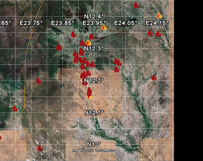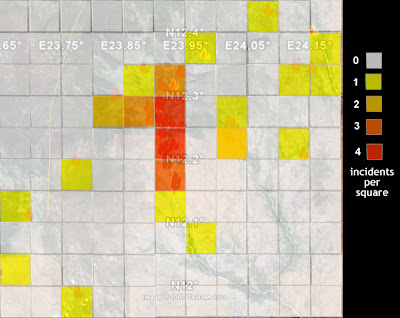
You can pick out individual event placemarks on the edges but in the middle its difficult to see what is going on. If we convert it to a density map we get:

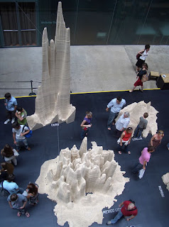
 I've counted the incidents in each square and coloured them accordingly in a process known as aggregation. You lose information about where each placemark is but gain clarity as you get rid of the overlapping placemarks. Take the idea to the extreme by plotting millions of placemarks (representing people), extend the 2D presentation to 3D and make into a wooden model to get the image on the leftk. It's a population density map of London, Cairo and Mexico city currently on display in the Tate Modern, London. Statistical display or Art? I don't know but I thought it was fun at the very least, I visited on Sunday.
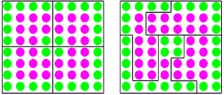
It is not all positive though. Gerrymandering is the process by which incumbent politicians move electoral boundaries to strengthen their positions. In a similar way, by changing shapes, moving boundaries or joining squares together we can manipulate data unfairly. The image below illustrates Gerrymandering, green and pink voters are equally split in the left of the image, on the right boundaries have been manipulated so that three of the areas are pink dominated with only one area being green dominated.
 To conclude, converting lots of placemarks to a density map can add clarity but its possible to manipulate data in this way. With Google Earth we have a unique opportunity as we can show a density map and then show we haven't aggregated it unfairly by plotting the base placemarks for people to turn on and browse if they wish.
No comments:
Post a Comment