The geologist was yours truly of course. My solution to the problem was to plot out some data in a clever 3D ribbon graph in XL, it didn't really show anything but it looked very flash. At the meeting with Water Affairs my bosses got panned, 'Why are you plotting this in 3D? It makes it more difficult to see what's going on. Why are we paying you to collect all this hydrochem data anyway?'. My Lords and masters were not happy but at least they never let me near anything to do with hydrochemistry again.
The broader message is that you have to be careful with 3D graphics. The "End Mountain Top Removal" project (Google Earth layers column > global awareness > Appalation Mountain Top Removal ) works very well because you can see the mountains they are talking about in wonderful 3D, however, I've seen 3D histogram plots in Google Earth that, just like my ribbons, are worse than the 2D alternative. Over at Urban digital Andy and his team have been experimenting with some 3D maps, I love the look but have mixed feelings about them as ways to convey information, for example, I can't see the 3D really adds anything here.
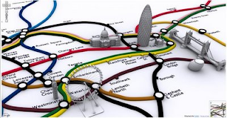
A 2D map of the regions with just the shading is no worse and the 3D nature makes it more difficult to see all the data at once. However, I do like the 3D icons on the tube map below - at a glance a tourist can work out which sight they want to go to and how to do it on the tube.

I spend so much of my time looking at maps I don't even notice the work my brain is doing translating a representational map into reality but for a someone who doesn't use maps regularly I think the graphic also helps understanding as less 'translation' is necessary.
I do think we all need to remember that simple is sometimes best and to be careful not to get carried away by flashy presentation but this post isn't meant as criticism of Andy and his team. The graphics themselves are well put together (I love the toothpaste look of the tube routes) and it seems to me that they are proving what is possible with sketchup and Google Earth. The techniques they are exploring are useful tools for all of us.

No comments:
Post a Comment