Readers will probably have spotted that this blog deliberately avoids discussing the whizz techy aspects of Google Earth. That kind of topic is well covered elsewhere, my particular niche in the blogosphere is usually about discussing how to use the simple tools better rather than about linking in your real time location to a weather map using your Nokia N95 via the inbuilt GPS and WiFi functionalities (no I don't own an N95, but I do covert them).
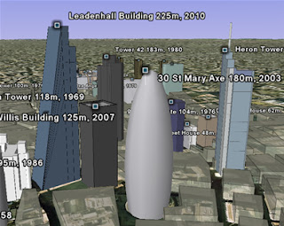
However, today we’re discussing a fairly advanced tool in the Google Earth suite; the timeline. This is a screenshot from a really good example using the timeline;

( kmz file )
Its 3D models of the 60 tallest structures built since 1950s in
A couple of points about the timeline. Firstly, its pretty fiddly to use, I tested it out on a student last year on a project I was working on and I had to abandon using Google Earth for that particular project. Its not very intuitive e.g. the range bars and its not obvious that you can click and drag the time range about. A tip for using it for yourself; with a big data set first drag the range bars to either end of the time range. This loads up all the data (you can see data still loading from the little circle icons in the places column). Once you have all the data the timeline will behave itself but if you press play before all the data has downloaded layers won't appear as the timeline moves through the years. I hear that the functionality for timelines existed for quite a while before Google finally released it because they couldn't get the user interaction sorted. IMHO they still haven't nailed it.
Secondly, I've seen timelines used in situations where they fail to tell a compelling story. In the Avian flu project kml file it neatly shows the spread of avian flu around the globe from SE Asia to Asia and
To conclude, the timeline is well worth using in Google Earth projects, however, it is a little for your users to control.
No comments:
Post a Comment