"Nobody cares about you or your site.In this case what goes for the web, goes for the geo-web except that 'purchases' are rare and problem [4] isn't well developed in the geo-web yet (although Healthy Planet seems to be a good start).Really. What visitors care about is solving their problems. Now. Most people visit a web site to solve one or more of these four problems:
- They want/need information
- They want/need to make a purchase / donation.
- They want/need to be entertained.
- They want/need to be part of a community.
Too many organizations believe that a web site is about opening a new marketing channel or getting donations or to promote a brand or to increase company sales by 15%. No. It’s about solving your customers’ problems. Have I said that phrase enough?"
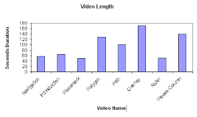
A good illustration is my recent video tutorial, in it I used a series of videos embeded in Google Earth, users were not restricted to an A to Z navigation system through the videos but it was designed with this in mind. Lovely Youtube hosted them for me and kept track of the hits. This graph shows the length in seconds of each video by title
 As you can see the total length of the set is less that 13 minutes long and I would expect you could complete the whole tutorial in 1/2 to 3/4 of an hour. So, having gone to the bother of downloading the file and booting up Google Earth, how did people fare going through the material?
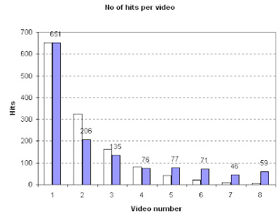
Graph of Video Hits vs Position in Tutorial.
Purple bars are data (black numbers show data values), transparent bars show a 'half life' curve where the number of users progressing to the next video is halved each time. Numbers here relate to the order of videos and refer to the same videos as in the first graph.
The graph shows pretty well that users have almost no attention span on the geo-web, fully 7/8 of them had given up without watching more than 3 minutes video (only 76 of the 651 got to video 4) which translates to total time spent on the tutorial of probably less that 10 minutes . I don't think all these users are the kind of person who cannot avoid changing TV channel every 30 seconds, no, I think they found that my tutorial did not 'solve their problems' so they clicked onto something new without completing the tutorial.
This is why design issues matter; even a small glitch can dramatically reduce the total user time spent on your Google Earth Project.
Further Analysis of the Results: The graph varies quite widely from a half life curve in the lower reaches of the tutorial. I put this down to a number of factors:
This is why design issues matter; even a small glitch can dramatically reduce the total user time spent on your Google Earth Project.
Further Analysis of the Results: The graph varies quite widely from a half life curve in the lower reaches of the tutorial. I put this down to a number of factors:
- Users coming across my tutorial not via Google Earth but via Youtube in which case I presume they dived into the topic area they were most interested in, wondered what the damn thing was about (the clips don't make sense on their own) and navigated away. They wouldn't be affected by the order of videos in GE so would contribute hits randomly across the set.
- Navigating to what interests them instead of what is next. An example is video 6 which is about overlays, from my first batch of videos I know this is a popular topic for users to access.
- I ran a tutorial with 40 undergraduate students using the videos, I imagine the possibility of the material being on the exam drove my students through more of the tutorial than the average member of the public would have done which would have skewed the results.
No comments:
Post a Comment