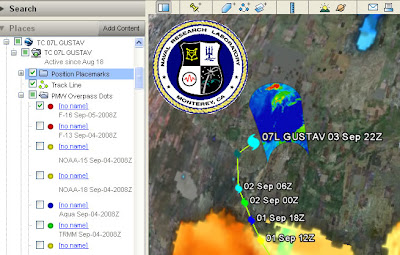
Screen shot of the Google Earth project showing satellite data for hurricane Gustav
I'm too busy to give this a full review but here's some points you can see from the screen shot.
- Introduction: Its there, but its overlong. Text is black on a dark gray background which is difficult to read. There is a link to a 28 page instruction manual, I'm afraid its difficult to get the public to read 28 sentences about how to use your project let alone 28 pages.
- Acronyms: TC 07L, PMW, F-16 and TRMM acronyms are all visible on screen, the public won't know what they mean.
- Shield: The Naval Research Laboratory shield screen overlay is too big and busy. You can turn it off and the design may be out of control of the people putting the file together but they could have reduced it in size or made it semi transparent.
- Rollover behavior: The blue inset screen you can see right and below the shield appears when you roll your mouse over a red dot ('no name' title in the places column). Its remotely sensed data but the key to the data is held elsewhere. It would be better to put it in a pop up window that works with a toggle click for on/off. Keys should automatically appear with the data that they apply to.
- No name: What are the red, yellow, green and blue circles in the places column? They are in the PMW Overpass Dots folder but have no names. There is no information in the icons themselves (i.e. they aren't shaped like a satellite to give us a visual clue). There is gray text information about what they are but mostly it's in acronyms and gray text gives the visual message 'extra non crucial information', it would be better to rename the titles.
- Orange Gulf of Mexico? (bottom of image). It's that color because its showing sea surface temperature. You click a link from within a pop up box and, without warning you, a new KMZ file opens, named (in this case) "20080902.0000.ghrsst.sst.global (1440)". Now, if you're smart you can interpret this as a global image taken on 2nd Sep 2008. But you probably won't know SST is sea surface temperature. The file also appears without an associated key so you can't work out what the colors mean. If data pops up in a separate kmz file like this the user should be warned so they can find it if they want to turn it off.
LATER: In archiving the project for my records I found bits and pieces I hadn't seen earlier (as I said, I did this at speed because of time pressures). That made some of the points I'd made unfair so I rewrote the post correcting these points and also making the language more neutral than it was in the original. If anyone saw the original, I withdraw my comments.
No comments:
Post a Comment