 Screenshot of the Google Earth track. Click to expand
I don't like:
Symbols: They've used the standard meterological symbol for wind which works when its on its own surrounded by empty space but when the symbols are packed together you can't differentiate them from one another nor work out what direction the wind is from easily.
Color: The key is truly wierd, red denotes wind speeds of 30 - 35 and 50 - 55 knots
Icons: The plane icon is way to busy, it should be a lot simpler and it is fixed with the screen so if you move the map so South is at the top the plane looks like its flying upside down.
So I've mocked up an improvement:
 Screenshot of my improved version. Click to expand
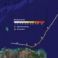
Wind Speed: I've introduced a better key, the color of the track denotes windspeed and I gave it a gray halo so that the color of the track is more visible. I could have just made the line a lot wider but this would have meant complications when lines cross.
Wind Direction: Small black marks with white halos denote wind direction (black with a white halo will stand out on any background). You could use mark length to denote wind speed but I think this would get messy when flight direction, wind direction and wind speed all changed at the same time. I also removed a lot of the marks, cutting down the number of symbols makes it a lot clearer. Of course you could always add them back in using the region function of Google Earth.
Flight Time Labels: These give you 3 sorts of information, you can see the relative speed of the flight, it gives you a sense of plane direction as well as the obvious flight time itself.
I haven't converted the whole track (and frankly, I'm not sure I've done it right now because the original was confusing) but I think you can see my points.
I'm going to review this whole project properly soon but thought I'd post this initial work now.
6 comments:
The colors in the legend for wind that I am using are those that the Naval Research Laboratory (NRL - http://www.nrlmry.navy.mil/tc_pages/tc_home.html) use. They even use wind barbs like mine in Google Earth for scatterometer measurements. The color palette is a bit unusual, but I liked the idea of going with something people might be familiar with. I might change that in the future though since you are not the first to bring the color choice to my attention.
The plane icon is rather difficult to get right. The plane icon is actually placed in a manner that denotes the direction of travel. The last two coordinates of the flight path are used to calculate a bearing that is then used to determine the plane icon's heading element in Google Earth. In a 3-D view of Earth, with the common orientation of north, it looks acceptable. In fact, there are actually two plane icons, one is inverted for when the plane travels in the other direction. It does however look a little off even with a north orientation when the plane is heading close to 0 or 180 degrees. I have thought about using a plane icon that would be of an overhead view of a plane, meaning looking directly down at it from above. However, at an angle it would no longer look very good for display. I might make the plane icon a little smaller. In the last day or two I decreased the plane icon's scale by 0.1. I might do that again.
I definitely like the appearance of your suggestion better. However, the current product is designed for functionality. The most important tools are what you get after you click a wind barb. These are the observations at that point, which is the important part of the tool. None of the observations can be left out since they may contain important data in between the 10 minute intervals you note. The additional icons give other important meteorological data from the aircraft that can be viewed in the popup balloons. This tool is mostly designed for weather professionals and hobbyists to have access to the data in a way in which they can easily visualize the location of important observations in relation to the location of that observation in the storm. Since I do provide data to media organizations for broadcast on television, I will have to consider some of the appearance issues that you mention. I had originally thought about making the line's color change depending on the wind speed but thought that it might involve too much additional data that would have to be added to the KMZ file retrieved by the network link. In addition, I thought it might not be noticeable enough. The background gray works well though. Perhaps I will revisit that issue because I really like your line. One line with color coded wind between each interval and slightly larger gray line behind the entire path correct? I would still prefer to increment the color by 5 knots though. Given my current color palette in the legend, I'm not sure how good the line would look with those colors, so it might not be worth it unless I changed the colors in the legend.
The flight times are interesting to look at visually, but if I were to add anything numerical, other than the vortex pressures, I would rather it be an important meteorological observation that I would be drawing someones attention to.
The tool works best when overlaid over high quality visible or black and white IR imagery (available from NRL or to a lesser extent my overlay product) rather than the standard blue ocean of Google Earth. This makes the wind barbs stand out better.
When the wind barbs are packed together, you can denote a wind field by color, which I kind of like. If you see the goldish color in an area, you can easily see the swath of 60+ knot winds. You can zoom in to that area and look for the highest winds as denoted on the wind barb. I made the wind barbs as small as possible when zoomed out, but wanted to make them as large as possible when zoomed in. For the most part, people will likely remained zoomed in to the data most of the time. That allows you to access each observation, usually taken at 30 second intervals. Because the intervals are so short, in order to access the data, you must zoom in significantly or else you will select quite a lot of wind barbs at the same time.
I thank you for your input. I think I will soon write a tutorial about how to best view the data. I think I will wait a bit until I decide if I want to make any significant changes to the output of the program. I do agree that changes could be made, though I have not decided on what would work best given the need to still maintain easy access to the important data. Ideally, I would have something visually stunning like yours and one more detailed for in depth meteorological study of the data like mine, but it would require too much processing on my hosts server I think to have both. If I did, I would have them separate anyways so that I didn't waste bandwidth on both for someone who had a preference over which one they preferred.
It would be nice if Google Earth had an easy way, without significantly adding to the file size, to have the wind barbs be much smaller at a higher altitude. I have yet to find a good way to so that.
Christopher Hollis
Tropical Atlantic
Christopher,
Thanks for your comments, the geo-web is still in its early stages so it really helps when these things can be discussed.
As I said, I'm going to get around to reviewing the project properly soon but a couple of immediate thoughts:
1] I assumed that this was aimed at the general public. If its aimed at skilled hobbyists and professionals then my comments are less valid.
2] Having said that, you could produce 2 versions with a new one aimed at the public which would reap the benefits of greater awareness of the organisation. I certainly think watching a flight occur real time is attractive to the general public.
3] The lines are a thick gray over variable color. I'm not sure how easy this would be to reproduce via GE though - the mock up was done in Fireworks. It would be vector data therefore low bandwidth. Think of putting a semi transparent image overlay in if you want a better background to your project.
4] You can get icons to appear or disappear depending on the view. See
http://googleearthdesign.blogspot.com/2008/06/regions-excellent-feature-if-used.html
So you could block out most of the wind points if the viewer is at altitude.
Rich
html above truncated. Try
http://bit.ly/4wNMYb
Rich
Unfortunately, double lines do not look very good in Google Earth. It's unfortunate that lines don't render "nicer" in Google Earth.
Since the lines can't be drawn in a nice looking way, I would still want the wind barbs to always be displayed so that from a high altitude a viewer can view what the wind field looks like simply by colors. What I would like to do is make the wind barbs different sizes depending on what altitude you are at. Meaning, close up make them much bigger than they are now, somewhere higher up leave them like they are now, and at a certain point up higher, make them much smaller.
Ideally, and the only way I would implement it if it could work, would be to have the icon's scale be set by a single style element. If I could have a region exist in that style element that exists for every wind barb and apply it to the scale, I could easily set the scale depending on your altitude. If that doesn't work, that would mean an enormous amount of additional text, putting too much of a strain on my host. And from what I am looking at about regions, it looks like I would have to have a bounding box and level of detail element for every single placemark.
I was thinking about not showing any barb until you get zoomed in to a certain extent, but the lines would be too hard to look at to determine color if I were to color those at 30 second intervals.
I guess what I would like to do isn't really available in an easy way in Google Earth yet. It would be nice if you could set a placemark's bounding box by the north, south, east, and west distance from the placemark. So, rather than having to calculate a bounding box by calculating 4 coordinates for every placemark, simply have something that says make the bounding box exist 5 degrees to the north, south, east, and west. Then, you could have a single style element contain all the regions for every placemark you have. Each placemark would have a bounding box of 5 degrees in each direction and you could also have the level of detail the same area for every placemark. That would make things enormously easy. I am assuming nothing like that currently exists?
Most of the people who use this will be weather professionals and weather hobbyists. I don't know of anyone using it on television yet like some do with my model plots. In the few times I have seen recon data on television, they usually show popup information with significant observations, which would be unavailable if I took out most of the wind barbs and replaced it with a less frequently displayed placemark. I could have a version with all small wind barbs that would always be hard to see at lower levels, but I'm not sure it would be worth it to process all that data just in case someone used it like that. Chances are, they would simply start out at a lower altitude on air anyway.
The network link is set to update and fly to a low level view every 5 minutes, so aside from loading the data the first time, subsequent views should be closeup if someone just sat back and watched.
I think when I eventually make a tutorial for the recon data I will recommend people use it in conjunction with my overlay product. I put together last year a large amount of satellite overlays. I'll recommend that a visible or black and white infrared satellite background be used. An actual satellite of the storm would be much better than any white background I could ever provide.
Christopher Hollis
Tropical Atlantic
Christopher,
Bounding boxes in regions can cover multiple placemarks. So you calculate a set of tiles for your area which work as bounding boxes, group placemarks into those boxes, if the user flies low over box X then all placemarks in that box appear. A small amount of code therefore saves you having to serve a lot of data.
At high altitude you can set it that only every 10th icon appears. This makes it clearer for the user and also saves you bandwidth.
Finally, have you tested your file on users? pull 3 likely people in and ask them to do some basic tasks on your content for 1/2 and hour each. This is the acid test of any design, we can discuss design endlessly but if one way works for your users then that's the way to go.
Rich
I would like to have all the data in the file when the user requests it. That way they can drag the entire folder out of the network link and know that they have all the information. So I wouldn't want to use the region method for saving bandwidth by only loading some placemarks.
I still want people to be able to see where the highest wind is from a high altitude. Since thick lines do not look good in trying to see where the highest wind is by color, the only thing I can do is display every placemark. If I leave some out, I might be leaving out some of the highest winds. If I had multiple bounding boxes, then I would have some icons showing and others not, which would look a little off.
As for multiple placemarks in a bounding box, I realize you can do that, but it would take a lot of code. If I wanted larger placemarks when you are more zoomed in and smaller placemarks when I am further zoomed out, I would need to have two of every placemark in the file, plus the region code, which would be too much. I tried a little of that today. While it would work, it just takes too much code.
I don't think there are any improvements I can make right now. Until Google Earth allows icons to be more easily scaled depending on altitude without using a lot more code, anything I do would make the file size too large.
Post a Comment