Wednesday, February 27, 2008

Regions Solution

I've long been suspicious of regions as a solution to data overload. The basic idea is that you can define an altitude above which placemarks are not visible but below which they appear. This meets two separate needs, firstly it is a way of avoiding visual clutter on screen, secondly it means large data sets can be viewed without loading all the data at once. Neat.

The problem is that users with a low IT literacy skills may not realise regions are operating, they can click a layer in the places column and be annoyed that nothing appears because they are at too high an altitude to load the placemarks in. To my high IT literate readers this may seem a petty point surely they'll explore and find the placemarks popping up? No. They might not. They might click away and find the secret middle section to the magic roundabout theme tune*. In which case you've lost them.

I have a solution. Below is a zoomed-in a view of the Dafur default layer** which uses regions, notice the red one out on its own center of the image.
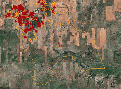

If you zoom out it will dissapear. But in its place a translucent magnifying glass placeholder tells you there is something worth zooming in to see in the square region it marks. Obviously this works best when there are multiple placemarks hidden under the magnifying glass placeholder.
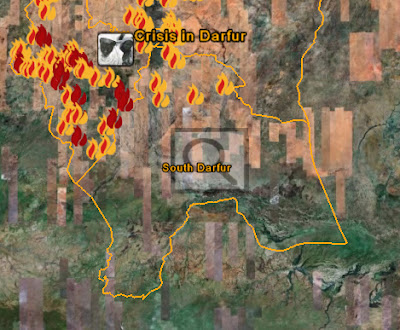

The magnifying glass image overlay can be tagged with its own region so it appears at an altitude above the one where the placemarks appear. It should also be explained in an introduction otherwise users won't understand what it means which is as bad as it not being there in the first place.

*Non UK readers will struggle to understand the humour to this.
**Disclosure: I'm currently doing some consulting for USHMM on Google Earth.
Tuesday, February 19, 2008

Design Example: Wetlands

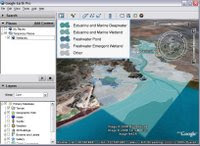
So over at Using Google Earth recently John posted a Google Earth project for use in a presentation about a conservation situation: authorities are seeking to place a landfill site in a sensitive area in California. It took me back to my masters degree in hydrogeology where we spent a lot of time looking at landfill design so I thought it would be an interesting case study: how would you convert John's file so it could be published as a web resource for the public?


Here's the original KMZ and here is my reworking

What I did:
  1. Allow users to see some of the file structure, the original was just a closed folder which is fine for a presentation but doesn't encourage exploring when put on the web.
  2. Change the name of the 'wetlands' placemark to 'introduction' and to give it a more meaningful camera icon - its main content is the photos and it serves well as an introduction to the project.
  3. I marked out the proposed landfill site in purple with a black outline. This allows it to be easily distinguished from the background terrain and the other overlays without making it too bright (I tried red as a fill but it was too much).
  4. Marked a series of zones on the map to give the user a sense of scale. These are simple rectangles but they would be better as 'buffer zones' (tutorial) showing all regions within 1km, 2km and 3km of the boundary of the landfill site. To generate these you need to use a true GIS package.
  5. I turned off the boundaries of the land use types as they were different colors and so confusing to the eye. If I had the time I would have changed them all to be black and put them back in.
  6. I also turned off the 'other' class of land use as I wasn't sure what it really was showing, strictly it should be everything else in the view but it wasn't.

Useful links for more discussion of these points:
Other Project Reviews by me
Dafur
Tree cover project reviewed in my talk

Further discussion about risk zones
: I said buffer zones would be better than the rectangles, in fact even these could be improved upon to explain risk. What you really want is a model which takes account of tidal flows, the river flow and other factors to identify the risk of pollution at any point in the view. Without any modelling at all you can see that the hills are at zero risk of being polluted and it would be pretty difficult for the pollution to flow up river, most of the risk would lie downstream even into the sea beyond.

Wednesday, February 13, 2008

Craft of Google Earth?

On the Thinking aloud radio 4 (UK) program recently they discussed the idea of craft in modern society. Of the notable points they made were several relevant to design of Google Earth projects:

- Comparisons were made between computer programmers and traditional crafts such as pottery, musicians and architects. All of them require a detailed knowledge of related areas and to learn them requires constant experimentation and making mistakes. This is certainly true of building Google Earth (GE) projects, I know a lot about drawing icons because icons are important in GE projects. As for making mistakes, I'm always tinkering about with things that don't quite work in GE to get them looking right, I rarely know the 'right' way to do something complex before I start. One commentator even went so far as to carve 'creativity is making mistakes' in the concrete beam of his studio.

- Many craft people talk of knowledge and memory embedded in their hands. I told my Google Earth students this as a way of encouraging them to go out and experiment, if they don't practice building GE projects they are going to forget everything I've shown them very quickly.

- The discussions also involved discussing computer aided drawing and how it had affected architecture. Commentators felt that this introduction of technology has led to users forgetting about good design because they became infatuated with the tools. Another example is the appearance of microwaves in kitchens, remember all the fuss about the wonderful things you could do with this tool? It was only after lots of use we realized what its truly good for: warming up leftovers and cooking baked potatoes quickly. It's only after some time and experimentation that a community discovers what the tools can be best used for and starts producing valuable items again. IMHO we are well and truly in this period with virtual globes, I see lots of examples where I end up thinking someone just whacked a lot of data into GE because they thought it would be 'neat' rather than really thinking of what GE is actually good at doing to their data.

Monday, February 4, 2008

Powers of 10

This film about the very small to the very large popped into my head last week, I remember being fascinated by it as a child which is probably linked to my current interest with Google Earth. It was created by Ray and Charles Eames who were brilliant designers in a range of areas.


I thought it would be interesting to try and recreate the squares so you could fly through them in in Google Earth with the film itself as a placemark. Unfortunately a cycle track runs through the area of the original picnic - blasphemy! IMHO there should have a plaque there to commemorate the site :) (maybe there is?). To deal with the cycle track I put in a couple of screen shots from the film as overlays at the one to ten meter scale. Its for fun so I did the squares by eye rather than calculate them precisely, for example the last 10,000km square is a fair bit smaller than the stated scale, it's as large as I could make it. You are limited to only a few orders of magnitude by the scale of Google Earth but it was still fun to do.

Powers Of 10
(Note: you may have to right click, 'save as' and then open the file from the saved location - I have an unresolved problem with it not opening automatically from my browser)

The fame of the film seems to be continuing, for more details click here.
______________________

Later: Frank of Google Earth Blog just emailed to say what I thought was a browser problem with the file (and hence local to me) is a MIME type error. I've replaced the link to one to his servers above, he's done some work on improving it too.