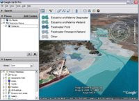
Here's the original KMZ and here is my reworking
What I did:
- Allow users to see some of the file structure, the original was just a closed folder which is fine for a presentation but doesn't encourage exploring when put on the web.
- Change the name of the 'wetlands' placemark to 'introduction' and to give it a more meaningful camera icon - its main content is the photos and it serves well as an introduction to the project.
- I marked out the proposed landfill site in purple with a black outline. This allows it to be easily distinguished from the background terrain and the other overlays without making it too bright (I tried red as a fill but it was too much).
- Marked a series of zones on the map to give the user a sense of scale. These are simple rectangles but they would be better as 'buffer zones' (tutorial) showing all regions within 1km, 2km and 3km of the boundary of the landfill site. To generate these you need to use a true GIS package.
- I turned off the boundaries of the land use types as they were different colors and so confusing to the eye. If I had the time I would have changed them all to be black and put them back in.
- I also turned off the 'other' class of land use as I wasn't sure what it really was showing, strictly it should be everything else in the view but it wasn't.
Useful links for more discussion of these points:
Other Project Reviews by me
Dafur
Tree cover project reviewed in my talk
Further discussion about risk zones: I said buffer zones would be better than the rectangles, in fact even these could be improved upon to explain risk. What you really want is a model which takes account of tidal flows, the river flow and other factors to identify the risk of pollution at any point in the view. Without any modelling at all you can see that the hills are at zero risk of being polluted and it would be pretty difficult for the pollution to flow up river, most of the risk would lie downstream even into the sea beyond.
No comments:
Post a Comment