In some situations the Google Earth background imagery is either redundant or of lesser importance than the information overlaid on it. It would be good to be able to have control over this layer and selectively bring it in or out of the display. I envisage a slider control allowing you to change either or both the colour strength of the background (fadeout) or the transparency of the overlay(s). An example of the effectiveness of this approach (although not currently
 user-controllable) is the hydrid layer on the new Multimap interface . When you select the hybrid layer it will produce a map with both the background satellite imagery and the data as an overlay (an overlay is a separate layer). The data overlay comes as a scrollable window with a fixed transparency, which interactively shows a transparent map “window” overlying the imagery, neatly making it possible to use the information on both layers. Imagine a combination of this window overlay, with selectable transparency, and including the ability to interactively zoom the two sets of detail at an enlarged (and variable?) size. Wizzy for the sake of it? Or possible an aid to understanding and interpreting the data? ArcGIS Explorer and Google Earth can certainly set transparency levels for overlays (Google with a on-screen transparency slider control), but I don’t think you can adjust the background in any way in either of them.
One of the problems of the penetration of Google Earth is that there is a sort of ‘must use Google Earth’ mentality nowadays. I would actually say that there are many situations where not even thinking of integrating into GE is the way forward – putting on cartographer’s hat for a moment – because the aerial imagery actually gets in the way of the message. It’s a bit off-topic but one of the most effective new map displays that I have seen recently is that for the new Wembley Stadium website. This uses Flash to map in movie format the various transport links to the new stadium. Plane, bus, train, etc versions of access details absolutely pared down to the minimum of data, but in my view a superbly clear illustration of clarity and fit for purpose mapping.
Is there anything in the way Google Earth works that is bad in a cartographic sense?
There is plenty that is good – socially in particular. It is quite possible that the average person’s understanding of the world, and it’s problems, is enhanced by seeing stuff displayed in Google Earth format. Many people are acknowledged as being poor at reading and understanding flat paper maps, with their complicated system of symbols, keys, scales and orientation. I have no empirical evidence of this, but I suspect that seeing something in 3D with photographic imagery that may be more recognisable to the viewer than a traditional map, and then overlayed with some other data, has much better chance of being assimilated and understood. This is particularly so when the ability to zoom, rotate and tilt the resulting images is taken into account.
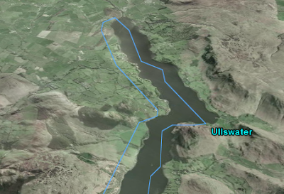
On the other hand, presentation of material via Google Earth does have it’s downside. The variations in image date/quality produce annoying problems when looking at less-populated areas of the world (try zooming in on Greenland). The default coastline that is shown as an overlay until zoomed way in can be spectacularly inaccurate in some areas of the world, as can internal boundaries which due to the level of generalisation do not follow their obvious natural features that define them (for instance rivers). Were these data not compiled from Google imagery?
 (An example of a misplaced boundary, the lake edge of Ullswater in the UK Lake District. Courtesy of Google Earth, added by RT)
Just taking at random a Google Earth layer that I noted the other day, there is an impressive amount of data on the US Federal Lands layer. However, the data is virtually un-interpretable if you are zoomed to a view that covers the whole of the area (9 Western US states). This is because the symbolisation (colours, line widths and spacings) were presumably designed for display at higher zoom levels. But the user is able to choose their own display size. This would just not happen in a traditional map as everything would be designed by the cartographer for clear display and interpretation at the particular scale chosen to depict the area.
How do you think our use of virtual globes is going to change in the future and does this threaten cartography as a subject area?
The first part of that question is hard to answer. I have a particularly poor record as a seer, and I am not sure I want to try to find an answer. I do feel that virtual globes, and the aforementioned “community cartography”, do threaten cartography as a subject. We have already seen (in the UK at least) a decline in the numbers of companies in the field of making maps, and thus employment opportunities in traditional cartography being severely constrained. This has rippled through into education with the virtual extinction of cartographic training courses in the UK. My view is that cartographers have got to change with the world if they and their discipline are to survive and have any relevance. Lateral thinking, encompassing new skills, and trying to get into positions to influence developments, are all ways to do this. Remember the demise of Rotring pens and scribing was not the end of cartography, it just was a signal for a change in methods. Similarly, I do feel that working to influence design in the new cartographies is where we can find interesting and stimulating outlets for our experience and skills. At one level I hope that the work of the Google Earth Design blog, and any contribution myself or other cartographers may have to it, will be part of this process.
5 comments:
Rich,
Great second post, definately provides some food for thought. I agree that cartographers definately need to grow with the changes. In my graduate school all my cartography classes focussed on digital cartographic methods, but more importantly how to create thematic content using GIS. There is definately a different face to geography.
Maybe someone with a a Cartography background could come up with a reading list for neogeographers?
Good idea Chad, I'm not strictly a cartographer but I'll see what I can do.
Rich
Chad,
That is such a hard thing to do. I have found very few basic GIS books I would recommend to anyone. Cartography is a little different, but the digital cartographic angle is a little different.
I guess I would look at the ESRI press slim book series, and some good cartographic design or even design books like tufte. But the principle idea would be to educate them better on relationships of space and place, not just how to display data.
Aaron W. VanWieren
www.gisdevcafe.com
yes Tufte is always a good idea. However two cartography books I would recommend:
a) Borden D. Dent. (1999) Cartography: Thematic Map Design. McGraw-Hill
and more in an entertaining way but still presenting the basics:
b) Mark Monmonier (1996): How to lie with Maps.
(there is also a newer book from 2001: Bushmanders & Bullwinkles: How Politicians Manipulate Electronic Maps...)
there is also THE engl. classic book of cartography:
c) AH Robinson et al. (1995): Elements of Cartography
further books exists: e.g. by Slocum and McMaster et al (2004): Thematic cartography and geographic visualization
Post a Comment