Wednesday, August 29, 2007
Folders as Picture Frames
By Picture Frame I mean that you arrange a number of items that make up a logical view and put them in a folder. You could also think of a picture frame folder as a map. With a paper map layers cannot be turned on and off, this can be achieved with folders by deselecting the 'allow this folder to be expanded' tick box in properties.
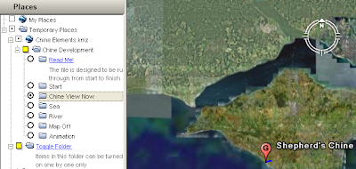
This is a screen shot of a project where I did just that. I created the 'Chine Development' folder and selected the 'show contents as options' tick box in properties. I then created a number of folders each with a some elements (placemark, overlay) inside that made up a 'picture frame'. The radio buttons you can see alongside the sub folder icons tell you that only one of the sub folders can be selected at once and I made it so that sub folders cannot be expanded.
I've posted before about needing to convert the tour of this project to a video, however, the folder structure shown above works just fine to create picture frames. Maybe picture frames are a good way of presenting the best of your project? You could cherry pick your data, arrange the data elements into picture frames and publish a set of them as a data summary (rather than an introduction which you should have as well). The rest of your data could be published separately for the power users to explore.
Friday, August 24, 2007
Embedded Videos
I still like the idea, hearing that you can get YouTube videos into Google Earth via Ogle Earth I thought I would experiment a little. Here's the result;
YouTube educational experiment
I think it works well. I've included a placemark for Tenbury as its very close to my parents house, the flash floods in the river at the bottom of their garden this summer in the UK have been the worst they've known in 40 years. The problem with this for my fieldwork example is that students will be offline with the tablets so although you could get the placemark in Google Earth, you couldn't get the video. Sad.
From a design point of view, I think this could be very useful but I can also foresee lots of instances where people thoughtlessly create links like this with thinking;
- Does adding video really add value in terms of understanding?
- Could I do it better with an image in a pop up? (adding video is a big drain on bandwidth and won't be available offline as an image from a .kmz would be)
- Does the video really have a strong geographical link to the placemark?
Thursday, August 23, 2007
New Photo Viewer
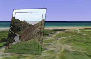
It has a new photo viewer that is similar in function to Urban Digital's panorama viewer . I've been experimenting with it to create an educational resource. The background is that I work for a school of geography so identifying features from landscape photos is useful for teaching our students.
The screenshot shows a photo 'screen' I've placed in front of the location where the photo was taken, the photo is of a site we used in our mobile Google Earth project . If you open the file there are two photos you can access, one for you to interpret and one with the answer. The photos are taken with a normal 7 mega pixel camera, you don't have to use a gigapixel camera to make use of the functionality, you can zoom in and examine the image and see more detail than in the original view of the photo.
Some Observations:
- Using windows its still a bit flakey, I crashed Google Earth playing around with the viewer and folders yesterday.
- When viewing an image you move into a 'photo viewer', mode. I think a better signal that you are not in normal viewing mode is needed, IMHO it would work better if the rest of the screen were 'greyed' out when you are in this mode.
- This location isn't a wonderful example, the topography is quite complex but small in scale. The valley that can be seen in the photo isn't apparent behind the picture because the terrain data at this point is not accurate enough to render the valley properly.
Monday, August 20, 2007
Good Design takes Time(lines)
Readers will probably have spotted that this blog deliberately avoids discussing the whizz techy aspects of Google Earth. That kind of topic is well covered elsewhere, my particular niche in the blogosphere is usually about discussing how to use the simple tools better rather than about linking in your real time location to a weather map using your Nokia N95 via the inbuilt GPS and WiFi functionalities (no I don't own an N95, but I do covert them).
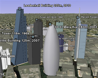
However, today we’re discussing a fairly advanced tool in the Google Earth suite; the timeline. This is a screenshot from a really good example using the timeline;
( kmz file )
Its 3D models of the 60 tallest structures built since 1950s in
A couple of points about the timeline. Firstly, its pretty fiddly to use, I tested it out on a student last year on a project I was working on and I had to abandon using Google Earth for that particular project. Its not very intuitive e.g. the range bars and its not obvious that you can click and drag the time range about. A tip for using it for yourself; with a big data set first drag the range bars to either end of the time range. This loads up all the data (you can see data still loading from the little circle icons in the places column). Once you have all the data the timeline will behave itself but if you press play before all the data has downloaded layers won't appear as the timeline moves through the years. I hear that the functionality for timelines existed for quite a while before Google finally released it because they couldn't get the user interaction sorted. IMHO they still haven't nailed it.
Secondly, I've seen timelines used in situations where they fail to tell a compelling story. In the Avian flu project kml file it neatly shows the spread of avian flu around the globe from SE Asia to Asia and
To conclude, the timeline is well worth using in Google Earth projects, however, it is a little for your users to control.
Thursday, August 16, 2007
Can't See the Wood for the Gerrymandering
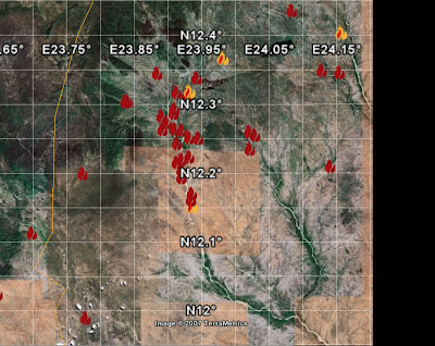
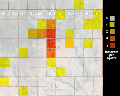
You can pick out individual event placemarks on the edges but in the middle its difficult to see what is going on. If we convert it to a density map we get:
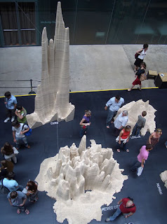
I've counted the incidents in each square and coloured them accordingly in a process known as aggregation. You lose information about where each placemark is but gain clarity as you get rid of the overlapping placemarks. Take the idea to the extreme by plotting millions of placemarks (representing people), extend the 2D presentation to 3D and make into a wooden model to get the image on the leftk. It's a population density map of London, Cairo and Mexico city currently on display in the Tate Modern, London. Statistical display or Art? I don't know but I thought it was fun at the very least, I visited on Sunday.
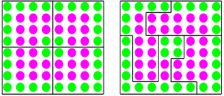
It is not all positive though. Gerrymandering is the process by which incumbent politicians move electoral boundaries to strengthen their positions. In a similar way, by changing shapes, moving boundaries or joining squares together we can manipulate data unfairly. The image below illustrates Gerrymandering, green and pink voters are equally split in the left of the image, on the right boundaries have been manipulated so that three of the areas are pink dominated with only one area being green dominated.
To conclude, converting lots of placemarks to a density map can add clarity but its possible to manipulate data in this way. With Google Earth we have a unique opportunity as we can show a density map and then show we haven't aggregated it unfairly by plotting the base placemarks for people to turn on and browse if they wish.
Tuesday, August 14, 2007
How To Make A Video Introduction
Ingredients (for PCs on XP):
1. A decently fast computer with a good graphics card. Hardware isn't really my area of expertise but I can tell you that this technique doesn't work on my Latitude D610 laptop but does on my dual core desktop Optiplex 745 PC.
2. Fraps, an application which allows you to record video and audio off your screen.
3. Freebie windows movie maker.
4. The free version of Google Earth
5. A place to upload video, I use you tube
5. Optional: A 3DConnexion space navigator mouse or joystick may help you fly around in GE.
Set up the Google Earth project you wish to video, a practise fly through is very useful. Set up Fraps to record, it will record the 'frame rate' as a number in a corner of the screen. Your computer will be working at a mad dash to render (technical word for 'draw') the google earth view AND to record it on video for you, the higher the frame rate the more smooth your final video will be. If the frame rate is low and your video jerky you can help your computer by reducing the size of video Fraps captures.
Once you have recorded your video it will be in uncompressed *.avi format. Using movie maker you can save it as a compressed .wmv file which will make it a reasonable size, an uncompressed .avi video on the web would involve long download times - they really are huge files.
You may wonder why I don't use Google Earth Pro since it does video recording. I wouldn't recommend it, I have tried screen recording with GE pro, Camtasia, Fraps and Captivate and for recording Google Eartj Fraps is by far the cheapest and best. Having said that, I tried Fraps out on another PC with a good graphics card and it was recording on 2 frames per second (fps) which is so bad its not worth doing and I know Andy had problems with Fraps when he upgraded to Vista .
Friday, August 10, 2007
The Farmer and the Cowboy should be friends
"Complaining that neogeographers don't know their Peters projection from their Mercator projection is like complaining that car drivers these days don't know how to crank-start an automobile."which is a wonderful put down but hides the bigger point, some maps put together by neo-geographers maps are wincingly bad, but without the neo-geographers computer maps (be it GIS or other) would still be limping lamely into the future dominated by the whims of ESRI.
The fun of cross fertalising ideas to both groups is pretty much the raison d'etre of this blog.
Thursday, August 9, 2007
Steve Chilton Interview part II
In some situations the Google Earth background imagery is either redundant or of lesser importance than the information overlaid on it. It would be good to be able to have control over this layer and selectively bring it in or out of the display. I envisage a slider control allowing you to change either or both the colour strength of the background (fadeout) or the transparency of the overlay(s). An example of the effectiveness of this approach (although not currently user-controllable) is the hydrid layer on the new Multimap interface . When you select the hybrid layer it will produce a map with both the background satellite imagery and the data as an overlay (an overlay is a separate layer). The data overlay comes as a scrollable window with a fixed transparency, which interactively shows a transparent map “window” overlying the imagery, neatly making it possible to use the information on both layers. Imagine a combination of this window overlay, with selectable transparency, and including the ability to interactively zoom the two sets of detail at an enlarged (and variable?) size. Wizzy for the sake of it? Or possible an aid to understanding and interpreting the data? ArcGIS Explorer and Google Earth can certainly set transparency levels for overlays (Google with a on-screen transparency slider control), but I don’t think you can adjust the background in any way in either of them.
One of the problems of the penetration of Google Earth is that there is a sort of ‘must use Google Earth’ mentality nowadays. I would actually say that there are many situations where not even thinking of integrating into GE is the way forward – putting on cartographer’s hat for a moment – because the aerial imagery actually gets in the way of the message. It’s a bit off-topic but one of the most effective new map displays that I have seen recently is that for the new Wembley Stadium website. This uses Flash to map in movie format the various transport links to the new stadium. Plane, bus, train, etc versions of access details absolutely pared down to the minimum of data, but in my view a superbly clear illustration of clarity and fit for purpose mapping.
Is there anything in the way Google Earth works that is bad in a cartographic sense?
There is plenty that is good – socially in particular. It is quite possible that the average person’s understanding of the world, and it’s problems, is enhanced by seeing stuff displayed in Google Earth format. Many people are acknowledged as being poor at reading and understanding flat paper maps, with their complicated system of symbols, keys, scales and orientation. I have no empirical evidence of this, but I suspect that seeing something in 3D with photographic imagery that may be more recognisable to the viewer than a traditional map, and then overlayed with some other data, has much better chance of being assimilated and understood. This is particularly so when the ability to zoom, rotate and tilt the resulting images is taken into account.
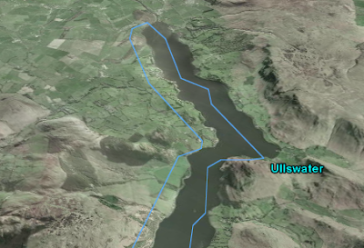
On the other hand, presentation of material via Google Earth does have it’s downside. The variations in image date/quality produce annoying problems when looking at less-populated areas of the world (try zooming in on Greenland). The default coastline that is shown as an overlay until zoomed way in can be spectacularly inaccurate in some areas of the world, as can internal boundaries which due to the level of generalisation do not follow their obvious natural features that define them (for instance rivers). Were these data not compiled from Google imagery?
(An example of a misplaced boundary, the lake edge of Ullswater in the UK Lake District. Courtesy of Google Earth, added by RT)
Just taking at random a Google Earth layer that I noted the other day, there is an impressive amount of data on the US Federal Lands layer. However, the data is virtually un-interpretable if you are zoomed to a view that covers the whole of the area (9 Western US states). This is because the symbolisation (colours, line widths and spacings) were presumably designed for display at higher zoom levels. But the user is able to choose their own display size. This would just not happen in a traditional map as everything would be designed by the cartographer for clear display and interpretation at the particular scale chosen to depict the area.
How do you think our use of virtual globes is going to change in the future and does this threaten cartography as a subject area?
The first part of that question is hard to answer. I have a particularly poor record as a seer, and I am not sure I want to try to find an answer. I do feel that virtual globes, and the aforementioned “community cartography”, do threaten cartography as a subject. We have already seen (in the UK at least) a decline in the numbers of companies in the field of making maps, and thus employment opportunities in traditional cartography being severely constrained. This has rippled through into education with the virtual extinction of cartographic training courses in the UK. My view is that cartographers have got to change with the world if they and their discipline are to survive and have any relevance. Lateral thinking, encompassing new skills, and trying to get into positions to influence developments, are all ways to do this. Remember the demise of Rotring pens and scribing was not the end of cartography, it just was a signal for a change in methods. Similarly, I do feel that working to influence design in the new cartographies is where we can find interesting and stimulating outlets for our experience and skills. At one level I hope that the work of the Google Earth Design blog, and any contribution myself or other cartographers may have to it, will be part of this process.
Tuesday, August 7, 2007
Steve Chilton Interview
You are Chairman of the Society of Cartographers in the UK, how would you compare cartography to neo-geography and GIS?
I have been working in this field for a good number of years, and have seen many changes over time. When I started as a cartographer Rotring pens and scribing tools were our stock in trade. The Society of Cartographers (as the Society of University Cartographers actually) was started in the UK in 1964 because it was realised that many cartographers were working in isolation in their one-person or small units and that a forum for communication of techniques and sharing of new ideas would be really beneficial. So, the Society’s aims were set as “fostering and encouraging the study of cartography in all its aspects, and in particular, promoting and maintaining high standards of cartographic illustration”. These aims have been met over the years by publishing a well recognised journal (The SoC Bulletin) and by holding a vibrant conference every year (The SoC Summer School). Over time the changing nature of cartography has been a challenge. The emergence of GIS (geographic information systems - the first electronic map systems) was seen as a threat as it was felt that this would parallel the emergence of desktop publishing (DTP) in the graphic design industry. Giving more people the tools and ability to produce maps would be as bad as giving people the tools to produce their own publications/newsletters. By implication these would be poorly designed maps because people wouldn’t have the training in cartography, because the styling would be influenced by the “techies” designing the software, and because users would invariably accept the default map style options presented to them rather than considering the purpose of the map and designing output that fitted that purpose.
To a large extent I think those fears were justified. Cartographers in general did not interact with the GIS producers to influence these matters as software and techniques were developed, a certain conservatism and resistance to change was evident. Now we have the so called neo-geographers, one definition being those who “combine online maps with data — such as blog posts, websites, and annotations — related to specific places on those maps”. The development of tools and techniques such as APIs (a way of allowing web programmers to control a web service, e.g. programming Google Maps where to plot train stations), Google Earth and geo-tagging, have considerably lowered the entry level skills for anyone to get into the spatial arena, and massively increased the number and influence of data users (the new map producers). Similarly, the increased availability and cheapness of consumer GPS devices has introduced a whole new tranche of users recording spatial data for maps.
These neo-geographers (or even neo-cartographers) have two particular and notable characteristics. Firstly, they invariably have no knowledge and understanding of cartographic principles, but more importantly don’t care about them. In all probability they would like to turn these principles on their head and even throw them out altogether. Peters projection? pah. Bi-polar colour progression? – give me a break, I am going to use these random gaudy colours that jump out at you. Scale – I don’t care, it’s relative spatial relationships that matter. ‘Basically, I have found this data on the web, merged it with some background locational data, and produced a unique spatial relationship (or map), in far less time that you traditional cartographers could ever hope to.’ Secondly, neo-geographers/cartographers don’t seem to have a need for traditional support networks – such as SoC. ‘Why wait for the printed publications to come out, or the mapping conference to come around, when I can get all the support and stimulus that I require from media such as mailing lists, IRC and blogs?’ My contention is that cartographers need to embrace these neo-cartographers, and work with them in the way that they possibly didn’t with GIS providers/users, and to get out there and influence the way we look at the world – which effectively is what this whole Google Earth phenomenon is changing in society. That is why it is really good to have been asked by you to contribute to this discussion on your blog .
I've heard you mention 'red dot fever', what is it and how should it inform us when building Google Earth projects?
Red dot fever is a term coined (possibly by Schuyler Erle) to denigrate the prevalence of early Google maps that simply used the fact that you could process data through the API and plot it’s location and link to the actual data from a “pushpin”. The standard default Google pushpins were little red flags, which people in their excitement to get their unique map mashup out were just accepting without thought. If you included enough data the map just became a mass of indistinguishable red splodges, often visually a nightmare, and in many cases actually masking the data distribution that they were employed to show. Mashers (who ‘mash’ data with maps) are now at least designing their own symbols to use as markers, and tweaking ways to include different marker symbols on the same map. It is a particular skill to be able to devise a distribution map with symbols of an appropriate and possibly varied size such that it shows the distribution effectively (purpose). It also requires skill to deal with the inherent problem of highly ’populated’ areas turning into a mass of symbols that coalesce together (readability). Cartographers might choose to put a small white halo around overlapping symbols so that they are able to be differentiated, or produce an inset at a larger scale to show the distribution of the cluttered area more clearly. Google has its own inbuilt ‘arrowing out’ technique that works when location pins that are too close together are clicked. Other effects in Google Maps or Earth are achievable such as having variable transparencies of symbols, or emulating insets by having a script that produces an interactive enlargement of the crowded area on mouse over. An example of the latter is on Ed MacGillavray’s blog (unfortunately the link is down at present). In 2005 Google X had used the idea on their prototype of scrolling icons which also seems to have been pulled, but incidentally is used on the Mac OS X icon display.
You are involved in the OpenStreetMap project. Could you explain what it is and do you agree with this article that suggests it is 'taking on the likes of Google maps'?
The aims of the OpenStreetMap (OSM) project are “providing free geographic data such as street maps to anyone who wants them”. The project was started because most maps you think of as free (like the UK’s Ordnance Survey and A to Z systems or Google Earth’s base data) actually have legal or technical restrictions on their use, holding back people from using them in creative, productive or unexpected ways. In the early days founder Steve Coast had the idea to collect his own GPS tracks, map them and share the data with others for free. From this germ of an idea OSM has developed into an impressively wide-ranging global community of people mapping, editing maps, producing new and better software tools and lateral-thinking geodata users. Such is the momentum generated by this burgeoning community that parts of the world are already impressively mapped to a finer grain than ANY other webmapping source (eg in the UK - the Isle of Wight, Isle of Man, Cambridge and most of Central London, and in Europe Amsterdam, Munich and Karlsruhe). Every day thousands of members of the OSM community are out in the field collecting GPS traces, noting down street names, points of interest, niche info (cycle ways/lanes/parking), uploading traces, editing them with the internal edit tools, tweaking the map outputs, and working on customised use of the resulting geo-data. One of the most impressive recent niche sites, although a work in progress, is a cycle-specific map site where the OSM data has been customised.
So, is OSM ‘taking on the likes of Google maps’? Well, some quite well respected commentators have certainly seen things that way. For instance Stefan Geens recently said: “Geospatial crowdsourcing already has an impressive working example: OpenStreetMap.org”. Surely it was not a coincidence that following the exponential increase in contributors and data collection in OSM that the People’s Map was launched and that it used an almost exact replica of the OSM model, including some of it’s Open Source software tools. Moreover, TomTom released it’s Mapshare concept for users to update their data view a public interface, and Michael Jones endorsed a project to community-generate geo-data in India. In his keynote presentation at the recent State of the Map conference Ed Parsons (Google’s Geospatial Technologist for EMEA and formerly CTO of the Ordnance Survey) actually went as far as to say about OSM: “what you are doing really is changing the way that the industry works”.
Some further snapshots on this change: One of the main players in the web-mapping portal area is already taking a serious interest in incorporating OSM data sometime in the future, Yahoo have released some of their aerial imagery to the project (with certain licence constraints). Automotive Navigation Data (AND) - a leading provider of location, routing, mapping and address management – donated their street network data of the entire Netherlands to the project. Furthermore, Michael Wills, the UK minister for information at the Department for Justice, thinks “the case for free re-use of public sector data in and outside government is compelling”, and “wants the Office of Public Sector information to set up a web channel through which the public can request public data, and what form they want it”(source).
Whilst I agree with Steve's description of neo-geography, my opinion is that the neo-geographers are not grumpy about the design of their maps in the way he suggests but they are uninformed about cartographic principles. That being said, I suspect he has come across more of them than I have.
Monday, August 6, 2007
Introductions II - By Video
I'll talk about the technical details of how I put this together in a later post. Its only an experiment at this stage so its a bit rough around the edges, for example, I would have liked to have captured the mouse clicking on the placemarks (it is off screen to the left at the moment) and capture more than 30 seconds of footage but I was limited by the software. The main function of the clip is to encourage people to follow the instruction 'double click the placemarks in the places column' so that they can see the 3D rendering. This is the main point of using Google Earth to view the .kml I talked about on Friday , you may think its unnecessary to remind users view Google Earth in 3D but this post says otherwise.
There are some more general points about video introductions which are worth considering; Google Earth allows users to alter the speed at which they fly to a placemark when its clicked or used in a tour. Users could set it very fast which means that they would lose a sense of where they are flying to when they move from placemark to placemark. By converting a Google Earth tour to a video you can ensure this does not happen, the landscape will fly by at the speed you decide on. Related to this issue of fly to speed, the limitations of the tour functionality in Google Earth are a problem. Sometimes (as in the video) it's not that you want the viewers to move to another placemark, it's that you want the view of the placemark to change. This is impossible to achieve at present so again, a video can come to the rescue. I had this problem in another project of mine where we also used video.
Using a clip is also a lovely way of giving users a sense of what's in your project, users get to sit back in their seats and soak up the jist of your project. They can sit forward and explore interactively once its finished.
A great example of an introductory video is the Dafur project by USHMM on this page which supports the layer in, Layers > Global Awareness > USHMM: Crisis in dafur. More info on Dafur is in this .kmz file.
Friday, August 3, 2007
What You're Gonna Tell 'Em - Introductions
Tell 'em what you're gonna tell 'em. Tell'em. Then tell'em what you told'em."Is a great quote about how to do a presentation and it also works well for a Google Earth project. Users will have a better experience if they have an idea of what they are going to find in your project before they access it. Once they've viewed it if you can sum up what they've seen that would add to their understanding, but a conclusion is tricky. The introduction is easier to tackle and its purpose easier to understand. For example, if you have thousands of placemarks in your Google Earth project a users computer is going to seize up viewing them all at once. If you're happy to get into kml coding you can use the regions functionality to manage this, one way regions help is that placemarks will only be loaded if the user flies down below a certain altitude. However, you need to make the user aware that this is going on, otherwise they could be roaming around at high altitude wondering why no placemarks are visible even though a layer is turned on.
George Bernard Shaw*
All fine and dandy, so include some instructions to be read before the user opens the file - right?
Wrong.
Users never, ever read instructions on the web. If it isn't apparent immediately what is going on they'll click away to in a huff to somewhere more interesting. So we have to be smart about how to deliver an introduction and there are a couple of solutions I'll be talking about over multiple posts. Today's is the 'Read Me!' text and I'm going to explain via a KML file I produced to go with the BBC 'Mountain' TV series:
Backstory: I watched this program on Sunday and thought to myself 'this would make a great Google Earth project because mountains are inherently about 3D, I bet the BBC don't even have a decent web map to support it'. And behold, here is the uninspiring map and I produced this KML file in about 45 minutes to show what was possible. Its a shame, the BBC is doing some really innovative experiments with the web such as backstage and experimenting with Second Life , they just don't seem to be on the ball with virtual globes or web mapping yet.
Back to the point: If you open the file you will see a 'Read Me!' placemark. I reckon that this will be opened by most people, 'Introduction' or 'Instructions' would probably get ignored. When you select the placemark you will notice it has 3 short paragraphs telling you the basics of what you will see and how to navigate around. This is really the maximum you can get people to read, put much more in and they'll skip without reading. The only odd thing about this file is that I want people to double click placemarks one by one which will fly them from view to view rather than just seeing the placemark on the ground. For instance, I wanted to show people what Ben Hope looked like in 3D and then what it looked like for invading Vikings coming from the North - a sea view specifically mentioned in the program. This oddness had to be flagged in the 'Read Me!' otherwise it would be easy for a user to navigate themselves from placemark to placemark without ever seeing the wonderful topography.
Next post: Using a video clip instead of a 'Read Me!'.
*GBS was the only reference I could find to this but it doesn't really sound like him, is it someone else?
Wednesday, August 1, 2007
3D Maps
The geologist was yours truly of course. My solution to the problem was to plot out some data in a clever 3D ribbon graph in XL, it didn't really show anything but it looked very flash. At the meeting with Water Affairs my bosses got panned, 'Why are you plotting this in 3D? It makes it more difficult to see what's going on. Why are we paying you to collect all this hydrochem data anyway?'. My Lords and masters were not happy but at least they never let me near anything to do with hydrochemistry again.
The broader message is that you have to be careful with 3D graphics. The "End Mountain Top Removal" project (Google Earth layers column > global awareness > Appalation Mountain Top Removal ) works very well because you can see the mountains they are talking about in wonderful 3D, however, I've seen 3D histogram plots in Google Earth that, just like my ribbons, are worse than the 2D alternative. Over at Urban digital Andy and his team have been experimenting with some 3D maps, I love the look but have mixed feelings about them as ways to convey information, for example, I can't see the 3D really adds anything here.
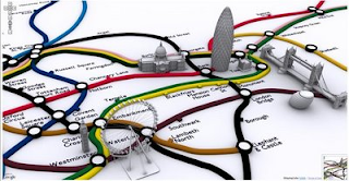
A 2D map of the regions with just the shading is no worse and the 3D nature makes it more difficult to see all the data at once. However, I do like the 3D icons on the tube map below - at a glance a tourist can work out which sight they want to go to and how to do it on the tube.
I spend so much of my time looking at maps I don't even notice the work my brain is doing translating a representational map into reality but for a someone who doesn't use maps regularly I think the graphic also helps understanding as less 'translation' is necessary.
I do think we all need to remember that simple is sometimes best and to be careful not to get carried away by flashy presentation but this post isn't meant as criticism of Andy and his team. The graphics themselves are well put together (I love the toothpaste look of the tube routes) and it seems to me that they are proving what is possible with sketchup and Google Earth. The techniques they are exploring are useful tools for all of us.