Friday, June 19, 2009

Quick Links: 3D Thematic Viz, Bridges Tour and Tobler's Law

I'm not going to be able to do any blogging until July now but there's some outstanding links I wanted to share with you before I disappear.


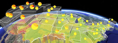
Thematic Map in 3D: This visualization of mobile calls from Washington DC at the Obama Inauguration is fantastic. I'm generally sceptical about 3D thematic maps (example) but this visualization has a couple of features that get around common problems:
  • By using squares the surface illustrating call density is easy to perceive, if you used complex polygon shapes (e.g. US state boundaries) it would be less easy to perceive.
  • Lower density of calls is shown by cooler colors, height and also by increased transparency. Higher density by hotter colors, increased height and by less transparency. This means the pattern of calls is easy to work out , its a challenging visual task if just color and height are used.


Interesting to compare with the Geothermal Project (shown above) which also uses transparency and height to illustrate a thematic variable but in a different way.

Fantastic GEarth Tour - Columbia Bridge: This project about bridge construction (via Google Earth Blog) is excellent. I particularly liked:
  • The bridges rising from the water effect
  • The use of pause at the start to give people information in the main screen about what they are about to watch.
  • Splitting the tour into 3 shorter sections reducing download time at the start and also catering for different user needs (some people will just be happy with the introduction, others will want more information)
  • The animation showing the problem of ships getting through the bridges.
I'll do a fuller critique later on.


Tobler's Law Discussion: Tobler's law is that things close together are more likely to be the same than things far apart. Very interesting discussion from Off the Map blog from Fortis One of the idea that we can apply the same idea to time and that with the new real time sensing capabilities feeding into maps (e.g. mobile phone tracking via GPS) we will see an exploration of this on the GeoWeb.

Thursday, June 18, 2009

The Patterns III: Virtual Globe

This is the final part of a three part series on Patterns on the GeoWeb (1, 2).

A screen Shot of the Mt St Helens Volcano in Google Earth showing an overlay map where red is the extent of a Pyroclastic flow.

What: Content designed to be viewed in 3D environment rather than as a simple 2D map. Virtual Globes such as GEarth are migrating into browsers and separate Virtual Globe clients are disappearing. The discussion in the post refers to both browser and client based Virtual Globes.

Use When and Why: The primary reason for using a Virtual Globes is the 3D nature of the visualization needed as in the screen shot, the map as a flat map would lose value from the 3D visualization shown. Other major uses of virtual globes include viewing the ocean floor from below sea level, the altitude and location of a plane's path and 3D buildings.

However, there are also other subtle reasons why 3D can be helpful. For instance, the Mercator projection of the globe which is used by map systems like Google Maps represents the arctic as a strip of white along the top of the map. If you are looking at the arctic as a whole then being able to view it from above the North pole as it really is represents a much better visualization.

I also suspect that being able to fly from place to place on a Globe helps people locate and orient themselves when they are taken to a new place when compared with zooming in and out on a flat 2D map. This idea needs further investigation.

Functionality not available in Browsers:
At the time of writing Virtual Globes also offer a range of functionalities not available in browser 2D systems. For example, Google Earth offers:
  • An easy way to mash data sets together (KML, but other formats are supported)
  • Producing tours for those who don't want to write KML directly
  • Accessing a range of data such as the multiple Google Ocean layers in the layers column
There is nothing to stop this functionality appearing in a 2D mapping system and really the situation is a legacy of how programs like Google maps and Google Earth client have developed.

How: Create KML:
KML can be loaded into GEarth client or using this gadget put in a web page via the GEarth API (no coding required)

Examples:
  • 3D buildings: Effiel Tower
  • Underwater tour: Part of this video


Monday, June 15, 2009

Ollie Bray on Google Earth in Schools


This is full of good ideas for using Google Earth in the school classroom. I do have one comment though, I think there is an issue with the true value of GEarth as a teaching tool compared with its visual wow! factor. The former is of long term use, the later gets attention now but in the near future, everyone will be used to it and will tire of it.

Examples from Ollie's talk: I think the pizza exercise (about 7 minutes in) where pupils trace the distance that all the ingredients components that make up a take away pizza is a winner. Really makes them think about geography and international trade in a very visual way. The smoke signal activity (2.45 minutes in) is fun once or twice but I imagine the 5th or 6th time students will start thinking it a little lame.

That being said one of the lessons I have learnt from being School Outreach officer for Geography here at Southampton Uni is that keeping attention of a class is much more critical than with our undergrads so maybe you just need to keep a set of such activities handy for grabbing attention.

Friday, June 12, 2009

Google Earth Tinting Problem: Green River Blues


Frank has noted the green tinting of base data in Google Earth already, I just wanted to add my 2c worth: Today I'm trying to put together a practical using GEarth in the area around Mt St Helens, I'm getting students to look at the effect of the 1980 eruption on trees. The elevation data is fantastic, the imagery is brilliant, good enough to identify separate trees but then Google have gone and tinted it all green which makes identifying trees more difficult. See the green river in the screenshot above.

I have noted the misuse of regions functionality in Google Earth before but its way of changing data based on your altitude is the solution to this problem. As Frank points out in his post, he suggested the solution to the 'stripey earth' problem ages ago - at altitude use blended data, lower down, let us see the stripes.

Wednesday, June 10, 2009

BBC European Election Map: Complex and Unclear


On Sunday we had an election TV program (available in the UK until next Sunday here) that discussed the results of the European election in the UK by the BBC. Part of the program is a set of graphics and maps to describe and analyse the results as they come in. Over the years I've watched these get more sophisticated but on Sunday they just went way too far IMHO - it was flashy, technically complex and confusing. A perfect example of chart junk.

The presenter stood in front of the displays, some kind of blue screen effect put him in the room you can see in the image above. My annoyances refer to the red numbers which I've added:
  1. The screenshot shows the presenter discussing how the vote split between the political parties from the 2004 election in the NW of England. The NW region is shown on the map marked by the [1]. To show its the region under discussion they accentuated it by making it appear a lighter grey than the rest of the map - not at all clear. It also mixed in with the 3D separation of regions (discussed below) to make it even less clear. An outline of an intense color would have worked much better.
  2. To separate regions of England out their borders are given a 3D effect to look like cliffs. This is distracting since the boundaries don't refer to anything 'real' - a border color would work much better.
  3. I didn't watch to see how the floor map of Europe was incorporated in the presentation because I switched off after watching the first few minutes but its just distracting to see it on the floor like this. Much better to switch between a UK map and a Europe map on the wall, you could do this with a transition virtual flight in or out of the UK to/from Europe.
  4. This is in effect a glorified pie chart. No need to add 'SHARE' in the middle, we all know what a pie chart shows! The arms and circles are unnecessary, names in color with figures beside the segments would be just as good and easier to read.
  5. And if the pie chart wasn't bad enough with its weird colored arms we have to contend with a background image of European buildings we have to separate visually to see the graphic.
The BBC has wonderful graphic design as a whole and making the design look professional is important so I support their usual use of animations and visual whizzyness. However, this map/graphic system must have cost thousands to put together they could have made it better by keeping it simpler AND at a fraction of the price.

Friday, June 5, 2009

Open StreetMap Foot Paths

Via Frank at Google Earth Blog and Mapperz I came across a KMZ of Open StreetMap tiles. I had a look and was impressed with the footpath data, this isn't available in the Google base mapping. As an example this is the area around where I live in Fritham:

Monday, June 1, 2009

The Patterns II: Web with Added Map


This is part 2 of a 3 part series. Part 1 here


The home page for the 'Oceans' series on the BBC, a good example of a web page with map. An embedded map (bottom right) is one of the options you can follow along with navigation to other types of content.

What: A web page with an embedded map that is a major part of the page.

Use When: Location is a key part of the purpose of the page but not the primary way you want to arrange your content. This makes it differ from the other two types in this series (Map with Web and Virtual Globe) where the spatial information is the key characteristic. If you have a web page where a map is just part of the offering, this is the pattern to choose.

Why: People have been putting maps on the web ever since it appeared just as they have been putting maps in leaflets, newspapers etc. It is now easy to make that embedded web map interactive, i.e. you can zoom in using it or click it for more information.


View London for Frank in a larger map

How: The simplest way is to create a Google My Maps map , click on link in the to right and copy the "paste html to embed..." box content. Paste it into your web page as I have done above and you have an embedded web page. For a more sophisticated map you can use the GMaps API or GEarth API

Examples:

World on the move is another example from the BBC. It uses quite a sophisticated web map with its own timeline.


Another page from the 'Oceans' site. This one is where I think the embedded map does not work

Although the inset map works on the home page as featured at the top of this page, this inset map on the locations page of the same site would be better as a 'Map with Web' IMHO. As it is, you click on the markers to read info in the bottom left - it would work better with the whole screen as a map and clicked markers showed pop up balloons with info in them.