Quick update of the Placemark Clustering project: we'll be doing user tests using the uk police crime map later this summer (discussed below) comparing it to a chloropleth grid (translation = head map based on grid, I explain further here)
In thinking about this I've hunted down some examples and I thought it would be interesting to name check 3.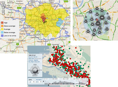
No Collation: The first map is Oakland Crime Spotting (bottom inset in figure) that is very similar to San Francisco Crime mapping, reviewed here. Unlike the other two maps it attempts no point collation at all, I image the authors would argue that they deal with the problem by providing sophisticated filtering tools to reduce the point density. However, it doesn't help if the user wants to get an overview picture of crime across the area the map covers.
Traditional Choropleth: Switching to the the UK, the Metropolitan Police (=London for non UK readers) offer a choropleth map based on wards and subwards (top left insert). I regard this as the traditional approach. Notably it doesn't show actual figures for postcodes, only sub wards - a sub ward is a collection of postcodes. My problem with this is that almost no one knows the boundaries of wards and sub wards so its a strange way to split the city up. (Aside: in my experience, Londoners tend to split London up based on tube stations)
Point Collation: The UK police offer a national map which uses point collation (top right insert). This is the main one we're planning to test as IMHO it isn't an effective way to visualise the data (related post). It offers a finer grain of data - you don't actually see the true location of the crime but it is collated down to the postcode level. In London, a postcode is roughly equal to a single street.
Also worthy of a mention although not a crime map is the Google Haiti Resource finder which uses a very similar point collation method of collating data points.
4 comments:
Have a look at http://www.ukcrimestats.com/ they do some pretty impressive stuff with the raw data from police.uk Clustering is still a problem though.
Clustering is inherently misleading, if additionally the raw data has already been aggregated then you need to be doubly careful. Ideally the cluster symbols need to incorporate some extents for the cluster so that when you click on the symbol you zoom to the extents of the cluster and see all of the points. Not easy to do dynamically.
My mates at geo.me are doing some neat stuff with clusters. This is a rough proof of concept not quite there but worth a look http://cms.geo.me/app/scdcbus
Cheers
Steven
Steven,
had a look at your links. ukcrimestats is 'vanilla' google maps: they don't do any collation.
re extents: yes, yes, yes! Glad someone else thinks this too. The post could have easily expanded into discussion of this but I didn't have all day.
re cms.geo.me, my gut feeling is that doesn't deal with the issues: The lowest level of clustering doesn't have symbol size = number in cluster. I'm also suspicious of the symbols obscuring each other.
However, I REALLY want to see how user tests go on these sorts of visualizations because they may have positive aspects that haven't occurred to me.
Finally, I like clustering as a term better than collation.
Interesting links, in the post and in Steven's comment - thank you.
One comment, though - it's choropleth (not chloro-) :)
Katy,
Doh! I've done that before too....
thanks
Rich
Post a Comment