If you're wondering where the posts are this week, I've been busy at the AGU conference in San Francisco. Some brief notes on things I saw there:
Volcano Lesson Plan: Declan De Paor showed me a neat trick for use in a lesson plan teaching volcano hazards. Similar to my own lesson plan on volcanoes he uses Google Earth to explain volcano hazards in the vicinity of Mt Rainer. However, he gets students to work out a plan for evacuating the area and then challenges them with an eruption and gives them a limited time to work out what to do. To simulate the real situation he has students open a KML file which has a network link. At a given moment he changes a single file on a server (very simple text change), which triggers a 3D model of an ash plume to appear on Mt Rainer on each of the students' screens. A lovely way to make a simulation more effective.
User Testing: I'm planning some work to look at how effective Google Earth visualizations actually are in helping students with spatial learning. I was pleased to hear that I'm not the only one interested in this, Declan is using a program know as Sliverlight on the Mac to record how students use his materials in an effort to assess the effectiveness of Google Earth based educational materials. As I've been telling anyone who will listen here this week, user testing is the acid test of whether materials based in Google Earth work so great to hear Declan and his team are doing this too.
Sunday, December 21, 2008
Tuesday, December 9, 2008
Review: Google's Geothermal Resource Project

As you would expect from Google this project is very well designed overall. As a result I've abandoned my usual template for reviewing projects and concentrated on noting good design points and things I think a] should be improved and b] could be improved. The [a] and [b] distinction is important, there are always things that could be improved with a project.
Good design points:
- Good topic: The choice of topic here is good, energy resources over the States suits itself to a map, a list of links for each state would be much less useful.
- Supporting Website: The supporting website is well designed, the use of a video to introduce the topic as a whole is a good idea.
- Clean, Uncluttered Look: The Temperature Key, pop ups and elements in the main screen all have a clear and clean look. Sometimes people get a bit too excited about customizing the look of a project, particularly pop up screens which are often littered with logos and links cluttering the view. This project has links and logos in pop up boxes but uses them in a subtle and unobtrusive way.
- Visuals and Introduction: Use of pie charts instantly communicates the total geothermal resource within each state in a visual way, they were produced using Google Chart API. The overview folder has a nice introduction, use of images is good and text is kept to a reasonable amount.
- Pie Chart Emphasis: Roll over a pie chart in the Flat folder and it will emphasize the outline of the State it refers too. A nice touch especially given the translucent nature of the boundary, it doesn't add that much to screen clutter.
- Overview Folder: This uses a structure where you click links in the top of the introduction to access other parts of the introduction (including the introductory video). I would cut down on the length of the overview overall and present as just one block of text in one placemark. The video could be presented in a separate placemark. Using links like this works in a web page but I bet that a lot of users will not recognize the structure presented like this in a pop up balloon.
- Lack of Key: The Flat folder contains Pie charts but no key in the main screen to explain what the pie chart means (although the colors refer to the same values). You have to click a pie chart to decipher it, which is an unnecessary complication. In discussion with the author about this he said that they tend to avoid using screen overlay keys
as they have evidence that users simply don't look at them. (Correction: actually the author specified that users don't turn layers on or off so end up with overlapping layers). He also reported that they have heard of users calling tech support to get rid of a key, theythink it is a virus in Google Earth that has appeared on screen!(Correction: I was over egging the pudding here, they just heard of users getting frustrated with something on screen they couldn't get rid of) (it can be unclicked in the places column). To me, if a user cannot be relied upon to read a (well designed) key I can't build them a useful map anyway. - 3-D: All my usual complaints about 3D not working as well as a simple color thematic map apply here. However, I have to admit that the translucent white color scheme is easy on the eye. The author makes a nice point that he thinks users will interpret height as a measure of potential energy more readily than color. That may well be true.
Points that Could be Improved:
- State Boundaries: As a Brit who isn't familiar with State boundaries and keeps his main screen clear from clutter by turning off the boundary layer I would have appreciated translucent boundaries to the States with the Flat folder. The author makes the point that the state boundaries are visible when you roll over them. That is true, but its another bit of work to move my mouse over a state to see what shape it is.
- Flat Folder: The title could be more meaningful, 'Only Pie Charts' is what I came up with as an alternative with but it is a little clumsy. I think most users won't understand the concept of a flattened layer which is what I suspect this refers to.
- Depth Animation: There will be some users who will be confused by what this is showing since the fact that the timeline is used to differentiate depth is not made clear. Of course, explanation then adds to screen clutter...
- Interpretation: The project contains data but no interpretation, for example, a label and brief explanation of what the shallow hotspot in NW Wyoming is would be interesting (I think its Yellowstone?).
- Rising Block: There's a lot for users to get their heads around in this project, they have to understand that there is different energy potential with depth, with location (i.e. by State), how much energy is used already by each state and what the 2% and 20% recovery rates refer to. To help with the explanation an introduction using a rising block may help.
Wednesday, December 3, 2008
Produce a Photo 'Placard' in Google Earth
The idea is to produce a Placemark that has a small photo as an icon. When clicked it opens a full sized version of the image. The photo appears above the ground tethered to it by a line making it look like a placard.
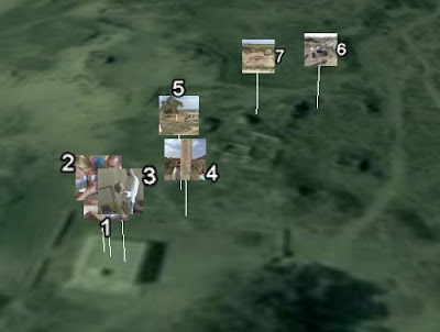 Screen Shot from Stefan's original Kom Firin Post, the first example I saw of placards.
I think the weird green color is shading added by Google to make this part of the Nile delta look green at altitude. It works a mile up but from down on the ground it looks very odd.
 Screen Shot from Stefan's original Kom Firin Post, the first example I saw of placards.
 I think the weird green color is shading added by Google to make this part of the Nile delta look green at altitude. It works a mile up but from down on the ground it looks very odd.
Before we start you should find an image to use and produce a smaller version of it. This can either be a cropped image, a reduction in pixel size or a completely new small image like a company icon.
Lets dive in:
- Click the Yellow pin icon on the top of the 3D screen to produce a placemark.
- A yellow box appears in the main screen, drag it to where you want the placemark to sit.
- In the new placemark dialog box select the 'Altitude' tab and give the placemark an appropriate altitude above the ground and tick the 'Extend to ground' box. The extend functionality adds the handle to the placard.
- Click the yellow pin icon top right of the dialogue box, the 'Icon' dialogue will open. Click 'Add Custom Icon' button bottom left and locate your small image. Click OK
- Back in the main dialogue, click the description tab and add the text:
- Add your large image name and path inbetween the inverted commas. This is actually html code, if you're not used to it or get stuck this is a useful guide (scroll down in the link to find the section on adding images).
- Click the OK button and you're done!
Subscribe to:
Posts (Atom)