Showing posts with label Aid or Environment Related. Show all posts

Tuesday, August 13, 2013

Geomorphology via Google Earth

Screen shot of a glacier from the file that shows dramatic changes over the seasons

I've just read a terrific paper by Holly Dolliver on using Google Earth to teach geomorphology (abstract, most of the body).  She mainly uses the historical imagery feature of GE to show the change in landscape with time and the elevation profile tool to show the topography.  She spent a lot of time searching out some great examples to illustrate her paper but didn't provide a KML file of the places so I've captured most of her examples in this file.

HowTo Notes:
The placemarks in 'Show Elevation Profile' folder need you to right click the placemark in the places column then select 'show elevation profile' to turn it on.

The other placemarks are related to time.  Follow these steps:
1] turn on historical imagery on the top bar in Google Earth by clicking the clock with arrow icon.
2] double click the yellow pins to be flown to the place in space and 'flown back in time

With Katama Bay, this illustrates long shore drift and I've left you to play with the historical imagery time slider ([1] above) as you wish.

Thursday, January 24, 2013

Google Earth in Award Winning Course

Screen shot of the Frozen Planet interactive map (Google Earth) showing permafrost layer
On Tuesday I went to a talk by Mark Brandon of the Open University (OU) about how they produced courses linked to the BBC ‘Frozen Planet’ TV series which was a joint OU/BBC production.  He had some great stories about what it was like to be involved with fiiming with the BBC at the poles with David Attenborough.

He described two courses:

  • A free online course (think MOOC if you don’t recognise the acronym, don’t worry) on the OpenLearn site (link from here but broken at present)
  • A short course

These are courses the OU produced, both of which he was involved in.  They were very sucessful in terms of student numbers breaking OU records and Mark explained how students completed tasks in Google Earth (API) as part of their assessments and also how it was used as a content platform. I was pleased to hear that for his work on the courses he won the ‘innovative teacher of the year’ award from the Times Higher.

Talking to him afterwards we agreed that the only real barrier to use by more university teachers was that they didn’t know about its capabilities, rather than it being too complex to use.  

Friday, October 7, 2011

Flood London's Bankers!

I was recently asked to produce something to showcase new big screened computers in a new media room at Southampton University.  VIPs watching including our Vice-Chancellor.  I revisited an earlier idea where I flooded London, I rewrote the code using an animated update to produce a tour which will raise the water from 20 to 200m in 3 seconds.


Open this

Flood London.kmz

and turn off all layers in the layers panel except 3D buildings which should be on.

1] Double click 'Space to High' and you will be flown from space to a high view over london.
2] Double click 'Flood London' and sea level rises from 20m above current to 200m
3] Double click 'High to City' to be flown to the city of London.  You should see the skyscrapers of London's banking center already partly flooded.  Turn off the tour (black cross in tour control, bottom left of main screen) then
4] Double click 'Flood London' and the sea rises again.  Experiment with controlling the tour controller bottom right to see you can become a virtual Canute. 

It shows two nice teaching facilities:

  • Animated update which will require you to get into KML if you want to do it for yourself in another location.  
  • A set of tours:  By combining tours which fly the user around with one which controls the flood level we can build some interesting visualisations.

Friday, July 22, 2011

How is the GeoWeb affecting the Climate Change Debate?

I was recently asked by a student from Southampton's Web Science doctoral training centre to comment on how the GeoWeb is affecting global warming. It's part of a larger study he is doing on how the web affects global warming and discussion about it. Here's my response as a blog post.

Data Visualisation: The GeoWeb has lowered the bar to visualizing data on the topic of Global warming and explaining the background concepts. Examples include Simon Rogers of the Guardian who is using fusion tables to visualise data on a map. See 34mins 33 seconds into this:


He explains how he can now produce useful map visualizations without needing input from specialist software engineers.

Unfortunately Simon hasn't used fusion tables to visualize global warming data (that I can find), however, fusion tables could easily be used to produce maps such as this other Guardian map: Carbon emissions by local authority in the UK. This kind of visualization has great potential as citizens can use them to make voting decisions by comparing their local authority to the others. Maps are very powerful in this regard.

Concept Visualisation: I've also used Google Earth to help visualise climate change concepts, the below clip is explaining Gaia ideas and I use Google Earth at 1min 13secs into this clip:


Mixed Concept and Data Visualisation: Google promotes the use of Google Earth in good causes via Google Earth Outreach, they have a showcase of climate related outreach projects based in Google Earth (click 'climate' link on the right when you reach the page). The showcase is made up of concept and data visualisations. Some of these are excellent such as the National Snow and ice Data Centre (NSIDC) but others could be designed a lot better e.g. 4 degree warming (my review).

Conclusion:
I think the GeoWeb has great potential to inform the climate change debate but at present, it hasn't been nearly as well used and discussed as use of the GeoWeb in emergency aid situations and helping the democratic process (e.g. Ushahidi). Despite having a personal interest in using Google Earth to explain climate change concepts, I think the best potential of the GeoWeb in discussing climate change is not in education but in lobbying politicians to live up to their rhetoric on delivering reductions in carbon emissions. A simple 2D map showing how much carbon dioxide is emitted by region is a fantastic tool to bring politicians and policy makers to account, I wish there were more examples out there of this use.

Wednesday, March 9, 2011

Fusion Tables for Volunteered Geographic Information (VGI)

VGI Background: There is a lot of discussion about Maps Crowdsourcing (or Volunteered Geographic Information - VGI) on the web at the moment. The excellent Geospatial Revolution clips are an example, this one discusses VGI as used by Open Street Map and Ushahidi in Haiti:


Note: Starts playing at relevant point in movie clip

I've just revamped a lecture for next week discussing VGI in depth and I wanted to get students to create and upload some VGI data but also to understand how to create a very simple VGI system. The solution was Google Fusion Tables.

Fusion Tables Background: For a while now I've heard Mano Marks amongst others pushing the geo capabilities of fusion tables (up coming where 2.0 example), this is the first time I've found an application for them. Neo-Geography is a term for all the new uses of interactive maps and map like visualisations appearing on the web, services like Google Maps, Google Earth are examples, they principally allow the public to visualise geographic data. What is so different about fusion tables is that they offer the ability not just to visualise but also to get into simple analysis of geographic data. Thus in Google Earth I can see Haitian refugee camps but with Fusion tables, it becomes easy to color code them by size. Fusion tables are also free and a lot more simple to operate than desktop GIS.

HowTo: Create VGI Thematic map: The following HowTo takes you through the steps of creating a database, uploading VGI data in the forms of polygons, defining a palette and outputting the result.

1] In GEarth digitise a number of polygons and give each of them a variable value (just 2 digits, no text) in the description box. E.g. I get students to digitise clumps of trees around Mt St Helens and give them a percentage tree cover value. Put all the polygons in a folder then save the folder as a KML file.

2] Go to the fusion tables site. If you do not already have a Google account you will need to set one up.

3] Click on File > New table > Import data > From this computer > Choose file, then upload your kml file. Click next then check the import columns include a 'description' column before clicking 'next' again to accept. Write a relevant description in the ‘Description’ box presented, then click Finish.

4] Your data should appear in a table with columns for description, name, and geometry. The Geometry column is the data Google Earth uses to draw each polygon, click on one of the kml labels to see the list of lat longs it uses.

5] Click on Visualize > Map. Your polygons should appear in a mashup using Google Maps, select ‘Satellite’ top right to see the true terrain. You will notice they are a default red at present. To create a simple thematic map we will apply a palette to the polygons colouring them a different colour depending on the percentage cover entered in GEarth.

6] Click on Visualize > Table to switch back to table view. Select Edit (on the menu bar) > Modify Columns > description > Type > Number > Save. This changes the percentages you entered in the GEarth description balloons from text to numeric values and you will see the description column right justify itself as a result.

7] Switch back to map view, now select Configure Styles (on the top of
the map) > Polygons, Fill colour > Buckets

Click the Radio button and on the pull down menu select 5 buckets. Select Column > description.
8] By default you have been given equal sized buckets (20% each), change them if you want. You should change the colours in the pull down menus on the right of the dialogue box to something appropriate. Click Save to apply this palette.

You should now see your palette displayed.

9] Now you have set up your VGI system, add others to the fusion table (share button top right of your fusion table web page > choose collaborators who can edit).

10] Get your volunteers to complete step [1] then access the fusion table and choose File > Import more rows to upload their own polygons.

Viola! A basic VGI system.


Wednesday, August 25, 2010

Current Projects: Haiti, Tours, Education and China

This summer has been very busy so I haven't got around to updating projects on my personal web pages. There are a number of projects that I'm working on at the moment that aren't listed and deserve a mention:

Haiti Maps Usability: I am supervising Luke Caley an MSc project student looking at usability of maps in the Haiti earthquake disaster, Luke is talking to people who where there at the early stages of the disaster investigating how maps and mapping were used in the field. There is a related area about the usability of crowd sourced map systems that is fascinating but unfortunately beyond the scope of this study.

Our theory is that Aid workers are a group for whom map usability is critical: when you publish a map on the web user's are only ever a click away from watching cats falling off sofas on YouTube. In an emergency situation the attention of aid workers is even worse - trying to figure out your map is time they could be using to pull people out from under collapsed buildings. So far the interviews seem to be showing that our theory is basically correct. Lots of organisations are generously giving time to helping us, for example ImageCat and MapAction. Final results are due in this autumn.

Google Earth Tour Research: Research is continuing into defining best practices for using tours in virtual globes (see 58:12 into this video for my talk on earlier work). Our results will apply to any virtual globe but for this study we've chosen to use Google Earth. Our main areas of investigation are into seeing how speed of flight and path geometry in tours affect the user's ability to track where they are within Google Earth. The video clip below illustrates the effect tour path has on user understanding, keeping track of where you are is easier on the outbound flight than on the return inbound leg:


User testing on students is planned for September and the results will be used in teaching materials. These materials will support students who will produce their own tours as part of a Southampton University GIS course. The study is funded by GEES.

Usability of Google Earth Materials in Education: I'm working with Declan De Paor from Old Dominion University and others on an NSF funded educational project where I'm providing input on usability issues. It's very early days on this project but Declan's examples give a good taste of what we're going to get up to.

China: I'm also off to China working with John Dearing and others where I'll be using Google Earth to communicate with Chinese farmers helping to alleviate poverty. Again, the project has yet to really kick off.

Next year is looking busy but exciting!

(update 26 Aug: Corrected Declan's surname spelling mistake)

Thursday, July 29, 2010

Next Climate Change Talk

Here's the latest release from a series of climate change talks I'm doing, this one discusses the Gulf Oil spill, the Athabasca Oil Sands and climate change:


Unlike the earlier 'Is the Earth a Super Organism' talk I've released so far in this series, this one is completely based in GEarth. It's 10th in the series but I've released it early as:
  • The spill is still ongoing
  • I wanted to have a go at a talk completely in Google Earth to showcase my ideas of what a well designed tour should be like.
I've made a Prezi to link to other resources beyond the scope of the talk:


Good Design Points: A few reasons I think this is a well designed tour:
  • The tour covers views across a range of scales, this is where a tour really beats a traditional PowerPoint presentation
  • Simple Flights: The flights between segments are simple and fairly slow to give users chance to process the movement and work out where they are being taken.
  • Scale: I included Nelson's column, the outline of Great Britain (twice) and a 5 mile long at various points to fix a sense of scale. GEarth is very good at helping users grasp the scale of things.
  • Annotations: I use lots of annotations to draw the user's eye to the correct part of the screen.
  • Dateline: Because the inbuilt GEarth dateline is too small I included a custom dateline indicator.
Things I'd like to fix:
  • Dateline is too small: I fell into the classic trap of looking at GEarth on a large screen then reducing down to a 640 wide movie clip - you can't read the text easily.
  • Audio Hiccups: There are a few audio hiccups that I'd like to fix but these aren't easy in Camtasia without affecting the video. I've got to get a better mic too....
  • Better Images: There are a ton of better images I'd have liked to have used but I haven't got the time to ask permission. Every image used is cc marked and that limits choice.

Work Flow: To produce it I imported models, images, overlays etc. into GEarth then I recorded a tour visiting all the locations as I wanted. Using the pro version of GEarth, I then recorded a silent movie of the tour which I imported into Camtasia. Within Camtasia I added the audio section by section, using freeze frames to extend the movie where needed and cutting footage to fit the commentary. I also added 'call outs' the red annotations which work in addition to annotations I've added in Google Earth. Its not an elegant technique but it avoids issues to do with GEarth tours such as not being able to review changes easily and needing to edit kml code rather than use the Camtasia graphic interface.

Friday, July 16, 2010

Global Warming Map from Foreign Office

This GEarth layer and GEarth plugin has been released this week by the foriegn office showing the effects of 4 deg C rise in tempearature on the world. Great topic but poor science communication IMHO. For example, in an earlier incarnation it was a map (click the screen shot to be taken to the map):

In this form you could click layers on and off at the bottom and see all the countries in the world at once. In the GEarth plugin version, countries are obscured by the curvature of the earth and there's no layer control so you're left with a cluttered mess of circles and ovals all on screen at the same time.

I'm going to review it more fully next week when I have more time, there are a number of other interesting design features to the project.

Friday, July 2, 2010

Climate Change Talks

Previously I've enjoyed releasing something good on GoogleEarthDesign's birthday (It was 3 this week) so here's my latest big idea:

Climate Change Talks: A quick search of the internets revealed no one has done a set of video clips on climate change for education (apart from illegal snippets of 'an inconvenient truth') so I decided to do some. Some of the later ones are matched to the UK A level Edexcel curriculum. Here's the first one on the topic 'Is the Earth a Super Organism'.


It's better viewed in HD

Format: Climate change as a topic requires discussing abstract ideas such as positive and negative feedback as well as map based graphics so I went for Prezi.com as an alternative to PowerPoint and added clips of GEarth tours where useful. When a lot of your presentation isn't actually spatial its better not to base your content totally in a GEarth tour as it presents difficulties. E.g. importing, sizing and adding labels to an image in Prezi is a snap with lots of drag and drop controls whereas its a pain to do as an image overlay in GEarth.

Having said that, some of the other clips I have planned which are completely spatial in nature will be done just as GEarth tours and recorded as YouTube clips.

Here is the original prezi page:
(navigate by using the plus minus buttons that will slide out if you mouse over the right hand side or use mouse wheel and click and drag)


It's rather like viewing a GEarth file after watching a tour of the content. In the bottom left corner of each frame it has links to related topics that don't feature in the talk.

Death to PowerPoint: Lots of people have criticised PowerPoint for its slide analogy format, I think you can still do some useful stuff with it but I see their point. The nice thing about Prezi is that I can produce a mind map like poster and then take you around with added audio by recording it with demo software (I use Camtasia 7).

Pros:
  • I like the zoomable interface idea Prezi shares with GEarth tours
  • Prezi is very usable and Camtasia is not bad
  • Doing it this way I like the way I can be discussing one set of points but adding arrows to link back to earlier slides of content.
Cons:
  • Using 3 bits of software is a drag (GEarth, Prezi and Camtasia 7) and is time consuming
  • I don't like the way Prezi.com promotes the idea of rotating text all over the place, I've heard reports it makes people feel sick.

Video Clips in Education: I had a long think about how to present this content and I thought it worth listing my inspirations:
  • Hans Rosling: Excellent speaker with great use of technology
  • Lawrence Lessig: Great speaker, interesting and unique style but I'm not sure I like how linear it is.
  • Ken Robinson: Amazing, totally absorbing using just his voice. Good to remember that technology is not what makes a great talk, its the talk itself and the speaker.
Very interested to hear what people think.

Thursday, February 18, 2010

Tuvalu Flooded in Google Earth


Tuvalu is a Pacific island famous for being vulnerable to global warming induced sea level rise. I've discovered in Google Earth, its already sunk a long way! A case of the model of the sea floor not being accurate enough in Google Earth. See more in this tour (needs GEarth v5+).

Other Sunken Islands: Previously I spotted the Scilly islands were underwater off the coast of Cornwall.

Friday, February 12, 2010

Global Warming, Snow and Ice tour


Lisa Ballagh of NSIDC wrote to point out their new 'Climate Change Tour of Cold Places', its a tour in Google Earth. She asked for feedback so I thought I would review it as a post. She also says she found my series of tour tutorials very useful, glad you liked them Lisa!

Overall Comments:
  • Good Work!: A lot of work has gone into this, overall I think its successful and informative.
  • Good Topic: Climate change of cold places is an excellent topic to tackle in a virtual globe because its very spatial (e.g. permafrost is more common closer to the poles). Also, people don't generally look at the poles on a globe so its good to get flown there to consider them.
  • Convert to YouTube: Given the amount of effort involved, I would definitely convert the tour into a YouTube clip as well. See discussion on this point.
  • Too Long: I think if NSIDC tracked how users access the tour they would find that its too long and that users were stopping part way through. 3 minutes is my guess as a good length of tour in this sort of instance, a solution is to split off the tour into separate parts as was done in the Colombia bridges tour.
  • Other Great NSIDC Content: On the same page as the tour page as the tour but lower down, the "Sea Ice: Daily Concentration and Extent" KMZ project is still one of my favourite GEarth projects.
Numbers in the next two sections refer to time in the GEarth tour itself

Pros:

  • Auto Play YouTube Clips: The use of youtube clips in the tour that automatically play (e.g. 8.47) is inspired. I'll be stealing that code and using that trick myself!
  • Good Start and End: Use of start screens, end screens, advice to turn audio on and which layers to select is well thought out.
  • Good Images: Good images have been selected for use in the tour, especially the retreat of glaciers.
  • YouTube Clips add Human touch: I think the youtube clips themselves add the human touch to the tour, making the content more accessible.
Cons:
  • (6.33) Fix Photos in Position: At 6.33 an image of Muir glacier slides across the screen showing before and after of glacial retreat. It would be better to fly into the Muir glacier and find the position from where the photo was taken and then overlay the before and after images one by one so they mimic the GEarth view. This gives users a sense of where the glacier is making it more memorable.
  • (7.12) Flight too Fast: Flights from A to B should be looped to include a high altitude view. This helps viewers work out where they've come from and where they're going. They should also be less fast than this one - most users won't follow where they are going at this speed. However, having said that, other flight segments within the tour were timed correctly.
  • (4.41) Split Attention: At this time the audio is describing something about glaciers while the placemark label asks the question, "why is Greenland called Greenland?". Users will be distracted by this, it's best not to split their attention, one way around the problem is to make the placemark only appear on screen when the audio track asks the question.
  • (4.41) Placemark vs Polygon: In discussing Greenland it should be marked as a polygon across the whole country with a camera view showing the whole country rather than the placemark shown at low altitude. A popup will work just as well from a Polygon.
  • (10.13) Timeline Labels and Annotations: To give viewers a sense of the time of events you could add labels for the times of each image. The timeline labels just aren't big enough to follow clearly. You could add annotations to show the physical scale (Rhode island outline over the ice?) and also add a polygon annotation to show the original extent of the ice shelf. The polygon island annotation should persist throughout the animation as the shelf disintegrates.
To summarise, this is a good tour with some innovations I'll be copying in the future. Although there are some cons I think they're quite minor points and don't distract from the quality of the work overall.

Monday, October 26, 2009

Climate Change Tours by Google: Review


This is my second post discussing the Google Earth tours which promote the Climate Change summit at Copenhagen by Google. My earlier post discussed how they used video clips instead of GEarth plugin tours here. The introductory video tour is narrated by Al Gore and there are 3 additional tours with more to follow, in this post I'll discuss just the introductory tour. I was excited to see these tours as I think using Google Earth is an excellent tool to communicate climate change science to the public (as I said in this talk).

Count the Ball passes: Before I start the review I want to make a point about attention and motion. If you haven't seen the 'count the number of basketball passes' test before watch this video and try and count the number of passes made to people wearing white shirts. Reading anything below the embedded video is cheating!:


How many were there? You're very clever. Did you notice anything else about the video? If not watch it again. The point is that in any view where multiple bodies are moving its very difficult to keep track of anything that you haven't been directed to watch. So most people viewing the video miss seeing the Gorilla walking across the screen even though under normal circumstances they would do so. For more detail on attention see no. 8 on PsyBlog. This inability to split our attention is a relevant point for our discussion as you will see.

"Confronting Climate Change" tour Review:
I felt the tour used some GEarth tools in a smart way but tried to cover too much in the time available, they may have done better to have removed some sections and cover the remaining content in more detail.

Pros:
  • Excellent Commentary: Having Al Gore narrate the tours adds to their value, it carries real cachet to have him do this.
  • Good References: There are numerous footnote references to the data that was used to put together the tour. Always good to see.
  • Innovative Timeline Use: They make innovative use of the timeline - I haven't seen many tours where the authors use the timeline this much. Combining the timeline and tours has the potential to be very powerful and its used here on some data that is excellent for timeline animation (e.g. melting of the Greenland icecap)
  • Explicitly Mentioning Pause: They explicitly show users how to pause the tour and encourage people to do this. This is a very neat use of tour.
  • Tour tab control: The thumbnail icons and titles to control which tour plays are useful controls.
Cons:
  • Moving Images: The tour starts with multiple images depicting climate change moving across a spinning globe. There are too many moving objects for the user to keep track of - the point the gorilla video made. Compare to this GEarth tour done by CBS where they had static images appearing above a static globe, I think the CBS one is much better.
  • Talk about what's on Screen: Towards the end of the tour the commentary doesn't relate directly to what is showing on screen: We are shown imagery of Kenya with the on screen text: "Kenya: Forest, water, Livelihoods" while Al talks about how we should "use this tool to get involved". This splits the user's attention, they don't know whether to follow the audio or visual communication and end up doing neither well. The Gorilla video is illustrates how important it is to avoid splitting attention.
  • Flights too Low and Quick: Many of the virtual flights in the tour are too quick and low for users to follow where they have been taken. Virtual flights should be looped i.e. to altitude and then back down low again and done at slower speed. This allows users to follow landmarks on screen, work out where they are and avoid becoming disorientated.
  • No annotation: At one point we are shown a time sequence of the Larsen ice shelf collapsing but it isn't clear which actual bit of the shelf is collapsing. The remedy would be to use an arrow or polygon annotation to guide the users eye to the right location. There are text annotations on the ground overlays during this part of the tour but they couldn't be read as they were too small and upside down. They should have been removed.
  • Bangladesh Scale: At 3.10 mins we are shown a view of Bangladesh flooding but because there are no landmarks it's very difficult to get a sense of the scale of the view. It needed an annotation to give a sense of scale, for example a line marking out 100 miles in distance on the ground. For an example see 30 seconds into the tour experiment I posted here where I use a 10 mile marker.
  • Antipodes Problem: One of the issues of virtual globes is that you can't see the whole world at once. At 1.32 mins into the tour an overlay is used that covers the whole globe and the globe is rotated to view how it looks. It would have been better to either use the new Google flash map API to show the world as a flat map projection and use the overlay on that or to only focus in on the changes of one part of the world as is done at 1.51 mins where the tour shows what is happening at the North pole.
  • Timeline Description: I have described this use of timeline feature as innovative, however, it was also confusing in the tour. If you are displaying a time sequence you have to describe it in the audio track so that users understand what they are seeing. We kept jumping about to different points on the time line with no proper explanation. Labels on screen were used to show the user what time the imagery related to but they weren't adequate because there was too much else going on in the view: The Gorilla effect yet again.

Climate change is the most important challenge facing humanity IMHO. GEarth is a wonderful tool to communicate the issue to the public but I think Google could improve the tours that they have yet to release.

Monday, October 19, 2009

Improving Color in Maps: Rivers of Blood


Google posted data about helping the victims of tropical storm Ketsana. This is great work, letting people see the problem in geographical context soon after the event.

Blue better for Water: However, I think the choice of colors used could be improved. They have used bright red to illustrate the flooded areas. While this attracts the eye to all the small areas its too intense for the large areas it covers. In addition, red doesn't work well to mark water cover, my first impression is that its a river of blood. Much better to choose a shade of blue and to make it translucent so you can see roughly what lies below it. To make the areas more noticeable I've outlined then in white. My version as a .kmz.

Annotation Adds Value: In looking at the data I noticed that most of the flooded areas are actually fields on free areas. Not much obvious housing seems to have been flooded. I've added a polygon which I've outlined in red and a placemark to show its location, double clicking the placemark will take you to the area of interest where there has been some housing flooded. This sort of annotation adds value to the data and encourages people to explore more for themselves IMHO.

Tuesday, August 11, 2009

Brahmaputra Lesson Plan Update

Screen Shot of Tour. Click to Play, NB: Uses Audio

Over the last week or so I've been updating a lesson plan I published last year to use the new tour facility in GEarth. The above is an audio tour to show what the lesson plan is about.

New Materials: Download from my personal website under 'Brahmaputra Flooding....'. Features include:
  • NEW Delivered via tours making use much simpler for the teacher
  • Helpful notes on how to use GEarth for Newbie teachers
  • Ideas for extension exercises for students
  • Links human and physical geography considering effects of global warming
In the materials I've produced tours which use pauses rather than audio, the idea is that the teacher plays the tour and when it pauses describes/discusses with the class what is shown on screen - rather like a powerpoint where slide transistions are replaced by GEarth flights. I used the new material for a global warming conference to a 6th form I did in December and it worked extremely well.

Design Notes on the Lesson Files:
  • I added the 'press play to continue' screen overlay because I thought the user needed more visual feedback that the tour had paused/was playing.
  • I turn elements on and off in my tours more than most people seem to. I think its good practise to annotate tours to help guide the user's eye to where they should be looking.
  • I think the use of GEarth tours with pauses replaces the need for PowerPoint in this instance. Obviously it only works for certain situations but I know ESRI are developing even more tools to make other Virtual Globes more useful in presentations (you'll be able to import PowerPoint slides into their Virtual Globe)
Update 16:13, 12 Aug 09: Edited to include Frank's comments

Tuesday, December 9, 2008

Review: Google's Geothermal Resource Project

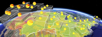
Screen shot from the Geothermal Resource.kmz by Google.org

As you would expect from Google this project is very well designed overall. As a result I've abandoned my usual template for reviewing projects and concentrated on noting good design points and things I think a] should be improved and b] could be improved. The [a] and [b] distinction is important, there are always things that could be improved with a project.

Good design points:
  • Good topic: The choice of topic here is good, energy resources over the States suits itself to a map, a list of links for each state would be much less useful.
  • Supporting Website: The supporting website is well designed, the use of a video to introduce the topic as a whole is a good idea.
  • Clean, Uncluttered Look: The Temperature Key, pop ups and elements in the main screen all have a clear and clean look. Sometimes people get a bit too excited about customizing the look of a project, particularly pop up screens which are often littered with logos and links cluttering the view. This project has links and logos in pop up boxes but uses them in a subtle and unobtrusive way.
  • Visuals and Introduction: Use of pie charts instantly communicates the total geothermal resource within each state in a visual way, they were produced using Google Chart API. The overview folder has a nice introduction, use of images is good and text is kept to a reasonable amount.
  • Pie Chart Emphasis: Roll over a pie chart in the Flat folder and it will emphasize the outline of the State it refers too. A nice touch especially given the translucent nature of the boundary, it doesn't add that much to screen clutter.
Points that Should be improved IMHO:
  • Overview Folder: This uses a structure where you click links in the top of the introduction to access other parts of the introduction (including the introductory video). I would cut down on the length of the overview overall and present as just one block of text in one placemark. The video could be presented in a separate placemark. Using links like this works in a web page but I bet that a lot of users will not recognize the structure presented like this in a pop up balloon.

  • Lack of Key: The Flat folder contains Pie charts but no key in the main screen to explain what the pie chart means (although the colors refer to the same values). You have to click a pie chart to decipher it, which is an unnecessary complication. In discussion with the author about this he said that they tend to avoid using screen overlay keys as they have evidence that users simply don't look at them. (Correction: actually the author specified that users don't turn layers on or off so end up with overlapping layers). He also reported that they have heard of users calling tech support to get rid of a key, they think it is a virus in Google Earth that has appeared on screen! (Correction: I was over egging the pudding here, they just heard of users getting frustrated with something on screen they couldn't get rid of) (it can be unclicked in the places column). To me, if a user cannot be relied upon to read a (well designed) key I can't build them a useful map anyway.

  • 3-D: All my usual complaints about 3D not working as well as a simple color thematic map apply here. However, I have to admit that the translucent white color scheme is easy on the eye. The author makes a nice point that he thinks users will interpret height as a measure of potential energy more readily than color. That may well be true.
Some of these points may seem petty, e.g. how much bother is it to click a pie chart to see what's in it compared with sweeping your eyes to a key? However, every little bit of work a user does requires energy and believe me, you don't have to do much to lose their attention completely.

Points that Could be Improved:
  • State Boundaries: As a Brit who isn't familiar with State boundaries and keeps his main screen clear from clutter by turning off the boundary layer I would have appreciated translucent boundaries to the States with the Flat folder. The author makes the point that the state boundaries are visible when you roll over them. That is true, but its another bit of work to move my mouse over a state to see what shape it is.
  • Flat Folder: The title could be more meaningful, 'Only Pie Charts' is what I came up with as an alternative with but it is a little clumsy. I think most users won't understand the concept of a flattened layer which is what I suspect this refers to.
  • Depth Animation: There will be some users who will be confused by what this is showing since the fact that the timeline is used to differentiate depth is not made clear. Of course, explanation then adds to screen clutter...
  • Interpretation: The project contains data but no interpretation, for example, a label and brief explanation of what the shallow hotspot in NW Wyoming is would be interesting (I think its Yellowstone?).
  • Rising Block: There's a lot for users to get their heads around in this project, they have to understand that there is different energy potential with depth, with location (i.e. by State), how much energy is used already by each state and what the 2% and 20% recovery rates refer to. To help with the explanation an introduction using a rising block may help.
All of the points in this section are arguable, the only way of really finding out if they are good ideas or not would be some user testing.

Friday, October 10, 2008

Indian Floods

A while back I published a lesson plan showing the causes and effects of global warming on flooding in the Brahmaputra. Unfortunately the discussion was all to accurate and floods have been occurring in the region I discussed in the last month or so. Google have published their own Google Earth project showing imagery from August 3oth and 1st of September.

Here is a screenshot from my lesson plan:
this image shows settlements in the area, the color of the circle shows how 'sensitive' they are to flooding and the size the population.
this image shows the same area with a red overlay of what has been flooded from the google project. The two translucent areas show regions I identified in the lesson plan as;
  • North area: poor people living close to the river
  • South area: richer people living further from the river.
Design Point: The red color used is far too intense and isn't a natural 'water' color - dark purple or blue would have been a better choice. At the moment 'river of blood' is what springs to my mind.

Tuesday, August 19, 2008

Hurricane Flight Graphic: Full Review.

In this post I complete a review of a Google Earth project by Tropical Atlantic highlighting the work of the Hurricane hunters collecting real time weather data of tropical cyclones. The author and I have been swapping comments so the back story is covered too.

Screen shot of the project.


Back Story: I promised this review of this project a while back after posting some immediate thoughts. Since that time the author Christopher Hollishas added comments about my post. I really appreciate this happening, the best way to learn for all of us is to discuss. Christopher says that he never meant the project to be for the public, he meant it for skilled hobbyists. That being the case a lot of my discussion is invalid as I'm assuming that the project is aimed at the unskilled public. However, you can't properly assume skills unless you've sat down and done some hallway testing, I wonder if this has this been done with some hobbyists and what was learnt about the project? If it hasn't been done I bet that the skilled hobbyists are a lot more like the unskilled public than Christopher thinks.

The Review:
1. What do the users get out of looking at the project?
They get to see real time (if a mission is being run) where the latest mission into a hurricane is and what its measurements have been as it has flown. There is a lot of public interest in this story because hurricanes are interesting and the people flying such missions are (in the public perception) putting themselves at considerable risk. Hobbyists able to interpret the data may be getting the latest data on the hurricane.

2. Is there a good introduction?
No, there isn't an introduction at all, a serious problem.

3. Is the text written concisely?
Yes it is but it is written as brief notes which cannot be understood by public.

4. Have icons, lines and areas been used well?
No, and my detailed comments on this are here.

I usually admit in a review that my suggestions are only informed opinion, however, the key here has two ranges of wind speed marked as the same color; that's just plain wrong. In addition, I think there are too many icons shown to illustrate the wind strength and direction data. Color may not be the standard meteorological way to illustrate wind strength but the standard approach here doesn't work as the wind icons are too closely packed.

In addition I have no idea what the binoculars and cylinder icons actually mean without clicking them open.

5. Have acronyms been avoided?
No, in one of the arhieved files I found HDOB, OB 04, AF304 and RECCO used. All are incomprehensible to me.

6. Is the Places column structured well?
Yes, this is pretty simple and straightforward

7. Is there an appropriate amount of data in the project?
Yes, the amount of data in the project is OK to tell the story.

8. Have advanced elements been used that could be avoided?
There isn't anything in the project which is overly clever, in fact for once I would suggest that the use of the regions feature could reduce the problem of screen clutter - if only every 10th wind icon was shown this would reduce screen clutter when the viewer is at high altitude and all the icons could come into view as the viewer zoomed in on the flight path.

9. Is there Map Junk?
No, the project is clean and clear of none essential items.

10. On entry is the level of visible features appropriate?
Yes apart from my thoughts on the icons looking cluttered.

This is a great story of high interest to the public and being able to track the plane in real time is a master stroke. I think the project should be relaunched for the public as well as for hobbyists. As it stands it's a lost opportunity to get some fantastic public attention for Tropical Atlantic.

Thursday, July 17, 2008

DVD of Data Shipped to the Field

Earlier this month I posted about regions. One of the uses I noted for this feature of Google Earth was that Aid workers could be sent into the field with a DVD of data in a region. This would mean they would not need to be connected to the web to use Google Earth so long as they were only using it to view a small region (e.g. around a refugee camp).

To illustrate the point a bit further I've recorded a video from the region covered by Crisis in Dafur, click the image to view:


Via Ogle Earth I found this post from Johnathon Thompson of Aid Worker Daily discussing how Google Earth could be used in the field with a poor web connection. His suggestion was that Google should let countries or areas beyond where he is interested in be blanked out, this would reduce the bandwidth needed to view the areas he is interested in. Unfortunatly the idea doesn't work, blanking out countries only saves bandwidth when you are viewing areas at the highest altitude, there will still be a considerable need for bandwidth as you zoom in.

Explanation of the Image Pyramid: To understand this you need to understand the 'image pyramid' arrangement of how Google Earth (and all other eMaps/Virtual Globes) loads in data . Lets follow what happens as you fly closer to the ground in GE*:
  1. You start by flying to a postion above Myanmar where the on screen view you see represents 1000 km x 1000km. GE loads in image A to render the view, this image is 1000 x 1000 pixels (pixels = dots that make up the screen) in size. You are viewing an image where 1 pixel represent 1 km on the ground.
  2. Zoom in to view a 500km x 500km wide sub section of Myanmar and GE loads in a new image (B) to render the view, image A is unloaded. Image B is also 1000 x 1000 pixel in size. It differs from image A because one pixel of image 2 is 1/2km or 500m wide. As a result the on screen view is more detailed.
  3. Fly in further so the on screen view is 250km wide and GE unloads image B and loads in image C: it is also 1000x1000 pixels in size and in this even higher detail image 1 pixel represents 250m on the ground.
  4. Pan across to view the land area to the East of image C and GE loads in another 1000x1000 pixel image (D) to render the new region. Because you have flown no higher or lower the resolution of D = that of image C.
If you consider Johnathon's idea it would only impact the first view when we were looking at image A. Lets say we save downloading half the pixels of image A. However, as soon as we flew down into the country we would lose sight of all the other countries surrounding Myanmar so all the pixels making up images B, C and D, would still need to be downloaded in full. Note that all the images are the same size so image A only represents 25% of the total download GE needs, so applying Johnathon's idea we only avoid downloading 12.5% of the pixels.

Johnathon goes on to say:
"I have a heard a number of times that caching imagery is a viable solution to the bandwidth problem but the reality is that most folks have no idea how to cache imagery" (emphasis is mine)
Help is at Hand: Well that's OK Johnathon, data on a DVD can be easily arranged so that all the user in the field needs to be capable of is opening a Google Earth (KMZ) file. All you need is a techie like me to arrange it for you, DVDs with the KMZ could be copied multiple times and cached data spread to whoever needed it. With some programming work, the process could even be automated so that some non-techie on a good, cheap web connection could produce a DVD to be sent to the field pretty much at the click of a button.

He also says that:
"when the fabled ‘DVD full of imagery that gets shipped to the field’ solution comes up it takes about 30 seconds to convince the other person that it is really just a nice idea that has little basis in reality" (emphasis is mine)
Am I missing something? I'm not sure if that just refers to Aid Workers not being techies and not knowing how to cache data or if there is some other barrier to this idea I've missed? I've worked in Aid situations so I thoroughly understand that there can be no expectation of specialist GIS skills in Aid workers.

I am interested in pursuing this idea further, if anyone has a case study area they'd like to volunteer and ideas about funding I'd be happy to collaborate.

*This is a very simplified version of what actually happens in GE and I've made the numbers simple to make the point but it is broadly the way GE works.

Wednesday, July 16, 2008

Appalachian Mountaintop Removal

Screen Shot of Appalachian Mountain Top Removal project

This week I review 'Appalachian Mountaintop Removal' (related site) which can be accessed by finding Global Awareness in the Layers column. I think it is an excellent use of Google Earth because topography (see [1] below) is a key part of understanding the issue, the purpose of the project is crystal clear and it links intelligently to all kinds of other web and Google Earth based materials if users require other details. My major criticisms are that the introduction is unclear and that use of sub layers in the Layers column would help users navigate more easily. That being said, overall it is one of my favorite Google Earth projects.

1. What do the users get out of looking at the project?

This project is an excellent use of Google Earth for two main reasons: the 3D topography is a key part of the story and the problem of mountain top removal is difficult to explain because before Google Earth it was very difficult to see the scale of the problem.

The basic idea of the site is to inform of the problem of mountain top removal in remote areas of the US. It is clear and simple. The project links well to a support web page where users can choose to get involved or donate.

2. Is there a good introduction?
There is an introduction and it leads users onto an introductory tour which is good. However, there are two conflicting placemarks 'Mine Site Overview' and 'User's Guide', it is not clear which is the proper introduction. It would be better to name one 'Introduction' and the other 'More information' since those labels better suit the content. The introduction also does not outline what users can access in the site which is a problem.

3. Is the text written concisely?
Fairly good, although there is some room for being more focussed. For an example see my attempt and editing some text from a placemark below, I think I capture the essence of the story in about half the words. The content I have edited out would be good to link to under some kind of 'more info' link.

4. Have icons, lines and areas been used well?
Yes pretty good. I like the flags in a blue circle placemark, they can be differentiated from each other nicely. A nice touch is the halo around the blue, it is both light and dark which means the icon can be differentiated from the background of Google Earth easily. Very smart.

However, I don't think much of the red target on a blue triangle. This is trying to say 'target mountain' however, it would be better to use something closer to the default mountain icon that Google Earth provides as it's unclear what the icon is trying to be.

Having said that, the unfilled square with an overlay icon in the corner is a nice design, immediately obvious that it is a flag for further content that the user can access.

5. Have acronyms been avoided?
Yes. None US users may not be aware of the state abbreviations but this may not be an audience the project is aimed at.

6. Is the Places column structured well?
No. They have chosen to rely only on screen navigation, this is a shame because it can help users to navigate the project. See USHMM: Crisis in Dafur also in 'Global Awareness' for a good example.

7. Is there an appropriate amount of data in the project?
Yes and they link to other sources without including them in the core project which is good. However, it would be nice if these links were flagged better i.e. there was a placemark that said something like 'further reading'. I think it is a little confusing that multiple further reading links are included in the placemark balloons, e.g. Glen Alum Mountain pop up balloon has 13 links, a simple balloon structure would have been better with the links collected in a dedicated placemark.

8. Have advanced elements been used that could be avoided?
I have a problem with the use of regions to hide the links to overlays. There should be some signal to the user when at altitude that there is content hidden there that they could zoom in on. See my post for details.

Otherwise the project is fairly simple.

9. Is there Map Junk?
No, in the main clean and clear. I think the placemark design is a little busy, e.g. the site graphic could be reduced in size but this is a small point.

10. On entry is the level of visible features appropriate?
Yes, further data is hidden from immediate view maintaining clarity.

Original (Marsh Fork Placemark)
Marsh Fork Elementary School in Sundial, West Virginia is located directly below the 2.8 billion gallon (yes, with a B) Shumate sludge impoundment on Cherry Pond Mountain, secured by a 385 foot tall earthen dam. Operated by a coal company, this ill-constructed sludge dam is one of West Virginia's largest and most dangerous, threatening the lives of 230 children each school day. According to a Mine Safety and Health Administration report, released under the Freedom of Information Act, this dam is leaking.Should the earthen dam of the Shumate impoundment ever be breached, there would be less than three minutes to evacuate the Marsh Fork Elementary School before the water at the school was 6 feet deep, and in only minutes more it would rise to over 15 feet. Residents of the community are particularly concerned because the emergency response plan calls for notification of school children and others at risk by bullhorn.

This coal company also operates a coal preparation plant about 200 feet from the school. Coal dust from the plant perpetually coats the school with a black film, which many residents complain is making their children sick. A geologist at Marshall University confirmed that there was coal dust in every air sample he took in and around the school.

Ed Wiley, whose 12-year-old granddaughter attends Marsh Fork, walked for 40 days from Charleston, WV, to Washington, DC, in August and September of 2006 to call attention to the plight of the children at Marsh Fork Elementary School. When he arrived in Washington, Ed held a news conference and met with Senator Robert Byrd to discuss Marsh Fork Elementary School. Despite Ed's reports that Senator Byrd "had tears in his eyes," and had promised to "leave no stones unturned," there has been no action to date on Ed's requests. Ed has formed an organization to raise money to build a new school called Pennies of Promise More about Ed's walk and the effort to move the school can be found on their website, or by contacting the community organization Coal River Mountain Watch .

My Version
Marsh Fork Elementary School in Sundial, West Virginia has 230 children and is located directly below a huge sludge impoundment (a kind of dam). According to a Mine report this dam is leaking, should it collapse there would be less than three minutes to evacuate the Marsh Fork Elementary School before the school was flooded.

The coal company that owns the sludge impoundment also operates a coal preparation plant about 200 feet from the school. Coal dust from the plant coats the school with a black film, a geologist at Marshall University confirmed that there was coal dust in every air sample he took in and around the school. Local residents think that it is making their children ill.

Ed Wiley, whose 12-year-old granddaughter attends Marsh Fork, walked for 40 days from Charleston, WV, to Washington, DC, in 2006 to call attention to the plight of the children. When he arrived in Washington, Ed met with Senator Robert Byrd to discuss the issue. Ed reported that Senator Byrd "had tears in his eyes," and had promised to "leave no stones unturned [to resolve the issue]" but there has been no action to date.

Ed has formed an organization to raise money to build a new school called Pennies of Promise More about Ed's walk and the effort to move the school can be found on their website, or by contacting the community organization Coal River Mountain Watch .

Thursday, July 10, 2008

Zakouma Ivory Wars and Cornwall Wildlife Trust

Last week I said this blog would be reviewing projects more projects, I also released a set of tutorials. One of the activities in the tutorials is that users review the design of two Google Earth projects and see how their thoughts line up with my own. So if you click the 'click here' button in the review activity you can read a review of both of the following projects:

Screen Shot of the Zakouma Project

Zakouma: Is still in the Google Earth Outreach Showcase, in my review I list a number of problems I have with it but, even if you disagree with some of my points, a lot of the links the project relies upon are now broken (hence the crosses in the above screen shot). I think Google Outreach and National Geographic should either remove it or get it improved and updated.


Screen Shot of the Cornwall Wildlife Trust

Cornwall Wildlife Trust: I'm a lot more complementary about this project which is also in the Google Earth Outreach Showcase but I still wonder if they should have used web pages rather than Google Earth to convey this information.