Googler John Bailey (Program Manger for Geo Edu) recently did a talk for Google Education on Air on Google's Geo tools:
Being able to tilt the view over a crater in the Moon bought to mind a teacher quote in one of my sessions last year
"you just made me fall in love with Geography again"
I had to tear myself away... Anyway, I thought I'd point you at my favorite ten new* examples of tools/content that John showcased:
1] 7:10mDistance: measure distance tool in Google Maps
2] 7:40m Area: that it also measures area in Google Maps
3] 8:27m Carousel: geolocated photos in Google Maps taken by users uploaded to google by users
4] 9:20mTilt: how to tilt to see 3D Google Earth like pictures using tilt button bottom left
Pisa location used: 10:05 Globe View: zoom out to globe view which will rotate which click and dragged
6] 11:08mMars and Moon View:zoom out to full extent and now you rotate around the globe when clicking and dragging and can access mars and the moon.
7] 11:19mTwo Map system: compare and contrast maps using geteach.com
8] 38:25mStreetview historical imagery: see street view before and after the Japanese tsunami on Google Maps (location near the site with historic street view available).
9] 43:42mTour Builder
10] 47:28mTime Lapse using Google Earth Engine. 48:25 Great moment showing Peruvian river meander dynamically.
*Actually some of them are new-ish rather than new
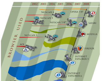
So after coming back from the NACIS conference I've been looking at cloud mapping again. At the conference Mapbox, CartoDB and Leaflet and ArcGIS online were getting a lot of mentions. Compare that to searches from Google trends:
My interpretation is that:
The non-experts are using/interested in ArcGIS online or Google Maps Engine
The experts are interested in the others.
Cloud mapping is on the up (as far as search terms go anyhow)
I get students to build Google Earth tours for classes (see spatial stories in this post), my site Google Earth for Teachers describes how to create them using Google Earth. However, the editing tools are basic to say the least. People have built tools for making tours before (Snoovel, Google Earth Studio) but they've both sunk without trace. So I was excited to find out someone else has had a go: Google Earth Tour Builder.
I had a go at creating a tour. It seems to be following the design of a 'stepper' as in, more like a PowerPoint presentation with slides and clicks to move on than a Movie clip so the flow through the tour is structured like ArcGIS explorer (not sure if that still exists either...). However, beyond that, I can't really explore it. My problems:
- No help files, screencasts, tutorials to tell me how to work it
- When I create a new place I'm told to 'drop a draggable placemark to specify a location' but I can't find anything to drag. (on OS, tried in FF and Chrome).
I was on a road trip holiday the week before last and before I left I read this James Fee blog post he has an image of Godzilla walking into electricity pylons with the tag line 'Google Earth keeps bumping into things trying to work out why it is here'. This led me to ruminate and I quickly wandered from James' post about GEarth enterprise to the more general 'what is Google Earth good for?'. I considered features such as
layer control
zooming
time animation
but, powerful those these are for visualisation, they are all also available in Google Maps and are just as much 2 as 3D*. What truly sets a virtual globe apart from web mapping is 3D and this is what I ended up ruminating on most of all:
Current Uses of 3D. I don't have much time for fancy graphics, so beyond cool looking 3D flights, what does 3D in Google Earth actually add to understanding at the moment? There are several examples:
3D buildings: Populating a city with 3D models adds a lot of value to urban geography, you can see what a skyline looks like or enhance what you've seen on a walk through a foreign city by revisiting your walk in GEarth later. 3D trees are available in GEarth too but I don't think they're nearly as useful as the buildings.
Mountains and Valleys: When considering topics where topography is important a 3D view can add understanding. The Appalachian Mountain removal project is a perfect example as the location of the mines on the tops of the mountains is key to understanding the problem.
Streetview and Panoramas: Streetview and gigapan panoramas come close to giving a realistic 3D view of a scene. Streetview enables you to move from location to location whilst a gigapan allows you to zoom in on interesting features of the panorama.
IMHO the Streetview/Panorama example is the most important of these. However, the 3D visualisations discussed above are far less common on the web than the uses of 2D like data mashups, real time maps and map related infographics.
Future Uses of 3D: But what is available now may not be the whole story. Can we imagine a use for 3D in the future that is the 'killer app?'. Here's some possible future uses:
Real 3D Earth Science Models: Currently the way to present a 3D geology model is to slide it out of the ground to give the viewer the idea that its come from underground. It works pretty well but it would be good to be able to fly beneath the earth's surface and show models in their real situation.
Thematic 3D data: I've frequently discussed 3D thematic maps on this blog, mostly unfavourably. However, the 'Obama: One People' visualisation I discuss here looks to me like it really adds something, I think 3D thematic maps could be useful visualisations but they remain unproven - no one has done user tests on them.
I can foresee that Streetview and similar panoramas will improve in time with real time 360 views and developments like Microsoft's streetslide helping make them more usable. Beyond that, neither of the topic areas listed above is convincing as a killer app.
2D Dominance: So I don't think 3D is ever going to topple 2D as the best way to visualise spatial data. This may seem a little surprising, we live, work and move about in 3D all the time, why won't 3D will become more common? What this point misses is that we also symbolise all the time too, a road map is far more useful than satellite imagery for navigating with because it strips out everything unnecessary (trees, people, greenhouses) and leaves exactly the information we need: roads and junctions as symbols. Usually the best visualisation is the simplest one possible so if a spatial problem can be visualised in 2D its best to do it that way. Especially if you are rendering the map on a small screen smart phone. We live on a planet that were it reduced to the size of a billiard ball would be smoother than any in the world so it really isn't surprising that most of our spatial data can be effectively reduced to 2D.
*of course you can now pull 3D GEarth into a Google Maps but I'm not really focussing on the technology here.
First of all I'll start by making a point by considering a couple of examples of the development of everyday technologies:
College Dropout changes Computer text: The text you're reading on screen would be very different were it not for the actions of a student dropout. Steve Jobs dropped out of Reed college but, because it interested him, still attended a class in calligraphy. The techniques he learnt, about elegant letter spacing and formats, were later applied to the Mac and from there were copied by windows. We've all benefited from Steve's nerdy love of text.
Spam Email didn't have to exist: Email was invented early in the history of the internet but because everyone then knew each other by name, no one bothered to produce code in email programs that checked the ID of senders. We all suffer because this didn't happen, the internet is swamped by spam email traffic that could have been avoided. Google Wave was an attempt to get us all off email to avoid this sort of problem, it didn't take off despite having the promotional weight of Google behind it.
Get Technology right early on: My point is that its incredibly important to try and get early technology right otherwise you may never be able to correct it. One of the issues I see like this in web mapping is the clustering of points, if we get it wrong now we may never be able to undo it and we will end up using sub optimal visualisation techniques just because we've always done it.
It may be that numbered blobs work as a way of clustering placemarks - maybe users immediatly get the concept of a large blob being a cluster and that outweighs other problems I've identified. But what worries me is that this technique is all over the place in web maps and no one has actually done any user testing to show that its effective.
Enter my new MSc student Craig who's doing his project on this map visualisation. By doing a series of user tests we hope to answer the questions:
* Does blob clustering work compared with other techniques? * If not, can we adapt it so it does?
Wider Point: This isn't the only example of a technique that is being widely used in web maps without being user tested (anyone for 3D thematic maps?) so I think Craig's work will also be important in promoting the more general idea that we need usability testing in web maps. At the moment I think web programmers are applying these untested techniques because they think the look flash and/or they are easy to apply because the software needed is readily available.
A couple of developments passed through my inbox this week with the encouraging news that there a growing number of us interested in GeoWeb Usability or NeoCartography:
An Italian Map Design Blog: Giacomo Andreucci from Bologna University emailed me to tell me he enjoys this blog (thanks) , has launched a new maps design blog and that he has produced his own variation of my (old!) list of 10 worst design errors . He has also produced a book which I can't comment on as its in Italian but he tells me he starts it with his own 10 design errors.
I noticed that Declan wrote up an idea we kicked around in September (see 'September' on the DigitalPlanet pages), so I thought it deserved a post. I referred to it then as 'Dreamweaver for KML.
Browser History: In 1997 Netscape adds a feature to its Netscape communicator browser that allowed for WYSIWYG simple production of html web pages. To put that in context you have to recall that this was the late days of the browser wars between Microsoft and Netscape. Then in March 1998 Macromedia release dreamweaver 1, this allowed web pages to be created in WYSIWYG or code views and produced short cuts that produced elegant html. It was also extensible so you could write a 'macro' to produce custom HTML. Developers loved it.
Geo-Browser History: My point is that if you regard GEarth as a geo-browser then the history is similar. Today in GEarth you can create simple maps and tours just like in Netscape communicator you could create simple web pages. However, a lot of sophisticated features such as time, region control, pauses in tours need to be hand coded into the KML. There are a few tools out there that allow you to produce KML without hand coding such as the spreadsheet mapper, my spreadsheet for adding loops and a tool for adding screen overlays but these are all limited in scope.
Tool Description: An obvious improvement would be 'Dreamweaver for Google Earth', where all this functionality was combined into one specialist KML producing program just as dreamweaver was a specialist HTML producing program. It would need to be:
WYSIWYG, ie be able to write code directly or using wizards and then see the result in an instance of the GE API
Extensible allowing you to write an extension that produced your favourite snippet of KML structure.
Elegant, highly usable and producing well formed KML code
So what should its wizards allow you to produce? My list would be:
Time control
Screen Overlays
Functionality producing usable maps e.g. color palettes that avoid color blindness issues
Simple sketchup models such as a photo billboard
Region controls
as well as enhancements to editing tools that are already available in GEarth such as better polygon digitising controls.
Flash Editor for Google Earth? So why haven't I mentioned tours yet? Well, I think the analogy here is with FutureSplash Animator (later 'Flash') released by Macromedia in 1996 which was a timeline based tool for producing animations on the web. It pre-dated Macromedia Dreamweaver and was kept separate. To me, it makes sense that a Google Earth tour is an animation so it needs a separate animation editing tool that is timeline based, I explain in more detail here (although I discuss it by comparison Captivate, another timeline based tool).
So Why aren't you Building these programs then? because if I did, and it was a sucess, a certain company ending with 'Oogle' and beginning with 'G' would bring out a rival and completely blow me out of the water. Instead this is a lazy web request.
I was away when GEarth v6 was released but I was excited to see the pegman make it into GEarth bringing the smooth usability of streetview in GMaps into GEarth.
drag and drop the pegman (orange man icon on the main screen controls) half way through to enter streetview
navigate around in streetview
click 'Exit Street View' button top left of your screen to exit street view
stop the tour.
to quote a famous meerkat: 'simples'
This has a ton of applications:
What better way to direct your friends to the pub?
Real estate (relators in US speak) adverts showing the town amenities close to their property
Teaching human geography
Well done Google, a smart feature all round.
Techy KML Details: GEarth 6 has spawned a new gx KML element: "gx:ViewerOptions", this element inserted into a FlyTo parent with"gx:option name="streetview"" tells GEarth to changes from normal to Streeview in the middle of a tour. ViewerOptions also allows historical imagery and sunlight conditions to be captured as well.
Back Button: As I move around in GEarth, GMaps and other mapping systems it occurred to me that I'd really like to have a back button to fly me back to the last view or back to the last placemark I looked at similar to the way a browser back button takes you back to the last page. You could have a whole history recorded like a GEarth tour which you could replay until you found the location you wanted.
Places Column Tip: There are 3 parts to the element listing in the GEarth places column which can be clicked with different effects. I use this most times I have GEarth open.
Sorry for lack of posts last week, my family is over from New Zealand so I took some time out.
GE 5.2 has already been reviewed well by Mickey and Stephan, I share their enthusiasm for the tracks, elevantion and slide in browser functionality. I've noticed some other features in the 5.2Pro version (not sure if they're in the normal version) that IMHO deserve comment:
Table: (Tools > Table) This gives you a table view of the KML that you've selected in the places column so you can see the text in the description boxes of a number of placemarks at once, its similar in functionality to Northgates KML editor. Table isn't documented anywhere I can find and I was disappointed to find its read only, it really would be useful if you could use it to write to KML directly as per GIS tools and the Northgates tool.
GE gives you the ability to produce KML within the editor already but I'd love to see functionality where I could put time tags into KML without having to copy raw KML out to a text file.
Regionate: This is documented to a degree but it didn't tell me exactly what this functionaility does, e.g. it doesn't chop up paths into smaller segments. Maybe it only deals with placemarks?
I was also excited to see a contextual help button in the dialogue box. Contextual help in GE is something I've advocated before so I was disappointed to find its only in the Regionate and flight simulator dialogue box (given a cursory hunt around). Why not link to help files from all dialogue boxes?
Slide in Browser: Stephan makes a nice point about the slide in browser, I agree with him that maintaining the option of the split screen would be good. However, I think that the sliding browser screen would be excellent for using GE in presentations, set up a tour, fly into an area in GE then pan across a presentation slide in a browser from the web, use that to support your talk for a while then return to GE to continue the tour. I think Google should think about linking the Google Docs presentation tool with Google Earth in this way, I played around with the idea but currently:
It takes 2 clicks to open a presentation (open balloon, select link)
Opening a GDocs presentation in the GE browser currently crashes GE pro!
Polygons and Ruler: I was pleased to see that the polygon bug has been fixed, that was a real pain. Being able to save paths produced with the ruler tool is also smart.
This is a move I suspect is driven by Cloudmade, a competitor using OSM (Open Street Map) data. They've introduced the ability to style maps already, here's a nice muted example (Pale Dawn) that would work well if your background map was adding too much visual clutter:
So competition from Cloudmade has driven the development of features that help in the design of maps. Good. But I have a grumble:
No Usability Advice: The post discusses how you can now match the map color scheme with the surrounding web page and make your map 'stand out from the crowd'. Whilst web page styling is important the post doesn't discuss anything about how use color to improve map usability: having a common theme between web page and map isn't much use if it makes your map impossible to use.
Red Fail: The post illustrates the new functionality with an example which misuses color:
amongst several criticisms I could level at it the clear fail is that the sea is the same color as Yosemite National park making it look like California is a peninsular.
To Be Fair: A 'hello world' example illustrating new functionality isn't meant to be polished but the implication I read into the post is that map usability doesn't matter whilst standing out from the crowd does.
This video is about how volunteers used satellite imagery to digitise roads, refugee camps and other infrastructure in Haiti following the earthquake.
IMHO its the most important instance of what is becoming known as VGI (Volunteered Geographic Information) yet to occur on the web. Those who organised it and those who just took part deserve a great deal of respect, I think we’re going to see a lot more mapping like this in future emergency situations and this was the first example. As they point out, key to this was the rapid publication of high quality satellite imagery.
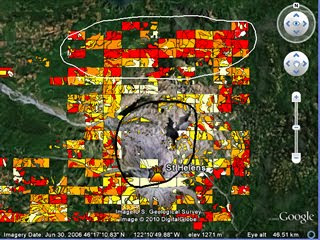
As it happens, I’ve just completed PolyMap a VGI based educational project for Southampton University where we got the students to create a thematic map via a web service based on Google Maps API* . They mapped tree cover around Mt St Helens volcano in USA to see how trees had recovered since the 1980 eruption, click the image to see a demo:
Thoughts for Others considering setting up VGI: Most of the following was obtained via written student feedback:
I gave students a background presentation of how VGI related to crowd sourcing and other VGI projects (here as a PDF), the students said this helped them realise what they were doing was a valid technique beyond the Mt St Helens problem. Could be useful as a motivator in non-educational situations?
I split the area into a grid and assigned them a square each. This helped in getting the entire area mapped although there was some problems with people working in the wrong square etc.
They complained that the classification scheme was difficult to apply whilst I had thought it was fairly simple and well explained. It goes to show that great care is needed in defining and then explaining classification schemes. My video tutorials on how to produce the map were very popular, fool proof documentation and instructions are well worth the investment of time.
They liked the fact that I collated the data and interpreted it in a presentation after they had finished and working in groups on a shared problem.
Advances in Google MyMaps since we started the project mean it would have been possible and much easier to do this project using Google MyMaps rather than the bespoke PolyMap service.
Other Educational Points:
Student feedback was the most positive feedback I've had for a long time!
The 1980 Mt St Helens eruption is a great topic to teach using technology, satellite images, youtube clips and photographs from USGS are out there in abundance. I think having an interesting context (the eruption) is possibly more important to the learning than the quality of the VGI data.
Interesting talk by Jack Dangermond and colleague at Where 2.0 discussing their soon to be released web service: ArcGIS.com.
Background: The reception from the crowd is polite rather than 'stoked' which isn't surprising, this is a collection of neo-geographers (web based maps people) watching a talk from the major player of paleo-geography* desktop GIS.
I think its fair to say that ESRI (Jack's company) has failed to capitalize on the virtual globe or slippy maps (e.g. Google Maps ) market over the last 5 years and now they're playing catch up. Jack's statement that the distinction between neo-geography and GIS was disappearing was interesting, pretty much everything they demoed I'd classify as neo-geography rather than GIS - it was all user side features rather than producer side.
Interesting Features: There were a number of interesting features to the web service shown:
Easy to search for maps from providers (Tree maps from Washington city)
Easy to mash-up maps and create a new map (Tree maps and a chosen base map)
Easy to share your map with a group or with the world
Easy to add annotations to public services (here is a pot hole, please mend it Mr Government)
Automatic integration with mobile devices (currently only iPhone)
Presentation mode (earthquakes and aftershocks in Chile)
All the listed features are currently available on Google Maps and Google Earth. Google My Maps does 1 and 3, customisations of Google Maps do 4 and 5 while Google Earth does 2, 5 and 6. The possible strength of ArcGIS.com is that all these features come in one application. However, the devil is in the usability detail, I'll have to wait for the release to see if they have made it usable enough for the public, usability is a key reason why Google Earth/Maps have flourished so far, if ESRI haven't cracked this issue then I think the service isn't going to fly.
*edited 9th Apr: I didn't mean this to be disparaging just as the opposite of neo-geography
Tuvalu is a Pacific island famous for being vulnerable to global warming induced sea level rise. I've discovered in Google Earth, its already sunk a long way! A case of the model of the sea floor not being accurate enough in Google Earth. See more in this tour (needs GEarth v5+).
I'm not going to be able to do any blogging until July now but there's some outstanding links I wanted to share with you before I disappear.
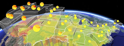
Thematic Map in 3D: This visualization of mobile calls from Washington DC at the Obama Inauguration is fantastic. I'm generally sceptical about 3D thematic maps (example) but this visualization has a couple of features that get around common problems:
By using squares the surface illustrating call density is easy to perceive, if you used complex polygon shapes (e.g. US state boundaries) it would be less easy to perceive.
Lower density of calls is shown by cooler colors, height and also by increased transparency. Higher density by hotter colors, increased height and by less transparency. This means the pattern of calls is easy to work out , its a challenging visual task if just color and height are used.
Interesting to compare with the Geothermal Project (shown above) which also uses transparency and height to illustrate a thematic variable but in a different way.
Fantastic GEarth Tour - Columbia Bridge: This project about bridge construction (via Google Earth Blog) is excellent. I particularly liked:
The bridges rising from the water effect
The use of pause at the start to give people information in the main screen about what they are about to watch.
Splitting the tour into 3 shorter sections reducing download time at the start and also catering for different user needs (some people will just be happy with the introduction, others will want more information)
The animation showing the problem of ships getting through the bridges.
I'll do a fuller critique later on.
Tobler's Law Discussion: Tobler's law is that things close together are more likely to be the same than things far apart. Very interesting discussion from Off the Map blog from Fortis One of the idea that we can apply the same idea to time and that with the new real time sensing capabilities feeding into maps (e.g. mobile phone tracking via GPS) we will see an exploration of this on the GeoWeb.
This is the final part of a three part series on Patterns on the GeoWeb (1, 2).
A screen Shot of the Mt St Helens Volcano in Google Earth showing an overlay map where red is the extent of a Pyroclastic flow.
What: Content designed to be viewed in 3D environment rather than as a simple 2D map. Virtual Globes such as GEarth are migrating into browsers and separate Virtual Globe clients are disappearing. The discussion in the post refers to both browser and client based Virtual Globes.
Use When and Why: The primary reason for using a Virtual Globes is the 3D nature of the visualization needed as in the screen shot, the map as a flat map would lose value from the 3D visualization shown. Other major uses of virtual globes include viewing the ocean floor from below sea level, the altitude and location of a plane's path and 3D buildings.
However, there are also other subtle reasons why 3D can be helpful. For instance, the Mercator projection of the globe which is used by map systems like Google Maps represents the arctic as a strip of white along the top of the map. If you are looking at the arctic as a whole then being able to view it from above the North pole as it really is represents a much better visualization.
I also suspect that being able to fly from place to place on a Globe helps people locate and orient themselves when they are taken to a new place when compared with zooming in and out on a flat 2D map. This idea needs further investigation.
Functionality not available in Browsers: At the time of writing Virtual Globes also offer a range of functionalities not available in browser 2D systems. For example, Google Earth offers:
An easy way to mash data sets together (KML, but other formats are supported)
Producing tours for those who don't want to write KML directly
Accessing a range of data such as the multiple Google Ocean layers in the layers column
There is nothing to stop this functionality appearing in a 2D mapping system and really the situation is a legacy of how programs like Google maps and Google Earth client have developed.
Community GIS for New Orleans: Denice Ross and James Fee gave a good talk on using GIS and web GIS to provide New Orleans with spatial information. What I particularly liked about this was that they mentioned that they did user testing (details). I tend to advocate a less sophisticated testing regime than they describe, I think you can identify most of the problems with your web site without needing to work on users actual machines but it was a good write up.
It was also interesting to hear that James Fee did a good job of assessing technology needs rather than ploughing in and telling the clients what technology they should use.
4D Maps: Brandon Martin-Anderson talked about representing 4 dimensions on a map. There was some interesting stuff in there but I felt he missed out discussing the many examples of time in GEarth and also Hans Rosling's wonderful visualisation tools.
Update:Andrew Turner has suggested "neocartographer" would be a better term than neogeographer in this post, I think he's correct based on this source.
This post is a follow up to a comment on yesterday's post about color blindness by Paul C, who can't read the 49. Color blindness happens to be the most effective way to explain why map makers (neogeographers, GISers and old school cartographers) need to know about map design. Paul asks why neogeographers aren't engaging in design to which a recent conversation is relevant:
A Developers View: In asking a developer friend why developers weren't thinking about map design, he answered that just getting the map to plot is usually what the client is asking for. Applying good design takes more development time and, in a process where unforeseen problems have already taken up time, the client isn't interested in the extra time needed for good design. Which reminds me of a fable:
Fable: Two blokes are lost in the African bush and they've just seen a hungry cheetah. One bloke starts to put on his running shoes. Other bloke says 'that's no use, a cheetah can outrun you no problem'. First bloke retorts: 'yes, but I only have to outrun you'.
Design as USP: In a world where you are the first person to mashup a couple of interesting data sets in a website, you'll get all the web attention. As the GeoWeb develops we can expect to see mashups getting ever easier to produce which will mean multiple overlapping mapping services appearing. At which time good design will be one way to add a USP (unique selling point) to your service.
Paul also asks what can be done about it. Well, this blog is an attempt and if I had the funding I'd be attending where 2.0 and other US conferences where neogegoraphers hang out.
BTW, I'd be intersted to hear if anyone out there counts themselves as a neogeographer and is applying the design best practices I've described in this blog.
I woke up yesterday morning to find the world had changed. London was covered by 10cm of snow, the heaviest snowfall here in 18 years. I woke up this morning to find the Virtual World had changed, Google Earth 5 has arrived with Mars, Oceans and historical data available. Wow.
Tour Backstory: Frank and Stefan have been posting prolifically (1, 2) about Google Earth 5, so I won't do a general round up. Instead, I'm going to explain why the tour functionality is my favorite of the new functions and why it is so important. Watch this video if you don't know what its about:
I hear on the grapevine that this has been some Googler's project for a couple of years now, if this is true s/he deserves a great cheer: IMHO this is the most important change to Google Earth since the timeline came out.
Tour as Introduction: In Google Earth as in any communication technique introductions are vital. You need to summarize quickly what they user can get from using your content and explain how you have structured it for them, I've written about this in detail as part of my tutorials including the characteristics of video introductions (take time to produce, big download for the user but visually captivating) vs text introductions (quick to produce, small download for user but less captivating). Well now we have a third option, the new tour functionality is visually captivating as it is a kind of movie clip, its easy to produce and its a small download (essentially a kml file).
Tour as Presentation: If you are preparing a talk in which place is the most important consideration, instead of using PowerPoint (informed critism about its failings) you can now create a tour in Google Earth instead. The slide transitions will be converted to a much more meaningful 'FlyTo' transition between places. I have given a lot of presentations (usually as part of a larger presentation done with PowerPoint) using Google Earth recently and I was forever double clicking placemarks to take my audience to a new place - the old tour functionality wasn't worth using IMHO. Now I can pre-record my talk tour with smart controls to fast forward, pause, rewind as I wish. I can also automatically rotate the view from one point without having to fiddle with controls whilst in mid speech. Wonderful! And I'll get my students to do it as assignments too.
Tour as Teaching Tool: I can now produce a file that flies students around Google Earth turning on and off placemarks to make teaching points and giving them audio commentary (why audio is so good) at the same time. I can also put a pause in the presentation having told them to go and do something and they have to press the tour 'play' to continue with the tour. That's a very nice way of teaching geography when I'm not there at the front of the class to show them.
Very. Very. Good. Now excuse me while I try and clear the snow from my car...
The web as we know it is based on a book analogy. It started out as little more than text with hyper links. Growing more sophisticated, the addition of multimedia and databases still hasn't altered the central book analogy: a web site is still made up of web pages whatever its content.
IMHO the GeoWeb represents the first radical divergence from this form. In the early days of the web maps were static, but now they're dynamic and involve 3D models, videos and time animations. Such a media is now way beyond what can be called a 'map', but it is map based because the navigation is not structured like a book, its primarily a spatial arrangement. Which goes someway to explain why I talk about Google Earth projects on this blog and don't refer to this or that .kmz file. To me its the difference between between a website and a .html file.
A lot of the terms we use on the web are spatial or have spatial roots e.g.: website, navigation, site map and cyberspace. In fact spatial thinking and location are such a central human approachs to thinking that I wonder if the GeoWeb has the power to overtake the BookWeb. It may happen, it may not but if it does I don't think any of us has the faintest idea what it will actually be like.