We (myself and Artemis Skarlatidou) have just submitted a paper to a cartographic journal about a successful experiment we did on users' understanding of Google Earth Tours. The work produced two rules of thumb to consider when making Google Earth tours so I thought I'd blog about it. Note that the title of this post isn't how to make a 'cool' Google Earth tour that grabs users' attention, this is about how to use them as an effective communication tool.
Why should I care about Google Earth tours?
Before we get to the two best practices its useful to think about the media we're discussing. Is it worth using? My answer to that is that Google Earth tours are common on the web and the wider generic group of Google Earth like animations (Atlas tours) are everywhere! e.g.:
- TV (e.g. weather forecasts)
- The web (e.g. National Geographic)
- Mobile satnav apps
As an example of Atlas tours in satnav apps, both Google Maps and Apple Maps in driving directions mode will zoom into tricky road junctions when you approach them but then zoom out when you are on a straight road section to show you the wider view.
So you should consider creating a Google Earth tour (or Atlas tour if you prefer) as a way to tell your spatial story.
Best practice 1: use high paths
If you are producing a tour with two or more low points, you get to choose how the camera moves between the two low views. Users' mental map of the study area will be better when your tour following a 'Rocket' path(1) where there is a mid point where you can see the start and end of your tour. This video explains the point and tells you how to achieve it technically in Google Earth:
Best practice 2: use of speed
We haven't explicitly proved it but an animation speed of 1 second for any camera motion is a good rule of thumb(2). If the tour is more visually complex, you may want to slow the speed down. Reasons to take more time:
- You are flying through a complex 3D cityscape
- There are lots of elements on screen (points, lines, areas) that you want users to understand
As an example, these are some of the experimental Google Earth tours; only the 'low, fast' condition really troubled the users in the experiment.
Conclusion:
Atlas tours are very common as they are an effective media to communicate a spatial story or data. Google Earth is one of a suite of software that can be used to produce Atlas tours, I think the principles described here will apply whatever software is used.
I read all the studies I could find in 2011 and produced an earlier paper which discussed these and 17 other best practices for producing Google Earth tours. This is the shorter blog version of the paper.
Notes
1] In the paper, this is called the high path. Less memorable but more professional sounding.
2] our experiment ran at speeds slower than this and user's had little problem building up a mental map of the study area.
Showing posts with label Design Principles. Show all posts
Showing posts with label Design Principles. Show all posts
Thursday, October 20, 2016
Monday, August 1, 2016
Thoughts after CAGTI16 (Geo Teachers Institute) part 1
So this time last week I was helping lead the Californian Geo Teachers Institute. John Bailey had filled his hall to capacity with some amazing teachers (example blog post), educational technologists, librarians... I thought I'd jot down some thoughts.

Maps are for everyone: Firstly, its interesting to note the difference between Geo in the USA and in the UK - here, geography is a core school subject so if you put on a GTI you'd mostly attract geography teachers. STEM teachers would mostly stay away - I predict they'd say 'maps are for geographers'. In the States, geography is far less strong at school level so a range of teachers from many subjects showed up to learn what Google Geo tools could do for them. Geo tools are now so easy to use that they can be used across subjects and it would be good if this could done in the UK too.
What Google Earth is for:
So true...
Map Design: I did a session on map design for teachers. As part of this I produced a worksheet that takes you through creating some of the basics of good map design via Google My Maps. Important design points worth making about my maps:
- Google My Maps now allows you to select the base map. Subtle and pale is good as the worksheet example illustrates.
- I find My Maps to be simpler to use than ArcGIS online
- You can choose a rainbow range to style your data. I can't think of a reason you would EVER want to use this and, each time you do, a puppy dies - Kenneth Field rants about rainbow maps as well.
I'll save discussion of tour tips, my thoughts on expeditions and the future of Google's Geo tools for a second post.
Monday, February 29, 2016
Three Types of Google Earth Tour
I happen to have been thinking about the different types of Google Earth tour recently. I've come up with three main types:
3D Flyover:
This type uses just camera motion and is through an area of significant topography (think mountain range) or other 3D structure (think buildings or Geology). Its immersive in the sense that it is close to flying through the actual landscape presented. Here's an example:
http://www.nps.gov/grca/learn/
I think this type is a bit old, people were very excited by them when they were first possible but now we've all grown used to Google Earth they don't impress that much anymore.
Map Tour:
In this type the viewer is flown from location to location with other media being used e.g. photos or overlays on the topography. It may use other map animations such as time animations but these are more minor. It doesn't really try to be immersive, the power of the camera movement is to explain the relative locations of things or to illustrate maps over two or more scales. A couple of examples:
Time tour:
This final type is more an animated map than a tour, it is mainly time animation with camera motion being a less significant animation type. Like the map tour, it doesn't aim for an immersive experience but instead uses Google Earth as a base map on which to present thematic data over time. A good example is this sea ice animation from NSIDC:
Thursday, June 19, 2014
Are men better than women at navigating in virtual 3D spaces?
I have a PhD student Craig Allison who is looking at spatial understanding in maps and related 3D spaces. He entered and won the faculty round of three minute thesis', a public speaking competition to see who could present their work best in three minutes with one powerpoint slide. This is his talk at the final of the event competing with other PhD students from around the University.
Navigation in 3D Spaces: He covers the importance of designing 3D spaces well to assist users navigate them and the gender differences that he has found in his experiments. It's especially relevant to anyone designing virtual field trips using tools such as streetview and/or Sketchup.
Sad that I couldn't make the talk to support him, great work Craig!
I've marked the location of the Psychology building he discusses if anyone wants a look.
Monday, June 9, 2014
What Features should a Teaching GIS have?
Sorry for the quiet on the blog, I'm only just surfacing after a lot of marking and teaching this semester.
In this post I'm going to explore the features needed to make a simple GIS for school level education. There are a lot of new services available that are excellent opportunities for educators (e.g. ArcGIS Online and the Google family of services [review]) so I think a consideration of what features a dream edu-GIS would have is a useful thought experiment.
How would we use a Teaching GIS?
My idea would be a simple introductory GIS that would be suitable to use outside of Geography, e.g. to support a biology project looking at the spread of trees in a forest. The tool would be simple enough that students don't really need to understand they are using GIS at all, it would just work. To teach students about GIScience itself, rather than just using it, you'd probably want another tool.
Working with this constraint defines the general area of functionality we want to cover, we are not thinking about GIS analysis functions (e.g. calculate how many trees are within a particular polygon), we actually need GIS just to visualise the data.
What Features do we need in a Teaching GIS?
So now I've defined the scope of what I'd expect my edu-GIS to achieve, we can dive in and think up some functionality lists. I've assumed there are various features common to all GIS already inherent in my all GISs such as layer control, data importation, navigation tools. Beyond those needs I've come up with two lists:
Must Have:
- Usability: This isn't a feature but is listed as IMHO it's the prime consideration. Whatever other features are available they must be robust, easy to understand and easy to use for students.
- Collection via Mobile devices: The GIS must allow users of mobile devices with GPS's to go out and collect data via customisable forms and upload the data seamlessly to a shared map. E.g. users go out in the forest with smart phones and log locations of different tree species which then uploads to a central map.
- Photographs: There should be a variety of ways of easily bringing photos into the map. In Google Earth these are screen overlay, balloon pop up and ground overlay.
- Symbology Styling: The major groups of symbols (points, lines, polygons) should be available and it should be possible to change the style of a symbol depending on an entered variable. E.g. a bigger icon for trees bigger than 10m. There should be suggested colour palettes for shading but also the ability to customise colour completely e.g. illustrate tree species with shades of green but then highlight one particular tree species using a bright orange.
- Attribute Table: Related to point [4], it should be possible to access the spatial data as a table and be able to edit it, e.g. for one tree change its height from 20 to 30m within the GIS.
- Base Maps: It's important to have an option to chage base maps for different purposes e.g. with lots of data you want to plot it on top of a subtle map that doesn't visually complicate the view. In other situations you may want to use satellite data imagery as your base map.
- Map Overlays: Images should be possible to import as map overlays, e.g. bring in an image of an old map of London and overlay it on the existing topography.
- Layout Tools: It should be possible to add titles, a legend, a scale bar and annotations to a map in a simple way to allow it to be output as a well made static map.
- Story or Tour Tools: There should be tools for constructing 'video' like stories with an audio narrative.
- Export: The raw data and styling data (data about how the map is styled such as title size) should be exportable and be possible to import into a non-cloud service such as ArcGIS or QGIS. This allows students to backup versions as they go along, if something goes badly wrong with the cloud file they are working on in the edu-GIS then they can use an older version elsewhere.
Also Could Have:
- Streetview: A great bonus for education is the ability to be able to snap in and out of 'real world view'
- 3D: Having true 3D rendering as per Google Earth can be very powerful e.g. in looking at conditions on mount Everest but for most applications, 3D is actually not necessary.
- Cross Section Tool: A very useful addition in lots of applications but not core.
- Group working: This is natural advantage of all cloud applications. Being able to collect data to make a map is a core function number [2] but beyond that, IMHO group working on a map is not really core unless you are in a distance learning situation.
- Models: Having 3D rendering of buildings can be very useful but, as with the point about 3D, it's not core. For Geologists 3D models are much more important but I wonder if it would not just be better to build a separate program for making these sorts of models, do they have to be within a GIS?
- Historical Imagery: A great resource for an edu-GIS but the patchiness of good data limits its use much as the fact that streetview is mostly consigned to public roads at the moment.
- Time animation Features: Very powerful but on the edge of what is possible within a school teaching situation, its quite abstract to get students to put these together.
- KML: To explain this point I'll consider the Google Earth situation: for power users, it is endlessly useful to be able to access the code that controls the data itself (KML) and manipulate it outside of Google Earth to go beyond the core functionaility. For example, I have spreadsheets that I can use to produce KML outside of Google Earth and import it in, for example, creating custom Google Earth tour flight paths and speeds. This extends the power of the GIS beyond the functions that are built in.
This is a quick, from the hip, set of thoughts. It would be interesting to hear what other's agreed/disagreed with on my lists.
Friday, January 4, 2013
Google Earth Tours in Education: 19 Best Practices
I'm pleased to say that John Bailey and I have a paper out in "Google Earth and Virtual Visualizations in Education and Research" on 19 best practices on how to design Google Earth tours for education.
The paper isn't free to download but to give you a taster I've taken a table from a draft of the paper which summarizes the best practices discussed (note GET = Google Earth Tour). I've discussed many of these best practices on this blog so I've added links to posts within the table (some posts also discuss other topics).
| Subject Area | ||||
| No. | Major | Minor | Best Practice Description | Evidence |
1
|
Producing Process
|
Iteration and testing
|
GETs should be generated in an iterative process that incorporates user testing.
|
Scholarly
|
2
|
Student focus
|
Scholarly
| ||
3
|
GET Slides
|
Narration, Annotations and Labels
|
Empirical
| |
4
|
Empirical
| |||
5
|
Empirical
| |||
6
|
Labels and annotations should be used often but without impacting visual clarity.
|
Empirical
| ||
7
|
Chart Junk
|
Empirical
| ||
8
|
Personalization
|
Within a GET narration should use less formal language
|
Empirical
| |
9
|
Using Animations
|
Scholarly
| ||
10
|
The visual complexity of GETs should be made simpler than comparative static maps where possible.
|
Scholarly
| ||
11
|
GET Virtual Flights
|
Speed of Flight
|
Speed in flights should be slower with rising complexity on screen and be in the range 0.5 to 8 scales per second.
|
Scholarly
|
12
|
Camera Angles
|
Empirical
| ||
13
|
Looped Paths and Overviews
|
Empirical
| ||
14
|
Empirical
| |||
15
|
Acceleration and Deceleration
|
GET flights between waypoints should accelerate at the start and decelerate at the end.
|
Scholarly
| |
16
|
CombinedGET Slides and Virtual Flights
|
Grids for Navigation and Scale
|
Scholarly
| |
17
|
Scholarly
| |||
18
|
Embedding GETs in Earth Science Teaching
|
Topics that are Effective when presented as GE Tours
|
The use of a GETs should be particularly considered when illustrating 3D topography, data over a range of scales/locations, and/or introducing a GE map collection.
|
Logical
|
19
|
Creating Activities for GE tours
|
GETs should be used to support activity-based teaching
|
Empirical
| |
Wednesday, August 8, 2012
Simple or Complex Map Icons
Over at my other blog I've just posted a response to a Google IO talk. In the second half of the post I discuss whether you should use simple symbol icons (e.g. circles) vs picture icons (a simplified icon showing a wolf) which is relevant to Google Earth.
Thursday, November 17, 2011
Misleading BBC Landscape Animation
This is a lovely science story: A massive range of mountains completely covered by the Antarctic ice sheet has been mapped in 3D detail. The story is nicely explained in an animation similar to a Google Earth Tour.

Unfortunately it contains a visualization howler: The vertical exaggeration is about x200 and although this is marked on the above diagram, it isn't emphasized (the 4000m scale bar is off in a corner). When you play the animation, it gets worse, you aren't told about the exaggeration at all. The outcome is that untrained viewers of this visualisation will think that under the ice the topography is much steeper than the Himalayas whereas I estimate the steepest slope they have visualized is no more than 1:500.
Unfortunately it contains a visualization howler: The vertical exaggeration is about x200 and although this is marked on the above diagram, it isn't emphasized (the 4000m scale bar is off in a corner). When you play the animation, it gets worse, you aren't told about the exaggeration at all. The outcome is that untrained viewers of this visualisation will think that under the ice the topography is much steeper than the Himalayas whereas I estimate the steepest slope they have visualized is no more than 1:500.
Thursday, August 11, 2011
Navigation - Too much freedom?
I'm currently writing a paper about the use of GEarth Tours in education. I thought I'd discuss one aspect that's come up: the problems of navigation in 3D software (thats Maps as well as GEarth as you effectively move through 3D space using pan and zoom).
The Problem: In GEarth you have 5 degrees of freedom:
Altitude, Latitude, Longitude, Camera Pitch, Camera direction
The Problem: In GEarth you have 5 degrees of freedom:
Altitude, Latitude, Longitude, Camera Pitch, Camera direction
Controlling these is complex and so causes problems - users can:
- become lost in virtual space
- get disorientated
- become confused as they fly through model walls (ie inside a building only designed to be seen from outside)
- navigate around missing the views that the designer of a GEarth project wanted them to see.
Similar Problems in other Software: It isn't just GEarth - map systems, information spaces with pan and zoom functionality and Virtual Worlds all suffer from similar problems. In some software its possible to fly straight into the ground with nothing visible at all which is when you get 'desert fog', users don't know where they are with no visual clues on screen to help them.
Solutions: There are multiple solutions I've found in the literature, one is illustrated by Google Body: Constraining freedoms of movement from 5 to 2. When viewing the body your camera angle is fixed and you can only fly around a cylinder of fixed distance from the body (in fact it feels more like you are moving the body rather than your camear position but actually they add up to the same thing).
GEarth Tours: The solution readily available in GEarth is the GEarth tour, effectively you are constraining the user to 1 degree of freedom as within a tour they only have the ability to play or rewind - nothing else. This means that providing the tour is designed well we mitigate or solve all the problems I listed above.
In education removing those issues comes at a cost: users watching a tour are far more passive than if they are navigating around so we have to be careful to insert active tasks into tour. For example, turning the tour off for a while and having students go and search for a landscape linked to the GEarth tour they've just viewed. How to do this is the theory that we are investigating with our Google Research Award.
Thursday, August 4, 2011
Usability testing and Problems with Questionnaires
I came across this interesting presentation from Patrick Weber and Catherine Jones (amended to name both authors 11 August) at SOTM eu. He discusses usability issues with Open Street Maps editor using eye tracking and usability techniques. I only got the video to work by downloading it, the player didn't work.
Map Usability: What's great about this is that its a discussion about the usability of maps in the public sphere not a secret report for some company. IMHO there is a great need for much more of this work, we're woefully unaware of how to make interactive maps usable. It has lots in common with a current MSc project I'm supervising that I discussed last week looking at placemark clustering.
Simple Testing: Patrick discusses results from videoing users and eye tracking. These tools definitely help analyse and communicate the issues that arise from testing but you can still find out a lot without these tools via a technique is called Hallway testing (talk aloud procedure). It takes about half a day and needs no eye tracking or video recording.
Testing 'Doing' not Gathering Opinions: Hallway testing is pretty quick given the amount of information you get from them but its quicker still to gather feedback by questionnaires. Questionnaire feedback gives you some useful insights into your map system but it is by no way a complete picture. This was bought home to me this week in a reference I found about users searching for targets in overview* maps. The experiment tested search tasks with and without an overview map. Users were very positive about the value of overview maps but when the speed and accuracy of the searching were analysed using the overview it turned out that their performance didn't improve. Questionnaire data can be misleading, to really find out the truth you have to observe (and measure if you can) users trying to complete tasks with you map based tool.
*An overview is a small map in the corner of a web page showing the view from a higher altitude and usually marking the current view.
Wednesday, July 27, 2011
3 Crime Maps: Point collation
Quick update of the Placemark Clustering project: we'll be doing user tests using the uk police crime map later this summer (discussed below) comparing it to a chloropleth grid (translation = head map based on grid, I explain further here)
In thinking about this I've hunted down some examples and I thought it would be interesting to name check 3.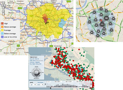
No Collation: The first map is Oakland Crime Spotting (bottom inset in figure) that is very similar to San Francisco Crime mapping, reviewed here. Unlike the other two maps it attempts no point collation at all, I image the authors would argue that they deal with the problem by providing sophisticated filtering tools to reduce the point density. However, it doesn't help if the user wants to get an overview picture of crime across the area the map covers.
Traditional Choropleth: Switching to the the UK, the Metropolitan Police (=London for non UK readers) offer a choropleth map based on wards and subwards (top left insert). I regard this as the traditional approach. Notably it doesn't show actual figures for postcodes, only sub wards - a sub ward is a collection of postcodes. My problem with this is that almost no one knows the boundaries of wards and sub wards so its a strange way to split the city up. (Aside: in my experience, Londoners tend to split London up based on tube stations)
Point Collation: The UK police offer a national map which uses point collation (top right insert). This is the main one we're planning to test as IMHO it isn't an effective way to visualise the data (related post). It offers a finer grain of data - you don't actually see the true location of the crime but it is collated down to the postcode level. In London, a postcode is roughly equal to a single street.
Also worthy of a mention although not a crime map is the Google Haiti Resource finder which uses a very similar point collation method of collating data points.
Friday, June 17, 2011
Do Flashy Google Earth Tours have a Place?
Looking at the examples of GE tours out on the web I'm struck that they often use flashy attention grabbing effects but fail to communicate their content well, (an example discussed). However, watching this video made me pause and rethink
Chart Junk: I've always advocated the Edward Tufte approach to graphic communication, he regards anything that is not directly contributing to communication as 'Chart Junk' - anything that is there to make the tour look flash or just as decoration is getting in the way of the message and should be removed. Richard Mayer has empirical evidence showing that chart junk in educational animations (which are very similar to GE tours) has a negative effect on teaching efficiency which he calls the coherence principle.
Context is All: So is chart junk fluff that should be removed or does it add a professional feel and grab attention in a useful way? My view is that in formal education (taught classes in schools or Unis) producing intangible value should be low priority, any clever effects in GE tours fail to grab attention by the 2nd or 3rd lecture of a course. However, in an outreach context, particularly in a setting like a kiosk in a museum, a GE tour would be vying for attention against other exhibits so special effects represent intangible value that is worth having. These two contexts are extreme points on the end of a scale and there are all sorts of other contexts inbetween them for which decisions need to be made. The key question in making such design decisions is 'do I need to grab users attention?'.
Content First, Flash Presentation Second: Despite the context discussion above I would add that even in a context where flash presentation is important authors need to be careful that the message still gets through. Its no use grabbing someones attention if you fail to then do anything with the time they then give you. Juggling this need to both attract attention and also tell a good story is not easy but Hallway Testing is the solution.
My answer to the original question is 'Yes, but it depends on the context and where the answer is 'yes', be careful'.
Friday, June 3, 2011
Grids and Scale Bars
Related to my post last week about landmarks and judging distance I have some suggestions for GEarth itself.
Scale Bar Problem: At the moment if you click
View > Scale legend
you get a scale bar in the bottom left corner of GEarth. It isn't very usable as it works in the same space as the tour controller. Also, as you zoom in or out the bar itself stays static and just the measure of the distance changes. This doesn't work very well as users can't gauge what 3/4 of 772.1m is quickly.
My Solution: It would be a lot better if the bar itself changed size and the numbers stayed round until a new number was needed. So zooming from a scale where the scale bar initially showed 0 to 100m my idea would be to have the bar gradually expanding until it reaches a critical width at which point the bar snaps back to half its width and the scale numbers now read 0 to 200m.
Grid: Selecting
View > Grid
pulls up a grid of thin white lines that dynamically change as you zoom in and out. Ironically, its a lot like the solution I suggested for the scale bar above but in this case, I don't think it works as its all over the screen and is too visually busy. Better to Allow the user to choose to have a grid of a fixed width visible which has smallish crosses at intersections rather than having a complete grid. This would help with orientation and memory. If you're interested in reading further about landmarks in Virtual Worlds and Virtual Reality I can recomend this paper .
If you have your own suggestions as to how to improve GEarth, Google would like to hear from you. I've added my vote on the above topics...
Friday, May 27, 2011
Tours User Testing
Earlier this year I did some user testing on Tours in Google Earth investigating my thoughts on best practices for producing tours in a more detailed fashion. Volunteers watched simple tours which flew them from one placemark to another via a variety of paths. The placemarks were then switched off and, from a high view, users were asked to identify where the markers were.
Preliminary results show some interesting outcomes that should be bourne in mind when producing Google Earth Tours (GETs):
Speed: Double click a placemark in Google Earth and you will be flown into a closer view at the default speed. We flew students around at that speed, twice as fast and half as slow but to little effect, students across the 3 speeds performed similarly whatever speed was used.
I've often worried that I'm flying students too fast for them to follow where they're flying from or to within a GET. It seems for simple paths, students can be flown surprisingly fast and still follow what's happening.
Overview: The paths used flew students from placemark to placemark at a high altitude with both placemarks clearly in view at the same time and also along the same route but at a lower altitude without being able to see both placemarks at the same time. Not having an overview dramatic reduced students abilities to recall placemark locations.
In terms of best practices this leads us to suggest that unless you have good reason not to, virtual flight segments within a GET should always include a mid point overview showing both placemarks in view if this does not naturally occur.
Distance vs Direction: Students proved good at tracking the direction they were following but were less good at guessing the overall distance between placemarks. Evidence for this is less clear but it may be worthwhile reminding students of scale when they are at overview points so they can get a sense of overall distances between map elements.
I'm writing the results up more formally for those interested.
Thursday, May 19, 2011
Google IO talk on Maps Usability
Stuff I liked:
- Mobile vs Desktop: I don't do much with mobile maps so it was interesting to have the differences between mobile and desktop discussed, I liked the idea that users on the desktop are 'planning'
- Rendering Speed: Fast response is an integral part of the UX (user experience), I haven't really thought about this before except for very slow rendering maps so the discussion at 21 mins in was useful.
- Emphasising: Justin's points about how to use the GMaps API to demphasise uneeded map elements (30mins onwards) were smart and well made. I liked his examples of both good and bad maps.
- White roads for routes I especially liked Justin's point about making roads white for route focussed maps (36 mins), he's right that it emphasises the route well.
- Placemark Clustering: At 14.29 Jez and Luke promote the idea that a placemark clustering visualisation is better than not clustering points. Strictly they're correct as it is a way of tackling the 'too many points' problem but I think placemark clustering is flawed and not as good as other techniques. It should be said that this is my opinion - it may be that the clustering they show is actually a very effective technique, the proof would be a user test (which I will have a student looking at later this summer). My point is you shouldn't promote an unproven technique.
- Walk the Walk: It would have been good if the heat map Jez and Luke presented at at 14.58 had heeded Justin's smart advice and faded the background so the mix of colors stood out. To be fair, I guess it wouldn't have been straight forward to do this as it was a fusion tables map visualisation rather than a straight instance of the maps API but it can't be that difficult.
- Missing Topics: So they covered a lot of topics but there's a of UX things that IMHO are relevant to developers that I discussed but which failed to get a mention: Layer control, Icon design (although they did point out that you should choose useful icons rather than just use the default markers), use of color, balloon design, map copy/micro-copy and introductions.
Thursday, April 21, 2011
Gapminder and GA Conference 2011
So at the GA Conference last weekend the most interesting thing for me was Hans Rosling and Gapminder. Hans's talk was excellent, as he was addressing a set of Geography teachers he went into more depth about some map design characteristics of the Gapminder World. If you haven't come across it I recommend you give it 4.5 minutes of your time by watching this video
Thematic Maps: Gapminder started out visualising the data with a standard thematic map of the world which they colored to show changing variables like rise in GDP. Hans said they soon rejected that as countries with big areas such as Australia dominate the view visually. That's a clever insight IMHO.
Map with Symbols: So they tried circle symbols and varied their sizes. This was better but a change in size isn't as visually arresting as movement. Hans's smart phrase was : 'movement has a direct highway to the brain'. So they ended up with their famous graph visualisation and a map tab you can click to see a map presentation. I think the key point about the data presentation is that country location isn't that important, all you really need to know is which continent a country is in. This means the map can be ditched in favour of a graph plot which brings with it the advantages of movement and the ability to draw tracks.
I couldn't help thinking that Hans the statistician seems to know more about good graphical and map design than a lot of GeoWeb developers and GIS specialists I know.
Happy Easter Break!
Thursday, April 14, 2011
7 Foot White Elephant: When Globes Fail
Negative Reviews: Observant readers of this blog may have noticed I've stopped doing reviews of Google Earth projects recently. They took a lot of time and I'd always get a defensive response from the authors which isn't any use in starting dialogue and discussion about map/Virtual Globe design. However, someone actively promoting bad techniques of geo-visualization in a keynote presentation deserves a rebuttle so here's some thoughts on Julia Grace's keynote from Web 2.0 Expo NY 2010:
At 2.29 she shows a graphic with static, old style pie, line and bar charts:
"whenever I see these sorts of charts, something inside of me dies. The bottom line is that we can do better than this"
Simple is Best: Well yes, sometimes a highly interactive graphic is a great answer to a communication problem but a lot of the time simple non-interactive graphics are better. Perfect example, David MaCandlass's graphic of scare stories with time. Its well produced but at its heart it's a simple line graph:
At 5.34 into her keynote I end up agreeing with Julia for a while. She name checks the interactive NYT Oil spill map as being an excellent visualisation. I agree with her on that, its a great use of an interactive map tools to help the user understand the spill.
Map on a Globe: At 6.06 she then discusses a 2D map of IBM offices she had to use, she thought it sucked because of map distortion, her solution? Go out and buy a 7 foot globe and project the map onto that (an image comes up at 6.39). Apparently the globe was so large it wouldn't go through the door of their offices.
The Problem with the Globe: The problem she thinks she's solved is an ancient one: you can't represent the earth's surface on a flat surface without distorting the map in some way. However, although the globe solution she's promoting does solve the distortion it has an even more important flaw: now you can't see all the offices at the same time because they're on different sides of the globe. Even if the globe was the best solution, what's so wrong with a virtual globe on an iPad? A whole lot cheaper and much, much easier to get through doors.
When High Tech is not Cool: But what I really object to in this talk is the tone. Simple visualisations are likened to 'Tron', old, flat and outmoded whereas 'Minority Report' visualisations are cool, 3D and the shape of things to come. Of course this isn't true, the best data visualisation solution is defined primarily by the audience you're addressing and sometimes simple is best. You'll notice she never mentions users and usability.
Friday, April 8, 2011
Investigation into Placemark Clustering
First of all I'll start by making a point by considering a couple of examples of the development of everyday technologies:
Spam Email didn't have to exist: Email was invented early in the history of the internet but because everyone then knew each other by name, no one bothered to produce code in email programs that checked the ID of senders. We all suffer because this didn't happen, the internet is swamped by spam email traffic that could have been avoided. Google Wave was an attempt to get us all off email to avoid this sort of problem, it didn't take off despite having the promotional weight of Google behind it.
Get Technology right early on: My point is that its incredibly important to try and get early technology right otherwise you may never be able to correct it. One of the issues I see like this in web mapping is the clustering of points, if we get it wrong now we may never be able to undo it and we will end up using sub optimal visualisation techniques just because we've always done it.

Clustering Placemarks: Previously I've written about the problem, placemarks need clustering because at a certain density of points it is becomes impossible to pick individual points out. IMHO some of the ways of visualising these are poorly designed e.g. clustering placemarks into 'blobs' with numbers.
It may be that numbered blobs work as a way of clustering placemarks - maybe users immediatly get the concept of a large blob being a cluster and that outweighs other problems I've identified. But what worries me is that this technique is all over the place in web maps and no one has actually done any user testing to show that its effective.
Enter my new MSc student Craig who's doing his project on this map visualisation. By doing a series of user tests we hope to answer the questions:
* Does blob clustering work compared with other techniques?
* If not, can we adapt it so it does?
Wider Point: This isn't the only example of a technique that is being widely used in web maps without being user tested (anyone for 3D thematic maps?) so I think Craig's work will also be important in promoting the more general idea that we need usability testing in web maps. At the moment I think web programmers are applying these untested techniques because they think the look flash and/or they are easy to apply because the software needed is readily available.
Thursday, March 31, 2011
Street View in Tours: Ancient Rome
AFAIK I was the first blogger to spot that the new GEarth tours in GE6 supported streetview. I still think this a great bit of functionality and I'm surprised I haven't seen it popping up more. Today I came across yesterday's blog post by Google about how their streetview trike has been capturing imagery of historic European sites (what a cool job that trike operator must have), really clever use of the technology but I was interested in the way they presented the streeview examples: They linked out to GMaps instances of streetview from within the blog, three examples are shown here:
to play in GEarth itself Rome Street View tour
Colosseum
It works and is impressive but this form of presentation is clunky if you wanted to see the relationship between sites in which case a GEarth tour becomes the media to choose. As an experiment I've produced these three sites in a GEarth tour, it's a bit rough but I think you can see my point about how this is a better way if the geographic relationship of the three sites is important.
to play in GEarth itself Rome Street View tour
Note I used the wrong forum site.
Good Design Points:
- You'll note that by use of annotations for Rome, and a 'reference' square I give a sense of location and scale to the viewer.
- Use of the square allows people to memorise the locations of the three sites as it acts as a strong landmark.
- I return to high views between sites as this allows people to follow where they're being flown to.
- I also customised the Colosseum views and tour path (by choosing a different high view) as in its original format the tour flew through the Colosseum walls - distracting for the viewer.
- I make explicit remarks about how the user can pause the movie to look around and also about how fast the imagery is likely to be downloading. The former is necessary to encourage active use of a tour, most people will hit play and sit back if you don't actively suggest they could do something different. The comment about imagery download will help those on slow connections who may be thinking 'its not working' as all they can see is a pixelated sludge on screen.
Technical Points:
In KML you can control turning on and off streetview, the sunlight slider and historical imagery. It would be useful to be able to do the same for 3D buildings and roads. However, by using the Tour gadget to produce GEarth in a browser (as I did) you can control these layers without needing to code anything.
I also noted that streetview imagery is low resolution until you click pause at which point it sharpens up.
Friday, February 4, 2011
Dreamweaver for Google Earth
I noticed that Declan wrote up an idea we kicked around in September (see 'September' on the DigitalPlanet pages), so I thought it deserved a post. I referred to it then as 'Dreamweaver for KML.
Image courtesy of favbrowser. A bit out of date but still interesting.
Geo-Browser History: My point is that if you regard GEarth as a geo-browser then the history is similar. Today in GEarth you can create simple maps and tours just like in Netscape communicator you could create simple web pages. However, a lot of sophisticated features such as time, region control, pauses in tours need to be hand coded into the KML. There are a few tools out there that allow you to produce KML without hand coding such as the spreadsheet mapper, my spreadsheet for adding loops and a tool for adding screen overlays but these are all limited in scope.
Tool Description: An obvious improvement would be 'Dreamweaver for Google Earth', where all this functionality was combined into one specialist KML producing program just as dreamweaver was a specialist HTML producing program. It would need to be:
- WYSIWYG, ie be able to write code directly or using wizards and then see the result in an instance of the GE API
- Extensible allowing you to write an extension that produced your favourite snippet of KML structure.
- Elegant, highly usable and producing well formed KML code
So what should its wizards allow you to produce? My list would be:
- Time control
- Screen Overlays
- Functionality producing usable maps e.g. color palettes that avoid color blindness issues
- Simple sketchup models such as a photo billboard
- Region controls
as well as enhancements to editing tools that are already available in GEarth such as better polygon digitising controls.
Flash Editor for Google Earth? So why haven't I mentioned tours yet? Well, I think the analogy here is with FutureSplash Animator (later 'Flash') released by Macromedia in 1996 which was a timeline based tool for producing animations on the web. It pre-dated Macromedia Dreamweaver and was kept separate. To me, it makes sense that a Google Earth tour is an animation so it needs a separate animation editing tool that is timeline based, I explain in more detail here (although I discuss it by comparison Captivate, another timeline based tool).
So Why aren't you Building these programs then? because if I did, and it was a sucess, a certain company ending with 'Oogle' and beginning with 'G' would bring out a rival and completely blow me out of the water. Instead this is a lazy web request.
Subscribe to:
Posts (Atom)