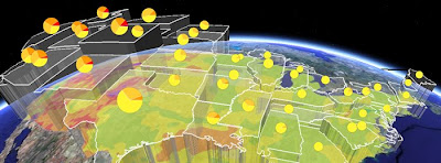
Thematic Map in 3D: This visualization of mobile calls from Washington DC at the Obama Inauguration is fantastic. I'm generally sceptical about 3D thematic maps (example) but this visualization has a couple of features that get around common problems:
- By using squares the surface illustrating call density is easy to perceive, if you used complex polygon shapes (e.g. US state boundaries) it would be less easy to perceive.
- Lower density of calls is shown by cooler colors, height and also by increased transparency. Higher density by hotter colors, increased height and by less transparency. This means the pattern of calls is easy to work out , its a challenging visual task if just color and height are used.

Interesting to compare with the Geothermal Project (shown above) which also uses transparency and height to illustrate a thematic variable but in a different way.
Fantastic GEarth Tour - Columbia Bridge: This project about bridge construction (via Google Earth Blog) is excellent. I particularly liked:
- The bridges rising from the water effect
- The use of pause at the start to give people information in the main screen about what they are about to watch.
- Splitting the tour into 3 shorter sections reducing download time at the start and also catering for different user needs (some people will just be happy with the introduction, others will want more information)
- The animation showing the problem of ships getting through the bridges.
Tobler's Law Discussion: Tobler's law is that things close together are more likely to be the same than things far apart. Very interesting discussion from Off the Map blog from Fortis One of the idea that we can apply the same idea to time and that with the new real time sensing capabilities feeding into maps (e.g. mobile phone tracking via GPS) we will see an exploration of this on the GeoWeb.
No comments:
Post a Comment