Monday, October 1, 2018

Esri Story Maps Experiment

This blog post is about me experimenting with Esri Story Maps  specifically the Cascade type, with a view to using them in educational situations both tutor authored (e.g. a case study location) and student authored (e.g. a report on a field study).  Esri Story Maps is a variant of what I call  Atlas Tours (map animations linked by a narrative).  Students find them creative and they can be linked to practising graphical literacy and also linked to fieldwork.

Screenshot of Esri Story Maps, click to open.


Background:  I'm currently writing a paper about this and the main example is using Esri Story Maps in a module run by one of the co-authors Damien Mansell (other co-author: Derek France).  The paper deliberately avoids discussing the actual tech in order to focus on educational principles so I thought I should have a crack with Esri Story Maps to explore the tech side of things.  I was thinking about various topics to tackle but then Kilauea erupted, my colleague at the Open Universtiy, Prof David Rothery, wrote a Conversation piece about it and I felt I had to have a go because it seemed a nice way to revisit a flash based resource about it whilst volunteering for the USGS in 2003.


Esri Story Maps background:  Esri Story Maps is a free platform for creating Atlas Tours, previously I've talked a lot about Google Earth Tours, which are also free to use.  The formats differ:

  • Esri Story Maps (Cascade) is 'scrollytelling', a format that started with the stunning Snow Fall by the New York Times in 2012.  The narrative is delivered by text and the scrolling drives film and animations.  For some reason users prefer scrolling to clicking 'next' buttons and that shows in web analytics - e.g. they will read further.  
  • Google Earth Tours can be audio or text narrated and usually form more of a virtual flight around a study site.


Esri Story Maps Functionality:  My comments apply to creation both by tutors or students unless noted otherwise. It's pretty easy to use (in depth tutorial by John Nelson), here are some useful things you can do with it in an educational setting:

Zoom in:  Create a map with various layers on it.  Zoom in from a high viewpoint to a detailed viewpoint to convey spatial situation.  In the Kilauea example, I zoomed in from a high view of the Pacific to show the location of Big Island Hawaii in the Hawaiian island chain.

Progressive zoom animation into part of Big Island Hawaii


Time Animation/Show different data layers sequentially:  Different layers can be shown sequentially, this can be a time animation (e.g. spread of Post Offices across USA over last two centuries) or other comparisons of layers such as land cover types in the UK e.g this by Esri education UK (full Esri Story Map  source is worth looking at)


Map Search Activity:  I think this one better suited to tutor-authored Esri Story Maps: create an Esri Story Map to introduce a concept or case study and then insert a zoom/pan-able map for them to search as an activity.  In the Kilauea example I found an eruption map (from ArcGIS Online) which I suggested students explore to find other example of vulcanism.  In a similar development, Esri education includes a more sophisticated version of a searchable map with clickable views in their example above. 

Enhance text with Video:  Esri Story Maps allows you to embed other web elements in the presentation.  In the Kilauea example I embedded a video but you could also embed other web elements such as other 'single map' story map types such as the swipe and spyglass.

I've previously discussed good practice about creating Atlas Tours, all of which are possible with Esri Story Maps

Technical gotchas:  Esri Story Maps is fairly easy to use to create a presentation, and Damien found students generally very supportive of using it to create an Atlas Tour in an assignment (which we'll discuss in the paper).  However, if you invite students to create an Esri Story Maps, some technical points to emphasise to them:
  • You have to remember to save edits.  In a lot of cloud apps, save is automatic so this can cause confusion.
  • Creating a map is done in ArcGIS Online and then bought into Esri Story Maps platform.  This is clunky IMHO and may cause confusion with students not understanding the two virtual spaces they are working in.  
Neither of the issues is major IMHO. 

Conclusion:  As with all edtech, there is a tutor investment of time necessary to explore using Esri Story Maps but it could be used to enhance Geography or other spatial teaching right now.  


Tuesday, June 12, 2018

In memoriam: Ron Schott

This is a joint post by Richard and John Bailey, (Program Manager Google Earth Education)

Ronald C. Schott was one of the original community users and advocates for the use of Google Earth in Earth Science and Education. Sadly we found out this weekend, that Ron died last week of natural causes.

In the early days of the Google Earth Community and related blogs, Ron was always the most positive voice, and led the charge for use of GE in Earth Science. It could be argued that he was THE original advocate as he was an early Keyhole user, and pushed the Earth Science / Education angle from those first days via his Geology Home Companion Blog. This all despite his traditional training as a geologist and focus on fieldwork. He saw there was a great opportunity for the science and technology to come together.

His blog, along with his active twitter and G+ profiles have been credited by many in the Geology and EdTech (and both) communities as major influences on their own geology careers, social media and other writings. He was known for spending a lot of time helping and interacting with geologists, students and armchair explorers that he’d never even met but who asked for help. One of his pet topics was advocating for a Google Earth “Geology layer”, which ironically the new layers now has the potential to make possible.

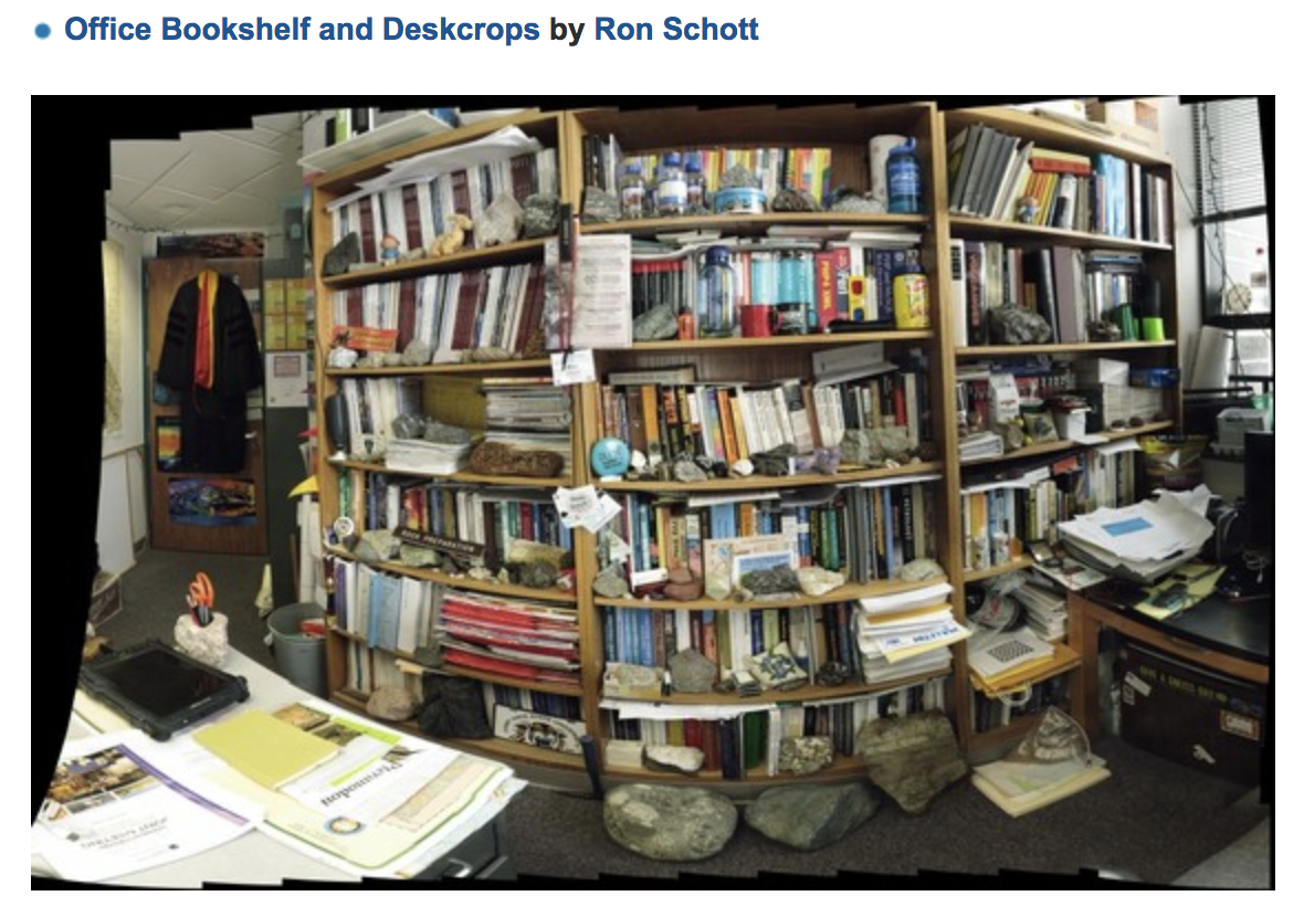
Ron was famous for his Gigapans - the one of his office is a classic.  As part of the fun, Edi and Berti are often lurking in there (someone tell me which one I've pictured below?).


It was in this world of Gigapan imagery where Ron excelled, he was one of the original beta testers and had few peers. His catalogue of uploaded images stands as a unique contribution to the world Geology community: Ron Schott and his 1,000 Gigapans.  He was also know for his excellent use of social media to promote Gigapanning and Gigapans and he did the same with Google Earth: his involvement in the #WOGE (Where on Google Earth?) game helped fuel an active blog and social media interest around Earth (and also led to the "Schott rule").

Ron was also part of the Virtual Globes at AGU sessions from day one, as both a contributor and organizer. Spun out from this, at the Penrose Conference held at Google in 2011, Ron organized the fieldtrip to the Marin headlands around using Google Earth “in the field”. We were later collaborators on on NSF-funded projects around using Google Earth and Geo for Education.

Coming into the present day, it was somewhat surreal that Rich messaged John with the sad news that we’d lost Ron and it flashed up on John’s phone as he stood watching sunrise over one the world’s most spectacular outcrops: Uluru, a massive sandstone inselberg in the heart of the Australia’s arid "Red Centre".

John writes: Although we’d both had fewer interactions in the last few years since I joined the GEO team, Ron was a friend, and a big part of the world that led me to joining Google, he will be greatly missed.

Rich writes:  Like John, I hadn’t spoken to Ron for a while at the start of this year.  However, I’m active on Twitter and Ron was ALWAYS popping up in my timeline and liking my tweets over the years since the Penrose conference.  The response to the news on Twitter shows it wasn’t just me, he was a huge part of many geologists experience on Twitter.

Rich writes:  Twitter led me to my last conversation with him, I had a hangout with him back in March picking up a thread of discussion on virtual fieldtrips.  We chatted about a ‘road trip’ geology idea I’d had, as always he was a technical guru and gave me some excellent notes to consider, both technical and educational.  We ended with me promising to set up a group web call with some other people about virtual fieldtrips, one of those ‘when I have the time’ ideas that we all have.  Of course everything else intervened and, to my shame, it fell off my todo list.  I feel sad to have missed the chance to hear his views on the recent developments in our field one last time.

The last word should go to Ron on his beloved gigapan work:
I hope that the images I shoot will help educators teach the science of geology and will inspire others to get interested in geology and strive to learn more about the planet they live on

Richard Treves, blog owner. 

John Bailey

Program Manager
Google Earth Education

We also lost Declan de Paor this week, a separate blog about him to follow.

Friday, May 11, 2018


Google have just released 'VR tour creator'.  Excellent!

This allows anyone to:
  • Identify a series of streetview photospheres
  • Add 'points of interest' to them with text or photos
  • Publish to the world

Which is essentially a way of authoring a Google Expedition.

This is a great tool for education projects, I've seen examples done already with other tools (sorry, can't find link) but Google make it very easy for students with this cloud offering.

Hello World tour (translation: my first tryout)
I've already had a play, creating a tour using photos of my work place:  the Open University campus at Milton Keynes (the OU is 100% distance learning so the campus isn't somewhere the majority of our students ever visit).  As with most recent Google tools, the usability and interface was well thought out and designed so I had no real problems.


The embedded iframe above won't work on certain machines, fire up the post on a recent laptop to see it.

Example activity - comparing town and city shopping.
If it would help get your creative juices flowing, here's an an example student activity I thought up: compare town shopping and city shopping.  I live in Leighton Buzzard, UK, a small town (streetview).  I work in Milton Keynes, a city with well developed shopping centres (malls)(streetview).  Students could be challenged with a field trip task:  Go and take photos to illustrate the differences of shopping in a small market town with a traditional UK high street vs shopping in Milton Keynes.  What you'd hope they'd identify:
  • City shops are all under cover with easy parking and lots of choice
  • Town shopping offers less choice, less service (e.g no cover or particularly good parking) but maybe more personal - you may get to know the people running the shops. 

The challenge for students would be to:
  • Identify photos to take
  • Identify photospheres (in streetview) to use
  • What points of interest to use and what text to put with them.

Solving these challenges is a great way of getting the students to explore the problem AND comes with the advantage that they can share their work with parents (school kids) or a link from their CV/resume (Uni students).

Educational advantages:
I happen to be writing up a paper on students creating map tours as an assignment, here's some thoughts expanding on the above (and the comments work for Esri story maps or Google Earth tour builder too):

Novelty:  Students react well to using a new medium provided they don't have to invest too much time learning to use it - i.e. It is highly usable.  Their feedback will say things like 'Creative', 'taught me new skills', 'fun', 'interesting', different'(based on studies I've read on student produced podcasts, story maps, films)

Interactivity:  Based just on the current study I'm doing, Students appreciate being able to create interactive resources with little effort.  They haven't created something a tour like this before, they've all seen interactive materials on the web so being able to create one for themselves adds lots of value.

Reflection:  Creating a tour like this can involve students in some really helpful thinking and reflection particularly if they are guided to:
  • Plan what they’ll do before starting (easy to do if it’s a field trip)
  • Think what they can do in the field (or what they're going to get done in class if its not a field trip)
  • Have a clear 'write up' phase where they collect their materials together in the tour and reflect on what they did and try and improve it. 
These distinct stages of processing can encourage deep learning of a subject if students engage properly.

Power of Photos:  Finally, deciding what photos to take, looking to see what they've taken and being able to link the photo in with the photosphere is very rewarding for students based on feedback from student created map tours I'm analysing (in Esri Story maps as it happens).

Educational disadvantages to a VR tour:
Problems to watch out for:

Techincal issues:  Is the equipment/software the students are going to use easy to operate and reliable?  Tour creator caused me no problems but I had trouble getting photos from my phone onto my laptop for editing.  Technical glitches like this can destroy the value of doing something adventurous like a VR tour for students.

Instructions:  Are students clear what they're doing?  They will obviously need more guidance than if they are just writing a report like they've done before and their excitement and enthusiasm will be seriously affected if they aren't clear about what they're doing.  For university students, this is related to having to take great care explaining how their work will be marked.

Versions:   There are advantages to cloud based software but one of the disadvantages is that there is no tutor control on versions used.  You have to use the latest version and Google are bound to change VR tour creator, this means annually instructions have to be changed and adapted to the tool.  With PC based software, the educator can choose whether to update or stay with an old version.


Some thoughts on what could be added
There is enough power in the tool as it is to develop some really interesting student activities.  However, there are limitations and any activity needs to be designed to avoid a situation where the limitations create problems.  Here are some of my thoughts on this:

No map 'spine' possible:  The 'spine' refers to where the narrative sits, so for this blog post, the spine is web text and you can follow links off the spine to streetview, other web pages etc.  The spine in VR tour creator is a web page which links you to the photospheres.  This design can work very well in cases where the relative location on the earth of the photosphere photos is not interesting, e.g. the international space station expedition:  the interest is what it looks like on the inside rather than the spatial spread of the photospheres.  However, some situations cry out for a map which illustrates the spatial relationship.  E.g. if you were looking at vegetation in West Wales (a favourite holiday destination of mine), Photospheres of grass with no trees are found in exposed locations out in the strong wind coming straight off the Atlantic.  In protected deep valleys out of the wind, woodland predominates in the mild, wet climate.  To explain this situation in an expedition it really helps to use a map to point out exposed and unexposed locations.  So IMHO, a good addition to the tool would be the option to have a map as the spine.

Can't easily add your own photospheres:  To create a photosphere for use in this tool you'd need to do it in advance and upload it to Google Maps.  I'm not clear if doing this guarantees it will be available to use for students.  This prevents some nice possible activities such as a geology field trip to a quarry which isn't on a public road and doesn't have a photosphere - you can currently only use locations in streetview.

Can't add links or videos:  The only media that can be added currently is text or photos.  This is limiting, often a video is much more meaningful.

BUT, its worth repeating, this is a great free tool which opens up lots of opportunities for use, I'd love to see what activities educators create with it!

Tuesday, April 18, 2017

New Google Earth: Thoughts for educators

So the new Google Earth is out.  Frank is covering it in detail but I thought I'd do a quick post about what it means for educators.  For clarity Google Earth the program I refer to as 'GE classic' and the new version as 'GE Web'.

Why the web: I'm guessing there are several reasons for this move:
- You can use GE web on Chromebooks, key for educators in the Google ecosystem
- Enables integration with G drive so your maps will be on the web
- All sorts of other reasons for which you should Google 'advantages of the cloud'

Usability:  In making the leap from GE classic to web Google have had a long hard think about their usability of GE and I think they've come up with good solutions to old problems that were in classic.  For example:
- Content is now mainly in a tile based graphic 'Voyager' section which is sumptuous and intuitive.
- Other base map type layers, that used to be in the places column, are now much more hidden away in 'map style' (in the three lined section, top left of screen) which presents you with three main options about which layers to have showing in your base map.  You can choose more options by choosing 'custom' at the bottom.

Both these interface elements are cleverly designed to direct people to the cool content they're most likely to use (Voyager) and little used layers that used to just confuse users are hidden away (Map Style > custom).  The tile based Voyager is quick to access and easy to understand.

The GE web navigation tool (bottom right of screen) is a lot better than the classic version, its more intuitive and I especially liked the ability to see the main screen view projected onto the mini globe (as a red border) as you navigate around.

Content:  Google has gone all out with this tool to link their great content (primarily youtube and streetview) to place (the main screen).   You can create and import your old KML but Google is making it quite clear that they think that this content/place link is the main reason for using Google Earth and map creation is less important.  It's interesting to compare this approach to Esri's approach with ArcGIS Online, IMHO they have gone the other way, tools for creating your own map are the priority and curating content for users is secondary.  This is an important fact to bear in mind when using GE web in the classroom, its probably good as a tool at the top of a lesson to showcase some content but maybe you'll want students to switch to Esri or GE classic at the back end of the lesson when they create maps?

Tours?:  I have been convinced for ages that student created tours are a great tool to teach simple GIS to students.  Google Earth Tour Builder has been lagging behind Esri Story maps for a while now IMHO.  I would expect to see GETB brought into GE web at some point in the future, again, Google don't see this as a priority as it isn't in this release.

Conclusion:  As Frank points out, to get GE web operating at a similar frame rate (how smoothly it works) as GE classic is a huge job, this will have occupied most of the developers time in producing GE web.  As a result, and in common with all software making the jump from program to cloud, functionality is lost, and generally comes back with time.   However, Google have invested time in sorting out some of the usability issues with GE classic and trying to link their great content to place.  I think they've done a good job.  In educational terms they're leading ArcGIS online in terms of usability and wow factor (from the content), however, they're lagging in terms of creation and measurement tools which are still only in GE classic.


Monday, January 9, 2017

Three Geo-Animations for Atlas Tours (Google Earth Tours, Esri Story Maps)

Just less than a year ago I published a post about 3 types of Atlas tour (1).   I've been thinking about the topic over the last year as I've been writing papers so I thought I should develop that post with some more detail.  I discussed this in my recent Google Education talk.

Types:
Just as you can have different types of PowerPoint (fieldwork briefing, photo slide show, talk etc. etc.) you can have different types of Atlas Tour.  Esri Story Maps (ESM) have identified a number of different types which emphacise text narrative, I believe most Atlas Tours should be narrated using audio, so I'm not going to discuss those.  My sorting works on two axes:

  • 3D or 2D:  ATs can be used to discuss both landscape (3D) or map views (2D).  
  • Realistic base map vs Symbolized:  showing realistic imagery works well when illustrating landscape but symbolising is endlessly useful in paring down a map to simlyfy it to the elements needed (e.g. temperature and wind but nothing else bottom right below)  
which produces 4 groups.  These are illustrated in an image grid below (2):


I give examples of the four groups in this videod section of my Google Education talk recently.

Geo-Animations
Within an Atlas Tour, you can have different types of animation that are highly suited to the format, I've identified 3 which I think are particularly useful and to illustrate them I've prepared a story board of an Atlas tour discussing the famous Snow cholera map:

1] Map Sequence:  using annotations or revealing layers (build animation) of a map one by one in order to explain a complex map.  The sequence above illustrates the build animation with street names added and then the pump.  It becomes much more important on complex maps.

Click to expand.  The audio narrative script is found under each image.


2] Time Animation:  Showing a sequence of maps to show change due to time.  This is well discussed in the cartographic literature.  Note that I've invented data, the spread was actually not recorded.
Click to expand


Avatar animation:  flying down from a symbolised map view into a 'human' view.  This is an original idea of mine and IMHO is very powerful, you can illustrate spatial relationships and then follow up with showing what they look like in real life.  In this case, on the street.

Click to expand


these aren't the only animations you can use and you can certainly usefully link out to static imagery and non-map video from within a Atlas Tour.  However, they are all very spatial and so worth highlighting above other formats in an Atlas Tour.


1] at the time I called them Google Earth Tours but to include people interested in using Esri Story Maps I now use Atlas tours as an encompassing term.

Wednesday, November 16, 2016

Fieldscapes: A new idea for Virtual Fieldtrips

A while back I wrote a post about Google Expeditions.  Since then I've come across a couple of colleagues working on a format that has a lot of similar, interesting features.  I presented these to Geography school teachers on Wednesday night at a 'TeachMeet' run at the RGS (thanks for hospitality RGS and for Alan Parkinson for standing in to compere).  Google were there promoting their expeditions in schools.  I couldn't post my slides for copyright reasons so I thought I'd write some notes.

Basic Idea:

Much as in a third person shooter game you enter a fieldtrip 'world' and explore it.  You can find markers which can be clicked bringing up web materials (related images, videos, multiple choice questions).  The environment can be customized by the teacher allowing them to put in instructions, self assessment questions and links 'in world'.  This means you can re-use the environment for different levels of students.


The video above gives you a nice taste, I am not convinced by the 'learning fieldwork skills' functionality but the other features it shows are very interesting.

As an aside, Declan De Poar came up with a similar idea for use in Google Earth  that I remember him showing me.


Who is doing this?

Daden are a commercial company already working with the Open University on this, Fieldscapes is their project.  A colleague of mine at Hertfordshire (Phil Porter) came up with a similar idea.

Thursday, October 20, 2016

New Paper: How to make an Excellent Google Earth tour

We (myself and Artemis Skarlatidou) have just submitted a paper to a cartographic journal about a successful experiment we did on users' understanding of Google Earth Tours.  The work produced two rules of thumb to consider when making Google Earth tours so I thought I'd blog about it.  Note that the title of this post isn't how to make a 'cool' Google Earth tour that grabs users' attention, this is about how to use them as an effective communication tool.

Why should I care about Google Earth tours?
Before we get to the two best practices its useful to think about the media we're discussing.  Is it worth using?  My answer to that is that Google Earth tours are common on the web and the wider generic group of Google Earth like animations (Atlas tours) are everywhere!  e.g.:
- TV (e.g. weather forecasts)
- The web (e.g. National Geographic)
- Mobile satnav apps

As an example of Atlas tours in satnav apps, both Google Maps and Apple Maps in driving directions mode will zoom into tricky road junctions when you approach them but then zoom out when you are on a straight road section to show you the wider view.

So you should consider creating a Google Earth tour (or Atlas tour if you prefer) as a way to tell your spatial story.

Best practice 1: use high paths
If you are producing a tour with two or more low points, you get to choose how the camera moves between the two low views.  Users' mental map of the study area will be better when your tour following a 'Rocket' path(1) where there is a mid point where you can see the start and end of your tour. This video explains the point and tells you how to achieve it technically in Google Earth:


Best practice 2: use of speed
We haven't explicitly proved it but an animation speed of 1 second for any camera motion is a good rule of thumb(2).  If the tour is more visually complex, you may want to slow the speed down.  Reasons to take more time:
- You are flying through a complex 3D cityscape
- There are lots of elements on screen (points, lines, areas) that you want users to understand

As an example, these are some of the experimental Google Earth tours; only the 'low, fast' condition really troubled the users in the experiment.


Conclusion:
Atlas tours are very common as they are an effective media to communicate a spatial story or data.  Google Earth is one of a suite of software that can be used to produce Atlas tours, I think the principles described here will apply whatever software is used.

I read all the studies I could find in 2011 and produced an earlier paper which discussed these and 17 other best practices for producing Google Earth tours.  This is the shorter blog version of the paper.


Notes
1] In the paper, this is called the high path.  Less memorable but more professional sounding.

2] our experiment ran at speeds slower than this and user's had little problem building up a mental map of the study area.

Thursday, September 22, 2016

Embedding Google Expeditions in teaching

tl;dr summary  

  • Interface and technology:  Excellent
  • Content: Very good
  • Educational design: Could do better.
  • Worth investigating: Yes


Introduction

Google launched expeditions for iOS this week (announcement of release).  This is important as previously expeditions was only available for Android devices and, being made available for both of the main platforms, removes a serious hurdle for schools in using it.  In the UK, they have also promised to produce lesson plans which goes some way to answering a criticism I raised previously, that they are passive ‘Cook’s tours’ and need to be more active.  So while my dearly beloved watched some TV last night I geeked out looking at the expeditions currently available.  I concentrated on the biology models, the natural history museums and the geography expeditions.  Here are some thoughts on those expeditions:

Wow!

Just like street view before it (my post on educational ideas on how to use streetview in teaching) there is some fantastic content available for teachers to use in teaching Earth sciences.  It's totally free.  You don't even need the cardboard, you could plug a tablet into a projector to show students the content.


Slick interface and no problems combining platforms:

I experimented using two devices, one following (student), one leading (teacher).  No problems mixing iPhone, iPad and Android devices in all sorts of combinations.  The ‘show and tell’ interface worked slickly and intuitively, you can direct student's attention to where they should be looking and see where students are looking to check they're keeping up.  Nice work.

I'm told that it throws up some errors being used on schools' wifi systems.  Having your own WLAN (about £30) gets around this.

Offline:

You can download the data to the teacher's device and then from there, over a WLAN (wireless local area network, think wifi not necessarily connected to internet) it streams to all the student's devices - no need to download the same data to everyone's device.  It also means if you have the technical chops you could set up a WLAN in a study centre in the middle of nowhere without access to the internet and run expeditions with students.  I'm thinking this will also be very useful in schools with dodgy internet.


Not the right media for the Biology Models

There are a number of human biology expeditions including the heart, the skeleton etc.  I'm not convinced they work because they consist of a static, 360 degree view of a the model where you can only see one side.  With this type of media you can't see the context e.g, considering the heart:

  • Where is it in relation to the lungs/ribs/diaphragm?  
  • How does the heart fit in with the circulation system?
IMHO a much better media to use in this context is what I call a 'build animation': video with audio where layers of graphic information are revealed one by one.  See Khan Academy's content and compare it with the heart expedition:


One of the photospheres in the ear model expedition is particularly poor:  it shows a model of an ear from the outside.  Much better to get students to look at the real thing, and, you know what?   There are lots of great examples attached to other students' heads all around them.


Museum Expeditions - hmmmm.

I also think the museum expeditions are pushing the format too far.  A museum is intrinsically designed around a 'skim view' and 'zoom in' viewing model* - you walk around the hall looking about you generally (skimming), you then see something that interests you so you zoom in: you walk towards it and read the information at the kiosk or exhibit.  Presenting materials formatted in this way in an expedition is preventing the zooming in part - you are 'stuck' to one point on the floor without the ability to walk up to an exhibit and access the detail.  

However, when the museum is impressing us with scale, e.g. discussing the dinosaur skeleton in the Natural History museum (see image), then an expedition becomes more effective because the museum experience is all about staying at the 'zoomed out' view.

Scale in Geography Expeditions:

If there are no familiar items in view (people, houses, etc. etc.) it's impossible to tell the scale of the view: 


Any idea how big those icebergs are?  A scale comparison needs to be provided, this could be the human drone operator as a Point of Interest (POI) or providing a POI showing a 100m line.

Geography Expeditions need maps:

I also think that the Geography expeditions really need to use maps.  Combining what I call the 'avatar view' (human scale view, as in expeditions) with the map view (views from altitude setting the place in context geographically) is a very powerful narrative tool and I haven't seen any examples of this being done in the expeditions.  I'll tackle that in a separate blog post.


Teaching tool:

Google are going to publish lesson plans about how to use expeditions in teaching.  Good, but I don't think that's enough.  IMHO expeditions need to be more customisable, in effect becoming a simple content creation tool.  Teachers need to be able to easily:
- Add polls with their own questions.
- Add their own POIs - there are many teaching reasons you may want to show students a jungle in an expedition, e.g. environmental science, biology, geography or tourism.  Having only one set of POIs available per expedition is limiting.
- Add traditional PowerPoint slides between the photospheres, e.g. maps putting the location in geographical context (see 'expeditions need maps' above) or showing a zoomed in view of a dinosaur tooth with annotations in the dinosaur example discussed earlier. 


Conclusion:
Watch the journey into a glacier expedition, its done by Jamie Buchan-Dunlop (of Digital Explorer fame) and, as usual, he does it really well.  My favourite was the Mt Everest expedition, lovely example of taking students to a place that they will never probably go. 


*I'm sure there's some literature about this, do comment and let me know if there are some proper terms I should be using.

Friday, August 26, 2016

Students creating Atlas Tours (aka Story Map, Google Earth Tour)


screenshots from student produced ATs I found on the web
Screenshots from student produced ATs I've found on the web
What is an Atlas Tour? So I’ve been writing some papers over the summer about ‘Atlas Tours’ (ATs) by which I mean a series of maps that tell a narrative.  An example well known in the UK residents is the BBC TV weather forecast


which is made up of animated time maps, camera motions through virtual space and a narrative delivered by a presenter.   In UK outreach events I used to run teaching geography, this was the ‘map’ that people said they looked at most often.

ATs encourage users to watch: A great example of how useful ATs are is from National Geographic who produced this site about tracking the illegal trade in ivory across Africa .  The web logs of this resource show that atlas tours encourage people to engage more with content than other non-narrative, interactive maps (Kaitlin Yarnall Presentation at 18.40 minutes).  

Easy enough for students to do:  The cool thing is that the technology (and I'm thinking Esri Story Maps and Google Earth Tour Builder here) has made it easier for students and other non-specialists to produce ATs almost as sophisticated as the Ivory trade example.  As a result a number of assignments have been set asking students to produce ATs, a good example is the PSU and Esri MOOC which asked students to produce a map based story as a final project, many chose to produce ATs via Esri Story Maps (Anthony Robinson and Colleagues paper (2015) )

Other Examples of students’ ATs on the web include: 
One of the papers promotes ATs as a good assignment to set students, watch this space for more!

Thursday, August 4, 2016

Thoughts on Expeditions following CAGTI16

Expeditions as Purple Cow: Expeditions is Google’s project where you use a viewer (such as cardboard) with your smart phone.  The system gives you 360 vision with wrap around visuals so you can turn and look at things above, below, left and right.  There was a great sense of excitement around this project at CAGTI16 with teachers interested in how they could use it and I heard very positive reports from teachers who had been involved in the pilot scheme.  Google have been very active capturing imagery from polar regions, coral reefs even other planets.  I think its certainly something to grab attention, it would be excellent at a Geography University open day or outreach event to pull people in.  It reminds me of Seth Godwin’s Purple Cow concept.  Well done Google, its worth paying attention to as a project just for this.

Hardware: Currently to use expeditions you need an Android tablet for the teacher and Android smart phones and cardboards for the students.  A comment I heard a lot of was 'when will it be available for iOS?' only being on Android is obviously a limiting factor because I doubt many schools are going to shell out on buying multiple Android phones just to use expeditions.  I imagine this will come soon.

Cooks Tour:  However I think educationally it needs more development.  The expeditions I saw at CAGTI expeditions are a ‘Cooks’ tour (see this paper ) - students get a wonderful immersive experience (hear the squeals in this video)


but they are being essentially passive because the lesson is structured around the teacher guiding students' view to interesting points and talking to the students.  The students themselves are not doing very much.  A Cook's tour approach can be a good introductory exercise at the start of a field trip (again, see the above paper), but to learn properly students need to do more, things like:
  • Collecting and analyzing data, 
  • Coming up with and testing hypotheses 
  • or even making their own expeditions
Early days: But its early days in the world of Google expeditions.  I discussed all of this with Jamie of Digital Explorer at CATGI16 who has been involved in recording expeditions for Google and persuaded me there was more to it than I believed.  He pointed out that his recent abseil into a glacier 360 degree video


uses a neat little trick:  The film has been annotated with bits of text that students have to hunt for, it becomes a challenge to see if they can ‘collect’ all the text before the video ends.  This is getting the student to be more active than the Cook's tour which is good.  We both agreed that a lovely educational activity would be to get students to create their own expeditions.

History of VR in virtual field trips: Expeditions are getting attention elsewhere, Audrey Watters has an interesting post about the history of VR relevant to expeditions - she points out that people have been claiming that technology can replace the field trip since the 1920s with technology like the stereoscope.  However, Martin Weller's post about Pokamon Go  is a good counter point.  He makes the argument that just because you've seen an educational technology appear before is not an excuse to refuse to engage when it resurfaces elsewhere and gets a lot of attention.

So I look forward to seeing how expeditions develop and I'm aching to get my hands on an 'ExpeditionsBuilder': GoogleEarthTourBuilder for expeditions that I can get students to use.

Edit 11.07pm:  Noodling around some more, I find much more detailed advice from Google on how to integrate expeditions into lessons:
"To get the most of an Expedition, it should be preceded and followed with connected learning activities. The Expedition itself is one powerful piece of the instructional puzzle. So as you’re planning for the experience consider the following learning activities for before, during and after the Expedition."
so accusing them of pushing Cook's tours is a bit unfair, they're advising teachers to use expeditions mixed in with activities as but why have they hidden it away off on another 'semi Google' (edutrainingcenter.withgoogle.com) website? 


Monday, August 1, 2016

Thoughts after CAGTI16 (Geo Teachers Institute) part 1

So this time last week I was helping lead the Californian Geo Teachers Institute.  John Bailey had filled his hall to capacity with some amazing teachers (example blog post), educational technologists, librarians...  I thought I'd jot down some thoughts.


Maps are for everyone:  Firstly, its interesting to note the difference between Geo in the USA and in the UK - here, geography is a core school subject so if you put on a GTI you'd mostly attract geography teachers.  STEM teachers would mostly stay away - I predict they'd say 'maps are for geographers'.  In the States, geography is far less strong at school level so a range of teachers from many subjects showed up to learn what Google Geo tools could do for them.  Geo tools are now so easy to use that they can be used across subjects and it would be good if this could done in the UK too.

What Google Earth is for:


So true...
Map Design:  I did a session on map design for teachers.  As part of this I produced a worksheet that takes you through creating some of the basics of good map design via Google My Maps.   Important design points worth making about my maps:
  • Google My Maps now allows you to select the base map.  Subtle and pale is good as the worksheet example illustrates.
  • I find My Maps to be simpler to use than ArcGIS online
  • You can choose a rainbow range to style your data.  I can't think of a reason you would EVER want to use this and, each time you do, a puppy dies - Kenneth Field rants about rainbow maps as well.  

I'll save discussion of tour tips, my thoughts on expeditions and the future of Google's Geo tools for a second post.


Thursday, May 19, 2016

EarthQuiz quick review

I came across EarthQuiz done by some colleagues running the Geode.net project.


Its a really nice idea, find some streetview (or other geotagged photo or satellite image from Google maps) and ask a geology question related to it.  For extra fun, you then have to guess where in the world the photo is from (bottom left map in the image above).

Good use of VR in teaching:  The nice teaching point is the geological question, you have to mostly navigate around in streetview to hunt for clues to solve the geological problem.  This is a good use of VR, if you accept my argument that this is a simple form of Virtual Reality.  The 360 degree vision is actually important to solving the problem whereas in a lot of cases, the VR is only there for show.

Where I'd take it:  What would be really nice would be if it developed into a resource where you had a number of streetview points that you navigated to via a Geological map.  You'd then have to solve a more complex geological problem.  However, I think that would involve taking custom streetview images in order to generate the required material so not a small project.

A more detailed write up.

Tuesday, April 12, 2016

Virtual Reality: iPhone or Microwave?

It's fair to say that the iPhone, and all the smart phones that followed, have revolutionized our lives.  Microwaves haven't.  I remember when these ovens first became common, my Mum cooked a microwave cake using a temperature probe following a complex recipe involving a temperature probe.  The cake was a flaccid, pale disappointment.  Everyone soon learnt that microwaves weren't going to replace ovens or hobs - they were good for heating up last nights stir fry, doing baked potatoes quickly and pretty much nothing else.

It's clear that there is a lot of media noise about VR at the moment driven by the release of Oculus Rift and the lower spec Google Cardboard.   Column inches are no guarantee of success, so we should be asking will VR be a Microwave or an iPhone technology?  Will it rocket in popularity or fail to impress for the second time?  My vote is for 'meh' rather than 'yay!' and I'll try and persuade you of my point of view by a bit of deconstruction:

Tunnel Vision: To understand what VR does and doesn't offer I need to digress into explaining a bit about your visual system.  Look slightly to the right of the text on whatever device you're reading this on.  Despite being able to see paragraphs and lines you'll find you can no longer read the words.   That's because your vision is made up of a very sensitive zone (the fovea) which takes up half of the nerves that link your eye to your brain.  Around this sensitive centre is a less responsive zone.  You couldn't read the text when not looking at it because of the lack of visual processing power in this outer zone.  Although this part of the eye is less sensitive, it is good at detecting movement; you can prove this by another little experiment - pick something moving in your visual field like a tree in the wind, look away by 60 degrees or so.  In your peripheral vision you should notice the moving branches but will not really 'see' the trunk of the tree.  So your eye really does work like it has a low level of tunnel vision.

The final part of the visual system I want to describe to you is eye movements.  To keep track of what is going on around us (is this lion I see stalking through the grass about to eat us?) our eyes flit around moving the fovea rapidly from place to place in order to track the important things (lion) whilst ignoring other less important objects (grass).  These movements are known as saccades and your brain is so good at processing the patches of high density information that you gain from them that you are largely unaware of your eye movements.  As a result, you have the sense that you are looking everywhere at once despite the fact that you aren't - you're actually sampling the space in high resolution patch by patch and tracking movement everywhere.  This video is a lovely illustration of that fact:


What does VR add?  When we use VR the goggles cover our whole visual field,  not just part of it.  However, when we go on a virtual field trip or watch a film on a non-VR device our eyes direct our fovea to what is being shown on the tablet.  A video of our eyes would show them flicking from place to place in rapid saccades scanning the screen for the most important thing to look at.  The fact that our peripheral vision is looking at the bedroom, bus or library that surrounds the tablet doesn't really matter because we are processing the information we need in our fovea just fine.  So I'm suspicious that VR doesn't really add that much to the information we can gather from a virtual field trip when compared to the same content delivered on, say, a laptop screen.

Immersion:  But gathering information isn't the only benefit that VR is said to produce, it's also said to be immersive.  By this people mean that it produces the feeling that you are actually in the place depicted.  In a recent radio 4 program an example was given where VR goggles were used in a lab to show a full vision simulation of the same lab.  Then the VR floor opens up before the viewer and they are asked to step into the hole - a challenge to the part of their brain that knows what they are seeing is not real to overcome the part that really thinks the Goggles are showing the truth.  Users explained just how compelling they found the illusion and that they were convinced of the power of VR as a result.

I'd raise the question, what about when they get used to seeing 180 surround vision?  Will they still be fooled the 10th time they are asked to step into the hole?  I'd predict that they won't just as they weren't compelled by the magic of the 10th place they'd looked at in Google Earth as much as they were by the first (which was, of course, the roof of their house).  So I'd argue that immersion is the novelty of a new medium that is closer to reality than the media you're used to and that the novelty wears thin quickly.  Lasting impressions are due to quality content rather than the media: reading the words that make up Hamlet is an immersive experience.

So what is VR good for?  I've clearly argued that VR isn't going to be an iPhone technology that dramatically changes the way we live.  However, predicting how a technology is going to develop is clearly foolish - crystal balls don't work.  I tend to think it is more like the microwave, important without being key but, having said that, its impact could be somewhere between the two.  I do predict its going to revolutionize gaming - immersion is such a strong draw in this case.  I also think there are some educational applications for VR in situations where you have to see the wide picture before homing in on detail; examples would be paramedics presented with a crash scene having to triage which patients to treat first and geologists being presented with a cliff section having to find a certain small scale geological feature.  There could be a 'killer app' use we haven't foreseen but I'm not convinced: as a technology it doesn't add to the content because we 'see' mostly through our fovea not the outer zone of our retinas and the immersion effect will only last as long as the novelty does.


Saturday, March 19, 2016

Tracking students in Google Earth

Our paper 'Footprints in the sky: using student track logs from a 'bird's eye view' virtual field trip to enhance learning' has been published.  It describes how students were tracked zooming and panning around Google Earth on a virtual field trip.  Their movements were recorded and their visual attention inferred as a paint spray map: high attention = hot colors, track = blue line.

A paint spray map of 7 students (1-7) performing a search task in Google Earth.
Background imagery has been removed to aid clarity.
Click to expand.

How it works
The idea is to track students performing a search task, in our experiment they looked for evidence of an ancient lake that has now dried up in a study area.  Their 3D track as they zoom and pan around in Google Earth is recorded, their visual attention is mapped as if it is a can of paint spraying:  if they zoom in to check an area in close up, Visual Attention (VA) builds up, if they zoom out VA still builds up but is spread over a much larger area.

Mapping the accumulation of VA  along with their track projected onto the ground (blue line) shows where the students have searched and in what detail at a glance.  The small multiples above show data from 7 students who were given 3 set areas to investigate in further detail (target/guide polygons).  This was done in Google Earth but to aid visability, the Google Earth base map has been removed.  From the maps we can predict what the students were doing, e.g. student g5 didn't appear to visit the top right guide polygon at all and students g1, g3 and g6 only gave it a cursory look.  By comparison, students g2 and g4 explored it much more thoroughly.

How it could be used
The idea would be to give the maps to students to help them assess how they did on the exercise.  In addition the VA from all students can be collated which can be used by the tutor to see if his/her activity worked well or not (bottom right of the multiples above).  In this case the summed VA shows that students examined the areas they were supposed, that is, within the target/guide polygons.

The system only works with a zoom and pan navigation system where the zoom function is needed to explore properly.  If the exercise can be solved just by panning, a paint spray map won't show much variation in VA and interpretation would be difficult to impossible.


Other Related Work
Learning Analytics is a growing area of investigation, there's lots of work tracking student's logs using VLEs (LMS in US) to understand their learning.  There has also been use of tracking to see where avatars have moved in virtual environments, visualizing it as a 'residence time' map similar to the VA maps above.  However, this is the first attempt we've come across where movement in 3D virtual environment via zoom and pan has been tracked and visualized.


Monday, February 29, 2016

Three Types of Google Earth Tour

I happen to have been thinking about the different types of Google Earth tour recently.  I've come up with three main types:

3D Flyover:
This type uses just camera motion and is through an area of significant topography (think mountain range) or other 3D structure (think buildings or Geology).  Its immersive in the sense that it is close to flying through the actual landscape presented.  Here's an example:

http://www.nps.gov/grca/learn/photosmultimedia/fly-through.htm

I think this type is a bit old, people were very excited by them when they were first possible but now we've all grown used to Google Earth they don't impress that much anymore.

Map Tour:
In this type the viewer is flown from location to location with other media being used e.g. photos or overlays on the topography.  It may use other map animations such as time animations but these are more minor.  It doesn't really try to be immersive, the power of the camera movement is to explain the relative locations of things or to illustrate maps over two or more scales.  A couple of examples:


Time tour:
This final type is more an animated map than a tour, it is mainly time animation with camera motion being a less significant animation type.  Like the map tour, it doesn't aim for an immersive experience but instead uses Google Earth as a base map on which to present thematic data over time.  A good example is this sea ice animation from NSIDC:


Friday, January 29, 2016

Microsoft Mix - first look

Warning:  nothing about maps, just of interest to educators.

So I've come across office mix this week, its an add on for MS Powerpoint with a linked cloud hosting service.  I've had a play and I think its a definite force to be reckoned with.  It does the clever trick of combining:

  • Easy audio and slides creation
  • Easy written materials with links and video embed creation
  • Self assessment quizzes 
  • Polling 
  • Easy cloud management (no ed tech help needed!)
  • good tutorials 
  • AND you get learner analytics 

The analytics is a big plus, you can see if a certain student has accessed your mix or gone only half way through. You can also see if most students skipped a slide and see if it was good or not.

The only downsides are: -

  • Functionality for students on mobile devices (tested on iPad/iPhone) is reduced a lot - you have to convert to a movie and you lose interactivity
  • I’ve found it a bit ropey in places e.g. fails to upload once in a while, analytics behaving oddly at times.
Some ideas for what you could use it for:
  • Recording skype tutorials for those who can't make it
  • Create some screencasts of Powerpoint content and then have a quick feedback survey at the end to gauge how your students found them
  • Give feedback on essays by screencasting you looking at their essay and adding ink onto their scripts
very much worth looking at.

Wednesday, May 20, 2015

Ten new Google Geo tools for the Classroom

Googler John Bailey (Program Manger for Geo Edu) recently did a talk for Google Education on Air on Google's Geo tools:


Being able to tilt the view over a crater in the Moon bought to mind a teacher quote in one of my sessions last year
"you just made me fall in love with Geography again"
I had to tear myself away...  Anyway, I thought I'd point you at my favorite ten new* examples of tools/content that John showcased:

1] 7:10m Distance: measure distance tool in Google Maps

2] 7:40m Area: that it also measures area in Google Maps

3] 8:27m Carousel: geolocated photos in Google Maps taken by users uploaded to google by users

4] 9:20m Tilt: how to tilt to see 3D Google Earth like pictures using tilt button bottom left Pisa location used: 10:05 Globe View: zoom out to globe view which will rotate which click and dragged

6] 11:08m Mars and Moon View: zoom out to full extent and now you rotate around the globe when clicking and dragging and can access mars and the moon.

7] 11:19m Two Map system: compare and contrast maps using geteach.com 

8] 38:25m Streetview historical imagery: see street view before and after the Japanese tsunami on Google Maps (location near the site with historic street view available).

9] 43:42m Tour Builder

10] 47:28m Time Lapse using Google Earth Engine. 48:25 Great moment showing Peruvian river meander dynamically.

*Actually some of them are new-ish rather than new

Wednesday, March 25, 2015

Creating static images in Google maps

Getting images into Google docs and then into Google My Maps


Monday, November 10, 2014

Cloud Mapping Compared

So after coming back from the NACIS conference I've been looking at cloud mapping again.  At the conference Mapbox, CartoDB and Leaflet and ArcGIS online were getting a lot of mentions.  Compare that to searches from Google trends:


My interpretation is that:

  • The non-experts are using/interested in ArcGIS online or Google Maps Engine
  • The experts are interested in the others.
  • Cloud mapping is on the up (as far as search terms go anyhow)

Tuesday, October 14, 2014

NACIS (carto) Conference thoughts

So I'm just back from NACIS (North American Cartographic Information Society) in Pittsburg, USA.  I was a newbie NACISer, I'd travelled over there as I'd heard that it was a good combination of educators, academics, techies, open source enthusiasts and working cartographers.

Tools:
My everyday tools are adobe firefox and Google Earth (you probably gathered that from the blog title) as I'm primarily concerned with educating 'sub-GIS' audiences like school students*, so it was interesting to find out what everyone else was using and finding which new tools were getting attention.  Of the new tools:
- Mapbox Studio
- cartoDB
were what I noticed everyone discussing, both are cloud services based on cartoCSS - a development of CSS, the code that controls look of web pages.  The difference between then (I was told) was that Mapbox Studio is better suited to finely tuning the look of a base map whereas cartoDB is better at styling data layers.  I did a Mapbox workshop whilst at the conference, it isn't that intuitive but then I don't think either of the tools are good 'first map' starters, they are more tools for those with mapping expertise.

Other tools that are well used are ArcGIS, adobe photoshop and adobe illustrator.  People's workflows generally consisted of processing in Arc then transferring to photoshop/illustrator to fine tune the look.  Very little mention of any of the Google suite of tools.  

Education:
There was a really good panel on education, convened by Matt Wilson.   The format was designed to keep people talking too much, I'd term it 'meatspace twitter'.  It largely worked producing some memorable nuggets:
  • Map selfie students produce a map based on their lives as an educational exercise
  • Map global warming or perish : on the future of mapping
  • Maps and mapping is always tied up with the wielding of power
  • Beer fart maps the fashion for 'link bait maps' that get attention but have little value
  • Candy machine gun teaching teaching what students want, in a way they want rather than teaching with academic value
These are what I scribbled down in my notes, more detailed notes 

The discussion also ranged onto the 'future of maps', with discussion moving to privacy concerns about the data being gathered from mobile devices for maps and critical comments about the use of big data.  This paralelled discussions going on in educational technology that I've been following mostly to do with Learning Analytics, interesting that its affecting the two parts of my career in similar ways.

Tours:
My paper (notes to come) was on the use of map tours (Google Earth tours but for any platform) as an assignment in my undergraduate course fitting in with a session on the use of narrative cartography.   The highlight of the session  for me was Robert Pietrusko's paper on a similar assignment:  

He has design students already skilled at layout and the use of design tools so they produce some fantastic looking tours compared to my students.  I'll be using his student's work to show just what is possible with map tours.

Google/ESRI/Apple
These three are the big companies with serious interests and investments in maps and mapping so it was interesting to see what presence they had.  ESRI had at least 4 delegates at the conference and I heard praise for them from others for integrating with the NACIS community and reacting well to criticism of their products both now and in the past.  Google, lead players in maps as they are, had no presence at the conference, given the effort they've put into producing tools I think it would be sensible for them to be there to promote their stuff and get informed feedback.  I think Apple were there but I didn't come across them, they certainly weren't as visible as ESRI.

Notable People
I was pleased I got to network with Alan McConchie from Stamen, I've been using their maps to illustrate points of good design to my students so it was very useful to hear where he thought things were going in cartography. I also hung out with Anthony Robinson from Penn State who teaches a terrific MOOC on GIS, he has a lot of expertise in education, maps and distance learning so I picked up a lot from him.

Thanks to all the organizers, there's a lot of work done behind the scenes and it made for a great conference.   I never did get to chat to him but Lou Cross clearly has been a great influence on the conference, he has a great sense of humour and is keen to make everyone feel included so last word should go to him:


*as in, not so advanced that they need to use desktop GIS such as Arc desktop.