Wednesday, July 27, 2011

3 Crime Maps: Point collation

Quick update of the Placemark Clustering project: we'll be doing user tests using the uk police crime map later this summer (discussed below) comparing it to a chloropleth grid (translation = head map based on grid, I explain further here)

In thinking about this I've hunted down some examples and I thought it would be interesting to name check 3.
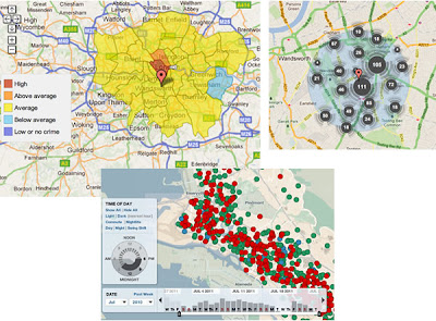
No Collation: The first map is Oakland Crime Spotting (bottom inset in figure) that is very similar to San Francisco Crime mapping, reviewed here. Unlike the other two maps it attempts no point collation at all, I image the authors would argue that they deal with the problem by providing sophisticated filtering tools to reduce the point density. However, it doesn't help if the user wants to get an overview picture of crime across the area the map covers.

Traditional Choropleth: Switching to the the UK, the Metropolitan Police (=London for non UK readers) offer a choropleth map based on wards and subwards (top left insert). I regard this as the traditional approach. Notably it doesn't show actual figures for postcodes, only sub wards - a sub ward is a collection of postcodes. My problem with this is that almost no one knows the boundaries of wards and sub wards so its a strange way to split the city up. (Aside: in my experience, Londoners tend to split London up based on tube stations)

Point Collation: The UK police offer a national map which uses point collation (top right insert). This is the main one we're planning to test as IMHO it isn't an effective way to visualise the data (related post). It offers a finer grain of data - you don't actually see the true location of the crime but it is collated down to the postcode level. In London, a postcode is roughly equal to a single street.

Also worthy of a mention although not a crime map is the Google Haiti Resource finder which uses a very similar point collation method of collating data points.

Friday, July 22, 2011

How is the GeoWeb affecting the Climate Change Debate?

I was recently asked by a student from Southampton's Web Science doctoral training centre to comment on how the GeoWeb is affecting global warming. It's part of a larger study he is doing on how the web affects global warming and discussion about it. Here's my response as a blog post.

Data Visualisation: The GeoWeb has lowered the bar to visualizing data on the topic of Global warming and explaining the background concepts. Examples include Simon Rogers of the Guardian who is using fusion tables to visualise data on a map. See 34mins 33 seconds into this:


He explains how he can now produce useful map visualizations without needing input from specialist software engineers.

Unfortunately Simon hasn't used fusion tables to visualize global warming data (that I can find), however, fusion tables could easily be used to produce maps such as this other Guardian map: Carbon emissions by local authority in the UK. This kind of visualization has great potential as citizens can use them to make voting decisions by comparing their local authority to the others. Maps are very powerful in this regard.

Concept Visualisation: I've also used Google Earth to help visualise climate change concepts, the below clip is explaining Gaia ideas and I use Google Earth at 1min 13secs into this clip:


Mixed Concept and Data Visualisation: Google promotes the use of Google Earth in good causes via Google Earth Outreach, they have a showcase of climate related outreach projects based in Google Earth (click 'climate' link on the right when you reach the page). The showcase is made up of concept and data visualisations. Some of these are excellent such as the National Snow and ice Data Centre (NSIDC) but others could be designed a lot better e.g. 4 degree warming (my review).

Conclusion:
I think the GeoWeb has great potential to inform the climate change debate but at present, it hasn't been nearly as well used and discussed as use of the GeoWeb in emergency aid situations and helping the democratic process (e.g. Ushahidi). Despite having a personal interest in using Google Earth to explain climate change concepts, I think the best potential of the GeoWeb in discussing climate change is not in education but in lobbying politicians to live up to their rhetoric on delivering reductions in carbon emissions. A simple 2D map showing how much carbon dioxide is emitted by region is a fantastic tool to bring politicians and policy makers to account, I wish there were more examples out there of this use.

Wednesday, July 13, 2011

Cutting Edge 3D - no User Tests

Today I want to highlight the work of the Senseable Lab at MIT, from a brief review of their work I'd say they seem to specialise in the area of real time 3D visualization and sensor input.

Beautiful Design Ideas: From an artistic 'this is a work of art' point of view their ideas are novel, fun and highly engaging, see this TED talk for examples


I really relate to the water building, I hang out on the South Bank in London and there's a similar water sculpture there that is hugely popular (clip). Also, I'd LOVE to have some of those helicopter pixels in my lectures to illustrate geography concepts like earthquake waves to students.

Artistic 3D Visualizations of Singapore: This year the Sensable team have produced a project collecting real time data from Singapore and visualizing it. Here are some examples as a clip:


Looking from the angle of information communication there's lots to like:
  • Engaging animations. The graphics draw the viewer in to find out more, they're certainly engaging and artistically beautiful. I'm sure their exhibition at Singapore Art Museum was a sucess.
  • Elegant Time lines: They show time as a playhead moving against a timeline or against a bar chart illustrating relevant data. These elegant graphics are minimalist and communicate effectively without making the animation too busy visually. In a lot of ways they remind me of Tufte's sparklines.
  • 3D Data Visualized Well? I've previously praised their technique in the of visualising 3D data using altitude, color and opacity at the same time as a way of getting over the problems of 3D thematic maps.
Beautiful but Ineffective? However, I worry that beyond looking attractive, these visualisations fail to communicate the data effectively. Two example issues that occurred to me:
  • Double 3D = Busy: In the heat vs energy consumption visualisation I think trying to show 2 sets of 3D data at once with the top layer of data partly obscuring the bottom layer doesn't work well.
  • Where's the Rain?: In the rainfall taxi visualisation by having the rain plot in 3D above the ground its difficult to relate where its actually falling on the ground.
I raise these issues without any evidence that they are actually problems, the only way of doing that is to conduct users tests. On the research page of the Singapore project Sensable discuss technical innovations and I admit in a real time visualisation project these are significant and important. However, there is no mention of user tests, given the amount of time and money that has gone into producing these animations wouldn't it be a good idea to find out if they actually work?

Friday, July 8, 2011

Teaching Contact doesn't = Quality

This post is of interest to those in education but hasn't anything to do with maps beyond discussing a GIS course.

Best Buy Facts of Uni Courses: Recently its been announced that English universities will have to collate and publish a set of 'key facts' about each course they offer to the public, kind of the equivalent of the Annual Percentage Rate (APR) that credit cards must publish enabling customers to easily compare card with card to see how much interest they'll be paying. In theory I like the idea but the devil is in the detail of what measures you use and what they communicate to students. Amongst a series of possible problems that were suggested at the GEES conference I was at last week one is particularly close to my heart: the measure of teaching contact time with staff. I unpack this issue in the rest of this post.

Value of Blended Learning: The main project I'm working on this summer is developing a blended learning course: We have over 300 students due to take a second level GIS course this autumn and who need to complete practicals on computers. Running standard face to face computer room practicals has obvious problems so this year I am rewriting the practicals so they can be completed without face to face support. In effect we are making a big investment (my time) to produce highly polished written materials. These will offer students a better learning experience whilst avoiding the cost of face to face support. Students can still get staff support but it will be via forums and drop in sessions. If I can pull it off, blended learning offers the best solution for the staff and students in this situation.

Contact Time = Good? The problem is that this blended learning solution reduces staff contact time. Every student will think that high contact time with tutors is a good thing when looking at the key facts sheet. However, that measure has not included the value of my highly polished practicals that (I hope) more than make up for the lack of direct support.

My expertise in converting courses to blended learning comes from my time at the Open University who offer distance learning courses with even less contact time, I wonder what they think?