Friday, April 23, 2010

Nice BBC Election Map Gadget

A feature of UK elections is the swingometer, sent up wonderfully by the US daily show (9.10 mins in). Trouble is it only works for two parties, since that's all the competition has been about in most recent elections. For this election, suddenly its a 3 horse race between Liberal Democrats, Labour and the Conservatives. At short notice, the BBC have come up with a nice little tool, you drag a pie chart around to see how the percentage of the vote translates into seats in parliament. The map is quite clever, they've translated the constituencies into a pentagon representation which gets over the problem of urban constituencies being very small compared with rural ones.

I have a history of dissing the BBC's maps in twitters and on this blog so good to be able to cheer them on for once.

I'm off next week so no blog for at least a week.

Wednesday, April 21, 2010

Photos in Google Earth via Google Docs

A while back I posted about how to put photos in Google Earth pop-up balloons using a spreadsheet. Well, with the new Google Docs drawing tool it just got easier. Here's how to do it:

1] If you have an image on your PC, fine. If not, find an image on the web that you want to use (images on the web might have restrictions, creative commons search gets around this). Right click and select 'copy Image URL'.

2] Go to Google Docs . Click the 'Create New' button top left and select drawing. If you haven't got a Google login you'll need to set one up.

3] Click Insert>Image. If you have the image on your PC select 'Choose File' and select the image you want. If you are using a web image, click the chain icon labelled 'URL' and paste in the URL from [1]. If the pasted image does not fill the square, click it and drag the corner boxes so it does.

4] Click the share button top right then 'publish to web'>'start publishing'. If your screen image is large you might want to select the small image size from the 'Image Size' drop down menu. Copy the text from the embed code.

5] Open Google Earth, create a new placemark (the yellow map pin icon top left). Paste the text in the big 'Description' box then drag the 'New Placemark' dialogue out of the way and drag the flashing yellow box to where you want the placemark to be. Select OK.

6] Your placemark should now show your image when clicked.

Additional Things to do:
  • You can add annotations, text or titles to the image in step [3]. In fact, you don't even need the image, you could have a diagram to show.
  • Add a title to the placemark in step [5]
Notes:
  • If there are any alterations to the image in Google Docs it will show up in placemarks even if opened on another computer.
  • The images won't appear if you are offline, if this is important to you then use the spreadsheet system
Wednesday, April 14, 2010

Voluntered Geog. Info: Haiti and Teaching

This video is about how volunteers used satellite imagery to digitise roads, refugee camps and other infrastructure in Haiti following the earthquake.


IMHO its the most important instance of what is becoming known as VGI (Volunteered Geographic Information) yet to occur on the web. Those who organised it and those who just took part deserve a great deal of respect, I think we’re going to see a lot more mapping like this in future emergency situations and this was the first example. As they point out, key to this was the rapid publication of high quality satellite imagery.

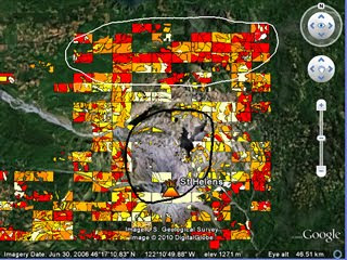
As it happens, I’ve just completed PolyMap a VGI based educational project for Southampton University where we got the students to create a thematic map via a web service based on Google Maps API* . They mapped tree cover around Mt St Helens volcano in USA to see how trees had recovered since the 1980 eruption, click the image to see a demo:


Thoughts for Others considering setting up VGI: Most of the following was obtained via written student feedback:
  • I gave students a background presentation of how VGI related to crowd sourcing and other VGI projects (here as a PDF), the students said this helped them realise what they were doing was a valid technique beyond the Mt St Helens problem. Could be useful as a motivator in non-educational situations?
  • I split the area into a grid and assigned them a square each. This helped in getting the entire area mapped although there was some problems with people working in the wrong square etc.
  • They complained that the classification scheme was difficult to apply whilst I had thought it was fairly simple and well explained. It goes to show that great care is needed in defining and then explaining classification schemes. My video tutorials on how to produce the map were very popular, fool proof documentation and instructions are well worth the investment of time.
  • They liked the fact that I collated the data and interpreted it in a presentation after they had finished and working in groups on a shared problem.
  • Advances in Google MyMaps since we started the project mean it would have been possible and much easier to do this project using Google MyMaps rather than the bespoke PolyMap service.
Other Educational Points:
  • Student feedback was the most positive feedback I've had for a long time!
  • The 1980 Mt St Helens eruption is a great topic to teach using technology, satellite images, youtube clips and photographs from USGS are out there in abundance. I think having an interesting context (the eruption) is possibly more important to the learning than the quality of the VGI data.

Thursday, April 8, 2010

ArcGIS.com: ESRI's neo-geography tool


Interesting talk by Jack Dangermond and colleague at Where 2.0 discussing their soon to be released web service: ArcGIS.com.

Background: The reception from the crowd is polite rather than 'stoked' which isn't surprising, this is a collection of neo-geographers (web based maps people) watching a talk from the major player of paleo-geography* desktop GIS.

I think its fair to say that ESRI (Jack's company) has failed to capitalize on the virtual globe or slippy maps (e.g. Google Maps ) market over the last 5 years and now they're playing catch up. Jack's statement that the distinction between neo-geography and GIS was disappearing was interesting, pretty much everything they demoed I'd classify as neo-geography rather than GIS - it was all user side features rather than producer side.
Interesting Features: There were a number of interesting features to the web service shown:
  1. Easy to search for maps from providers (Tree maps from Washington city)
  2. Easy to mash-up maps and create a new map (Tree maps and a chosen base map)
  3. Easy to share your map with a group or with the world
  4. Easy to add annotations to public services (here is a pot hole, please mend it Mr Government)
  5. Automatic integration with mobile devices (currently only iPhone)
  6. Presentation mode (earthquakes and aftershocks in Chile)
All the listed features are currently available on Google Maps and Google Earth. Google My Maps does 1 and 3, customisations of Google Maps do 4 and 5 while Google Earth does 2, 5 and 6. The possible strength of ArcGIS.com is that all these features come in one application. However, the devil is in the usability detail, I'll have to wait for the release to see if they have made it usable enough for the public, usability is a key reason why Google Earth/Maps have flourished so far, if ESRI haven't cracked this issue then I think the service isn't going to fly.

*edited 9th Apr: I didn't mean this to be disparaging just as the opposite of neo-geography

Wednesday, April 7, 2010

UK Election Map: Triumph of Style over Content

In June last year I reviewed the visualizations the BBC were doing for the European election. Well, the BBC have released their new version:


I'm reviewing it again because they've obviously spent a lot of time and money putting the visualization together but it still comes out as more stylish than useful.

Pros: To be fair to them since last time:
  • They've taken out the chart junk 3D
  • They're not differentiating areas using grey any more (at least not in the clip).
Cons:
  • Why are the floor supports coming up in front of the map? I was left thinking they were marking a specific region for further discussion until I worked out what was going on.
  • By putting the map on the floor instead of the wall you distort the view, making it difficult to locate your chosen place on the map (as per last time)
  • A map on the floor can't be pointed at like one on a wall, making it difficult to follow which bit of the map is under discussion. You could get away with this if you annotated the map as it was discussed but they don't.
  • Beyond this clip the presenter starts discussing other elements than the map. To make the map visually move to the background the map gets a grey mask in front. Unfortunately there seems to be a colored halo around the map and this spreads out from behind the grey mask. Switching the whole map from color to gray and reducing the opacity would be more effective.